

When we recently rolled out our Mobile Suite offering, we saw the culmination of months of work building a solid and customizable set of tools. The trickiest, in some ways, was the addition of a mobile framework to our existing CMS. We had some clear goals and requirements defined from the onset, and the end result provides us with an elegant mix of new and existing development practices. Here’s an overview of what we did.
Built Upon Our CMS Framework
Our CMS is basically a content-> template system. For instance, a page showing blog content will have a specific “blog” template, to tell the browser how to display that blog content. Using this model, the foundation of our mobile system is rather straightforward – we create custom templates for those content types we decide to include in the mobile version of the site. If someone on a mobile device tries to view a page without a mobile template, we simply fall back on the regular template. This additive approach allows us to tailor the complexity of the mobile site to suit each client’s needs.
This additive approach also means that internally, we are developing within the existing structure of the full site. With this model, we are able to make full use of all the integrated features of the full CMS, such as automatic RSS generation, advanced analytics and tracking, and automatic image resizing (more on that later). We are also able to utilize the same development techniques that we’ve been perfecting over our 15 years of website building.
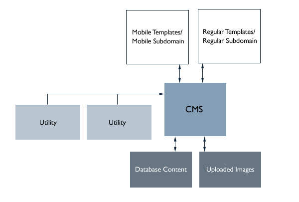
A Subdomain-Driven System
The second part of our mobile system is in essence a sub-domain management system. This allows for specific rules to be tied to a list of sub-domains (www.newfangled.com, for instance, or m.newfangled.com). For instance, if we see that you are visiting the site on an iphone, and you are trying to view a page that has a mobile template defined, we know to redirect you to the mobile WebKit sub-domain (m., in the case of the newfangled site).
While I spoke above about how we format specific pages to show up on a WebKit-enabled mobile device, at the core of the system we don’t need to know any of that. With this open-ended way of creating and managing multiple sub-domains, we can determine if the user is visiting on an iphone (or a toaster, or a web-enabled cat), and invokes the appropriate sub-domain. At that point, the CMS takes over and loads the appropriate templates. This will allow us the freedom to implement additional solutions as new technology becomes available.
Content Filtering, Not Duplication
Until now, we have not touched on the actual reason we’re building the mobile site – the content delivery. We decided that for most of our clients, the ability to maintain one set of content for both the mobile and full sites would be very important. Fortunately, our CMS is granular enough that we almost always have very specific control of each field that makes up a complete piece of content in the CMS. That lets us, for instance, build a list view consisting of a Title, Date, Location, and Abstract. On a mobile version of that same page, we could display only the Title and Date. Less scrolling makes this format much more usable on a smaller screen. Where appropriate, we are also able to use the CMS’s automatic image resizing to deliver smaller versions of the same images that a visitor would see on the main site.
We also realized that, while we would be displaying the same content in both formats, some clean-up would be required for smaller displays. One mechanism we employed is to force all “inline” images (illustrations within a blog post, for instance) to always display at the full width of the browser and to never float to the left or right. The CSS for this is pretty simple:
#contentarea img
{
	margin-bottom: 20px!important;
	float:none!important;
	padding:0!important;
	display:block!important;
	max-width:100%;
	height:auto;
	margin:0!important;
}
Another issue was that of embedded video. On the newfangled site, we found that we had many embedded YouTube videos, none of which would display on the flash-less iPhone. What we did instead, however, was to programatically strip these out, and replace them with the video’s thumbnail and a link to the video, which would play on the iphone. The result is not seamless, but is much better than a page full of broken video icons. A simple regex takes care of this:
$text = preg_replace('#<object(.*?)youtube.com/v/(.*?)&(.*?)</object>#', '<a href="https://www.youtube.com/watch?v=\2"><br><img class="video-screenshot" width="320" src="http://img.youtube.com/vi/\2/0.jpg"></a>', $text);
Embracing WebKit and HTML5
This has been discussed elsewhere, but it is worth mentioning that very early on we decided to focus on mobile devices that use the “WebKit” platform. This mean iphones, ipods, ipads, android devices, and (sometime this summer) blackberrys. The benefit from a development standpoint is huge. Rather than having to make our mobile sites work to the lowest common denominator of browsers, we could instead employ the latest HTML5 techniques. Generally speaking, this means faster pages, smoother animations, and generally smarter webpages.
Building for the latest web standards opens up some development doors that would otherwise be unavailable. By using HTML 5’s support of Manifest Files, we are able to use client side storage to override the browser’s caching mechanism. This means fewer network lookups, which is great when dealing with a 3G connection. Likewise, display elements like rounded corners are a breeze using just CSS:
#rounded-corners
{
	border:	1px solid black;
	-webkit-border-radius:	10px;
}
In fact, the simplicity of developing for HTML5 standards has been one of the most exciting parts of starting to offer mobile development. Some good resources are this overview, and Mark Pilgrim’s Dive Into HTML 5.
What We Didn’t Do
Conspicuously missing from this overview, I think, are some common mobile development principles. The most glaring might be the lack of any javascript/mobile toolkit, such as jQTouch. While this was used when building the mobile versions of our administrative tools, we found that for actual mobile website development, it just didn’t make sense. We found much greater success using the same HTML/CSS/jQuery approach that we’d take when building any website, as it lets us streamline and optimize everything we build. Of course, should a project warrant it, there’s no reason why a more robust javascript framework could not be added on top of our existing structure.
Further Reading
To learn more about what we’ve actually been doing with this system, check out: