Smart phones are becoming the tool of choice as technology rapidly advances. As people begin to rely on these mobile devices more and more, Newfangled needs to prepare its own website to cater to mobile users. That being said, Katie Jamison and I have been tasked with the prototype for this mobile site. We brainstormed and researched how other websites were currently handling their mobile version of the site. As you read on, you’ll catch a glimpse of what we thought about and what we finally ended up with.
Where did we start?
First, we did some searching through Google. Lucky for us, a trusted source came up with recommendations for what to think about when creating a Mobile website.

After looking at the examples provided by trustworthy sources, Katie and I had a foundation to work off of. We had a good sense of what to avoid as well as what we liked about some examples we saw.
However, as we learned from our years of experience – websites are unique. This concept applies to mobile websites as well. So, Katie and I put on our thinking caps and imagined ourselves as mobile visitors to Newfangled.
We asked ourselves some questions.
What next?
When we found the answers to the questions above, by doing a combination of Google Analytics research and brainstorming, we utilized our prototyping tool. Normally, our prototyping environment is a gray slate that fits the size and height of your computer screen. So, we got a little creative and set up the following prototyping environment.

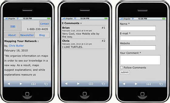
What you see to the left is the actual grayscreen prototype built on top of an iphone image. This screenshot was scaled down, but the prototype is an accurate representation of the “website” as if I were holding an iphone and loading up https://www.newfangled.com.
Please note that, Newfangled’s grayscreen prototyping phase is devoid of any design since we focus on the information architecture. Read Chris’s Newsletter about “How a Website is Built, Part 1” to find out more information about prototyping in general.
The prototype itself actually works. When clicking on the link “Mapping Your Network” found in the screenshot above, you’re brought to the prototype page that shows the details page for a blog. On this page, we have mimicked how a user would scroll “below-the-fold”. I could go on and show you each individual page for the prototype. However, that would ruin the surprise when we have completed the mobile website, so I’ll hold off on that.
Are we done?
The prototype has been completed for the most part, aside from needing to be reviewed by our developer who will be handling this upgrade.
Newfangled’s next step after prototyping is to have our creative director Justin Kerr review the prototype and come up with a fantastic design. Newfangled will be following its own process outlined in Chris’s Newsletter, “How a Website is Built, Part 1”.
Hopefully, the next blog post you read by me is through a mobile device.