We keep moving forward, opening new doors, and doing new things, because we’re curious and curiosity keeps leading us down new paths.
– Walt Disney
Newfangled’s design process is continually evolving. We’re always looking for ways to streamline the process, ask better questions, and provide the best design deliverables for our clients’ needs.
A Brief History of Our Visual Design Process
Ten years ago, our design process for each project began with creating fully-realized, static layouts of the home page with minimal input from the client about their design goals. This was an ill-informed, time-consuming process that resulted in overwhelming the client with choices and forcing them to make decisions about visual design, user experience and content simultaneously. Why did we do it this way? Partly because we still thought about the web as static HTML pages rather than a dynamic content delivery system. And partly because we perceived it was the design process everyone else was using.
Five years ago, we introduced mood boards into our process. This was a big step forward because mood boards allowed us to focus on the elements of visual design divorced from the structure of the website. They provided a way of showing the client a sampling of design elements rather than a specific page of their site. We were dealing with the ingredients of design rather than looking at a finished cake. Mood boards also took less time to develop than fully-developed page layouts so we could explore more design options at the beginning of the process.
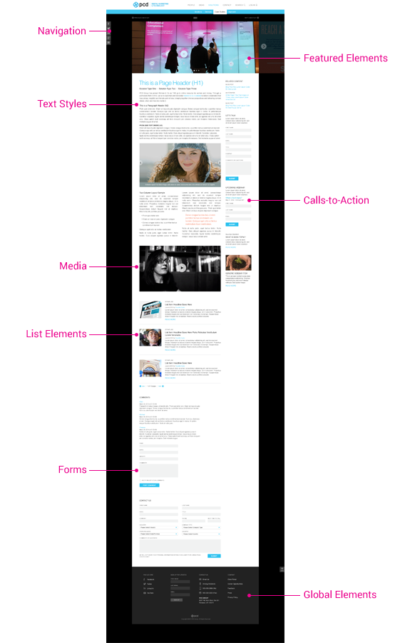
A year ago we began including comprehensive style guides as a design deliverable (in addition to mood boards and page layouts). The style guide is related to a prototype tool called the modular page template. This template is comprised of content modules that the client can create and arrange in different combinations in order to produce a custom page layout. The visual style guide uses the modular template as its framework and is populated with a collection of content elements (page text, headlines, image carousels, forms, etc.), which are the basic content ingredients for creating custom pages.
Three months ago I listened to a webinar entitled, “Design Deliverables for a Post-comp Era” with Philadelphia-based designer Dan Mall. During the webinar Dan introduced a couple of design deliverables he had developed: the Visual Inventory and the Element Collage. I listened as he shared the history of his own frustrating experiences of multiple page layout iterations in the midst of a client approval process that was already laden with anxiety and subjectivity. When he talked about how visual inventories and element collages could help shepherd clients towards thinking objectively about their website as well as promoting better decision-making, I was more than a little intrigued.
Since then, I’ve used both of these deliverables in a few new projects. My own results have been positive, not just in the nuts and bolts of designing but in client interactions as well.
Visual Inventory
A visual inventory is a survey of websites and website elements collected into a single document and presented to the client to generate conversation about design: colors, typography, conceptual direction, etc. Newfangled’s existing client intake form asks our clients for a list of their competitors’ websites as well as inspirational websites, so collecting samples and putting them into a Keynote presentation was an easy step towards a visual inventory.
The biggest advantage of the visual inventory is that it gets clients thinking about about design sooner in the web development process and helps define goals up front, before any page layouts are produced.
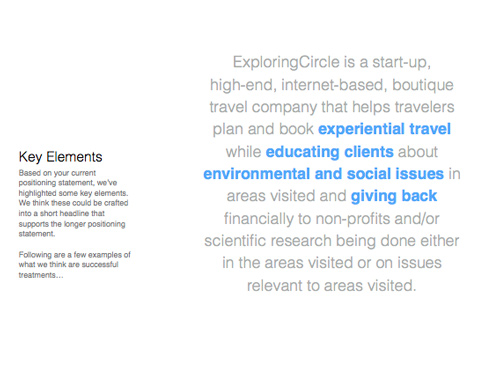
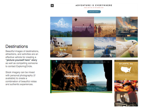
My first visual inventory was for ExploringCircle, an adventure travel site with a focus on social and environmental issues. I built the visual inventory around four areas: Positioning, Color, Concept, and Tone. These categories are not meant to address every detail of the site but instead pose good questions about what the site should look like.
Positioning: this is what would make ExploringCircle (EC) unique among its competition, so I highlighted key phases from their mission statement such as experiential travel, education, and environmental and social issues. These phrases became the guidelines that would shape everything we put into the site — not just the visual elements but the site content as well.
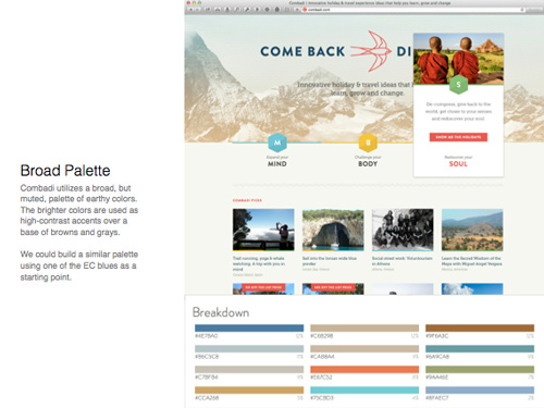
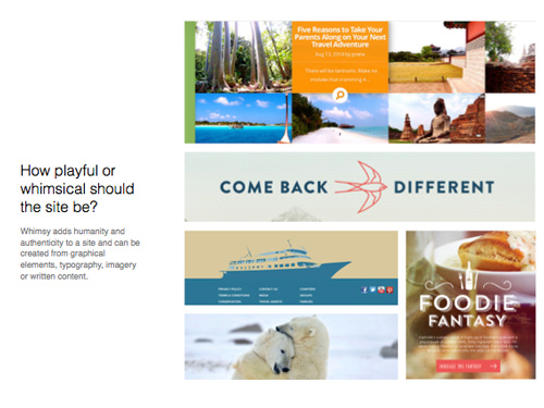
Color: I sampled several different sites, some with broad color palettes and other sites that were almost monochrome. Having the client respond to examples proved far more effective in shaping the direction than asking, “what colors do you want on your site?”
Concept: We needed to know how we were going to tell the EC story so I proposed several methods and let the client tell us which ones suited them best. Based on our conversations, the client decided a combination of large, compelling destination photos combined with traveler testimonials would be the key elements to telling their story.
Tone: Is this going to be a serious, button-down site or will it include some playfulness and whimsy? You may assume certain things about the demeanor of your client but it’s always better to ask than guess. EC decided that a friendly tone with a bit of whimsy would appeal to their target audience.
Element Collage
The element collage is a close cousin to style tiles and mood boards, which is what we have been using in our design process for about five years now.
The issue we’ve had at times with mood boards is that the client would mistake them for page layouts. We wanted the clients to think about the site design at 30,000 ft. and they were zooming in to ground level to focus on small details. One of the advantages of element collages is their horizontal orientation, which eliminates any chance they will be mistaken for page layouts.
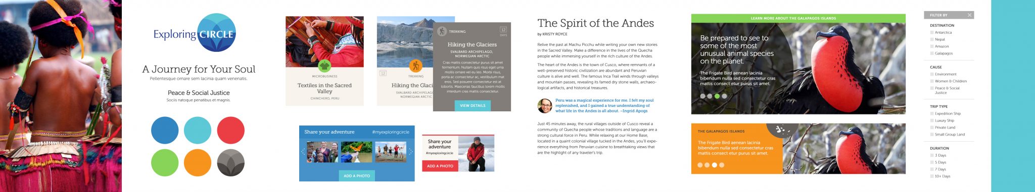
Also, since moodboards were the first design deliverable the client saw, we usually had to produce two or three boards — each in a unique style — which sometimes led the client to combine elements from different boards. The visual inventory eliminates many of the design “guesses” that were inherent in the mood boards and the feedback from the VI is used to inform the direction of the element collage.
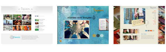
We gleaned from ExploringCircle’s feedback that a broad, bright color palette combined with destination imagery and friendly, easy to read text were some of the key design elements. The finished collage included a color palette, sample typography, examples of “destination cards,” two versions of a proposed social network feature and feature slide carousels, and a snippet of a form. The element collage was well received and I was able to immediately proceed to page layouts.
The Best Thing
One of the benefits I’ve seen, even in the relatively short time I’ve used these new tools, is better conversations with our clients (as well as our internal teams) and a more iterative process. Rather than pinning a Photoshop layout up on the wall and saying, “what do you think?” we’re walking alongside the client through the decision-making process from the very beginning and helping them make the best choices for their new website.