 I was chatting with a colleague this morning about some of my current projects and the subject came up of web content and its relationship to design. A recent trend in web design is the beautiful, pixel-perfect, long-scroll website that’s chock-full of over-sized images and video. I can understand the attraction of that type of presentation and why clients would be seduced by the aesthetics of it. But there are some things that need to be considered, such as: is the site scalable? What happens when the content changes? Would it look just as good on an iPhone as it does on a 32-inch flat-panel monitor?
As I continued to talk with my friend, I found myself beginning to rant (a bit) about the issue of “style over substance” when it comes to web design trends and client requests to “make our website look just like [insert the name of a hand-crafted agency website here].” Since last year, we’ve written several pieces about responsive design, modular content, and continually optimizing your website’s content. And I imagine we will continue to write about these topics until we feel satisfied that our readers are taking it to heart.
The Right Questions
 My plan for this piece was initially to write a follow-up to a post from a while back entitled, “How Wide Should I Make the Website?” This question was fairly relevant three years ago because responsive web design was just beginning to get broad attention in the web design community. Now, with the proliferation of mobile devices, and with responsive web design having become the norm, my original question from 2011 about the optimal width of a website is kind of stupid. It’s like asking how big to build your house without first determining the purpose of it. Is it a primary residence? A vacation home? How many people does it need to accommodate? Two? Five? Twenty? Where is the site location? Near the ocean? The desert? On a mountainside?
If it’s not already obvious, these questions are about content, context, and functionality. The question “what color would you like the house?” is irrelevant to whether the house should be a three-story Italianate or a split-level ranch.
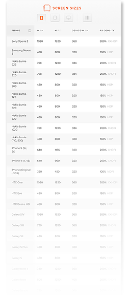
In 2014, it really doesn’t matter how wide the site is because, in some circumstances, it will be 2500 pixels wide, and in others it will be 320. The container needs to carry the content to many different devices and be flexible enough to accommodate all (or almost all) of them. You can read more about the philosophy of “content vs. container” here. Yes, grids are still important. As a matter of fact, they’re critical since you need a structural system that will allow the site design to be flexible but not require you design each page or viewport instance individually. Content changes. It’s not static. The container cannot be static.
My point is that there may be some really slick-looking custom sites on the web, but most of them come at the cost of either flexibility, portability, or usability. A modern marketing website (which is what we build at Newfangled) cannot be so proprietary in its structure and design that it fails to accommodate the fluid nature of the web. Chris Butler wrote a great piece about web content and design in January. One of the real-world examples about the limitations of custom websites Chris used was Teehan and Lax (teehanlax.com). According to one of the agency’s principles, Jon Lax, the resources that are devoted to maintaining their site are significant. Lax said it takes a team of about four people (two designers, one developer, and one partner) about two weeks of full-time work to create a new case study. That’s just one piece of content on their site!
Design vs. Decoration
There is nothing wrong with having an attractive looking site. But don’t confuse design with decoration. A well-designed site is one in which you don’t notice the design first. A well-designed site is one that is easy to use and invites you to engage with the content (which is the point of a marketing website; turning viewers into customers). Amazon and eBay are never going to win any web design awards, but they’re consistently in the top 40 of the most-visited websites. If you want a beautiful piece of art, make a poster, paint a picture, or design a chair. Marketing websites are design systems, not design products.
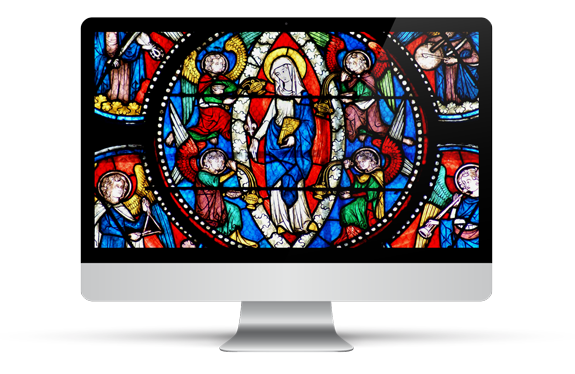
We have endeavored to change the way we design sites over the last several years. Ten years ago, the visual design phase consisted of laying out full web pages (usually the home page first) in several different styles in hopes that one of them would be selected by the client. After multiple rounds of a single page layout, we would move on to designing the next single page layout. This process was not only inefficient and costly, but it didn’t provide an overall picture to the client of how the site’s content worked together. We were, in essence, creating individual stained glass windows for the client to see without showing them what the rest of the cathedral looked like.
We’ve been moving away from the “multitude of page layouts” model to one in which we begin with the big picture (color, typography, imagery) in the form of mood boards and slowly work our way towards a few key templates that will inform the design of the site. This has been a challenge for two reasons: the psychological aspect of visual design and educating our clients about this new process. It’s natural for clients to want to see every single page of the site, especially if that client is an agency. Visual design is the most subjective and emotional phase of web development. It’s a challenge to get clients to let go of their desire to micro-manage the process and put their trust in our expertise, but we’re not going to give up on moving in the direction we believe the web is heading. As successful as we were in convincing our clients and agency partners to transition from print to web, we feel confident that we can help them make this next transition as well.