Life Before Mood Boards
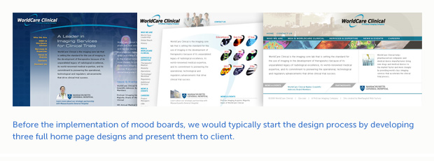
Prior to integrating mood boards into our design process, we would begin by showing the client 2-3 versions of a fully realized page layout, usually the home page.
This was a flawed model for several reasons.
1) Starting with fully developed page layouts forces the client to focus on more than just the visual design. It’s too soon in the design process to be addressing information architecture, specific user interface issues or site functionality.
2) Secondly, a website’s home page is usually too unique from the rest of page templates to truly represent the site. A more general template such as a product detail page or newsletter detail page will contain more of the common elements of a site and is a better choice to begin the page layout phase.
3) When you start with page layouts, a lot of time is spent up front working out small details of the site’s form and structure when that time could be spent exploring different looks based on client input collected in the discovery phase.
 The Benefit of Mood Boards
Mood boards are visual “sketches” that contain elements of the site (type, color, textures, imagery). A board may contain some elements from the site, such as an email call out box or bio abstract, but no single page template from the site is represented. This allows the client to focus just on the look and feel of the site, quickly form a first impression and ask themselves, “Is this how we want to represent ourselves on the web?” Mood boards can be put together quickly and it’s easier to eliminate ideas that don’t match the client’s taste or personality and develop the ones that do. Since mood boards don’t rely on a site’s structure, I don’t have to wait for a prototype or wireframe to be completed before I can start the design phase.
Mood Board Evolution
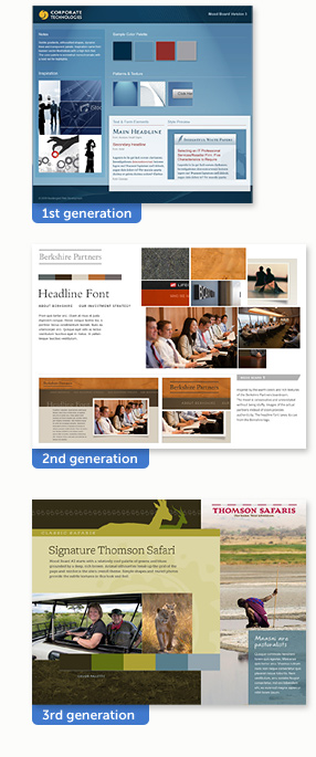 When we first starting creating mood boards in 2009, I used a template that had been developed by viget.com and made available for download. The template was very structured, with clearly defined areas for type treatments, a color palette, source imagery and a keyhole sketch where some of the elements from the board would be combined.
It took a while to convince our clients that the mood boards didn’t represent a particular page of their site but were more like swatch boards that an interior designer would use to gather ideas and inspiration before redecorating a room.
About a year later, I decided to change the format of our mood boards. I had been using a separate Photoshop document as a visual “sandbox” to collect bits and pieces and experiment with different textures, colors and imagery. It was much larger (about 1200 x 900 pixels) than the mood board template I was presenting to the client. I would take the portions that I liked from the sandbox document and shoehorn them into the smaller mood board template. I realized that I preferred the loose and more conceptual nature of the sandbox documents and decided to clean them up a bit and present them as the final mood boards. The focal point of these new boards was the large collage of inspirational images; they also included more detailed page thumbnails below the collage.
Although I was pleased with the more conceptual nature of these boards, the image collage was causing some confusion with our clients. “Where will this collage be on our website?” “Why is there a picture of a violin in the collage? We manufacture servers.” The 2.0 versions of our mood boards lasted through a handful of projects before I realized I needed to rethink the format again. I still liked the loose layout, but the collage had to go and the keyhole sketch was too close to a page layout and defeated the idea of a mood board somewhat.
The third generation of our mood boards takes some cues from its predecessor but the entire board is a collage of visual elements. These new boards provide a more unified composition with content from the client’s current site (or prototype) helping the client visualize things like contrast, juxtaposition and scale. I retained the larger board format because it allows me to create a “living space” for all the elements. Instead of a board made up of many little windows (like the first generation), the entire board is one large display window.
I’m sure our mood boards will continue to evolve as we continue to develop the process of guiding our clients through the design phase.
If you have a mood board story, I’d love to hear it.