
What is Important?
Here’s a list of three things I did today:
- wrote this blog post
- ate a salad for lunch
- finished up some designs for a client
Which thing is the most important? Well, that depends upon the audience, doesn’t it? And, the way I present the list. For example, say I wrote the list this way:
- Finished up some designs for a client
- Wrote this blog post
- Ate a salad for lunch
You might conclude that #1 — finishing up those designs — is the most important thing. After all, I put it at the top of the list. But, perhaps I simply ordered these things sequentially. Finishing up those designs might have been the first thing I did today, but not necessarily the most important. Unless, of course, you are my client. In that case, those designs were the highlight of my day. Obviously. But what if I presented the list like this:
The Top Three Things I Did Today
3. Ate a salad for lunch
2. Finished up some designs for a client
(fanfare)
1. Wrote this blog post
Now there can be no doubt what was most important, can there? Well, maybe. You see, while I’m giving a few clues in the text about what was most important — specifically, the numbering and the editorial title of the list — the most important factor isn’t in the list at all. It’s who is reading the list. In this case, you. I wrote that last version of the list for you, so naturally, writing this post is the top thing I did today.
Ok, enough parlor tricks. The point of this game is to get us thinking about what is important, and how we communicate that. Often, the way we communicate diminishes the importance of those things that are of the greatest importance, while elevating things that are, in the grand scheme of things, pretty trivial.
I wonder, is your homepage a good example of this? I know ours is. But more on that in a moment.
What is Important on Your Homepage?
A few weeks ago, I wrote a blog post called Four Steps to a Better Agency Homepage. I suppose I could have called it, “What is Important on Your Homepage.” The gist was this: Too many homepages are designed to be seductive — to give a first impression of sophistication, intelligence, glamour, sexiness, or even just creativity — and do that at the expense of communicating the most important things that visitors to your website need to know. I argued for following a simple, four-point outline when designing your homepage. Any decisions about content or imagery should not change this simple order of priority. Here are the four things — in order of importance — that your homepage should cover:
- What you do
- What you’ve done
- What your clients say
- What you say
In other words, the most important thing your homepage can communicate is your positioning — what you do — followed by examples of your work (ideally, links to case studies), testimonials, and then whatever insights you have to share as part of your content strategy.
I mentioned in that post that many agency homepages get that priority backward. I know this because we did, too. Having made that mistake better qualifies me for noticing it elsewhere. Everywhere.
It mostly comes in the form of the flashy, flex-y, colorful, gridded homepage.
I’m not sure which was the first website to launch a gridded homepage. I’m not even sure — roughly — when that would have happened. I do recall one of the first ones to catch my attention. It was the homepage for a very well-known and respected agency. When it launched, I heard about it from at least four different sources within the same hour — Twitter, RSS, Facebook, email — the internet was abuzz. I clicked the link and was in awe of what I saw. It created this immediate impression of WOAH! and then wow and then, well, something like this. Did I have any idea what I was looking at? Not really. Now I know that it’s a mix of articles, press, work, social media, and other culture items from the agency. But that’s after a few years of looking at it (as of right now, that homepage is still up). That day? I had no clue, and no clue that I had no clue. I was seduced. What made matters worse was that we were in the midst of a redesign of our own and within seconds, I was already fooling around in Photoshop. This is the design equivalent of drunk-driving.
A few weeks later, we had produced a version of this:
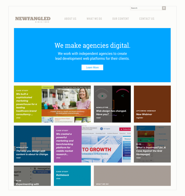
Yes, as of right now, you can just click our logo and see this in action for yourself. But we don’t intend for that to be true for much longer, so I’m including the screenshot for posterity. That way, you’ll know that my do-as-I-say-not-as-I-do was even more hypocritical at some point.
What we are excited to replace it with, though, is this:
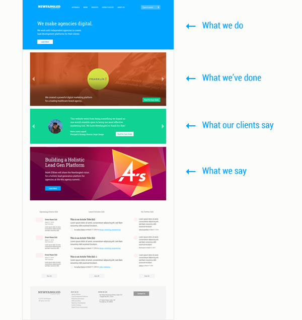
You’ll notice I’ve labeled how the sections of our new homepage design correspond to the outline I shared earlier. This latest homepage is designed to ruthlessly abide by those four rules. But, at least as far as I’m concerned, it’s not at the expense of looking good. In fact, the more I look at our new design, the more critical I am — even just aesthetically — of the old one. I’m sure this won’t be the last time I feel that way, of course. This stuff is always a work in progress. But thankfully, progress is taking us away from the gridded homepage.
A Case Against the Gridded Homepage
Gridded homepages are a mistake. Pretty much in every case. Except, of course, if you don’t need your website to create awareness or opportunity for your firm. If your reputation is good enough to keep you in demand regardless of what you put on your website, then you have the freedom to put whatever you want on your website, how ever you want. But if you’re expecting your website to strengthen your reputation and create opportunity for your firm, you’re going to need to resist the temptation to follow many of the flashy trends you see online, and make especially practical design decisions that reinforce that simple goal, not distract from it.
So why are gridded homepages a mistake? Well, let’s first think about them as purely visual or symbolic versions of the lists I wrote earlier in this article.
What about this grid?

At first glance, and without more information, it’s safe to assume that the contents of this grid are of equal value. If you were to conclude that, say, the top row of the grid contains the most important information, you could very well be wrong about that. The grid certainly isn’t making that clear.
OK, so what about this one?

In this case, there are at least a couple of things that could communicate importance — specifically, the size and shape of the boxes. It’s possible that the larger ones contain the most important information, right? Perhaps. Unless, of course, there’s no perceivable difference in the contents of those boxes. Many gridded homepages randomly distribute content into a grid that was designed simply for visual diversity and without consideration of the specific content it might contain. One way to test this is to drag the browser window around and see how the grid reacts. Does it rearrange the distribution of its contents? What about refreshing the page — does that rearrange and redistribute the grid’s contents? Most gridded homepages work this way. Their behavior is indicative of a few key conceits central to this design approach:
- The content is the most important thing
- All content is of equal importance
- The content experience should be delightful and fun
But we already know this isn’t true. Not really, anyway. See, it’s not that your content — your articles, your blogs, your case studies, your webinars, your social media — isn’t important. It is! But it doesn’t just stand on its own. It doesn’t operate like other media. When you turn on your television, it makes sense that you have the freedom to flip through channels at your leisure, without being forced to do so in some order that your TV prefers, or be limited to looking at particular media that someone at Time Warner thinks is the most important. It’s all equally important until you decide otherwise. But your website doesn’t play by the same rules. First, your content needs to be contextualized. Because your content isn’t entertainment, but is marketing, you have to tell the viewer what they’re being presented with and why. They’re not here to zone out after a long day at work. They’re here to learn something, which is, itself, a form of work. So don’t dress it up and pretend it’s not.
To summarize: (1) Content is not the most important thing, context is; (2) all content is not of equal importance; (3) The content experience should be simple and informative before it is delightful and fun.
You made them think? Never make them think!
But what of the big picture? Regardless what a content grid contains, or how well it arranges its content, a grid breaks the cardinal rule of web design: It makes visitors think. Too much and too soon. They have to do all kinds of semiotic orienteering and other mental gymnastics just to figure out what on earth your website is about, besides, of course, being pretty. It’s kind of like they’re on a speed date with someone very attractive but who just shouts out random facts rather than make conversation. You wouldn’t expect them to opt for another round, would you? I didn’t think so. For the same reason, you can say goodbye to the majority of your visitors. They’re going to end up spending their time and attention consuming information that has been designed to make the quickest and best use of it.
Have I convinced you yet?
If not, here are a few more points. Some of these might make great talking points if you find yourself needing to argue against this design approach in the future…
Further Arguments Against the Gridded Homepage
Guess what? I’m going to make this one in the form of a list. Which point do you think is the most important?
- Gridded homepages overestimate the value of a creative first impression and underestimate the value of clearly articulating positioning and saving unqualified prospects from wasting their time. Sub-points include:
- Your homepage isn’t a gallery. It’s a door. You need to convince them that there’s a good reason to come through it.
- If your name isn’t immediately recognizable, then you have to convince people who have never heard of you that you’re worth their time and attention. Another analogy might help: When a prospect loads your homepage, it’s actually like you stepping into their elevator. You have that brief moment to share what you do and why it’s important to them. Remember, you (your homepage) are the one stepping into their elevator (their browser), not the other way around. If you are already known, then you can treat your homepage like they are stepping into your elevator. But before you take that liberty, be as honest as you can about the strength of your reputation in the marketplace.
- Gridded homepages overestimate the time and attention users should be expected to have to spend browsing. Imagine a store with twenty doors of different sizes and shapes. How many people do you think would find that fun? How much do you think that store would sell?
- Gridded homepages underestimate how quickly the neato! effect wears off once a user ends up somewhere in the site and is still unsure about what they’re looking at. This is because the amount of information contained in a gridded homepage tends to far exceed user attention, which means people will either click at random and end up on a page without being entirely sure what to expect (is this an article? a video? a gallery? what is it?) or quickly leave because they are too overwhelmed with choices.
- Gridded homepages tend to be a result of “punt planning” — what happens when you don’t know exactly what you want to do with the content on your homepage and can’t be bothered to figure that out in advance, so you rely upon a framework that you believe offers the flexibility and freedom to figure that out later. Sub-points include:
- Often, when you do figure what you want to do with your homepage, whatever system or logic you’ve created will not be exactly right anyway.
- The more algorithmic the homepage grid is, the less control you will have over how your homepage looks or the experience you can expect a visitor to have.
- The less algorithmic the homepage grid is, the more work it will require of you to keep it current.
- Lastly, gridded homepages have already worn out their welcome. Everyone else is doing it — and have been for a couple of years now — so it’s no longer as unique and cool as it used to be. By the time you catch up and build one of your own, the cool kids will have already moved on. In fact, haven’t they already moved on to parallax? On that note, my man Page has the case against parallax made for you.
Think Before You Grid (or Let the Data Be Your Guide)
Like I said, all of this comes from a place of having pursued the grid approach and found it wanting. Having had the past two years to think it over and reconsider our own design decisions while guiding our clients to better ones, I’ve settled on this case and think it’s a good one for agencies that want to use the web, not just be on it.
But I probably wouldn’t have gotten this far if some of our own analytics hadn’t clued me in that our homepage wasn’t doing what we wanted it to. So before I sign off, I want to share with you just a bit of that so that you can then look at your own data and see what they’re saying about your design. I’m actually taking this almost verbatim from an email I sent to one of our agency partners who asked me about our homepage after doing some deep thinking about his own.
What Our Data Say
The vast majority of our site’s visitors come in on sub-pages of the site, not the homepage. Specifically, an article page, like a blog post or longer article. Specifically, over the last year here’s the breakdown:
- 25% of all site visitors landed on a specific article, “The Way You Design Web Content is About to Change.” Needless to say, this one went viral.
- 9% of all site visitors landed on another specific article, “How to Tell the User’s Story“
- 6% of all site visitors landed on the homepage
- All other visitors landed on subpages, comprising of 5% or less
For those users who do enter via our homepage, or visit it in the course of their session, here’s the breakdown of what they do next:
- 20% of visitors went to our “About Us” page. Makes sense. It’s the first thing in our main navigation and they definitely want to know who is responsible for the site.
- 15% of visitors went to our “What We Do” page. Again, in the main navigation and what most visitors want to know anyway.
- 10% of visitors went to our blog landing page
- 7% of visitors went to our “Contact Us” page
- 5% of visitors went to our newsletter landing page
- all other visitors went to other subpages, comprising of 5% or less
So, getting our users to content is not a problem for us, and hasn’t been for a long time. What has been a problem is prioritizing the flow of their session, which is why we’re strongly advocating for the four-point hierarchy I mentioned earlier (What we do, What we’ve done, What our clients say, What we say). We’re in a place now where sifting qualified leads from our considerable audience is far more important to us than growing the audience itself. I think that’s a progression, and while it’s not a change to the content marketing priority that everyone is ready for, many of our partners are. We’re certainly leading with this message, and soon — hopefully very soon — our own website will make that clear.
Thanks for reading. I hope this deep-dive was helpful 🙂