
Over the years, there are few aspects of a website that I’ve come to think about as differently as I have the homepage. What should a homepage do? How should it look? How much information should it contain? These are questions I’ve answered very differently, sometimes depending on who is asking — and what kind of homepage we’re talking about — and sometimes simply depending upon what I’ve seen work and not work. There are many things we’ve loved to stick on homepages that never worked, just as there are many things that have worked whose time has passed.
So here’s my latest thinking on this.
First and foremost, it’s important to reiterate the eternal truth of the homepage: it is not always the first page. The number of visitors to your site who will first arrive via a sub-page is in direct proportion to the amount of content your site contains. The more pages you have, the more first pages you have. But most of the people who arrive on a sub-page that don’t leave after reading it will probably head to your homepage next, armed with predictable questions: What is this site? Who made it? What are they about? Should I stay or go? Your answers to those questions will be suitable for a first time visitor, too, so they should definitely shape your homepage design approach.
What shouldn’t shape your homepage design approach is the idea that your homepage should seduce visitors with a ton of cool images. It doesn’t work. I can say that from direct experience. Take a look at our current homepage. It follows the look-how-neato approach, and all that does is confuse people. They don’t know what’s what, even with all those labels and abstracts. They end up deep into our site before they even know what we do, and why. When we first designed this, we thought that one of the best things we could do is show a new visitor just how much content we had available to them on our site. But we learned an interesting lesson about that rather quickly. A few months later, Mark and I were at a conference and chatting with a colleague. In the course of the conversation, we realized that our friend thought that we were a publishing company! Imagine that. While kind of flattering, it showed us that our creativity had compromised the most important thing our site should do: inform visitors about what we actually do, and for whom. So, we’re finally fixing this — in fact, we’re making good progress on a complete redesign* — but in the meantime, we wiped out the top and made room for a really big positioning statement. It works, but kind of like a band-aid. I’m saying all of this to preempt any hypocrisy charges after you read the rest of this post 🙂
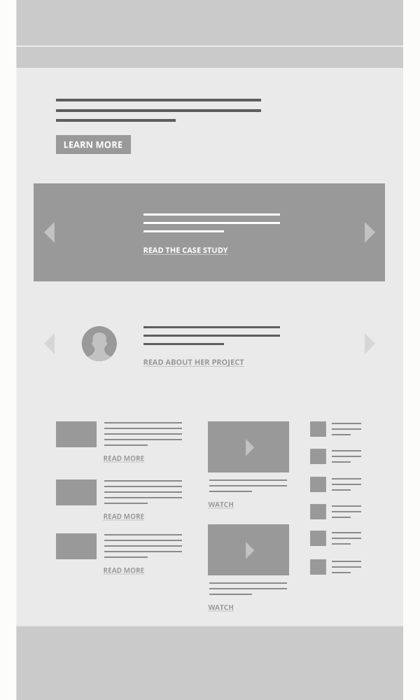
With that said, I’d recommend planning your homepage as a text outline first. Your outline should contain and organize your priorities for your homepage, starting with what you think is the most important information a prospect should know and ending with things that are important enough to be on the homepage, but not as essential. This should make for a pretty short list. If you’re still not sure about your list, try this one:
- What we do
- What we’ve done
- What our clients say
- What we say
Here’s how that might look. I’ll give you an example of each along with how I’d prototype/wireframe it.
What We Do
If you’ve worked on your positioning, this should be relatively easy. What do you do? Who do you do it for? Your positioning statement is a succinct answer to those questions. Think of this like stepping into an elevator with a prospect. She turns to you and says, “So, what do you do?” You answer clearly and succinctly, knowing you’ve got about 15 seconds to make it count. It should be short and sweet and easy to remember. The harder it is to say, the more work it needs. (On that note, take a look at how many times we’ve revised our own positioning statement. That work continues!) Most of the best examples of this tend to keep it to 20 words or less. Here are a few that I think serve as terrific examples:
- “Franklin Street is a health care brand consultancy. We build patient-centered brands.”
- “We build brands for purpose-driven companies and causes.”
- “We create smart communications that inspire your audiences and help them connect with your nonprofit’s mission.”
Basically, it should look like this:

What We’ve Done
This is even simpler. This is your best work. The stuff that serves as the best example of what you just said you do. The stuff that would inspire and excite your ideal prospect. On your homepage, you should show a beautiful image and a brief explanation of the engagement with a clear link to a case study. Whether you show more than one, and how you do that, is up to you. If you go the carousel route, bear in mind the diminishing engagement with carousels past slide #1 (and all the other drama unique to carousels), OK? That being said, a truly interested prospect will probably push beyond the first slide. So a good solution here might be to include a carousel with several slides that randomizes their order. But I wouldn’t fuss too much. A carousel just for case studies is better than a carousel for everything.
(And about that case study link. I really mean a case study, not just a page of images. Inspire them with that first image, then focus more on the tell and less on the show. I’m not saying your case study shouldn’t have beautiful images — it should — but I’ve found that we visual folk need to overcompensate a bit just to ensure the right balance. More on this at that case study link above…)
Here’s how that might look:

What Our Clients Say
Ideally, your case studies already include client testimonials. But it makes a lot of sense to pull the best ones out and bring them out on your homepage. Here’s why: Think of a testimonial like a real, person-to-person referral. Some of your prospects will look at your “what we do” stuff on your homepage, but might not bite on the case study links. The testimonials are for them. You are giving your prospects a chance to meet their peers and hear what they have to say about working with you. And you reap the benefit of their praise (not to mention the implicit confidence you exude by letting your clients speak for you). The same carousel point I made about your “what we do” stuff applies, here too. Load up a carousel if you like — no harm in that — but know that many of the testimonials it contains won’t be seen by the same visitors. That’s OK. One, if it’s powerful, may be all you need.
Here’s how that might look:

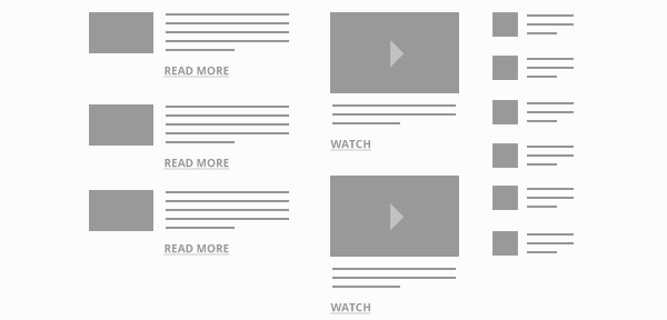
What We Say
Finally, this is where you get to put your content. Your intelligence. Your insights. Whatever you want to call it. Articles. Blogs. Webinars. Books. You name it. And how you arrange it is up to you, too, so long as your arrangement doesn’t make the whole experience confusing (I need to write a post debunking the masonry grid we’ve all come to know and love… consider that a promise). Make it clear what kind of content it is, so that a visitor will be clear on what to expect once they’ve clicked or tapped that link. Or you could just feature the most recent or important stuff. There’s plenty of latitude here, because let’s face it, it’s way down there, at the bottom of the page. But that’s OK. This is the stuff that backs up the promise you’re making in your “What We Do” statement, and the implicit promises in your case studies and testimonials.
It could look like this (but it doesn’t have to):
This is your intelligence. It is important. But remember the elevator pitch metaphor. If you stepped into an elevator with a prospect, would you start talking their ear off about everything you know about whatever topic you’re excited about that day? Probably not. You’d get to the point. If they were interested, you might say, “hey, you know I wrote something about this. I’ll send you a link later.” Same thing on your homepage.
(That’s what the rest of your site is for.)
As for your homepage, these four steps that make up your simple outline should produce an equally simple and elegant wireframe, one that could look like this:
I hope this is helpful!
* About that redesign. I’ll share with you a very brief preview in the next week or so. You probably won’t be surprised to find that it follows the logic above almost exactly.