
Measurement means all kinds of things to different people. In the early days of the internet, webmasters, content to simply count traffic to their site, slapped visitor counters onto their homepages. The higher the number, the more the glory (and, oh, the glory when that counter advanced into the thousands!). But once database-driven websites became more common, the coveted hit—the metric everyone had come to obsess over—became irrelevant. After all, the number of times a call is made to your database, especially for graphics-heavy sites, is irrelevant to any measure of success. We eventually did get a bit more sophisticated, thanks to tools like Urchin and WebTrends, and began talking about true visits—unique website user sessions—and measuring them with gusto. But these metrics really don’t tell us much. We all know that now. The truth is that the volume of traffic a website receives is far less important than what those users do when they get there. That insight is what led Google Analytics to sweep us all off of our feet and begin our new romance with website data. By setting goals and coordinating them with website user actions, we could truly see if our investment in the web was paying off. We learned that measuring user engagement with a website’s content is what really matters.
But have we really learned it? I think we all believe we have. But my experience has been that, in order to tell the real story of what’s going on with your website, you’ve got to do a bit more work than just tracking the numbers that Google Analytics provides to you in their pre-configured reports. You’ve got to create your own custom reports that answer the questions only you can ask—why you built your website in the first place, what you hope to achieve with it, and how you’ve nurtured it over time as your business has changed. Those are the fundamentals that should focus your measurement. This month, I want to go back to the basics, looking at the fundamental metrics of visits, referrers, bounce rate and conversions, in order to advance forward to a new level of measurement understanding.
(By the way, in this article, I’m assuming you’ve set those goals and are already collecting data from them. If you haven’t done that, go back and read some of our earlier articles on website measurement. If you have, read on…)
By advanced, I don’t mean anything that requires the help of a web developer, or any other special configuration beyond simply placing Google Analytic’s script on your site. There’s plenty of information on our site (and the rest of the web) on various tracking techniques, goal funneling, custom reports, and the like, but this article is about taking your measurement of the basic metrics—visits, bounce rate, referrers, and conversions—to a more advanced level…
Gathering Data
Google Analytics does a great job of presenting a vast array of data in many meaningful reports, but those reports can also be confusing or not quite configured to tell the particular story you’re looking for. With that in mind, I’m often inclined to pull the data out of Google Analytics and into another context in order to make the connections I need to see in order to discern what’s actually going on with our site’s traffic. Fortunately, Google Analytics offers the ability to export any report—in PDF, XML, CSV, TSV, or Excel format—a function you can access at the top of the page, as shown below.

For the purposes of this article, I wanted to look at a large sample of data. So, after exporting the data I needed from Google Analyics, which came from applying an advanced segment for goal conversions to three different reports, the Top Content, Top Landing Pages, and Top Traffic Sources, I put together my own spreadsheet to see how this information might enable me to draw conclusions about the effectiveness of our site in converting traffic over the past two years. You can view this data in its raw form below:
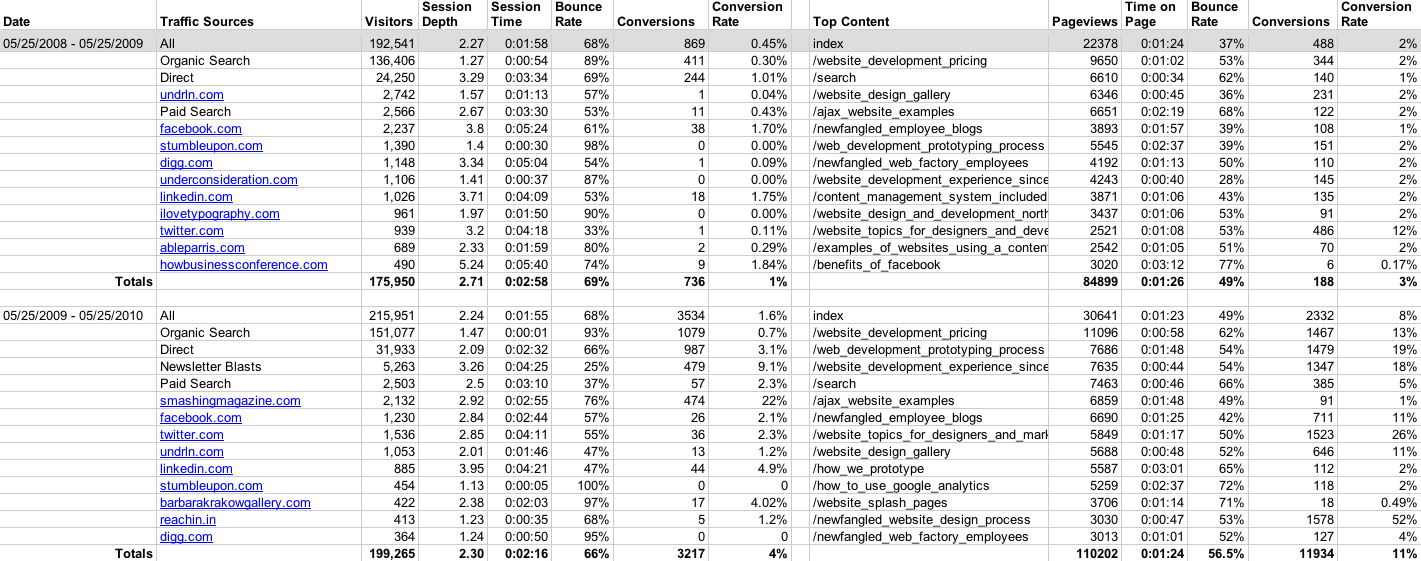
Click image to enlarge.
I can’t emphasize enough the benefit of exporting Google Analytics data. There are connections you just won’t be able to make, particularly if you’ve been doing basic website measurement for a few years now and are ready to go deeper, by only viewing isolated reports. Sometimes, in order to answer the more meaningful questions you have about your site, you’ll need to create your own reports that draw from multiple analytics sources. It was by doing this that I came to an interesting conclusion about how referral traffic converts, which I’ll share with you at the end of this article. But first, I’d like to clear a few things up about bounce rates and show how the principle of properly gathering your data will help you to better understand how your pages are actually performing.
Understanding Bounce Rate
The bounce rate measures the percentage of visitors to a web page that leave it without following links to any other pages on the site. This means that a bounce can be registered if a user remains idle on a page long enough for his or her session to be terminated (30 minutes or more), or if they click a link to a different URL that is not configured to open in a new window, or if they close the browser window outright. But the most important principle to remember is this: the bounce rate only applies to traffic that landed on a page. This means that in order to determine the exact number of bounces from a particular page, you must combine data from two different reports in Google Analytics—the Top Content Report (or Content Detail Report) and the Top Landing Pages report.
Google Analytics’ Top Content and Content Detail reports list the bounce rate along with the total number of unique visits but exclude landing data, creating the false impression that the bounce rate should be applied to the total number of visits. However, the bounce rate should only be applied to the number of visitors that landed on the page—often a much lower number than the total visits, which means that the bounce rate is likely lower than you might initially conclude.

The page I’ve decided to use as an example is one of the most important pages on our website —one that describes our prototyping process1. It’s one of only 12 pages in our main navigation and is the first in a section specifically identifying key aspects of our services and approach to web development. Because it describes the unique way we approach web development protoyping, its performance is a good indicator of how successful our website is in communicating what we do to potential clients. Therefore, I put it in a category of pages I call “positioning pages” — pages I pay very close attention to. Below are the details:
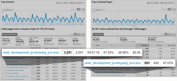
By merging data from both the Top Content and Top Landing reports (shown above), I can create a new, custom report of my own that will help me to better understand the traffic to this page (shown below):
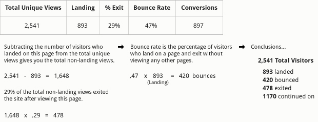
The Top Content report tells me that a total of 2,541 unique visitors have come to this page since we launched the redesign of our website on January 12, 2010. I can assume that most of the 2,541 visitors arrived here after viewing another page on our site, but without checking the Top Landing Pages report, I won’t know the exact number of them that arrived to our site on this page—893 visitors. Now, between these two reports, I want to be able to reconstruct the story of all the visitors to this page. I can do this by focusing in on the visit numbers, the bounce rate (47%), and also the percentage of visitors that exited the site after viewing this page (28.56%, which I’ll round up to 29%).
My first step is to subtract the number of visitors who landed on this page from the total number of unique views of the page, which leaves me with 1,648. I apply the exit percentage to this number, which gives me 478—the number of visitors to this page who came to it from another page on our website, but then decided to leave. This is different from the bounce rate, which, as I mentioned before, identifies the portion of landing traffic that left the site without viewing any other pages on it. To determine the number of bounces, I apply the rate (47%) to the number of users who landed on this page (893), which gives me 420 bounces. By doing this bit of math, I now know that out of the total 2,541 visitors to this page since we relaunched our site, 893 entered our site for the first time on it (landed), 420 left right away (bounced), 478 left our site from this page after having viewed other pages (exited), and 1,170 continued from it on to other pages. Now 420 is only 17% of the total traffic to this page, leaving 2,121 others that at least saw additional content on our site (83%). That’s a much better reality than a quick glance at the reports indicates!
What Does this Mean for Conversions?
If I apply my “sessions with goals” segment to both the Top Landing Pages report and the Content Detail report, I can get an even clearer picture of how traffic to this page performed. In total, 897 visitors of this page (35%) also completed goals. The Top Landing pages report tells me that 123 of these were completed by visitors that entered the site on this page. That leaves the remaining goals (774) completed by those non-landing visitors (1,648). If I parse these two amounts, I can conclude that 14% of landing traffic to this page converts, while 47% of visitors that viewed this page among others during their session converted. That’s a massive difference, and a much more meaningful number than just looking at the overall conversion rate applied to the total visits. From these numbers, I surmise that the message of this page is much more compelling when additional pages about what we do are viewed. The more a user reads, the more likely they are to convert.
The Value of Referrals
Looking at what visitors do once they’ve arrived at your site, which we’ve done by focusing in on the traffic data for an example page above, tells you a lot about how your content enables certain user behavior—particularly conversions. But that’s only one piece of the puzzle. To understand even more about why some visitors convert, we need to look at where they came from.
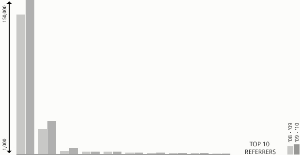
In the graph above, I’ve plotted the top 10 referrers to our website over the past two years. (Again, I’m working from the data I assembled from various reports in Google Analytics and reconstructed in my own spreadsheet, which I included in the “Gathering Data” section above.) I think the problem with this kind of visualization is pretty clear: because the top contributing referrer (organic search) brings almost 5 times the visitors as the next one (direct visits), the graph portrays the remaining 8 referrers as contributing relatively the same amount of traffic. Consequently, it could be simplified down to direct traffic versus everything else. But that isn’t a very helpful story, especially in light of the fact that despite bringing huge numbers of traffic to our site, organic search performs dismally when it comes to conversions.
The Familiarity Spectrum
Here’s where things get interesting. For a site like ours, which receives quite a lot of referral traffic from search engines, simply plotting out the top ten referrers is pretty much a waste of time. We’ve got thousands of pages on our site, which bring in visitors with all kinds of interests—a very small sample of which are actually looking to learn more about a web development company. So it’s no surprise that the percentage of visitors referred by search engines that convert would be low compared to other sources. Last October, I wrote an article on this very subject and included a graph of six months of referral traffic to our site that really emphasized the point that more conversions come from human referrals than from search engines2. The principle makes perfect sense when you think about it—and remember, we’re talking about organic search engine traffic here—people trust people and people act upon trust.
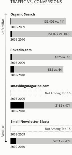
But I think there’s an important nuance to that principle that’s worth considering. When I plot out the top referrers to our site, the general point still stands: Organic search traffic accounts for the largest portion of incoming traffic, but a comparatively small amount of conversions (.3% in 2008/2009 and .7% in 2009/2010), while LinkedIn brings far fewer visitors but performs much better in terms of conversions (2% last year, 5% this year). But then I noticed something else. Smashing Magazine has referred to us a few times over the past two years—not enough to make the top 15 I pulled in my report last year, but plenty this year—and is proportionately one of our most frequently converted referrers (22%). But our own newsletter blasts, which offer conversion opportunities by linking to upcoming webinars or being forwarded to non-subscribers, fall below Smashing when it comes to conversions (9%). In the grand scheme of things, its performance is still great. I consider anything above 1% as worthwhile. But, it’s less than Smashing despite targeting an audience that is far more familiar with us and what we do than Smashing Magazine’s diverse audience of over 200,000 readers. Why is this? Here’s where the familiarity spectrum comes in.

At the top of the familiarity spectrum are those referrers that are the most unfamiliar with their own audience, like search engines. Search engines are robots and, though they’re used by millions to find information every day, their “recommendations” drop in value compared to those users receive from other human beings. LinkedIn, on the other hand, is a social network that is shaped by its users—where proximity in connection tends to increase familiarity. We have a few thousand participants in our Web Development for Advertising Agencies group, and can reach a bit further in our “network” by asking and answering questions and polls, so the familiarity here between participants and others that recommend our content is obviously higher than search engines. Smashing Magazine, on the other hand, tends to have a more brand-loyalty connection with its readers. Like any magazine, Smashing’s readers trust them to give valuable information and recommendations and are likely to act in response. This is evident from the participation level of the readers on Smashing’s own site, and from the value of the traffic we’ve received from them—the familiarity here is what keeps the magazine afloat. At the bottom of the spectrum is our own subscriber base, who are as familiar with us as anyone could be without being a client or employee! They already converted in the past—when they signed up to receive our newsletter—and it’s going to take a bit more for them to convert again. Think about it this way: given the choice of professional recommendations from a robot, a stranger, the president, or your grandmother, which one are you going to act upon?
What to Do?
Look at your own referrers. You’ve probably got some robot-referred activity (organic search), some semi-anonymous social network stuff (LinkedIn, Twitter, Facebook, etc.), and probably even some from your own marketing initiatives, like our newsletter blasts. But what about more influential recommendations? You may not be able to get a nod from Barack Obama, but I’m sure there are influencers in your industry or network that would love to point people your way. If you haven’t already, seek them out. Don’t ask for a link (that’s so 1998), but build a relationship with them so that the referral is implicit in all kinds of activity between you, whether that be social network activity, participation in blog conversations, or something else. You may even be able to deepen that relationship by writing articles or creating other content for them, like we’ve done with Smashing Magazine3.
Put simply, don’t expect to re-convert the already converted. Focus your efforts on spreading new seed, in the most fertile ground you can find. The “sweet spot” of the familiarity spectrum is going to be just shy of the most familiar audience you have, probably among those connected strongly to an influencer with whom you could build a strong, mutually-beneficial relationship. Looking closely at your conversion data, using reports like those I’ve reviewed in this article, should help you to pinpoint who that might be.
Footnotes
- Our page on the Web Development Prototyping Process.
- This comes from a page of our October, 2009 newsletter, Who Are You Speaking To? discussing measuring the conversion rate of referral traffic.
- Last August I noticed that a Smashing Magazine article recommending our newsletter was generating great referral traffic to our site. Shortly afterward, I began speaking with their editor about writing some articles, the first of which, Holistic Web Browsing: Trends of the Future, was published in April.
Related Posts
-
Strategic segmentation touches content marketing and outbound email marketing. Here are some thoughts to consider…
-


Chris Butler presented on "You, the Other Kind of Business Leader"...
-


Christopher Butler will be a keynote speaker at the 2015 ConvergeSE conference...