A lot of the content in the Newfangled blog is centered on lead development best practices when it comes to your website. That’s because the website has been the hub of digital marketing for a while now, and it has long been the focus of our work.
However, thanks to what we’ve coined “The Great Inversion,” your website’s role in your digital marketing is only as powerful as the other tools it’s connected to, like a CRM system or marketing automation software.
As part of this inversion, we have seen an increased number of our clients paying more attention to their outbound email strategy. While creating great, thought-provoking, expertise-based content is still the bedrock of a good digital marketing strategy, it is important to promote this content via outbound email campaigns to help cut through all of the noise and get eyeballs looking at the content you’ve worked so hard to create.
Thus, the design of your email can be a make-or-break situation that can dramatically affect the success of your digital marketing. It is an area that many agencies stress over, but it really doesn’t need to be. To help you out, I have compiled a few of the best practices that we recommend when it comes to email design. These recommendations are all based on the results of our own email campaigns and those of our clients. This gives us a great first-hand data pool to back up our assertions of what works and what doesn’t. It also shines light on areas that are best suited for A/B testing, as opposed to a one-size-fits-all strategy.
1. When to Use a Templated Email or a Text Email
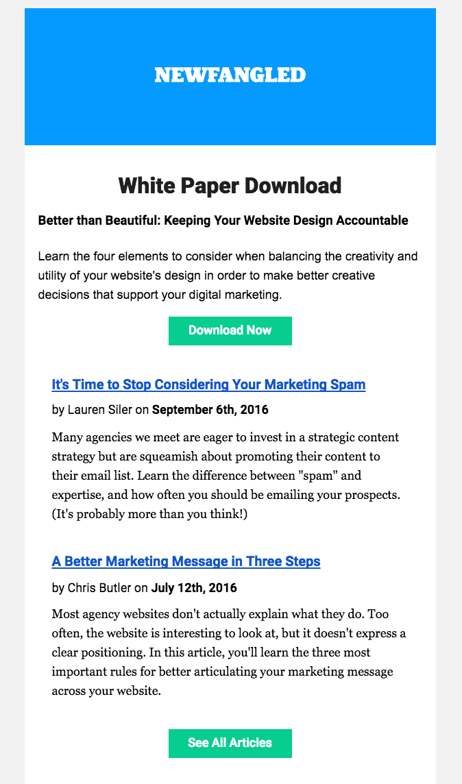
For many years, all of the emails we sent were templated, branded emails, with many calls to action. They looked something like this:
Then, we made a fairly drastic shift and started sending out what was the total opposite – simple, text emails with a single link.
We saw a notable increase in our clickthrough rates, which we interpreted as proof that all of our emails should be these simple text emails. However, we have since learned that maybe we were a little over-eager.
What we were seeing was our audience’s reaction to something new and different. By simply changing up the format, it caused it to stand out, resulting in more people engaging with the content. We’ve seen the same thing happen in reverse when clients switch from the simple text emails to a digest-style template.
What that led us to realize is that there isn’t a one-size-fits-all approach to this. Instead, there is a time and place for both templated digest emails, and focused single-link emails.
The way we have implemented this, and have helped clients implement this with success, is to send out a regular, predictable, digest-style templated email once or twice a month that promotes several pieces of content that have been created over that time period. Then, we intersperse those with the occasional single-item text email that is written from an individual person at the firm and is focused on one key piece of content. This is usually focused on our white papers or webinars.
By taking this approach, we can please those who like the buffet of articles in our blog digest emails, while still getting focused attention on our key gated pieces of content that are produced less frequently. The result is increased engagement with both types of emails.
2. Single column is king
One other thing you may have noticed in the last screenshot above is the purposeful use of a single-column layout. Just because the email is templated and is highlighting several articles, doesn’t mean it needs to have many columns.
Email clients have very few standards when it comes to rendering HTML emails. They all seem to treat the same code in slightly different ways. This complication is compounded further when displaying on a mobile device with a much smaller screen.
By creating emails that use a single column, you limit the possibilities for different email clients to render the email in undesirable ways. Additionally, we have seen that single column layouts are more easily scannable and create an easy hierarchy of content. The easier it is for the user to scan and comprehend the intention of the email, the more likely they are to click through. The reasoning here is the same as why we recommend against grid-style layouts for website homepages or article list pages.
Here are a few well-designed examples of digest-style email templates that effectively use a single column.
3. Keep it simple, stupid
With similar reasoning as to why you should stick to a single-column email template, we also recommend against any unnecessary frills in email. Things like rounded corners, drop shadows, and image overlays all have the possibility of rendering poorly across the various email clients. There are just (unfortunately) very few standards for how email clients render HTML, as compared to what we now see for web browsers, so you don’t have as much leeway in the design here.
Mobile is another consideration. Your email needs to be scannable for people on the go and on a small screen, so removing anything that doesn’t support these goals is important.
4. Calls to action that actually call the recipient to take action
In every email you send out, there is likely (and should be) some sort of call to action. But, how you format that call to action can have a dramatic impact on its effectiveness at getting your recipients to click through to your site.
When it comes to calls to action, through our own A/B testing, and through that of our agency partners, we regularly see that the calls to action that perform best are the ones that:
- Are action-oriented. Words like “Register,” “Download,” “Sign Up,” are literally a call to action, and tend to perform better than CTAs that just say what it is “White Paper,” “Blog Post,” etc.
- Are on their own line, as opposed to in-line as part of the paragraph. You want the reader to finish reading the sentence, then be presented with a CTA, not have a CTA mid-sentence. Below is an email we sent out. Can you guess which of the two links saw three times as many clicks?
- Stand out. Whether you use a button or a text link or a URL, make sure that it stands out. Make it bold, give it a color, but most importantly, make sure the user knows what you want them to do. The less they have to work, the better.
5. A/B Testing Is Key
If you stick to all of the previous guidelines, I’m sure you’ll create a great email design. However, I am also sure that it could be better.
What color should your button be? Should your subject line be a question or a statement? Should we note in the subject line that it’s a webinar, or just focus on the topic? Should we send in the morning or the afternoon?
These are all questions you should be asking. They’re also all questions that you can definitely answer, based on your own A/B tests. The answers aren’t the same for everyone, but the more testing you do, the more you will learn about how your specific audience behaves.
My general guideline to all of my clients has always been that they should be testing something with every email blast they send out. If you’re taking the time to create an email campaign, it’s worth the extra 10 minutes to create a second version, as you’ll learn something every time.
Related Posts
-
So much of what makes digital marketing exciting today is driven by a vastly complex…
-

As everyone's inboxes are becoming more crowded, email clients are becoming more stringent about what…
-
Chris Butler is MC'ing at this year's Hopscotch Design Festival...