
This year’s HOW Interactive Design Conference was in two cities — Washington, D.C. in September, and San Francisco in October. I presented a session on getting website feedback at both events. Below is a transcript of my presentation — pretty close to what I actually said, though I’m not saying there aren’t a few edits here and there to make me look good 😉

Thank you, very much. Good morning! I hope you all are well rested, caffeinated, and otherwise ready to put your minds to work today. There’s going to be a lot of great stuff coming your way. Actually, I’m really glad to be going first so I can join you all in soaking it in!
This morning, I want to share with you what I’ve learned about feedback — specifically, the ways we think about and then gather feedback about our websites.
The best place to start, I think, is by looking at some pictures. …And they all breathed a sigh of relief! Seriously, though, we do need to ease our minds in to this sort of thing first thing in the morning. So, I’ve brought some images with me that I’d like to flip through. If you can identify these images as I reveal them, feel free to say so out loud for everyone to hear.
Here we go:

What do these things have in common?
They are all forms of feedback! The interesting thing about feedback is that its a signal that only makes sense once you know what it’s responding to.
For example, the scantron, which we all remember from high school, is a matrix of answers to test questions. The ballot records your response to the question, “who are you voting for?” And the scale, it displays the answer to your question, “how much do I weigh right now?”
What about this form of feedback?
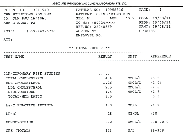
This is a blood test analysis, similar, actually, to one I received just a couple of days after my last physical. It took me a few minutes of staring at mine to realize that I had no idea what to make of it. The problem with this form of feedback is that it doesn’t answer the simple question I imagine anyone without medical training would have upon reviewing it: “Am I healthy or not?” I quickly went from being impressed with the service of having received this report by mail, to frustration with not being able to extract any meaning from it.
If I can’t make sense of a report, what good is it?
Let me show you one more form of feedback, one you might be more familiar with.
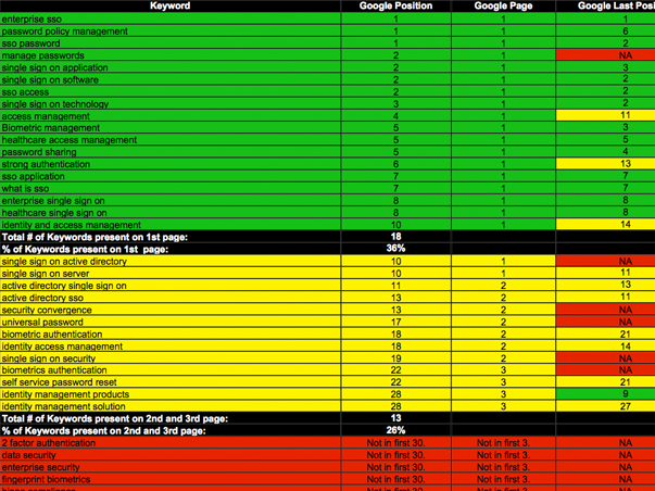
This is a KPI report. In fact, a KPI report that one of my firm’s clients purchased a couple of years ago.
For those who don’t know, KPI stands for key performance indicators. This is how web feedback is typically recorded: a huge matrix of answers but no questions to provide context. Impressive as it may appear, if you’re interested in making any sense of what’s going on with your website, the KPI is probably not going to be much help. This sort of report demonstrates that we’ve fallen victim to a pretty common fallacy: that the volume of data validates the measurement itself. Now, this particular KPI report goes on for 90 pages…
…so there must be something interesting and important in there, right? Riiiight. Probably not. But even if there was, most people will probably just tune out a few pages in. The conclusion that “measurement is being done” is good enough for them.
The good news is that we can swap in some new words for KPI that are much more straightforward about what it does. How about: Keeping People Ignorant!
Now, repeat-after-me is an old standby for teachers to get sleepy students engaged, so let’s all say that together:
KPI reports are: KEEPING PEOPLE IGNORANT.
They do say that oral regurgitation is one of the best ways of imprinting something on your brain. I’ve always felt that writing things down is even better, so I hope some of you did that too.
The failures of the keeping people ignorant report make a good example of broken feedback, which tends to have three core characteristics. It’s:
- outsourced
- irregular
- overly quantitative
Outsourcing this sort of thing isn’t objectively bad — there are plenty of good analytics consultants out there who are worth their fees — but it’s not generally in your best interests.
A report like the one we just looked at is the product of metric regurgitation, not questioning. Think about it: They don’t have the questions that you have. If they aren’t asking the right questions, they won’t be able to supply the right answers. They can give you 90 pages of data and wish you good luck.
If you’re not gathering your own feedback, then you’re probably paying someone else to do it. And if you’re paying someone else to do it, it’s probably not getting done very often. And if it’s not getting done very often, it’s probably not getting done until you’re desperate for answers. And here’s the thing: Data gathered in crisis is guaranteed to be misinterpreted.
As we’ve already seen, broken feedback also tends to be overly quantitative. It’s all answers, and no questions.
How do we ever expect that to work?
That’s a good question, isn’t it?
Now that we know what kind of feedback isn’t working, what I’d like to do with the time we have left is go a little bit further with establishing a baseline for good feedback — that’s the theoretical side of all of this — and then build upon that foundation a repeatable method for gathering feedback — that’s the HOW.
The Foundations of Useful Feedback
Feedback that is useful also has three characteristics. It’s:
- done by you
- on a regular basis
- qualitative
In other words, it prefers meaning to numbers.
But what exactly do I mean by that? How do we make sure that our feedback gathering prefers meaning? Well, for one thing, we make sure it answers the specific questions we should be asking about our websites. There are five questions that anyone involved in web design, development or marketing should be asking all the time:
- Who is coming to my website?
- Where are they coming from?
- What content are they consuming?
- How are they engaging with that content?
- What can I do to improve their experience?
Outside of these questions, I’m not sure what else you would really need to know.
These five questions have something very important in common. Can you guess what?
The answers to these questions are not numbers! We use numbers to answer them. Numbers aren’t always good enough; they’re a means to an end. Which means that we can conclude two exciting things about feedback…
- There are no independently meaningful metrics. It’s not just about page views or downloads, and it’s never, ever about hits. Nobody says hits anymore, right? It’s about the connections between metrics that provide answers to our five questions.
- Anything can be a source of data.
Which brings us, naturally, to robots and people.
As far as robots are concerned the ones I’m going to talk about work for Google — of course they do! — and one of the things they do is make possible a wonderful feedback tool called Google Analytics.
If you were hoping for something more sci-fi, we can talk about robopocalypses and such at tonight’s cocktail hour, I promise.
After we look at what the analytics bots have to offer us, I’d like to introduce you to a few methods for gathering incredibly useful feedback from living, breathing human beings.

That’s my brother Martin, by the way. He’s pretty excited to be here, representing all people in general.
So, if you’re ready, let’s start with Google Analytics.
Google Analytics in Three Steps
Now as a warning, our next few steps might get a little mathy, so this would be a great time to get out your graphing calculators… …I’m kidding. Although if you did bring a graphing calculator, like I said: nerdy chats later.
Google Analytics is a big, powerful tool. There’s far more that you could (and should) do with it than just the bit I’m able to share with you today. Really, I’m only going to skim the surface. But my goal is to reduce any intimidation or other barriers to entry that you might have by simplifying Google Analytics down to three steps — a drastically pared down routine that is focused specifically on pursuing answers to our core questions on a regular basis.
Of course, I hope that in doing this, you’ll find cause to go deeper with it on your own time.
So, our three steps will go like this:
- We’ll start with looking at visitors — this will help us to get a general sense for who our website’s users are.
- Then, we’ll explore our traffic sources — this step will help us to answer our second question, “where are our visitors coming from?”
- And finally, we’ll look at the reports Google Analytics has on our content, which should help us answer our third and fourth questions, “what content are our users consuming, and how are they engaging with it?”
Here we go:
STEP 1: VISITORS
I’m going to be using one of my client’s analytics account as an example this morning. They are a mid-sized credit union based in the midwest.
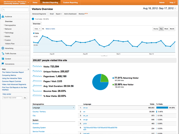
The first thing we see when we log in to Analytics is our Visitors Overview. By default, Google is showing us the last month’s worth of activity, and displaying it in a line graph across the top. As you can see, this website tends to get a pretty good amount of weekday traffic — typically somewhere between 25 and 30 thousand visitors.
Beneath the line graph, Google displays the basic “health” stats of the website. I think it would be helpful to take a few moments just to explain what each of these means, even though I imagine that will be review for at least some of you.
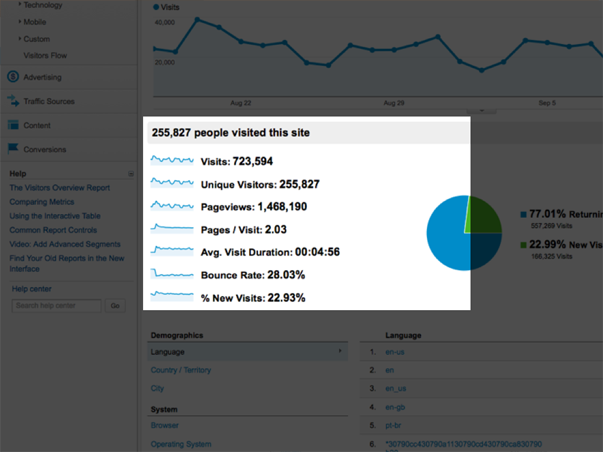
Let’s start with visits. A visit is not a “hit.” In early days of the web, a “hit” was what people used to use as a unit of popularity for their sites, as in, “my site gets a thousand hits a day” or something like that. It was exciting to get a lot of hits! The thing is, as websites became more complex, a hit became less valuable. This is because a hit is simply a database request. If a webpage is just one html file with text, loading it in the browser registers one hit. But if a webpage is more than that, every single file that loads with the page registers one hit. That means every individual image, media file, javascript file, css file, the works. Now, it’s not uncommon for one page load to register hundreds of hits. Instead of hits, Google Analytics deals with the “visit,” which is a very real, practical unit. It represents one single user’s session on your website.
Now, “unique visits” are differentiated from “visits” because Google is trying to show you what your traffic looks like once you’ve taken into account individuals that make repeat trips to view your website. So if your Mom hits up your blog every day this month, she’ll log 31 visits, but only one unique visit. In our site’s case, the numbers aren’t very close, which means that the majority of its traffic is coming from people who have been here before.
A Pageview is our next unit of measure. It represents exactly what it says: a view of a single page. So, one visit might have many pageviews, assuming the user is engaged with the website’s content. Here, we can see that the pageviews are around twice the number of unique visits, and as the next stat points out, averages to just about 2 pages per visit.
I think the average visit duration is also pretty self-explanatory: It means the average time a user spends browsing the site in one session — meaning from when they first arrive to when they leave. If they come back the next day, they start a new session. So, if your Mom is hanging out on your blog for two minutes every single day, she’s not skewing your average.
Next is bounce rate. We’ll come back to this one when we look at our content reports.
Finally, the percentage of new visits refers back to that unique visits metric. I mentioned that because the unique visits number and the visits number were close, we could conclude that the majority of this website’s visitors weren’t seeing it for the first time. That’s what this number measures exactly — that almost 80% of this website’s visitors are returning visitors.
In reviewing these numbers, we’ve learned a bit about the impact visitors have on this website, but we haven’t actually learned much yet about how this site is being used. So, after I’ve given these basic health stats a once-over and glanced at the main traffic graph to make sure there are no significant drops or spikes in traffic that I can’t explain, I’m ready to move on to Step Two and look at the sources of all these visits.
STEP 2: TRAFFIC SOURCES
In Step Two, I’m going to open up the Traffic Sources Overview report.
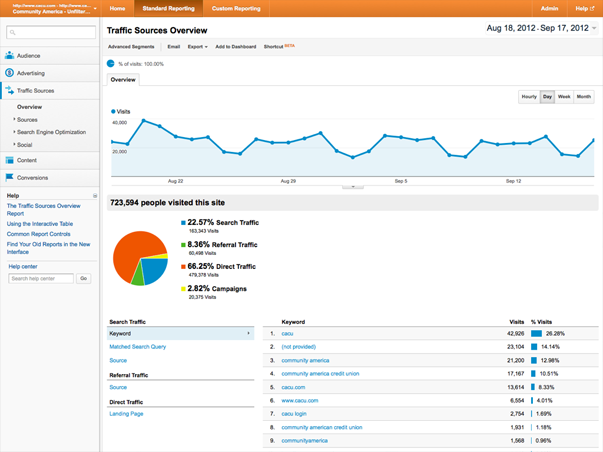
Again, Google is showing the same traffic line graph at the top, but beneath it, the data has changed to reflect some general categories of sources.
From the pie chart displayed here, I can see that the majority of this site’s traffic is comprised of direct traffic — visitors that manually enter in this site’s URL to their browsers’ address bars.
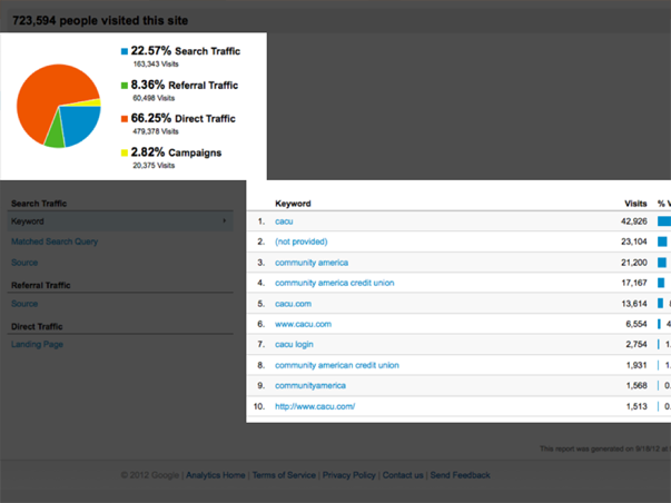
The next largest source of traffic comes from search engines. To get a bit more insight into this source, I can look just below the pie chart at a list of the top keywords driving traffic to this site from search engines.
What’s interesting here is that every keyword in the top ten is a “branded” term, which means that it includes the name of the company or its website, which, of course, means that the searcher already knows about them. Since we already know that most of the site’s users are returning visitors, this is not a big surprise.
But it’s worth pointing out that this site could be doing much better at bringing in visitors that are not already familiar with it. That’s exactly what your focus should be when it comes to SEO: creating content that describes your expertise for those who are using Google to search for it, but don’t yet know about you specifically. Being #1 on Google for your own name is not nearly as useful to your business as being #1 on Google for a phrase that describes what your business does!
Remember our question about what we can do to improve our users’ experience? This is one of those things: While it’s a good thing to have returning users — and for a bank, this is to be expected from all its account holders returning to log in to their accounts — it’s also good to attract new visitors. SEO is about connecting people with information they need. If your website contains information about a service that people are searching for, your job is to try to match their search intent with information that you have. That is done by framing site content for search, and not relying upon name recognition to connect you with new prospects.
I didn’t want you to miss that point, but as far as our routine is concerned, I don’t want to get too hung up on keywords right now. Instead, I’d like to dig a bit further into sources, so I’m going to click into a new report, which is a list of All Traffic Sources.
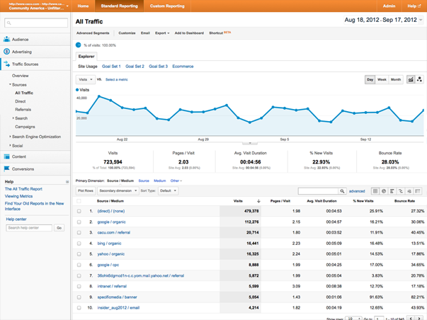
Like the previous screens, this one also displays the visits graph at the top. So, more eye candy. But the main attraction is below that, in the list of all the unique referrers of traffic to the site.
What’s useful here is that instead of just aggregating all the different search engine traffic into one, generic category, we now get to see each one listed individually.
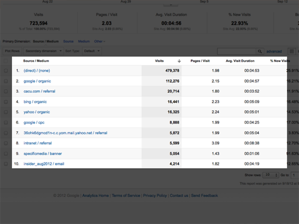
For example, we can see that Google organic search — organic means traffic generated by search queries, not by paid search like Google AdWords — refers more traffic to the site than Google paid search, which is #6 on the list.
Once I’ve started to get a little more familiar with this list of sources, what I really want to know is how to evaluate them. Which ones generate traffic that is more valuable?
One way to figure that out is to find out which sources generate conversions. A conversion is any touchpoint on your site where a user gives you information. It could be a general contact form, or a sign-up form that subscribes them to a newsletter or blog, an event registration form, an asset download, or even a purchase. Any of those are touch points that can and should be measured.
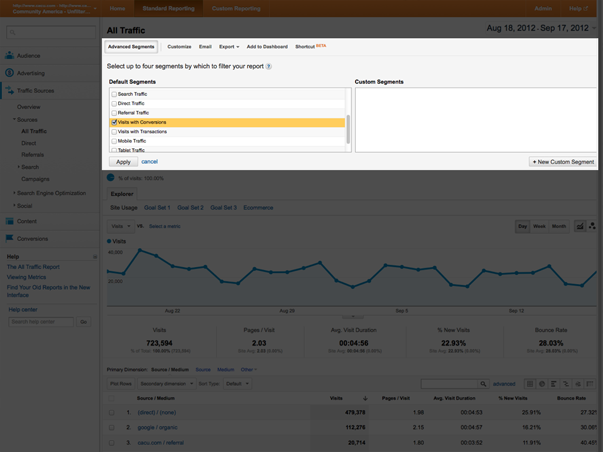
Google Analytics lets you track events like that, which they call “goals.” Once you have set up the specific goals you want to track (here’s how to do that), they will appear in your analytics reports. Then you can use them to create filters for any of the reports contained in Google Analytics. These filters are called “Advanced Segments.”
So, to answer my original question about which sources generate the most conversions, I’m going to apply an advanced segment to this report by expanding the “Advanced Segments” menu at the top of the page, choosing “Visits with Conversions” and hitting “Apply.”
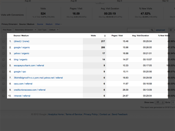
This refreshes the report, and instead of displaying the total visits per source, it displays the number of conversions that resulted from a source’s traffic.
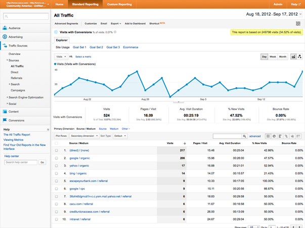
What’s interesting here is that Google paid search fares no better on this filtered list. I’d be questioning now how much I’m spending on AdWords if my organic performs so much better in terms of generating traffic that converts.
This underscores an important principle that you should etch on your brain: that traffic is not valuable on its own. It’s the action of that traffic — the conversion — that is valuable. Understanding our sources in the same way is critical.
OK, now we’re on to Step 3.
STEP 3: CONTENT
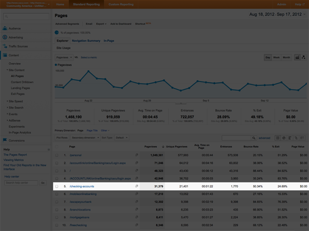
I’m going to start with the “All Pages” report, displays a list of the website’s pages in order of the amount of views each one received.
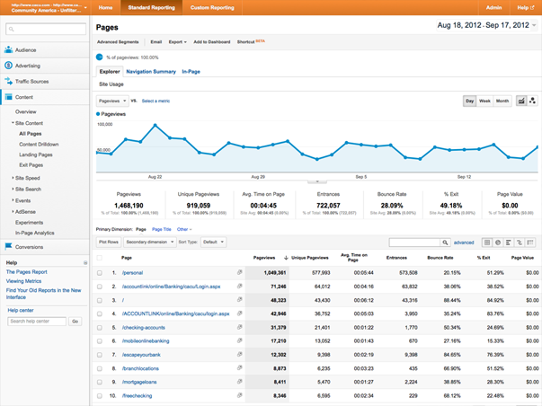
If I choose a particular page from the list — “Checking Accounts,” for example…
…we get a new screen that shows stats particularly for this page: the number of views this page has received, how many of them were unique, and the average time a visitor spends on this page (a little over 1 minute). All good stuff to know.
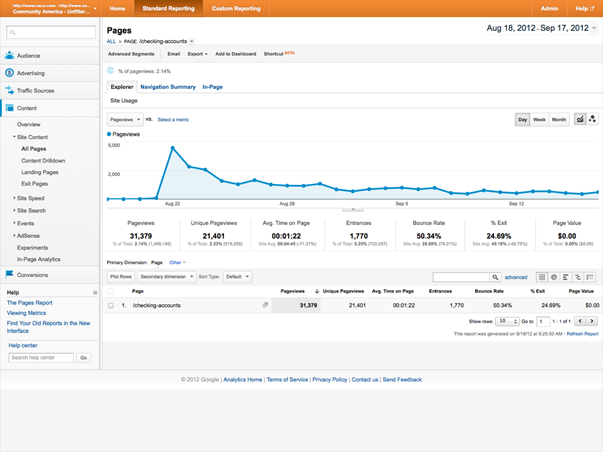
But the metric that tends to stand out the most is the bounce rate. For this page, it’s around 50%.
So, what is bounce rate? The bounce rate measures the number of visitors that come to a website and then leave without viewing any other pages than the one they landed on. That’s why a website can have a site wide bounce rate, as well as individual rates for each page — because a website’s homepage is not always it’s “front door” for visitors. Often, they enter a site from a sub-page that has been referred by a link from someplace else.
So, does this mean that 50% of the 31 thousand visitors to this page over the last month left without looking at anything else? If so, that would be a lot of people. Well, it would be. But remember, bounce rate doesn’t apply to all pageviews. Pageviews include all views of this page, whether it was the first thing a visitor to this website saw, or the fifth.
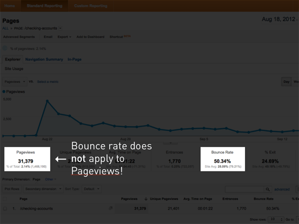
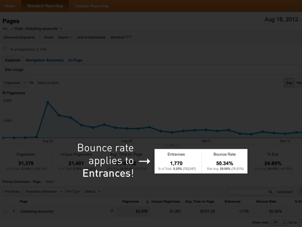
Bounce rate applies only to entrances, which in this case were only a small portion of this page’s overall views. So, it’s 50% of the 1700 or so visitors that entered this website on this page that bounced, not 50% of the 31 thousand visitors that viewed this page at some point in their sessions. That’s a huge difference in number, and a major difference in the impression bounce rate should make. I can’t tell you how many times I’ve seen people overreact to the bounce rate because they’ve done the wrong math in their head.
Now all of that said, bounce rate isn’t something we should ignore. It is a measure of a user’s interest, and therefore something to take seriously.
But let’s consider the actual page we’re talking about for a moment.
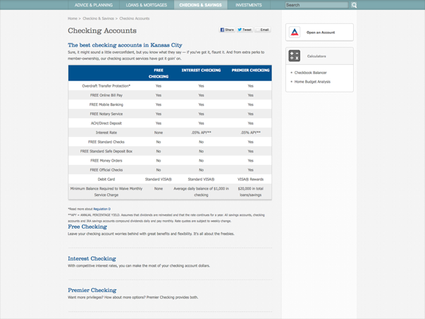
On this page, there is a bit of text, a chart describing the three different checking accounts the credit union offers, and links to more information about them. There’s also a call to action here on the right.
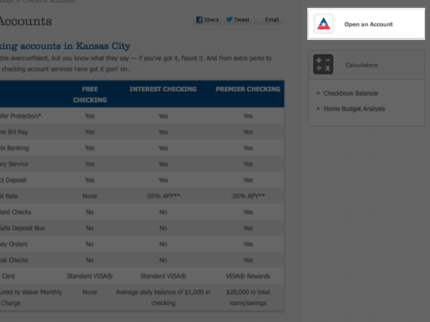
Now, let’s say I just moved to Kansas City. Once I’m settled in, I Google “checking accounts in Kansas City,” find a link to this page, follow it, read through this page and say, “OK, I’m ready to sign up!” Then, I click the link up here in the call to action to get started. That’s about as successful a scenario as you could imagine for this page, right? But here’s something I happen to know about that link — it goes to another website! But, if it goes to another website, then anyone who enters this website on this page and clicks this link will register a bounce. Interesting! All of the sudden, what’s successful here looks like failure in Google Analytics!
In other words, while our analytics report creates an impression of failure, the full story isn’t necessarily so bad.
And that brings me to the most important lesson I could teach about analytics: We need to avoid analytics myopia! Don’t get so wrapped up in stats that you can’t properly assess the situation.
So that’s Google Analytics. Yes, it’s powered by robots, but I think there’s one other reason that makes it fair to think of Google Analytics as a robot — it’s predictable; how it works doesn’t change. You can have a standardized method for working with it that is reliable.
People, on the other hand, do change.
We’ve got all kinds of information rattling around in our brains (especially right now after all that analytics stuff) that influences how we understand and experience things.

So, getting feedback from people is much harder. But, that feedback is always going to be more interesting and important to you. After all, you’re creating for people, not robots.
This, by the way, is exactly the face we make…

…when we’re looking at one of these! It’s sort of a brain-sucked-out-of-the-back-of-the-head look. Not cute.
OK, so our next and last stop is usability testing.
Simple Usability Testing
Now, a bit of a caveat is in order. I’m using the word “simple” intentionally. Most people think of usability testing as something that requires facilities, equipment, people, expertise, and time that they just don’t have. So, in the absence of all of that, they conclude that they can’t do any usability testing. For a long time, they might have been right about that. But these days, while you can hire usability testing experts that may fit right into that expensive, high-tech picture, you can also do a lot of it yourself. That, of course, means simplification. But my experience has been that simplifying the process doesn’t reduce the amount of actionable insight you can derive from it. I’d rather prescribe a simple usability testing procedure that I know you can (and will) put to use, than adhere to such a long list of technical requirements that nobody has any hope of meeting.
WHAT YOU WILL NEED
There are just a few things you’ll need to do your own usability testing:
- A Quiet Space: Not a soundproof chamber in a lab somewhere, just some place quiet where you and the volunteers you’re going to recruit can focus for a few minutes without distraction or interruption.
- A Computer: Nothing fancy. The one you have will probably work, as long as it has…
- A Webcam: Most laptops have these built-in these days.
- Screen-Capture Software: You’ll also need to run some kind of screen-recording software. This will allow you to gather the information collected by your webcam, the computer’s microphone, and the screen into one consolidated interface.
- A Volunteer: This is the interesting part. Most people assume that a volunteer for usability testing needs to correspond perfectly with a website’s target audience. So, in some cases, that persona might be very specific. They might need to have quite a lot of background information and understand industry jargon that most other people wouldn’t. While that person might make a perfect subject for persona verification testing or even a focus group addressing issues of messaging, and of course could be a usability testing volunteer as well, they’re not necessary. Really, the only qualification needed for a usability testing volunteer is basic digital literacy. Can they use a computer, surf the web, and talk about it? Since what we’re doing here is testing whether there are any barriers to proper use of the website, this is really all we need from our volunteers.
- A Moderator: That’s you! You’re there to provide the environment, the technology, and the process, but most importantly, you’re there to observe. Besides the information that the screen-capture software is designed to collect, you’ll be able to observe lots of other stuff and ask questions of your volunteer to draw out more information when you need it.
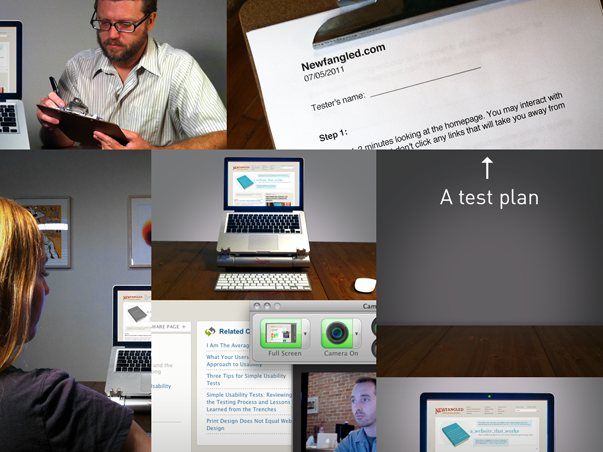
- A Test Plan: What we’re not doing here is taking a volunteer, sitting them down in front of a website, and asking them to click around a bit while we watch. Instead, we’re crafting specific test plans that address the core purpose and goals of a website with directly worded procedures for the volunteer to follow. There are two specific plans I’d like to review with you that I’m sure you can begin to put to use on your own sites right away.
TEST PLAN 1: GOAL-FOCUSED TESTING
This test plan is crafted around the core goals of a website. If the purpose of your website is to generate leads by converting passive visitors into subscribers or customers, then the means by which you do that — the conversion points, which we measured in Google Analytics — are what we’ll test here. For example, if one of your website’s goals is to get visitors to subscribe to your newsletter, one task might be to find the latest newsletter, let you know what it’s about, and then sign up to receive it by email. When it comes to wording these tasks, by the way, we want to be straightforward, not clever. We’re not trying to trick our volunteers or even make it a challenge for them to complete these tasks. What we want is to make the task itself very plain so that if the website presents any difficulties for the user, they are made clear by the test experience.
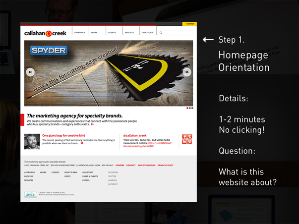
The first step of this test is to have your volunteer spend a couple of minutes orienting themselves on the homepage. You want to ask them to take some time to read and scroll through it, feeling free to talk out loud about what they’re thinking as they do, but not to click any links that would take them away from the homepage. After a few minutes, you want to ask them a very simple question: What is this website about? You’ll be amazed by the answers! The point here is that we’re too close to our websites to accurately assess whether our messaging is clear. In fact, we’re rarely as clear as we could be, so we need this kind of feedback to adjust our messaging.
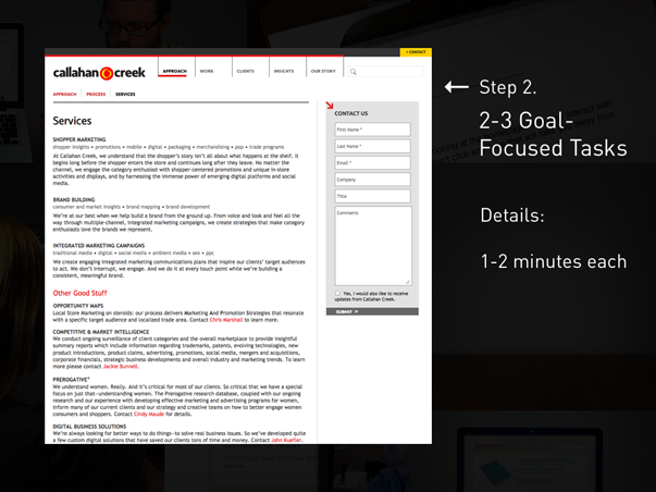
Next, you want to take the volunteer through 2-3 goal-focused tasks. Again, these should correspond with the specific conversion points that exist on the site — content subscriptions, event registrations, purchases, and the like. Try to keep these brief — and the whole experience to under ten minutes — as the longer it goes, the more fatigued your volunteer will get.
QUESTIONING & BIASES
Any kind of usability testing will have some inherent biases — there’s no way of avoiding that. What’s more important than avoiding biases is understanding them so that we can properly assess the results of the testing given the effects of bias. For example, one fundamental bias is called the Hawethorne Effect, which is simply the effect that awareness of being observed has on a volunteer’s actions. Usability testing is meant to approximate the experience of using a website, but because we’ve invited someone in to help us do that, they already know that what they’re doing is synthetic. So while they might do their best to embody the role of a typical user, the problem is just that: they’ll do their best! Everything you ask them to do will probably be done better and with more patience and effort than we could ever expect of a typical user. Another bias is what is called “task-selection bias,” which is just that if you asked them about it, it must be important! Again, what you’ll observe is that the volunteer will try very hard to complete a task — much harder than anyone normally would.
These biases don’t make usability testing worthless, of course. They just make it a bit handicapped and before we congratulate ourselves when a volunteer sails through each task, we need to remember that these results are skewed. We need to pay close attention to the details of the volunteer’s experience being mindful of these biases so we can assess whether any specifics would make things more or less difficult for an un-observed user out there on the internet somewhere.
As moderators, we need to make sure our questioning doesn’t exacerbate the biases, too. We don’t want to ask questions like, “Didn’t you see that “submit” button down there on the right?” Instead, we want to ask general questions that draw out more from our volunteers, like, “Could you say more about that?” or “What are you thinking right now?” or “It looks like you’re having some difficulty. Could you tell me what’s going on right now?”
A WORKING EXAMPLE
OK, I’d like to show you an example of what this kind of testing looks like. In this video clip, we’ll see one task from a series of tests I ran on my firm’s website last year. I’ve asked my volunteer to find our upcoming webinar and register for it.
A couple of points to make about this clip: First, you could tell there was some confusion about the registration process. What we do is ask our users for their name and email address, then we pass them over to GoToWebinar to finish the registration. It’s not ideal, but it’s what we’ve had to do to use that tool. In this session, the volunteer got a bit nervous when clicking “submit” on our form, so she quickly clicked it twice. That triggered a bug we’d never known about. See, we’d tested our own form, of course, but no one had done exactly what this volunteer did, so we never knew that clicking the “submit” button twice would send you off to the wrong form. As it turns out, it sent her off to our general contact form. So that was great! This is exactly the sort of thing that this kind of testing is designed to uncover!
The other thing, though, is I sort of broke my own rule. As soon as that confusion took over, I got a bit more directive with the volunteer. I was already on to what was happening, and was glad that she’d uncovered the bug. But I also didn’t want her to struggle too much with this task since I had others I wanted to move on to. Since I’d already gotten more useful information out of this task, I saw no point in making her struggle so much with it that she might be too fatigued to handle the others. This is what we’re there to look for, anyway. We need to be flexible with how we administer these tests, and roll with the punches as they come.
TEST PLAN 2: TEN-SECOND TESTING
The second test plan I want to share with you is called “Ten-Second Testing.” I came up with this idea after reading a research report by Jakob Nielsen that concluded that the average web user decides whether they will stay on a page or go within ten seconds of opening it. Just ten seconds! I was blown away by this! I thought, man, what a tiny window of opportunity for us to give the right first impression. But then I realized that we humans can take in a ton of information, make judgements on it, and even act on it in far less time than ten seconds. If we couldn’t do that, we wouldn’t be able to walk across a room or drive a car! Then I realized that this would make a perfect format for usability testing.
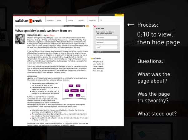
The procedure is dirt simple. You pick a page you want to test — ideally a content page or landing page of some kind — and give your volunteer ten seconds to view it. Again, we’re going to ask them not to click any links during that time. After ten seconds, we hide the page. Then, we want to ask a very simple question: What was this page about? Just like the homepage orientation, you’ll be amazed at the answers. Some won’t remember much, and so we’ll want to ask some follow up questions, like, “What do you remember about the page?” or “Did anything stand out to you, like colors, or text, or images?” For those that do remember specific information, you can ask follow up questions, like, “Based upon what you remember about this page, would you continue reading it?” or “Would you consider this a trustworthy source of information?” or “If you had to find this page again, what would you search for to find it?”
A WORKING EXAMPLE
I’ve got an example of this type of testing to show you as well. In this clip, I’ve actually joined together two ten-second tests with the same volunteer back-to-back.
OK, so what’s interesting here is that in the first test, my volunteer remembered nothing about the page he viewed. Remember, when I asked him what the page was about, he said, “I have absolutely no idea!” and then went on to describe the page’s structure. This made sense to me, because the page was fairly traditionally laid out — it had a header, main nav across the top, a left column, center content column, and then a right column — and most of the text was pretty small and close together. So in scanning it, it’s not surprising that it would kind of spot or block together.
But in the second test, he remembered far more information, didn’t he? In fact, once I’d gotten down to my last question about finding the page using a search engine, he recalled the page’s title almost verbatim. Now, in my estimation, a lot of this was made easier for him because of the design. That second site was designed by someone with a lot of experience in publishing — someone who understands how to design a page that is easier to scan and read. The text was much larger. It has more space. It’s designed to make the informational hierarchy very clear. So it’s not surprising that this page would do better in a ten-second test.
Of course, biases are at play here, too. In the first test, the ten seconds surely caught the volunteer off guard. You could tell that he was a bit bewildered when he admitted that he had “no idea” what the page was about. So, in the second test, you can bet he tried harder. He knew what questions I’d ask, so he probably adjusted his own observation.
So one thing I’ve learned is that you probably can’t get more than one good ten-second test out of the same volunteer. Each additional test is just too weighted by that Hawethorne effect.
But, when I ran these tests, I used a pool of pages — about 5 or 6 different pages — and a pool of volunteers. Some saw the more minimal page first, others second, and some not at all. But no matter when I showed that page — whether first or second — it always outperformed the others. Why? Well I think it’s reasonable to conclude that it’s design just makes it easier to read.
That’s really the lesson with this test: That design can mean the difference between a conversion or a bounce. This test will help you identify whether your design decisions help a user get the right first impression of a page, or whether they hinder it. I encourage you to start running these tests as soon as possible!
Review
We need to wrap up.
Getting feedback isn’t a checklist item. It’s not even a job, really, or a “hat” you wear some of the time. To make an impact, feedback needs to be a cultural shift for everyone on a team. It’s a posture, a way of working, not a task.

So, this whole system — from breaking down measurement into basic questions, then pursuing answers to them through simplified analytics and testing procedures, and then taking action on the basis of what we learn — is simple for a reason: To make it possible for you to embrace a culture of feedback right now. Rather than getting bogged down with data for data’s sake, we need to be simplifying our approach to measurement so that we can do it on our own, do it more regularly, and derive real meaning from it.

Thank you very much for your time and attention. I’ll be back here this afternoon for the panel, so bring lots of questions, and of course feel free to grab me in between sessions.
Also, I’d be foolish to not mention that I do have a new book out that you can purchase here at the conference. It’s called The Strategic Web Designer, and it’s all about taking a thinking-before-doing approach to the web. If you’re interested in learning about planning, the web design and development process, content strategy, measurement, usability, SEO, mobile, and the future of the web, check it out.
Thanks again, and enjoy the rest of the day!
Related Posts
-


Chris Butler presented a session titled "How Robots and People Can Help you Improve Your…
-

A book for marketers, designers, and advertisers who are interested in making their website into…
-
In this one-hour webinar, CEO Mark O'Brien and Director of Strategy Chris Creech discuss the…