
I want to string together a couple of things I’ve been thinking about lately as far as web reading and web content formatting is concerned.
Are Links Distracting?
The first point has to do with links. In a recent WIRED article summarizing some points from his book, The Shallows, Nicholas Carr argues that hyperlinks may actually disrupt concentration and weaken comprehension—effectively hindering our ability to engage in “deep reading.” When I read this last week, it immediately struck me as true—I know that the more links I encounter in an article, the more likely I am to feel overwhelmed with options that I am inclined to follow up upon. Here’s a snippet from Carr:
Navigating linked documents, it turned out, entails a lot of mental calisthenics—evaluating hyperlinks, deciding whether to click, adjusting to different formats—that are extraneous to the process of reading. Because it disrupts concentration, such activity weakens comprehension. A 1989 study showed that readers tended just to click around aimlessly when reading something that included hypertext links to other selected pieces of information. A 1990 experiment revealed that some “could not remember what they had and had not read.”Even though the World Wide Web has made hypertext ubiquitous and presumably less startling and unfamiliar, the cognitive problems remain. Research continues to show that people who read linear text comprehend more, remember more, and learn more than those who read text peppered with links. In a 2001 study, two scholars in Canada asked 70 people to read “The Demon Lover,” a short story by Elizabeth Bowen. One group read it in a traditional linear-text format; they’d read a passage and click the word next to move ahead. A second group read a version in which they had to click on highlighted words in the text to move ahead. It took the hypertext readers longer to read the document, and they were seven times more likely to say they found it confusing. Another researcher, Erping Zhu, had people read a passage of digital prose but varied the number of links appearing in it. She then gave the readers a multiple-choice quiz and had them write a summary of what they had read. She found that comprehension declined as the number of links increased—whether or not people clicked on them. After all, whenever a link appears, your brain has to at least make the choice not to click, which is itself distracting.
A 2007 scholarly review of hypertext experiments concluded that jumping between digital documents impedes understanding. And if links are bad for concentration and comprehension, it shouldn’t be surprising that more recent research suggests that links surrounded by images, videos, and advertisements could be even worse.

The full article is quite interesting, and definitely piques my interest in the book. Ironically, I read this on the iPad version of WIRED magazine, which I (along with apparently 24,000 others – wow!) downloaded on the day of its release. I was immediately struck by how pretty it was, but quickly let down by the ways in which it didn’t live up to the promises of the demo Adobe put out during their R&D process. At this point, the embedded interactive element capabilities are not that great—there are a few embedded audio pieces that are nice, but they are cut off if you continue “paging” through the magazine—and are predominantly taken advantage of by advertisers, rather than actual editorial content. It should have been the other way around, but my cynical side tells me I should have expected just this. But my point here is that, when reading on the iPad, I’m far less inclined to open links I find within text. On my laptop, my instinct is to always right-click on the ones of interest and open them in new tabs. I don’t have this option on the iPad, so clicking a link is far more of an interruption than it should be. Carr’s points hit home especially in this context.
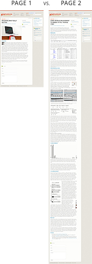
This month, I tried footnotes within the text of my article on Measuring What Really Matters
in order to preserve concentration.
In any case, I was motivated to try out some of Carr’s suggestions for “delinkification” on this month’s newsletter, Measuring What Really Matters, so rather than including links within the text, I added them as footnotes (see above). It feels like a bit of an anachronism to do this, but at this point I’m just interested in experimenting with ways of handling linked content that will encourage greater concentration while reading. For an article like this one, which is fairly in-depth and includes a lot of data, I thought it especially important. Do you think that the footnote method works, or did you find it annoying? Carr posted a shorter blog post to think a bit more about experiments in delinkification and wrote a bit about footnotes, specifically. Carr again:
The link is, in a way, a technologically advanced form of a footnote. It’s also, distraction-wise, a more violent form of a footnote. Where a footnote gives your brain a gentle nudge, the link gives it a yank. What’s good about a link – its propulsive force – is also what’s bad about it.
Pagination – Yea or Nay?
The second point has to do with pagination. Personally, I really dislike it. The very first thing I do when I open a longer article that is paginated is find the link to view it on a single page. In some cases, like The Atlantic magazine, that link actually goes to a print-optimized version of the article, which is especially nice to read on the iPad. But in any case, I think that the continuity preserved in reading by vertically scrolling a long article rather than clicking from one page to another is another important means of encouraging greater concentration in web reading. As far as I’m concerned, the only “pro” for pagination is SEO, but someone dispute that if I’m missing something or if you just don’t agree.
Over the past year, I’ve tried to reduce the pagination of our newsletter articles considerably, but it hasn’t been until this month that I’ve felt as uneasy about it as I do. There are only two pages—the first is the usual introduction, and the second is the remainder of the article, which is quite long. But as a reader, I much prefer the long, uninterrupted article to shorter portions of it that require clicking and waiting for the page to load. My assumption is that readers who don’t have the time or patience for a longer article are just as likely to bail on loading the first of a several-pages long article as they are once they realize that the one page article they’ve opened is considerably long.
Right now, I’m just thinking out loud. I’m not making any official Newfangled recommendations. But I’m interested in feedback: Do you find links within the text of an article distracting? Is the footnote approach helpful, or not? What about pagination—do you prefer it or would you rather read one, longer page? Are our newsletter articles, like this month’s in particular, just too long in general?
Related Posts
-

Christopher Butler will be a keynote speaker at the 2015 ConvergeSE conference...
-

Chris Butler will be speaking at the concluding session of the AIGA's Web101 course...
-
Chris Butler is MC'ing at this year's Hopscotch Design Festival...