Here’s a call-to-action I saw recently. I’m sure you’ve seen something similar, probably many, many times.
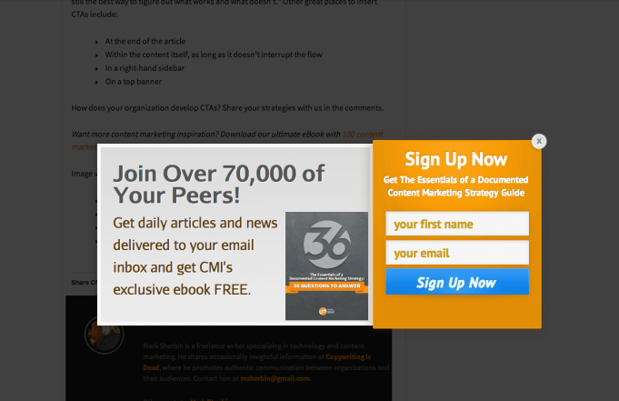
This example literally came from a blog post about CTA usability. Literally.
What would YOU do next? I hit the back button, immediately. It was almost a reflex.
I get the reason for it. The people that made this were focused on drawing attention to their offer and the opportunity it represents for their business. That’s completely understandable. What bothers me is the fact that the balance is so off between highlighting the call to action and allowing the user to have a good experience reading the content that brought them to the site in the first place.
Yes, in this example there’s a button to close out the CTA and return to the content, but most users will probably not notice that “X” quickly, and assume that the form is required to view the content. That will probably cause most of them to leave the site.
At Newfangled, we talk a lot about having strong calls to action on your site. We talk about them enough that we have to use an acronym to save ourselves voice strain: CTAs. In fact, we believe having between one and three CTAs on every page of your site is absolutely a requirement for a website that can measurably contribute to your business.
Ok, great. Most people we talk to are completely on board with this idea. For your website to convert users into leads, you need to have easily accessible touchpoints for them to do so. Fair enough. However, that “easily accessible” part is where things get tricky.
The Three C’s of Effective CTAs
The idea is to make the process of seeing the CTA, evaluating the benefits of filling it out, and actually filling it out as painless as possible. We often talk about the three Cs of CTAs: clear, concise, and compelling. You should make sure that:
-
The CTA clearly states what you get for filling it out (e.g. a monthly newsletter, weekly content digest, registration for a webinar, downloadable research report, etc.);
-
It doesn’t ask for a huge amount of time to read the CTA, or to fill it out; and
-
It offers something of value to the user. It doesn’t need to be grand, but they need to get something they think is worthwhile — that’s the whole reason they’ll fill out that form (remember, they don’t care about helping you to grow your list of potential leads). A typical offer is a bi-weekly digest of your blog posts in email format.
That’s easy enough, right? Well, actually, there are quite a few things we’re recommending in there that aren’t immediately apparent. Let’s dig in.
Clear
For starters, the command to make your CTAs “clear” isn’t just about the language you use. It extends to things like not hiding the cost of the interaction. Let’s step away from the usability-speak for a moment and look at a concrete example of what that means. One biggie is that the CTA should, by default, show the form fields you need to fill out in order to complete the CTA.
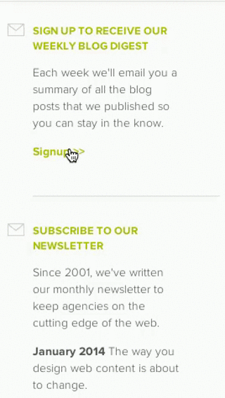
On pages with a right-hand column reserved for CTAs, especially, it can be tempting to keep the form fields hidden until a user clicks a “Signup” button, at which point the form expands and the fields are revealed. This is a logical decision when you consider that it helps to free up space in the right column. After all, the shorter the height of your CTAs, the more CTAs you can fit on the page “above the fold.” Even we’ve fallen prey to that sort of thinking in a couple of instances, like this one:
This is a problem because the user doesn’t know at a glance how much effort is required on their part in order to complete the “transaction.” Put more simply, if a user needs to click something for the form fields to show, they’re going to have a hard time evaluating if it’s worth it to fill out the form. Make it easy for them. Don’t make them hunt for it. A higher conversion rate is likely to be the result.
Clarity also extends to certain design principles. I know that “flat design” is in, but in the case of some elements — especially form fields and buttons — users expect to see a little visual depth, and that expectation informs the way they scan your CTA and try to make sense of it. To avoid unnecessary confusion (which immediately drives up the cost of the transaction for the user), your form fields should have borders of some kind and should probably have some slight visual metaphor indicating it’s indented, or “hollow.” The idea is that you’re showing that the field is currently empty. The inverse holds for a button: it should look raised, as if it could be pushed.
Here’s an example from Lowdi.com, where the form fields and the buttons don’t have that amount of depth. It’s problematic, and takes users far too long to figure out what element does what. Time that they probably won’t spend. Add the depth, and you’ll probably see a higher conversion rate. 
I know, I know, fake depth is skeuomorphic. The depth here is a physical metaphor that doesn’t apply in any real sense to the software. Do it (subtly) anyway. It’s part of a set of design conventions that people understand. It doesn’t need to look cheesy or overwrought. Just a subtle visual reminder of what the item is. Web users have very limited attention to spend on the details, so make sure that familiar items like buttons or form fields are, well, familiar.
Concise and Compelling
These two final mandates are fairly self-explanatory, but they hint at something else a bit subtler, and that is the balance of information that you’re requesting from the user. The more info you ask from your users (i.e. the more form fields they have to fill out), the less likely they are to fill out the CTA. There is no set rule for how to approach this, and you need to balance the info you need vs. what’s reasonable to ask for in a bite-sized exchange like this. You need to know your users and have a general sense of their threshold in order to figure out the right balance.
We have a pretty good solution to this, by the way. We call it progressive profiling. On website platforms we build with marketing automation, we can set up all the CTAs to ask one set of questions the first time a user interacts with them (say, First Name, Last Name, Email Address). Once they’ve filled that out, the next time a user sees a CTA on the site (using our Smart CTAs, it may be an entirely different one), it has different questions. Maybe Company Name and Position Title, for example.
Don’t ask someone the same question twice. This functionality lets you gradually get more and more info from your prospects, without asking them to fill out nine form fields to get your newsletter. You may want all those details, but it’s an awful lot to ask of an initial exchange like this.
To Interrupt or Not to Interrupt?
One final thing. We get asked a lot whether it’s a good idea to have CTAs interrupt content. So, like the example at the beginning of this post, a CTA that pops up (in a javascript window so your popup blocker is helpless to stop it, of course), obscuring content until the user fills it out or dismisses it. Another variation is a CTA that floats on top of content in order to stay accessible.

Yep, that’s a CTA floating over the content. Here it’s obstructing the author info and social sharing widget.
I’d always advise caution when it comes to things of this nature, for two reasons:
-
If it obscures the content they came to read, then it will probably affect how users perceive the value proposition in the CTA. In essence, if you’re willing to make it difficult for them to read your content, wouldn’t the offer in your CTA be less compelling? Doubly so if the offer you’re making is more content! This is triply true if you can’t dismiss the interrupting message.
-
That sort of interrupt can also cause users to simply close the page, or hit their back button. How often have you seen a pop-up on a site and immediately, almost instinctively, hit the back button? Your users aren’t going to wait any longer than you would.
Having CTAs throughout your site is absolutely necessary to create leads that can grow your business. Having a consistent approach to these CTAs that’s clear, concise, and compelling is going to make the CTAs worth the digital real estate that you give them. Just make sure that you’re not asking your users to do a lot of work to see, understand, and fill them out!