Usability so often gets painted as mysterious, secret knowledge. It requires a lot of testing, and the experience and wisdom of some sort of expert (what kind of person becomes a usability expert, anyway?). It seems expensive, and requires special software. It tracks eye movement for some reason. It’s usually seen at odds with visual design and all of the other fun parts of a project. It’s the proverbial buzzkill, picking away at the personality of a project.
But it doesn’t have to be. Usability thinking at its best prevents basic issues that make your site less effective at doing what it should be doing: attracting, informing, and engaging. It’s about removing speed bumps that don’t need to be there, in order to make your visitors spend more of their energy on your words (and the calls-to-action that accompany them), rather than trying to figure out your site.
Here’s a real world example of a usability problem that I saw recently while grabbing a bagel:
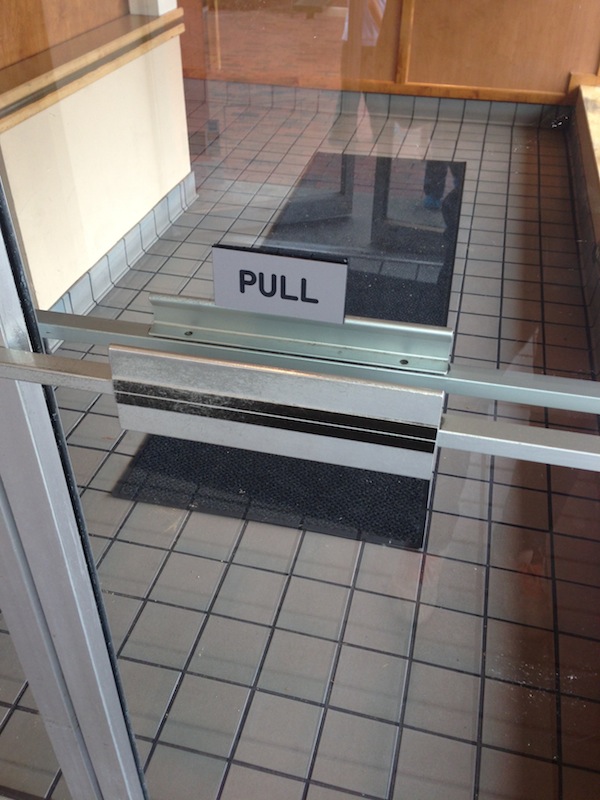
It says “Pull” but has the door has the handle doohickey that you know means “push”!
I’m fairly sure that the people who work at this shop never even think about the fact that that door needs to be pulled. It’s so obvious. It even says it in big letters above the door handle. How could this be an issue for anyone? I mean, didn’t they ever see the Far Side cartoon about this very thing?
It’s not a big problem, but it’s annoying for people entering the building. I definitely was not in peak bagel-buying mood after crashing into the tempered glass like a cartoon character. It’ll probably subconsciously color my decision-making next time I’m jonesin’ for pumpernickel.
Cognitive Dissonance
Don’t be that door. That door is contradicting itself, and telling you two different things about how to use it. It’s giving users cognitive dissonance, pitting something they’ve learned over and over for years and years (that handle means “push”) against a small sign, hastily stuck to the door.
That little sign doesn’t fix the problem (wrong handle on the door), it just blames the user when they follow their years of training and push. The door is annoying, but the sign makes people feel stupid. Bruised egos (and forearms!) do not a happy prospect make.
Make sure that your site’s interface isn’t sending mixed messages like this. This is especially crucial for places where you’re asking people to take action. For example, using colors consistently to draw attention to calls-to-action on your site can be great. But make sure you’re not using colors that have other strong associations.
An oldie (for web usability, anyway) is using red for action buttons on a site, like “download”, “sign up”, “checkout”, etc. Red pops, right? Except, users think of red as stop, and green as go. Just a little thing like that is fighting your users’ years of training. People don’t love learning new interface conventions. They’d rather learn about what you have to offer, read about your expertise and problem solving. Which is what you’d prefer too, I’d wager.
Design With Human Factors In Mind
Don’t fight those bits of training. Your users have been trained over and over that clickable buttons on a site look a little different than their surrounding areas. They usually look a least a little raised, and a bit like a real-world physical button. There’s a clue that it uses the metaphor of being pressed, i.e. has a bit of depth. Yes, flat design is in, but don’t abandon your users’ training, and don’t hide your calls-to-action! If you flatten a button out, and change the shape, it starts to look less like something that prompts you to take action and push it, and more like a banner. Spoiler alert: people ignore banners.
Speak human with your design, and use what they know, and your users won’t be concentrating on trying to figure out what’s what. They’ll be reading your words, and then using those clear calls-to-action. Which is why you have the site in the first place, right?