
About a week ago Chris Butler and I were invited to speak about the mobile web at UNC’s Wilson Library. Chris shared some thoughts about the state (both current and future) of mobile technology. I followed up with some technical considerations. Since I didn’t know the exact level of the group that I was speaking too, I defined the context of the presentation as dealing with modifying a content-driven website to display an optimized experience for visiors on a mobile platform (generally, a webkit-enabled handheld device).
The first topic I discussed, which I’ll cover in this post, was how to deliver the alternate experience. I examined two approaches.
Alternate Stylesheets
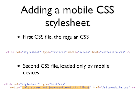
Perhaps the easiest way to differentiate a website’s presentation is to utilize unique stylesheets. I deliberately started with this approach due to it’s simplicity and broad application. For a site that is already built, or for a fast solution that requires no programming changes, this might be the best way to go. I illustrated this by demonstrating one (of many) ways to include a device-specific stylesheet, in this case by targeting specific screen size. I like this approach as it removed the specifics from the equation, and instead focuses on the generic issue: if the screen is small, modify the presentation.
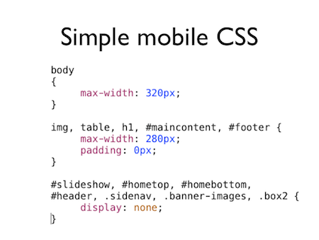
I also threw together a simple mobile-friendly stylesheet, to illustrate the point. For this example, I used the newfangled.com site. I defined a couple of simple changes to that would occur only for mobile users. Here we are simply defining a specific boundary width, and transforming elements within that boundary to conform to the new width. I also set a number of site elements to not display, in order to create a more useable, streamlined experience.
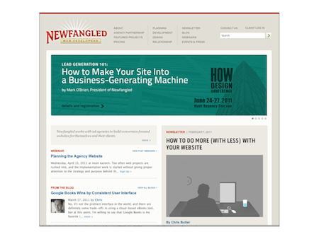
And the final result. Here, the existing newfangled.com homepage:
And here, that same homepage, with the above stylesheet applied.
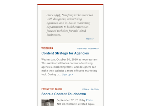
A very basic example, to be sure, but the benefits are clear. In about 15 minutes, I was able to define a browsing experience that is streamlined for the mobile visitor without changing any of the back-end code.
There are some drawbacks to this approach, though. First of all, by limiting the changes to CSS only, the modified experience can only be taken so far. This approach only deals with masking and manipulation of an existing structure. This means that while visually the site can be greatly streamlined, behind the scenes the full site is still being downloaded by the mobile device. In the case of an image-heavy site this does nothing to increase the speed of browsing. In the case of an image-heavy site, for instance, this does nothing to increase the speed of browsing.
Alternate Templates
Taking the alternate CSS approach one step further, then, would be to replace all of the site’s presentation layer (html, css, and javascript) based on the visiting device. For a CMS-driven site that employs templates, this is pretty easy to set up.
Since templates allow for content to be separated from the presentation code entirely, greater freedom is given to customizing the mobile experience. By presentation code, we mean the HTML, CSS, and JS “wrappers” that go around the content stored in the database. In particular, entire sections of the site can be removed, allowing the visitor to focus on the content deemed most appropriate and beneficial. In other cases, it might be determined that only part of the content (such as an abstract) should be shown. Images and other stylistic elements can be customized, and javascript libraries specific to handheld devices can be utilized.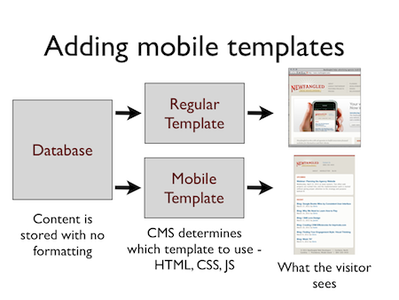
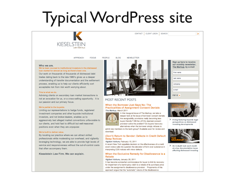
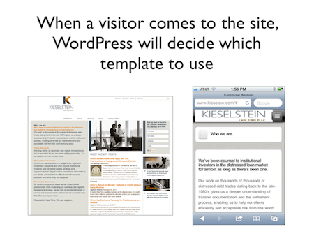
As I mentioned above, the use of a content management system (such as WordPress, Drupal, etc) will greatly facilitate this approach. Most open source CMS solutions offer plugins to extend the core functionality of the system, and there are countless plugins that offer mobile templating solutions. Here, I’ve used WordPress as my example, and the plugin WpTouchPro. Below is a simple WordPress-based site, as viewed in a regular browser. The site has been built using a custom template.
By installing WpTouchPro, we simply tell the application to use two sets of templates, and show one or the other depending upon the device being used to view the site. A new, second template is now available, to be customized as seen fit. There are existing “mobile” themes to choose from, or it may be completely modified to reflect the design of the site.
If your website is a custom application, and not using a CMS with mobile-enabling plugins, then the template switching logic must be added manually. Depending on how the application is written, the difficulty of this can vary. Frameworks such as Zend Framework or ROR offer built in mechanisms to facilitate this. The benefit to this approach is that you have complete control over how the template substitution will function. Here are a few of the choices we made in adding mobile support to the NewfangledCMS templating system a year ago.
1. Additive templating
Since we knew that the sites built with the Newfangled CMS would already offer standard templates for all the site’s content, we decided to allow the mobile templates to be built upon this foundation. Basically, we can decide to offer a mobile template for any type of content – by default, if one does not exist, the system will deliver the standard template. For sites with large amounts of information that might not all be appropriate for mobile browsing, this enables us to focus on the areas that are appropriate, while still maintaining full access to the information if needed. A recent article at metautonomo.us looks at a similar approach, in the context of rails development.
2. Don’t bastardize the business logic
If you’re working in the context of a MVC framework, this is a given, but is important enough to mention anyway. When developing alternate templates, its can be easy to let the existing site logic change to accommodate the new presentation. This can quickly lead to a mess. Avoid the temptation to embed switches to accommodate the two states – Let the templates do all of the work.
3. Keep it simple
In my CSS example above, I targeted screen size rather than specific devices. We decided early on that at this point, it made little sense to try to target specific devices within the mobile spectrum. With the emergence of webkit as the de-facto browser, we are able to create a set of mobile templates that works well across all devices, regardless of specific screen size variations. In most cases, we don’t consider tablets to fall into this mobile spectrum. Their resolution usually makes the default templates a better browser experience, and the typical use of tablet to access a website is very different from the typical use of a handheld device.
………………
To recap, there are several approaches that one could take to implement a unique mobile browsing experience. Which one makes the most sense will depend on the complexity of the site, the platform it was built upon, and the goals of the content delivery.
The next part of my UNC talk dealt with some UI choices to make when planning the actual mobile experience. In deciding how to “optimize” an existing site for mobile display, a slightly different approach than the standard website planning phase must be taken. I’ll discuss some of those topics in my next post.