
This week I’ve had the privilege of attending and speaking at the HOW Interactive Design Conference. Rounding out a program that included many fascinating topics presented by a fantastic, talented group of people, I focused on what, comparatively, is the boring side of interactive design: making sense of the data.
For those of you who couldn’t make it out in person, this article will compose everything I shared, just moments ago, at HOW…plus a bit more.
What You’ll Learn
- How to start regularly gathering data that provides enlightening, qualitative insights
- How to meaningfully connect metrics from analytics tools
- How to gather data from real, live people
Ready? Let’s get started…
Below is an adapted version of my presentation at the 2011 HOW Interactive Design Conference in San Francisco. It covers my basic philosophy of web measurement, a simple approach to using Google Analytics, as well as two types of user testing that you can do easily and quickly on your own. It gets a bit mathy in the middle, so find a comfortable and quiet place to dig into this one.
(FYI: My presentation included a variety of slide transitions, so in some cases below, I’ve consolidated slide groups into animated GIFs. Keep your eye out for those so you don’t miss any details.)
Recently, I visited my doctor for my yearly physical. My last one was sometime before the Obama administration, so that’s what I mean by “yearly.” I should go every year, and you’d think that would be a reasonable goal to set—just one visit per year—but I just can’t seem to stick to it. Let’s be honest, going to the doctor is a drag. And I don’t make it much easier on myself by having a doctor that is a 35 minute drive away. (There must be some psychological significance to that.) Anyway, the physical was what you might expect: stripped down to next to nothing, invasive examination, weighed, blood pressure taken, blood test, the works.
After the exam, my doctor and I had the following exchange:
Me: Should I go ahead and schedule next year’s appointment?
Doc: No, that’s not necessary. Come back in a few years.
Me: Really? I thought yearly was kind of the bare minimum.
Doc: Nah, stuff doesn’t really start happening until you’re forty.
Stuff?! What does that even mean? I nervously eyed the walls for diplomas.
A few days later, I got the results of my blood work in the mail. I stood there staring at it for a while, trying to make sense of a grid of numbers. See, I don’t know what’s normal, and the report didn’t help me figure that out, either. It failed to tell me the basic story I needed it to: Was I healthy, or was I not? So, why’d they even mail me this thing?
And that, right there—just in case you were wondering—is the connection to measurement. Many of you have been handed reports just like this. Instead of telling you the story you need to hear, they deliver you too much information and, usually, confusion. There’s a particular report that is common in the corporation that seems to do this every time. Ring any bells?
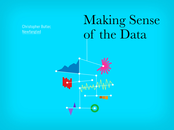
I’m thinking of the KPI report. Here’s an example for you to see; a page from an actual KPI that one of our clients paid for:
Ugh. Doesn’t it just make you hurt all over?
I thought it was so important that you see this that I was willing to contaminate my beautiful presentation by including it. Now, I’m not saying there’s nothing of value in a KPI report. It’s just that after 90 pages just like this—seriously, that’s how long it was—anyone in their right mind will start to tune out.
I like smart people. More than that, I like watching other people get smarter. But sometimes smart people create things that don’t come close to sharing their true intelligence. The KPI report is one of those things, which is why I’d like to suggest that we refer to it from now on as the “keeping people ignorant” report. Next time your manager blusters:
“Where’s my KPI report?“
you’ve got a ready response:
“Oh, you mean the…”
Actually, maybe don’t say that. Or, if you do, don’t say you heard it from me.
Seriously though, the KPI report represents all that is wrong with how we typically do measurement. The story I told you about my dysfunctional relationship with healthcare bears striking resemblance to what I’ve seen over and over again of website measurement.
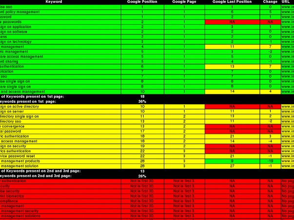
Dysfunctional Measurement
Dysfunctional measurement has the following characteristics:
1. It’s outsourced. You’re paying someone else to do it for you because, for whatever reason, you believe you can’t do it for yourself. As a result…
2. It’s irregular. When you rely upon someone to do something else for you, it typically doesn’t get done the way it should. And when you’re paying for it, it probably isn’t getting done as often as it should. But when it does get done…
3. It’s too quantitative. Think about it. A third party cannot know enough about your business to ask the right questions—the questions you probably already are asking. They can give you stats, but stats aren’t always answers.
I want to show you how to dismantle that system. To do that, we have to address each piece.
Outsourcing isn’t all bad, by the way. There are many analytics experts out there that have deep expertise that is certainly worth seeking out from time to time. But that’s the key—from time to time. In between those engagements, you should be routinely measuring on your own. It’s the same principle with health: go see your doctor routinely, but don’t ignore your health in between. So if we start with #1 and make website measurement our responsibility, we can begin to right the ship.
But, it’s not just about regularity, either. I don’t think that going to my doctor more often would make it more appealing—or valuable even. After all, if I found a doctor that only weighed and measured me every time I had an appointment, you’d probably suggest I find a new doctor. But that’s pretty close to the approach we take by default with website measurement. We look at basic stats, and we look at the same ones over and over again. And generally, we’re looking for more—more visits, more pageviews, more conversions. I imagine that if I kept returning a bigger number with each visit, even a lazy doctor would eventually get concerned about me. So more isn’t enough. It’s not even about more, really.
It’s all about having a holistic, functional system.
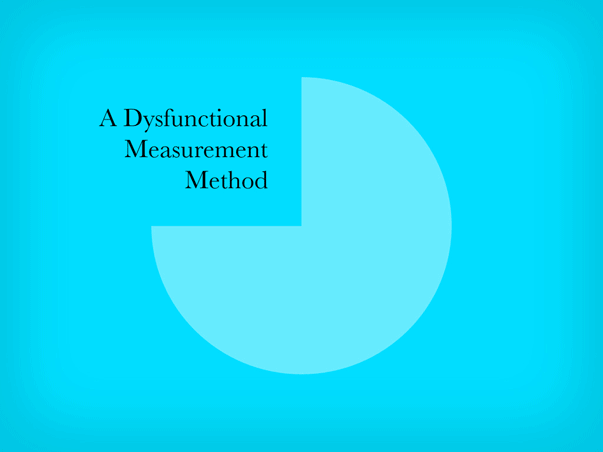
Functional Measurement
We can turn our dysfunctional system into a functional one by:
1. Doing it ourselves
2. Following a routine
3. Keeping it simple.
Or, put in natural language:
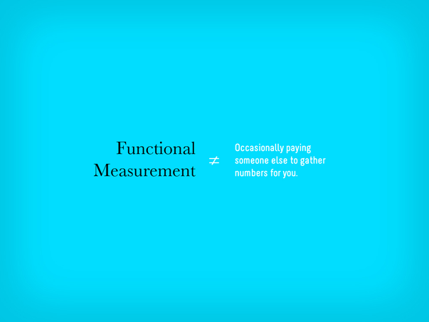
Functional measurement isn’t occasionally paying someone else to gather numbers for you. It’s regularly gathering data that provides enlightening, qualitative insights.
Sounds good, right?
I like it, but I have one problem. Qualitative sets off a bit of a subjectivity alarm for me. We need to define that…
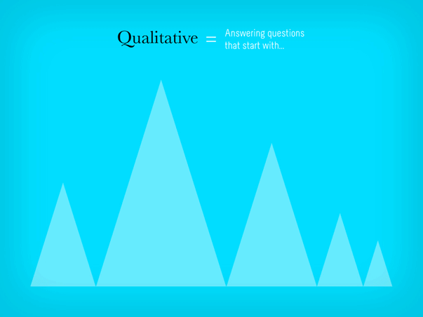
Qualitative measurement answers questions.
Specifically, the questions you should be answering through measurement are:
1. Who is using my site?
2. Where are they coming from?
3. What content are they consuming?
4. How are they engaging with that content?
5. What can I do to make their experience better?
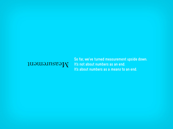
So far, we’ve turned measurement upside down.
It’s not about numbers as an end; it’s about numbers as a means to an end. That’s the essence of measurement.
A while back, I discovered something that really helped me understand how to get down to the essence of things, something I later applied directly to measurement and was instrumental in shaping the process I’m sharing with you here. Have you ever heard of The Two Things?
The Two Things About Website Measurement
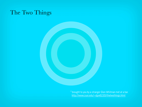
I was introduced to The Two Things by Glen Whitman, who has a page up on his website all about it. It begins with a story he told about meeting a guy at a bar. When his new acquaintance learned that Glen is an economist, he asked him, “What are the Two Things about economics?” Glen was surprised at this question, and the man clarified that “for every subject, there are really only two things you need to know. Everything else is the application of those two things, or just not important.”
Glen offered his two things about economics (“Incentives matter,” and ” There’s no such thing as a free lunch”), and then was hooked. He’s since gathered a huge list of two things’, covering a wide array of topics—from business to being a DJ.
So, to frame the rest of this article, I’d like to share with you the Two Things about web measurement. Since first thinking about this, I’ve revised them a few times, but I think I’ve settled here:
Thing #1: There are no independently meaningful metrics. It’s about combining them to answer questions.
Thing #2: Anything can be a source of data.
I believe that if you stick to these two things as non-negotiable truths, you’ll get the most out of the measurement you do.
For the purposes of this article, I’d like to start with Thing #2, by digging in to two particular sources of data—Google Analytics and real, live users. In both cases, especially Google Analytics, we’ll see how Thing #1—that there are no independently meaningful metrics—applies.
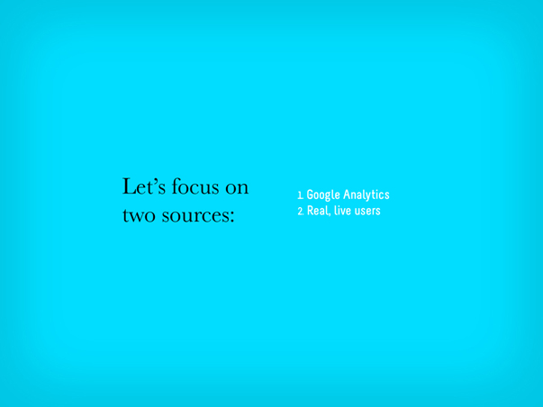
Gathering Data from Google Analytics
Google Analytics is a big world. I just want to scratch the surface with you here and provide a basic approach that you can use on a regular basis. Once you’ve been using it for a while, you can probably stick to a weekly to biweekly schedule.
There are four metrics worth looking at regularly. They are:
1. Traffic Sources
2. Top Content
3. Bounce Rate
4. Goals (conversions)
But remember, it’s important that we don’t look at these individual metrics independently. They are meaningfully interconnected!
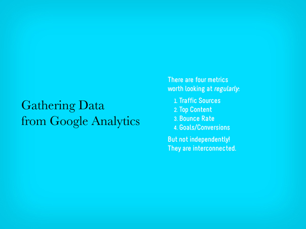
If you’ve never used Google Analytics, here’s the first thing you’ll see once you’ve logged in:
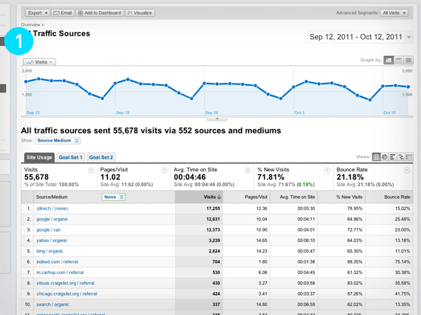
This particular view (above) of the Google Analytics dashboard comes from a client’s accounts—they offer used car loans and see a large volume of traffic to their site. The Google Analytics dashboard will give you an overview of a website’s traffic over the last month by default (you can configure it for any date range). Lots to see here, of course, but once I’ve glanced at it, assuming there are no major dips in traffic, I usually head right over to check in on Traffic Sources (below).
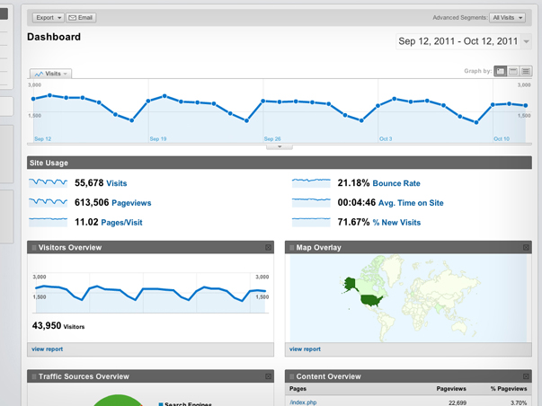
Here, I’m really just interested in getting a sense for where people are coming from. For this particular website, I can see that most people are coming in directly, others are coming in through search engines, and some from other places like Craigslist. But now that I’m digging in, I’m curious: Which sources are bringing in users that convert in some way?
I can figure that out by applying an advanced segment to this report.
I’m going to walk you through the flow of applying this advanced segment by using the animated GIF above.
An advanced segment is a way of filtering any report on the basis of some other metric. Google Analytics lets you create as many as you want, and configure them in just about any way you like. In this case, I want to put my Traffic Sources report through a simple filter that just identifies goal completions (Step #2 above).
Once I’ve applied that segment, I can now see some new information in my Traffic Sources report (Step #3). First, I can see a new orange line along with the traffic graph at the top. This is telling me how many goals have been hit from day to day—obviously, less than the overall traffic. Below that (Step #4), I can also see each source with it’s own goal conversion rate in green. This helps me value traffic sources. Traffic is exciting, but it’s only meaningful once it’s valued by some other metric. Conversions are probably the best way to value traffic.
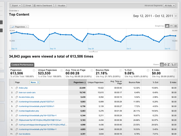
The second report I routinely look at is the Top Content (above). This shows me which pages on a website are getting the most views, how long users are spending on them, and which pages have the highest bounce rate.
Bounce rate, by the way, is one of those metrics that people get hung up on all the time. Here’s a simple definition for what bounce rate is: The bounce rate is the percentage of traffic that landed on a page that then left the website without looking at anything else. You can average that for all the pages of a website and come up with a site-wide percentage, which is often what most people are focused on, but I think it makes much more sense to look at bounce rate for individual page performance instead. Let’s explore bounce rate on one particular entry listed in the Top Content report:
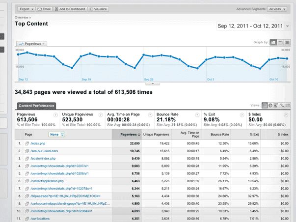
I’ve isolated one page from the list of top pages (above). The Top Content report tells me that this page has received over 15,000 unique views. Just over to the right a bit, it also tells me that the bounce rate for this page is 6.49%—amazingly low, by the way. So the question I’m left with is, how many users bounced? What most people would do here is apply the bounce rate to the number of unique views. It’s a simple math problem: 15,615 x .0649, which produces 1,013. But is that the right answer? No. The correct answer is 274.
Wait, what?
Remember, the bounce rate only applies to traffic that landed on a page. All the other unique views a page gets are from users that have landed on other pages and eventually made their way to it. So, to figure out how many people actually bounced from a page, we need to look at the Top Landing Pages report instead (below).
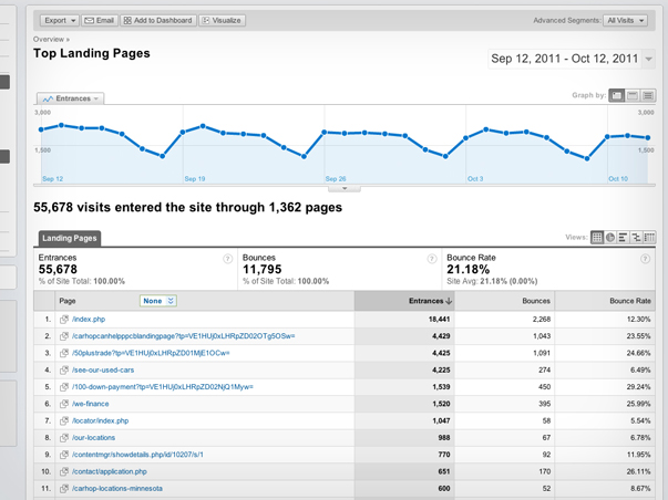
Instead of telling me about all the views a page receives, the Top Landing Pages report (above) only shows me how many views were first views—the first page a visitor saw on a website. If I look at the same page from the other report, I can finally get to the bottom of this bounce rate thing.
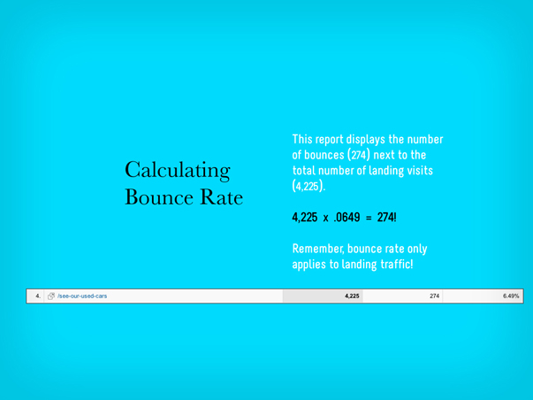
Since I’ve isolated that page (above), I can see that 4,225 people landed on this page (less than a third of its overall views), and only 274 of those people bounced. 274 is 6.49% of 4,225. The Top Content report didn’t make that very clear, did it?

Digging in to bounce rate for a particular page reveals just one example of how there are no independently meaningful metrics, and how you have to keep your big-picture questions in mind when navigating analytics reports. Otherwise, you’re vulnerable to what I call “analytics myopia,” which is what gives data the power to mislead rather than empower. So, always evaluate your Traffic Sources and Top Content in light of Bounce Rate and Conversions.

Have we had enough numbery stuff for now?
Does your brain feel a little bit like a jumble of tinker toys?
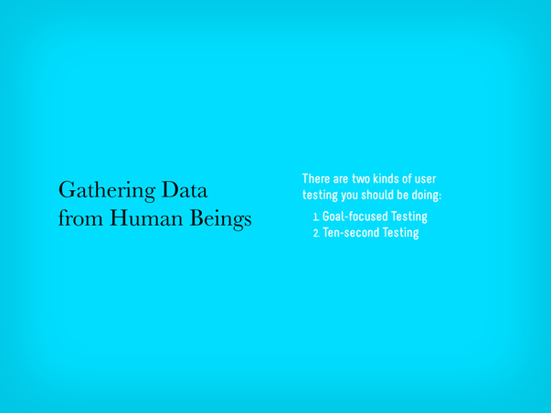
Gathering Data from Real, Live Humans

Let’s talk about people, and what they see.
Remember Thing #2 about web measurement? Anything can be a source of data. People are another source we should take just as seriously as the analytics bots. We can learn a lot from seeing what other people see. So, let’s talk about how to do that.
(By the way, this is exactly the kind of expression we make when staring at a screen.)
First and foremost, the kind of user testing that I’m recommending isn’t the most scientific process you could pursue. Recently, David Baker mentioned to me that he thought people were much more interested in a “man off the street” approach to this sort of thing than a “laboratory” approach, and I couldn’t agree more. The amount of work and the high cost to mount in-depth usability studies that make use of heat mapping technology and the like is so great as to be a very real barrier to entry for most of us. But a much smaller version isn’t necessarily going to offer diminished results. In fact, our experience has been that the simpler the process, the greater the insights.
There are two particular types of user testing that you should be doing on a regular basis:
1. Goal-Focused Testing
2. Ten-Second Testing
I’ll explain what each type involves, but first, let me explain how to practically plan for user testing. Fortunately, the setup required for both types is exactly the same…
To do simple user testing, here’s a list of what you’ll need:
1. A quiet space. We’re not talking about a sound-proof chamber here, just a place free of distractions. Since we’re going to be recording our test sessions, it’s important to keep peripheral noise to a minimum both for the volunteers and our future selves who will watch the test footage.
2. A computer. Nothing fancy, just make sure you’re able to run some kind of screen-capture software, like Camtasia.
3. A webcam. Most laptops come with them, but if you’re running something older, you can probably pick up a USB-powered webcam for cheap.
4. A volunteer. Ideally, this person needs to know how to use the web, but not necessarily be an expert in your field or have any deep familiarity with the information or concepts contained by the website you’re testing. The fresher, the better.
5. A moderator. This is you. You’re there to provide the context, technology, and guide the test, but most importantly, to observe. Even though the software will capture the screen your volunteer is looking at, as well as their face in real time, take notes. The more information you have later, the better.
6. A test plan. This is a simple step-by-step procedure to guide your volunteer. The most important thing about these tests is that you’re not just putting a volunteer in front of a website and watching them try to use it. You’re guiding the volunteer through specific questions/tasks that are created in order to prove or disprove the website’s effectiveness.
Goal-Focused User Testing
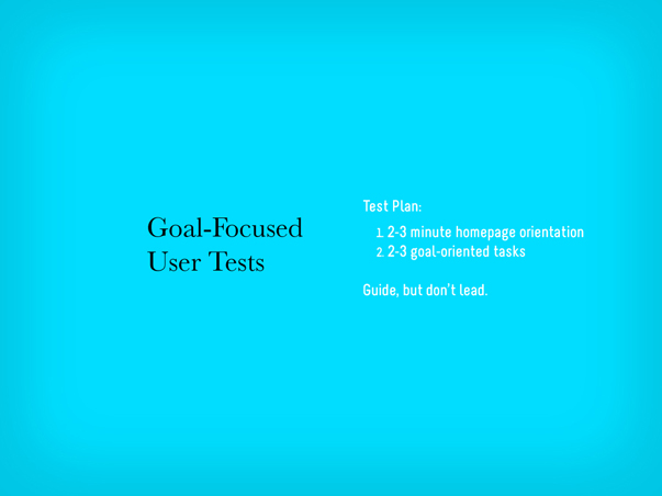
In a goal-focused test, the first step is to have the volunteers orient themselves on the homepage. You’ll want to give them 2-3 minutes to explore the homepage. Scrolling or interacting with slideshows is fine, but ask them to not click any link that would take them away from the homepage. After 2-3 minutes, as your volunteer to explain the purpose of the website. Their answer will help you evaluate the clarity, or lack thereof, of your website’s purpose to the outside user.
Next, the test plan’s steps should correspond directly with the goals of the website. If a goal of the website is to generate leads through various conversion points, like newsletter signups, webinar registrations, etc., then there should be tasks on the test plan that require the volunteer to do those very things. For example, one task may be to have the user find a particular article on the website, which would test your site’s navigation and search tools, as well as then subscribe to that content, assuming a corresponding call-to-action exists.
These test can really be customized in any way that makes sense for the goals of your website, but should be kept to under ten minutes. As soon as fatigue sets in, the quality of the results will drop considerably.
Here’s an example of what a resulting clip should be like:
Ten-Second User Testing
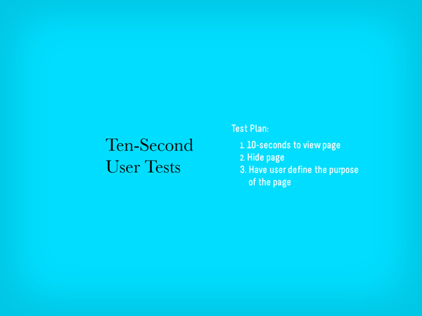
Ten-second tests condense this approach even more. I came upon this idea after reading an article by Jakob Nielsen in which he wrote that the majority of website users decide whether to stay on or leave a page within 10 seconds of opening it. While that may seem like a tiny window of opportunity, the reality is that we are able to perceive information and make judgements about it in much less time than that. So rather than using this simple testing format to evaluate an entire website, a ten-second test instead should focus in on just one page.
The setup is exactly the same as before, but the procedure is slightly different.
First, give your volunteers ten seconds to view a page. Again, ask that they limit their interaction to scrolling only and not click any links that would take them away from the page. After ten seconds, have them minimize the page. Then, ask them to explain what the page they viewed is about. Like in the homepage orientation step of the goal-focused testing, the volunteers’ answers will help you to evaluate how clear your page is. You’ll also begin to see ways that visual design decisions can either help or hinder a user’s ability to evaluate a page in those first 10 seconds. Other questions you might ask are what stood out most to the volunteer, whether they would return to this page and continue reading it based upon their short experience so far, and also what they would search for in order to find this page again.
Here’s an example of what a resulting clip should be like:
The real value to this kind of user testing is that you can be up and running with both of these procedures almost immediately. The system is structured enough to be reproduced, but flexible enough to be customized to a variety of needs. But the big point is that you are getting exposure to users in a very natural way.
In Conclusion…

This whole system—breaking down measurement into basic questions, pursuing them through specific analytics procedures, and gaining quick and simple user insights—is simple for a reason: Rather than getting bogged down with data—and there is enough of it available to make that very possible—we need to be simplifying our approach to measurement so that we can do it on our own, do it more regularly, and derive meaning from it.
There is, of course, so much more detail you could pursue, whether in terms of analytics or user testing. Once you’re up to speed and successfully reproducing this approach on a regular basis, I urge you to go further. When you’re ready, we’ve got many resources right here on this site to help you do that.
Do You Want More?
- Learn more about measurement from our newsletters, Measuring What Really Matters and How to Use Google Analytics, as well as our webinar, Google Analytics 101.
- Learn more about simple usability testing from our newsletters, The Website, the Webcam, and the Testplan and Webpage Speed Dating, as well as our webinar, What Users Want.
- You can also check out all of our blog posts about Measurement.
Related Posts
-


Chris Butler presented on "You, the Other Kind of Business Leader"...
-


Christopher Butler will be a keynote speaker at the 2015 ConvergeSE conference...
-

Chris Butler participated in a moderated discussion on rethinking entrepreneurship...