
I was nervous when we decided to start doing responsive design. I thought it would completely disrupt our workflow, causing projects to be much more complicated, stressful, and far less profitable. Fortunately, that hasn’t happened. It’s not that it hasn’t required us to make changes to our process, or that it’s been stress-free. But it hasn’t been a disaster, and that’s what I tend to expect from change…
After a year or so of doing responsive design projects, we’ve learned a ton, and I’ve solidified some of my opinions about what we’re doing and how we’re doing it. I’d like to share some of that with you here, but first I think it would be helpful to review the basic idea behind responsive design and take a critical look at some of the philosophical stuff that gets wrapped up with it. If you’re anxious to get to the examples and pictures, feel free to scroll down a bit to the “Planning is still necessary” section.
In a nutshell, responsive design is really about the nut, not the shell.
For those of you who could use a refresher — or for those of you who have never really been clear on what responsive design means — I’ll do my best to sum it up for you as simply as I can: Instead of building an entirely separate site that users are redirected to based upon the devices they use, or creating alternate templates that are swapped in based upon a user’s device, responsive design is an approach to creating a website that simply amends its CSS file with unique ways of displaying information based upon the size of the browser window. Because there are so many different devices from which users might access a website, the most efficient approach to consistently presenting information across such a wide variety of contexts is to make the information itself flexible, rather than the container. Sounds good, right? Well, that depends upon what we mean by making the display of information flexible. Or, really, how flexible we can truly make it.
The more flexible the information, the more variables there are to manage. And, since we designers and developers have no control over the number of unique little screens that are out there, we need another way of keeping this responsive thing manageable. Otherwise, we might feel pressured to tweak our designs for every unique screen dimension that exists (turns out there are a lot of ’em). So what we do to remain sane is decide upon a smaller number of breakpoints — typically 3-4 — between which are ranges of resolutions that fit general categories of “desktop,” “tablet,” and “phone.” Our CSS file responds to the user’s viewport by applying the display amendments — we call them media queries — that we’ve written specifically for those ranges. This way, visitors who are using 7 or 10-inch tablets, which have different screen resolutions, will trigger the same media queries that correspond to the range between two breakpoints: the smallest “desktop” resolution we’ve anticipated, and the smallest tablet resolution. The difference in resolution between those two devices is small enough to be accounted for by other, more general flexibilities, like text wrapping, padding, margins and the like. I know, it’s complicated. If it helps you to visualize, this is essentially the same technique we’ve been using for years to optimize how a webpage is printed — in that case, the media specified is “print” — it’s just that we’ve pushed the idea into much more rich and complex territory. Ideally, this approach is the most efficient means of optimizing user experience across the widest variety of contexts. Ideally. I’ll come back to some of the not-so-ideal subtleties a bit later, when I grumble about testing and device support…
Responsive design is more work. And more expensive. Maybe you don’t need it as much as you think you do.
I’ve run into the idea that since responsive design is a more efficient mobile solution than creating unique mobile sites or alternate page templates, it is therefore going to be cheaper and simpler than what everyone is expecting. Not true. The fact of the matter is that doing responsive design requires work that just wouldn’t be done at all if mobile wasn’t a consideration. Now, I’m not advocating that we ignore mobile. But in some cases, I’d argue that mobile is probably higher on the priority list than a serious cost/benefit analysis would merit.
Our audience is primarily comprised of people working in the advertising, marketing and design industry. They’re people who influence or make decisions about design and development projects. With our audience in mind, if you were to ask me if mobile should be a higher priority I’d say absolutely. I’d think of all of our hip and stylish visitors and how many of them probably already have an iPhone 5. But you know what? In the last month, just under 10% of our website’s visitors accessed it with a mobile device. That includes phones and tablets. If I extend my look to the last six months, the mobile population is exactly the same. The last year? It drops to 8%. So, mobile traffic is growing, but not as rapidly as I would have assumed based upon what I think I know about our audience. With those numbers, should mobile be prioritized as much as it has been (we’re about to launch a site redesign that makes heavy use of responsive design techniques — more on that later)? With over 90% of our visitors still coming in through a “desktop” computer? Probably not. But for us, there’s an additional consideration of needing to demonstrate our capabilities in this area, which pushes the benefits over the cost. For many other businesses, though, that additional benefit doesn’t exist.
Very few of our clients have a “money is no object” attitude when it comes to budgeting for a web project. In fact, for many of them, our costs are a bit of a stretch. But they believe in the value of what we offer and trust us to lead them to the best outcomes. It would be wrong for me to push responsive design on all of them, indiscriminate of what they know about their audience, their actual visitor data, and their actual budget. If their money could be better spent in some other way, then it should be.
C’mon guys, mobile shouldn’t always come first.
If your cost/benefit analysis backs up doing responsive design, great, let’s roll up our sleeves and have some fun. But, where to start? Perhaps you’ve heard people talking about taking a “mobile first” approach to web projects. It’s become a bit of a dogma at this point, so I think it’s important to clarify what we mean when we say it. Generally, I think it tends to mean two different things, though sometimes both are relevant.
Thing #1 is that mobile devices are so prevalent at this point that we should invert our usual sense of design priority — designing for “desktop” use first and then figuring out how to make it not suck on tiny screens — so that we start with tiny, get that right, and expand from there. That, of course, assumes that a large enough population of your website’s visitors access it — or can be expected to access it — with a mobile device. Yes, mobile device use has exploded. We’re practically cyborgs and all that. But, is your site the kind of site that will be accessed mostly by mobile device users? Look at your personas. Check the data. If so, then, great: Mobile first! But if not, then refer back to the previous section about cost/benefit analysis.
Thing #2 is that starting with mobile forces a certain economy of design thinking that should make for good design no matter what — whether tiny phone screen or enormous cinema display. This is just false. Designing something that is a perfect fit for a phone, no matter how good the design is in terms of classical, formal considerations, will never also be a perfect fit for something vastly bigger. Remember when the iPad came out and Apple had to spin it to all the iPhone app developers by saying, “Good news! You don’t have to redesign your app for this new thing. You can just center it in the bigger screen or stretch it out to fit.” Uh, wait. So, what’s the good news? Right, there really wasn’t any. Centering was lame, and stretching made everything look less crisp. If an app developer simply rewrote the app to natively fit the dimensions of the new iPad screen but didn’t actually rethink it, sure, it would look crisper, but it would still look like an iPhone app stretched out. The point is, good design takes context into consideration. Just because a smaller screen forces us to make strong (even cutthroat) prioritization decisions doesn’t mean it will produce the best of all possible designs.
One last thing: The reality of your audience should really dictate your design philosophy. It’s one thing if a significant portion of your audience uses mobile devices to access your site. It’s another if those users who match the personas that matter to you use mobile devices to access your site and actually engage — by responding to your calls to action — while using these devices. We really need to think deeply about this and then verify our thinking by talking with people who are representative of our core audience. Ask them. Do they consume your content most often using mobile devices or at their desks? Do they respond to calls to action most often using mobile devices or at their desks? Based upon the conversations I’ve been having for years now, our audience may be increasingly consuming content from a variety of devices, but I get the sense that when it comes to business transactions, they’re still at their desks. That puts the mobile priority in a very different light for me. Yes, it’s anecdotal. Other than my analytics data, I don’t have numbers to throw at you, so I encourage you to start by asking these questions yourself.
Planning is still necessary.
We’re all about planning, so it should come as no surprise that I’d reserve a section to briefly mention some ways to plan for responsive design projects.
Prototyping:
We prototype every website we build using an interactive prototype builder, similar to something like Protoshare. Instead of wireframing on paper, we are essentially building the site before we build the site, focusing on information architecture rather than any other visual design issues, in an environment that enables a user experience as true to life as possible. Of course, if we’re doing responsive design, we also prototype how the site’s pages and functionality will adapt to smaller viewports. Below is a recent example of a real estate website’s prototype showing how the homepage’s search functionality would work on phone-sized screens.
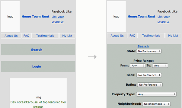 ↑ We prototype our responsive projects, just like we would any other project.
Google Docs Wireframe Template:
Even though prototyping is a non-negotiable for us, I’m a big fan of pre-prototyping by whatever means you find helpful, especially if there’s a way that you can quickly get your ideas visualized. Google Docs has some wireframing templates for this that are really pretty decent. Below is an example of one for the iPhone:
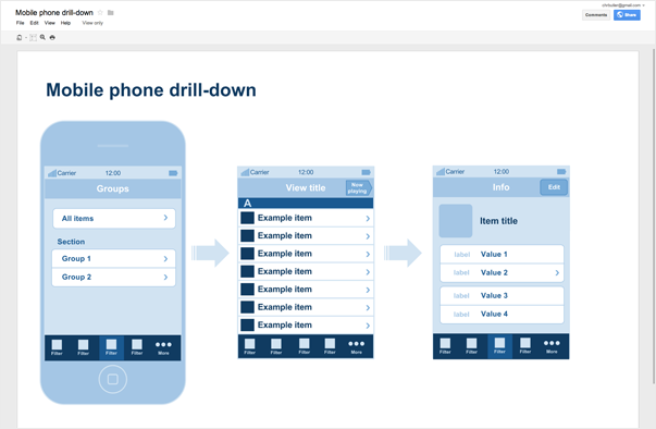 ↑ Mobile wireframing image source: Google Docs Blog.
Good Old Fashioned Paper:
Of course there’s nothing wrong with using good, old-fashioned paper. Again, this is a pre-prototyping step, because I’m a big believer in the idea that you can’t really communicate an interactive experience with a non-interactive media. But, if sketch templates (like the one below) help you brainstorm and quickly iterate layout ideas, then please use them. Plenty of people — myself included — don’t think as creatively when they’re using screen-based tools with lots of rules. If that’s you, I recommend sketching out your interfaces before prototyping them.
 ↑ This sketch template created by Oliver Waters.
I did see this video recently that is trying — really, really trying — to make paper work as an interactive prototyping tool. I can’t say I’m not impressed, but I do think there’s a limit to how useful this sort of thing could be. It’s kind of cool, though, in a Science of Sleep sort of way…
Navigation requires a little extra attention.
If you think about it, navigation menus are really just interactive visualizations of a website’s information architecture. The way we design them tends to correspond with the hierarchy of pages, as well as what information is most relevant to a user’s sense of place. We’re used to having lots of horizontal and vertical space to handle them, as well as desktop-specific interactions — like hover states — to make them intuitively usable. But on smaller screens, space is obviously limited and there’s no such thing as a hover state. So, it makes sense navigation would be one of the bigger challenges of responsive design. Here are three perspectives on handling that challenge:
1. Consolidating Menu Items:
If it’s possible to do so, the simplest solution would be to reduce the number of items your main navigation contains so that you either don’t need to use any media queries to adjust it for smaller viewports, or that the adjustments you do make are so minor that they don’t change the UI at all. This is, of course, a whole lot easier said than done. It just may not be feasible to get everything your website contains consolidated under just a handful of headings.
Below is an example of a consolidated main navigation. Our client, DesignPlan, wanted to make sure their website was optimized for visitors using mobile devices, but they just didn’t have the budget to do a full rebuild — something we’d generally recommend over trying to retrofit an older website with an up-to-date skin. Since their design was pretty spare to begin with, we figured we could rebuild the page templates and write new CSS that used responsive techniques fairly easily. But their navigation menu was too long to be squeezed into narrower viewports without doing a bit more with the CSS to create an entirely new way of displaying it. Instead of doing that, we opted to consolidate the navigation menu so that it would fit horizontally on all sizes. The only CSS trick we used for the navigation was to remove the word “catalog” from two top-level items when the page displayed on phone-size screens, so that the four items would fit nicely across the screen and have enough room for tapping.
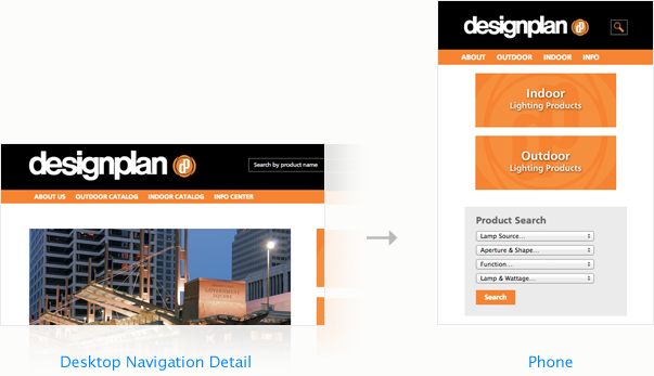 ↑ Consolidating your nav is one proactive way of dealing with less horizontal space.
2. Using Browser Defaults:
Another “lighter” option is to let the browser handle your navigation structure with a default pulldown menu on the smaller viewports. In this scenario, you might be willing to sacrifice a more customized design at smaller sizes for the simplicity of a form select element, which has no styling of its own. In most cases, it’s minimal enough to not seem out of place.
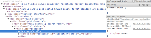
The way this works is that the navigation elements would always be contained within a select element — which is typically used for options in a form, like “country,” “state,” etc. — that is hidden by the CSS at larger viewport sizes and replaced by more detailed display specifications. For example, our friends over at SmashingMagazine.com handle their navigation exactly this way (shown below). At larger viewports, the main navigation is displayed in two columns to the left of the main content column. As the viewport reduces in size, they alter that navigation at a few different breakpoints, until the final one, which provides no styling specifications and “unhides” the select element. That is why users accessing their site on a phone will see the navigation as a simple select pulldown instead of something more uniquely designed. I’ve also included a short sample of the CSS for SmashingMagazine.com below to show how at the 1220px breakpoint, the select element is being hidden. It may not be the prettiest option, but it’s probably one of the most user-friendly.
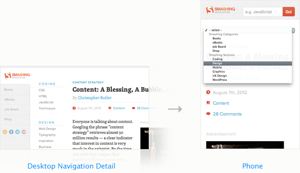 ↑ Smashing Magazine lets the browser display the main nav at the smallest display sizes.
We chose to use the same technique for our client, Inhance Digital (shown below). On wider viewports, the site uses a pretty typical horizontal navigation with hover states and drop-down menus. On smaller viewports, we default to a form select element.
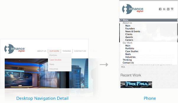 ↑ Inhance Digital also uses browser form elements to handle its nav at the smallest sizes.
3. Creating Unique Menu CSS:
Before the Boston Globe launched its responsive site, there really weren’t many successful, large-scale responsive websites created outside of designer/developer enthusiast circles. So, it set a pretty significant precedent. We began using it to demonstrate what responsive meant to our clients, as well as to help them understand why a more minimal design was necessary in order to make for a more responsive site. The less image-dependent the site’s design, the more flexible it can be to the context in which it is displayed. Our clients needed to understand this, and you couldn’t pick a more solid and visible example than a major publication like the Boston Globe.
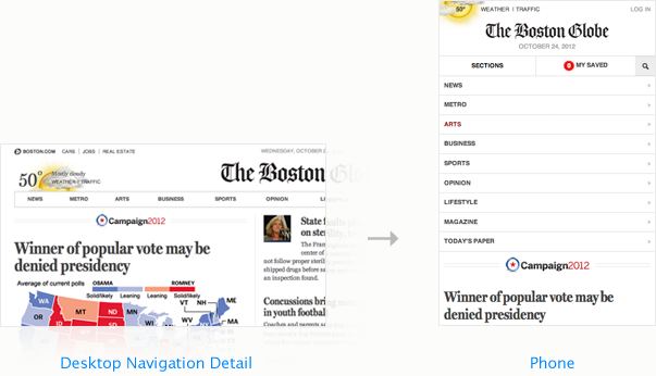

But after having used it for more than a few demonstrations, I’ve realized that there are some shortcomings. I had been particularly enthusiastic about how the Globe was handling such a deep navigation. At larger viewports, it’s distributed horizontally, in a pretty standard main navigation bar. As you hover over the nav items, you get pretty elegant drop-down “supermenus.” But at smaller sizes, you get a vertical stack of sections. It’s pretty intuitive to use.
What isn’t intuitive is that once you have tapped down to a sub-section of the site — say, the Arts section, for example (shown left) — the navigation is no longer displayed beneath the masthead as it was on the homepage. In order to see the pages that exist within a subsection, you have to tap the small arrow icon that is next to the section title. It took me a while to discover this.
So, while I’m still enthusiastic about many of the ways that the Boston Globe handles its responsive design, its navigation isn’t one of them. For there to be such a strong break in the consistency of the navigation is confusing and likely to be overlooked by plenty of users. I certainly wouldn’t advocate for any of my clients to use the same approach.
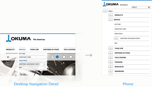
We recently launched a fairly large-scale site for Okuma Corporation (shown above), and in order to preserve as much consistency as possible in the main navigation, we opted to use an expandable, vertical navigation display. You can tap “Menu” and see a list of the top sections, and then tap any one of the sections to see a list of the pages within. This approach can handle many levels of hierarchy — Okuma’s goes down 4 levels — without disorienting the user. The only cost for users on phones is the need to scroll up or down more as the list is expanded. Additionally, this type of menu pushes down the page content as it expands, rather than displaying as an overlay above the page content.
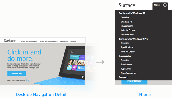
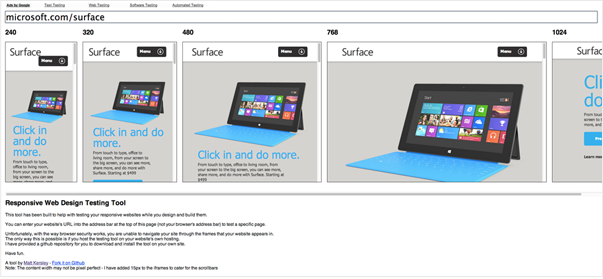
A slight variation on this approach would be to display your expandable navigation menu over top of page content, especially if it is short enough to still reveal some page content beneath on the smallest viewports. Microsoft’s Surface website, which recently launched, does just this.
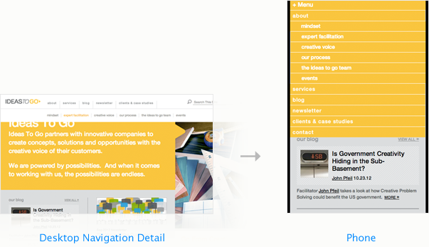
We also used a similar technique on a recent site redesign for Ideas to Go (shown below). It’s a vertical-stacked navigation, sort of a hybrid of The Boston Globe’s, Okuma’s and Microsoft’s. It allows the user to expand each section and see its subpages, but it also overlays on top of the page itself.
One does not simply… shrink a slideshow!
I am less and less a fan of slideshows. I’ve covered this before, so I won’t bore you with my gripes. But if slideshows are tricky on “desktops,” you can bet they’re even trickier to handle on smaller viewports.
Tap or Swipe?
When we first started doing mobile sites, we felt a lot of pressure to make slideshows work just like swiping through image galleries in iOS. Because we didn’t have a solid answer as to why it wasn’t a great idea, we tended to go ahead and try to make it work. But, performance was lousy. We were taking a javascript slideshow that was typically auto-rotating as well as had clickable controls, shrinking it and its contents, repositioning it, disabling the controls, and trying to enable the user to touch and swipe through each slide. But the swipe animation struggles under those conditions, and frankly, it would be better to just create an entirely new piece of content to make that work. Since then, we’ve tended toward tap-to-swap control, which is much more stable and just as intuitive to the user.
However, tap is problematic if the slide needs to link somewhere — like to a subpage — rather than just advance to the next slide. If a slide does need to direct a user elsewhere, but the advance action is on tap, then the link needs to be placed in a caption for slide. Camera is a customizable slideshow plugin that we’ve used quite a bit, but it still requires that links be placed in the caption, even if a swipe action is being used.
Mixed Content
This is another tricky issue. Slideshows aren’t always just a collection of images that a user can cycle through. Often, they’ll include a mixture of content, cycling between images and videos, for example. While it’s pretty straightforward to reconfigure a slideshow of images for smaller screens (barring any tap vs. swipe issues), videos aren’t as simple. You’ve got to consider what player is being used, the dimensions of the video, etc. If you’re embedding YouTube videos among slide content, you can have a consistent user experience on a “desktop” size because the player can sit within the image area. But on a mobile device, that player will open the mobile OS’s YouTube app instead, which is a break in interface continuity.
Full-Page Images
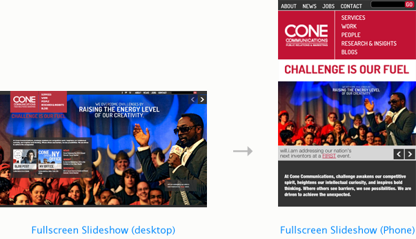
These are popular. But man, they are a pain in the neck. Here’s the thing: the bigger the image, the bigger the file, and when the image has to respond to the size of the browser, the site has to be processing that image, which slows things down. The benefit, of course, is a very big visual impact. And it does look very cool. Check out the site we launched recently for Cone Communications, which features a full-screen slideshow that rotates behind all the other page elements.
Now guess how we made it work on smaller screens: We shrunk it! Simply! It was like walking straight into Mordor. It’s not ideal, but it works. I wouldn’t recommend it very often, but that’s because I generally don’t like slideshows. But if you need a slideshow, and if you need it to be muy grande and whatnot, then yes, it can be done.
Testing and device support is not easy.
Emulators
They’re great for a cursory spot-check, but they’re not the most accurate representation of how things look on mobile devices. This is because each phone or tablet has its own hardware specifications, which interact with the software in different ways. The differences are often pretty subtle, but even a minor difference can matter to the user, and especially to your client. So while emulators are helpful at a certain stage of the project, they’re no substitute for using actual devices for your official QA. There are plenty to choose from, though. Here are a couple I’ve used:
↑ Matt Kersley has a pretty simple responsive testing tool you can use on the web.
Matt Kersley has created a straightforward testing tool at his site that lets you drop in a URL and see it right away in different sizes — from tiny phone width to standard “desktop” width. It’s pretty handy, too, for demonstrating how responsive works for someone who may not understand it yet.
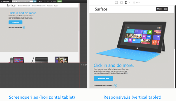
↑ You can’t always trust that an emulator is showing you the most accurate display.
There are two other emulators I’ve used pretty frequently: Screenqueri.es and Responsive.is, which let you drop in a URL and spot check its display on different sized viewports. Notice, though, in the comparison above, that Screenqueri.es isn’t displaying the main image when you test for the iPad width, while Responsive.is shows it just fine at the same size. As it turns out, the site displays just fine on an actual iPad, so something isn’t quite right with Screenqueri.es. Just be careful.
Device Support
Devices. There are so many of them. New ones are coming out all the time. Few of them have the exact same screen dimensions and pixel density. What to do? We certainly can’t support them all.
I think the best solution here is to look at the analytics for any site you’re working on and prioritize the devices that account for the majority of your mobile traffic. After looking at the overall market share and then the device share across our clients, we’ve determined that we’ll support iOS devices (iPhone, iPod Touch, and iPad) as well as Android devices running unaltered installs of Google’s OS (the current version is 4.1, called “Jelly Bean”), as well as any other device that accounts for 5% or more of visitors to a client’s site. So far, we haven’t found one instance where another device — other than iOS or canonical Android — is within that 5% or more. Below is a snapshot of the mobile devices our audience has used over the past month to access our site, and only those that are unidentified (“not set”) fit within that 5% or more (they’re roughly 6%). But clearly, iOS devices are the ones we should prioritize. If you’re grappling with this question for your or your clients’ sites, save yourself some grief and let the data determine your support policy.
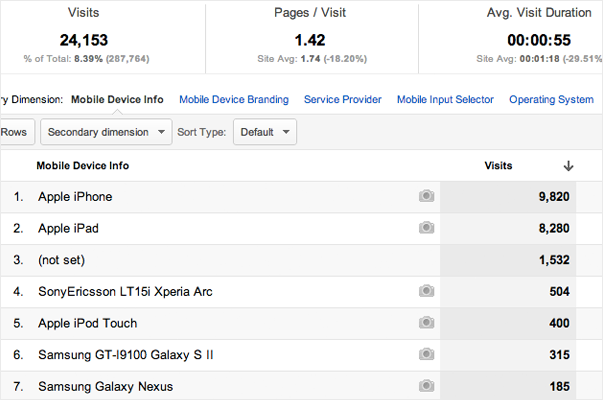
↑ Let visitor data determine your support policy!
The browser is a lousy salesman.
Since responsive design adapts page layouts based upon the size of the viewport, you can actually see it happen in real time by dragging the edge of your browser and reducing the size of the window. See below:
Neato! Except not really. See, doing this may demonstrate a distinction between how responsive works versus an alternate mobile site or alternate mobile-optimized templates, which would only show for visitors using a mobile device, but it also creates a use scenario that is totally unnatural. The whole point of adjusting the layout is to address the concerns of people on mobile devices, not people who want to reduce the size of their browser to be about the width of a necktie. Who uses their browser that way? Also, I often do want to reduce the width of my browser — if I’m referring to information on a webpage while writing in another document, for example — but don’t want the layout shifting around.
Additionally, this sort of demonstration behavior creates bug-like phenomena that are confusing. For example, in the video above, I started by showing how the navigation works on IdeasToGo.com. Then I reduced the width of the browser until it was at its narrowest setting. Once there, I engaged the navigation menu again. This time it was designed differently — optimized for the smaller width. But when I opened the window back up again to the width it had been originally, the navigation menu disappeared and the “desktop” version didn’t come back! BUG! BUG! Well, is it a bug? Not really, because what’s happening here is this: When the page first loads, it looks at the viewport size and defers to the CSS to show the appropriate version of the menu. In this case, we’ve got plenty of room so it shows the standard “desktop” version. But then, when you reduce the width of the browser, it engages the CSS again and spits out the alternate menu. Now, it “thinks” it’s done. When you expand the window again, it’s not going to engage the CSS until you refresh the page. It’s a bit wonky, yes, but that’s because when you’re on a mobile device, you don’t have the ability to choose the size of your browser window. On a desktop machine, you do, so it creates this strange behavior. But it’s not a bug. It’s just how this stuff works.
With all that in mind, I think it’s time we stopped doing the window dragging thing. It teaches us to evaluate the success of responsive design within parameters that are not true use cases. In fact, I think that in addition to responsive, we should also use device detection so that if you’re on a desktop, you can’t engage the media queries written for responsive design. If you’re on a touch device, you can. I’m sure that’s controversial, but from a client services standpoint, I think it’s the right thing to do.
“Desktop” is not a size!
For most of this article, I’ve been putting “desktop” in quotes for a reason. Mostly, this is because referring to “desktop” as a size is about as clear as referring to “phone” as a size. They’re all different. In fact, there’s a wider array of resolutions on desktop displays than any other. We tend to design maximum widths for websites based upon small laptop displays, so they often cap at around 1000 pixels wide. Makes sense. But if we’re interested in the best solution for smaller viewing contexts, why aren’t we also interested in the best layout for larger ones?
I’ve got a huge Apple cinema display. Here’s what happens when I open Microsoft’s Surface site and expand it to fill my entire screen:
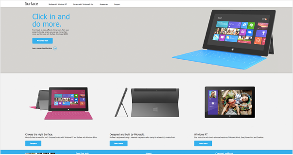
↑ Most websites are not designed for very large screens.
The page’s elements spread to fill the screen, so there’s some fluidity to the layout. But at this size, that means I’m physically turning my head back and forth to scan the page, and there’s this wide, awkward gap between the headline (“Click in and do more.”) and the main image.
Below is an even more common example:
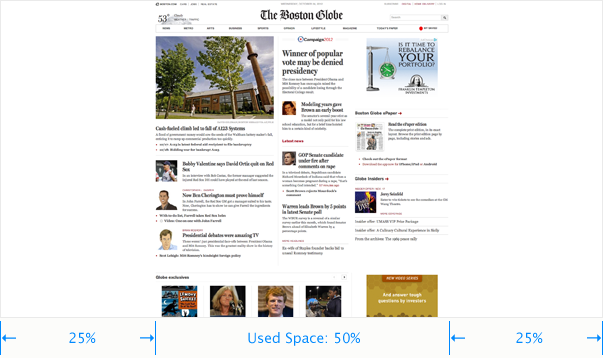
The Boston Globe, which was designed with a ton of attention to smaller viewports, has a maximum width beyond which it simply centers to the window. The benefit of this is that it makes it much easier to scan and read. But there’s still 50% of the page completely unused.
I don’t have a clear solution ready here, but I was excited to see how Second Story handled their new homepage. Rather than stacking information vertically, as most websites do, they decided to organize the page’s information in columns that cascade horizontally. No matter how wide your viewport, a handy arrow button hugs the right edge which you can click to scroll right (you can also use touch gestures or your mouse to do this). I like how this uses the entire space available without putting the user in a literal pain-in-the-neck position. It’s a beautiful design.
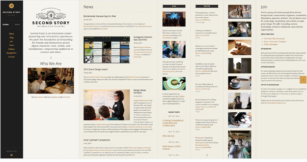
↑ SecondStory.com makes full use of your screen, no matter how wide it is.
So, the parting question for me is this: What about upward responsiveness? If we’re heading toward bigger displays with much higher pixel density, how will our designs adapt to make use of them? We’re all excited and sold on the concept of responsive design, but so far that has been limited to responding to smaller conditions. If we’re up for that challenge, than I know we can do better on the “desktop,” too.
Our responsive site is coming…
I realize there’s a bit of a “cobbler’s children” thing going on here, what with us not having a responsive site of our own and all. But we will soon! We’ve been working on a new version of Newfangled.com for months now, and we’re getting really close. Want a sneak preview? Here’s what we’ve got planned…
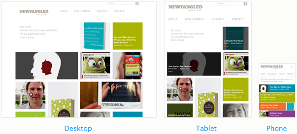
↑ Our new homepage will sport tons of images, lots of color, and even a new logo!
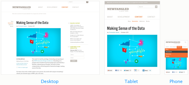
↑ Here’s a peek at what a page like this one will look like with the new design…
Let’s Open This Up…
Well, that’s all I’ve got for now. But I’d love to hear what you think. What have you struggled with? What successes have you had? What haven’t I covered here that you want to know more about?
Thanks for reading!
P.S. I intentionally left out the whole responsive images thing because we’re still grappling with it and haven’t settled on an approach that I thought was good enough for newsletter material. So, I’d love to hear your thoughts on that, too. In the meantime, here’s a brand new Responsive Images Community Group that I just heard about via some folks on Twitter.