
Introduction
Design is in flux. Thank goodness that’s always been true. The web began a major paradigm shift for design — a print-to-web transition that, remarkably, is ongoing for plenty of designers. You might think that anyone still making the print-to-web transition is a lost cause, too far behind to ever catch up. But I don’t know. Maybe they’ll be OK. Maybe it’s the rest of us who have gotten comfortable with “web design” over the last decade that will struggle continuing to transition. Because it’s not over yet. The internet has given us the gift of perpetual change, batteries not included. That means it’s our job to recharge and press on. That’s what I want to talk about here. Are you with me? Good. Get comfortable.
I want to start with a more recent development — this idea of modular content — and how it is changing our design practice, and then work my way back to some of the things that have become “fundamental” to web design. If you’re not angry with me by the end, then I’ve probably not done this right.
And yeah, it’s going to be long. What else is new?
Modular dis-Content
Modular content is the web design industry’s response to the need for two things: (1) greater creative freedom without (2) “design phase” template bloat. Rather than being the template to end all templates (though I like the sound of that), it’s an approach that affords an enormous amount of design and content flexibility on any page, which liberates all of us from the long, drawn-out template-buffet of the pre-production “design phase.” Because there’s so little you cannot do with it, you no longer have to try to think of everything you might want to do and create as many unique boxes that commit you to doing those things months before you actually start using your website. For years now, that’s essentially what the “prototyping” and “design” phases have been about. And for some of that time, I’ve been pushing on the idea that there really is no “design phase” — it’s all design. Creating a prototype is design. Creating mood boards is design. Creating template layouts is design. Programming all of that is design. Etc. Well, modular content makes that a whole lot easier to swallow because it forces us to think in design system terms from the moment we begin considering our content strategy, not just when we’re ready to “add the pretty.” In fact, we’re showing our clients how modular content works and giving them a sandbox to play with it on day one — before we prototype anything — so that an understanding of how it works and what it can do will shape every strategic and design decision they make.
But you know all this already because you read January’s article on modular content, right?
I thought that modular content would reduce template bloat. I figured that with such a powerful and expansive set of tools, we designers would no longer feel the need to create so many different templates. I was hoping that we would stop worrying and learn to love the CMS. Unfortunately, this hasn’t happened. Not yet, anyway.
Instead, I’m seeing the exact opposite of what I expected. The unexpected has come in two varieties:
- More gimme more
- If it’s gonna be this kind of party, I’m gonna…
More gimme more
I’m seeing a lot of “oh yes, we’re modular now, but we’re doing these two or three things just a bit differently and adding this one other thing.” So, in other words, template bloat as usual. What’s surprising is how the appetite for “something different” persists despite being absolutely unnecessary. We’ve just been granted access to the most sumptuous buffet ever and yet we cannot help but feel it’d be just a bit more splendid if we ordered a few other dishes off the menu, oh and can I have the dressing on the side?
The whole idea behind modular content is to reduce the need for differentiating between content types on the basis of unique page templates to contain them. If every page can be flexibly arranged using a variety of media, there’s little need for programming a different structure or container for the various forms of content we’re likely to create. Things like blog posts, articles, case studies, etc. used to need their own, dedicated template. Now, they don’t. Right there, we went from three different pages that needed to be visualized and programmed differently to one. Except I’ve yet to see that level of consolidation. There’s always something we must have that forces our developer friends to create a unique template that adds to the modular tool set or makes some exception to it.
If it’s gonna be this kind of party, I’m gonna…
But how is this not overkill? Just plain old, run-of-the-mill getting carried away with ourselves? What is a webpage but text and media? How much complexity are we willing to add to that basic recipe before we realize that we’re ________. Well, insert whichever metaphor is most effective there. Bringing a bazooka to a bar fight. Sleeping in cargo pants. Going to Taco Town. You get the idea. With modular content, we can make our pages as complex as we want, but most of the time, what we really need is just a column of text and the occasional image.
But let’s say that we do need something more complex. Say, for a landing page for a new product or service. That’s where modular content really shines. It’s meant to make it easy for us to create that complex page without running into limitations or “no’s” from our friendly neighborhood developers. Need a page with full-bleed slideshows, rows of text, videos with text wrapping around them, three column text areas, and CTA’s embedded within text areas? Easy. As long as we’ve got the time. But modular content is still a system, which means that it’s going to have some global rules behind it. This is a good thing. It preserves consistency of design and use. But unless we understand that, we end up with Taco Town, or actually, I’m going to go with some other town. For example…

Welcome to Tinsel Town
Modular content makes it possible for a designer to put slideshows anywhere. We could put one at the top of our page that goes edge to edge. We could put one someplace further down that is half the page’s width and sits to the left of a body of text. We could put one in the middle of a column of text on the left and a video on the right. That’s probably a bad idea, but we can do it. But no matter where we put that slideshow, it’s going to work by the same fundamental rules. It’s controls will be the same. It’s transition animations will be the same.
This is because the slideshow is a centralized media object. How it works has been programmed once. Modular content assumes that we’ll decide where to use it and what it contains later. But it doesn’t let us change the rules every time we use it. That would be more work for us, and more work for our users who would now have to re-learn how it works every time they encounter it. This is the same principle that makes for one “headline” style in a website’s typography so that we can wrap some text in a “headline” tag and always know it’s going to be black 14pt Helvetica.
Makes sense, right? You’d think.
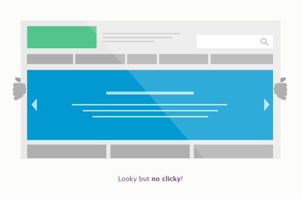
Just the other day, I looked at a website design that had three slideshows styled completely differently (meaning different controls, different ways of previewing thumbnails of upcoming images, different chrome) — and intended to work completely differently (meaning some contained mixed media and some actually opened images in lightbox overlays once you clicked them) — on the same page. On the saaaaame page! Look, your webpage isn’t a truckstop Christmas tree, so stop treating it that way. Media ain’t tinsel, but it sure can be just as tacky if you let it. The point is, this is all not good. It’s not good for design. It’s not good for usability. It’s not a good use of anyone’s time. And, more importantly, it’s a misunderstanding of the system beneath modular content.
I’ve seen the same thing with virtually every other element that can be styled on a page. Here are just a few examples:
- Multiple forms of text link styling in the same body paragraph. Why on Earth. Do you hate your users?
- Different video players with different chrome, controls and logic on the same page.
- Different padding, rules, and type styling for rows of text on the same page.
It goes on and on. I thought modular content was all the “more” we needed but apparently more is the new more.
And here’s the thing: It’s not “clients” who are driving us to Taco Town — this is not at all a Clients from Hell-style rant — it’s us. Designers. We think that more is going to impress our clients, which is Un-strategic Weak Myopic Design 101. Clients want the right thing, not the fanciest thing.
I realize I’m being a bit snarky. And to be fair, I do think I understand why this is happening. Part of it is psychological, of course. That’s why Taco Town is funny — we can all relate to wanting more even when more is absurd. Once you get more, it’s no longer more, so then you want more. It’s worth noting that the diners don’t want a pancake-dipped, pizza-wrapped, triple-layer taco; it’s the marketers who think that’s what they want.
But the other part has to do with method. We’ve got an entirely new way of creating content on the web, but we’re still using our very old way of visualizing it. That’s not doing us any favors. We’ll never stop template bloat until we stop templates. Templates gonna bloat.
So, the solution. I think it comes in two forms: (1) a change in method, which will probably prompt (2) a change in materials.
It’s time for a new method
Prototype → Mood Boards → Layouts → Production
That is the process we’ve followed for years. We’d document our information architecture decisions in the prototype and our visual language decisions in the mood boards, and then merge them together and document that with page layouts created in Photoshop. Then we’d hand all of that over to the developers, who would use our documentation to build the website. In general, it’s a pretty good process. It allows everyone to do the right kind of thinking at the right times and make decisions that support future decisions in a logical sequence. This is especially true of isolating IA in prototyping and visual language in mood boards, so I’m not going to suggest we change that. It’s in the “layouts” step that we’re typically running into the most problems, and I think that has to do with “layouts” being a mostly outmoded concept. As I’ve already pointed out, modular content obviates the need for most of the differentiated templates we used to create.
But even before modular content entered the conversation, the “layouts” phase still introduced plenty of problems. Procedurally, the idea was to follow a “narrowing funnel” of decision-making. So, you’d start with one of the more complex templates from the prototype — one that contained the greatest diversity of visual elements — and use it to put the visual language of the mood boards to work. For an e-commerce site, for example, this is typically a product detail page. Creating a layout for it gives you the opportunity to work out all kinds of details — typography, iconography, buttons, forms, sorting tools, and the like — as well as the site’s global elements, like the header, main navigation area, sidebars, and footer. If you can get your client’s approval on a template like that, you’ll have done most of the heavy design lifting, and later templates will inherit many of the decisions made there. That’s the idea, anyway.
It was, of course, quite common to have worked your way through a precedent-setting template like this one only to receive feedback on a later template that called the entire color scheme into question. All of the sudden, the funnel image falls apart. What tends to take shape is a long and not-so-narrowing cycle of how about now? how about now? how about now? This is painfully slow and labor-intensive because we have to go back to our Photoshop files, make changes, save an image of them, and then show them to our clients. And then, of course, ask, how about now? Every time we ask that, we’re really asking our clients to imagine whether or not what we’re showing them is the best solution. But nobody is good at this! Nobody really knows if what they’re looking at is a good solution until they start using it.
Styleguides
Starting with the most visually complex template is almost the right idea, because it’s an attempt to establish a system for the website’s visual language. The language itself — in the form of typography, color palette, textures, and imagery — has been worked through in mood boards. But now we need to turn it into a system. Starting that with real content, whether it’s a product or an existing article, makes a lot of sense because it will take that language and put it to work on something real.
It’s what we do next that matters most.
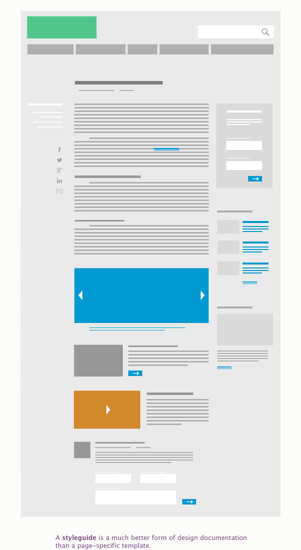
Instead of forcing our clients to approve that template and then moving on to another one, our next step should be to create a comprehensive styleguide. Using the prototype as its source it would document every form the website’s content could take. It would show the full typographical system (headlines, sub-headlines, body, block quotes, links, etc.), how page content could be arranged, image sizes and aspect ratios, padding and margin rules around page elements, buttons, form elements, avatars, and any other visual component of a page. A styleguide is extensive. It could look like a webpage, just like a mood board can at first glance, but closer inspection would reveal that it is more of conceptual schematic than a visualization of how an actual page might take shape. What’s important is that it articulates a system for the website’s visual language and its logic, but leaves specific arrangement commitments for later.
Approval of the styleguide might require a few template-specific extrapolations, especially because the modular content system isn’t going to replace the need for unique templates for content that — like a product — has specialized field sets that need to be parsed and/or tied in with other areas of the site. So you might need to show one or two images of how this system might look on a specific type of page to get sign-off on the system. But the point is to avoid doing that for every page on the site in order to get to “design approval” and begin production.
Following this process means that once production has begun, you won’t have “designed” every possible detail. But the idea that you can do that — by creating a heap of template layouts before production begins — is an illusion, anyway. I have never worked on a website project where something pretty important hasn’t come to light only after the client has started to use their new site and contribute to the QA process. It’s that old David Kelley insight again: you never learn anything until you start showing it to people. It doesn’t matter how smart you are. So following a process that is structured on the basis of capturing everything before production isn’t just naive, it’s disingenuous. You’re going to spend the time getting it right, but it’s most efficiently spent when everyone is looking at the actual thing, not pictures of it.
Pattern Libraries
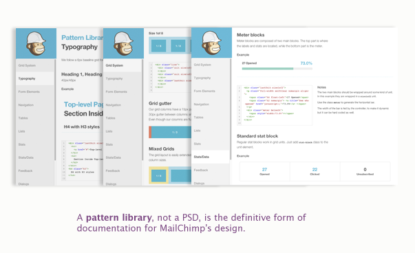
Once you have gotten it right — and yes, if this is new it’s going to be an uncomfortable synthesis of production and design — you can finally document the visual language in the form of a pattern library. The difference between a styleguide and a pattern library is that a styleguide is a visual document — it can live in Photoshop and stay there if that’s your preference — but a pattern library is an organized collection of all of those visual elements in the form of the code that is used on your site. The folks over at MailChimp explain it well:
“[A pattern library] is a byproduct of our move to a responsive, nimble, and intuitive app. Constant iteration requires both an efficient workflow and a well defined collection of atomic elements that can assemble new UIs quickly without accruing new technical or design debt.”
While a styleguide is the best possible map to carry in to production, a pattern library is the best possible map to document the actual path you took and hand it off to everyone who’s going to need to navigate it later. It’s an investment in the future growth of your website. Think of it as if a restaurant included a list of every ingredient needed to make every dish on the menu, but instead of words and pictures, it included the actual food. Impossible IRL; possible on the web. Now, some people use “styleguide” and “pattern library” interchangeably. Yelp’s styleguide, for example, is in a form that I’d call a pattern library — because it’s clickable and contains actual code snippets, whereas a styleguide could be a purely visual document. But ultimately, the semantics don’t matter that much. The point is that this documentation exists at all, which makes me hopeful. So, in other words, the future is now, guys, and it’s pretty tight. The only thing holding it back is people like us who are still stuck in our Adobe caves.
Granted, something like this works especially well for a site or environment like Mailchimp that executes much of its visual language with markup techniques rather than images that need to be sliced up and referenced in the code, and that also uses a minimalistic visual language. That being said, the capabilities of CSS and SVG code are beyond incredible at this point. There’s little that you might create in Photoshop or Illustrator that they can’t do, and better. The advantage to using Semantic SVG is that the imagery on your page can be as responsive as the rest of your page. Don’t believe me? Have a look at Iconic. Of course, it’s code, which is typically on the other side of that designer/developer line we designers like to keep so straight and narrow. Now, tools like Iconic do the heavy lifting for you, so you don’t have to go full developer yet. But this pattern library and Semantic SVG stuff should make us think a bit more critically about our materials.
It’s Time for New Materials
What I find the most interesting about pattern libraries is that they show how important it is to differentiate between the materials we use for creative purposes, and the materials we use for documentation.
A pattern library is a form of documentation. It’s a resource that retains its value during and after a project, which, I think, is pretty different from how we web designers have typically thought of our Photoshop files. In my experience, the PSD has been mostly a container for creation, and sometimes a form of documentation, but even then, it’s usually meant to inform a developer, who will then turn its layers into something we can actually use. Once that happens, the PSD is left behind. It becomes a relic — a sketch of something that fully exists now in a very different form. So let’s consider Photoshop then, as a creative environment and as a documentation format. And I’ll beg your pardon in advance; there’s a bit of a rant here.
Photoshop?
So many designers like to think of themselves as leaders. Some even call themselves “change agents.” Really? Show me the change. I think we like the idea of change more than change itself. We like associating ourselves with the sexy aesthetic of futurity, but then we go back to our caves and do old things the old way.
Boooo! You cry. I know, you’re about to send me a link to Ethan Marcotte’s website, or Brad Frost’s, or Scott Jehl’s — pretty much you just want me to read the entire A Book Apart library — and you’re right, they’re out there, and they’re great, and they’re nailing it. But they are the few.
You show me one designer actually embracing change, and I’ll show you five who send developers InDesign or Illustrator documents. You show me one designer doing something novel, and I’ll show you five who take screenshots of other websites and paste them into their comps. I’m not kidding. I see that stuff all_the_time. Still. Honestly, if you’re creating things for the screen in InDesign or Illustrator, I would rather you just use pencil and paper. Hand that sketch to a developer and there will be far less moaning and groaning than there will be when they can’t even open your file. And really, lots of designers use pencil and paper for ideation because it’s fast and doesn’t waylay them in layer-land when what they really want to do is get into real production.
But, that doesn’t mean Photoshop is a bad tool for creative purposes, it just means that it tends to keep designers within its “walls” for far too long. So, when it comes to creation, if you’re going to be committed to some piece of software, Photoshop should probably be it. It’s meant for screen-y things, after all.
But, is Photoshop the best documentation tool? More and more, I’m thinking no. Insofar as I find myself asking “what happens when…” and not finding an answer in its layers and notes, I find Photoshop to be lacking in some pretty-essential-to-interactive-design ways. If you want to show me what happens when a design’s context is a very tiny screen — or a very, very large one — you have to create a whole new document or layer group with its own dimensions and then recreate all your visual elements. You may or may not have the time or patience to do that.
But speaking from experience, my five-to-one-designer-complaint ratio doesn’t carry over here. I’d love to say that for every designer that has thought through responsiveness in every context and documented it, there are five that either do a partial job or don’t at all. But it’s worse than that. Typically, it’s a one or two that have thought it all through — thanks to getting input from everyone and making responsive a starting point, not an afterward — and painstakingly documented it in several annotated, layered documents (and I adore those designers, truly), five that haven’t at all or have completely missed the point of responsiveness and have dreamed up some truly wacky “mobile site” that bears no logical relationship to the “desktop site,” and one who respects her time enough to ideate in Photoshop and then document it using actual markup.
Uh oh. Designers and code. I’m gonna go there.
So back to my favorite designer ever. Right, I said “markup.” Which means she actually learned some “code.” Like, the most basic HTML and CSS and maybe even a little Javascript. She went over to Treehouse and made a tiny investment in her own future and sanity or Codeacademy and got it for free for goodness sake. So, look, we’re not talking about hacking into the mainframe or anything here. We’re talking about markup.
So am I saying designers should be developers? No. I think there’s a pretty important difference between designers gaining some code literacy and designers becoming developers. It’s a subtle difference, yes, but it’s a meaningful one. What I’m suggesting is this: (1) Designers who explore and learn some markup will quickly find that it improves their work, regardless of whether they practice any coding professionally. Understanding how visual things are described and manifest on the web — the logic and system beneath the typography, colors, and shapes that we love — will enable us to produce more thoughtful, useful, and realistic work. (2) Designers who can document their work in markup form will find that the integrity of their designs will be better preserved, and that they will help to accelerate the production process as they move more and more of their creative practice out of Photoshop and into markup. Neither of these things mean that designers should become developers. The larger the team a designer finds herself on, the more likely it will be that she can be specialized, both in role and practice. But when that team is smaller — or when a designer is working alone — code is unavoidable. There’s no reason to fear code. It doesn’t threaten design. What threatens design is incompetency, and continuing to use antiquated tools and resist learning how the thing you’re designing for actually works is the fastest route to it.
At the other end of this rant is a simple premise: Change is required of us. For designers, this is what change looks like. We have to let go of all the trappings of design that we’ve held dear for so long — pixel perfection, layouts, templates, even Photoshop — and learn to love the new tools of the trade. There can be no bystanding. Remember that Seinfeld bit, about how some people just want to hang out in the area where work is bein’ done but not actually do the work themselves? That.
So, are we designers or are we JPEG-makers? Some food for thought.
Postscript
Practicality is a drag. It’s the thing that keeps a frustratingly wide gap between recognizing things you could do better and being able to say “we don’t do that anymore.” Sometimes, no matter how quickly you can acknowledge the need for change, actually bringing about that change has to be a bit slower. If you want to redo the plumbing, you have to turn off the water. Except most of us can’t turn off the water, can we? We’ve got to keep working. That’s why, no matter how cutting edge a company may appear, look closely enough and you’ll find the old-school. I guarantee it. It’s there somewhere. I say all of this to offset any pressure I may have put on you, or any unreasonable expectation I may have set, or any impression I may have given you that we have it all figured out. To the contrary. I’m writing this like a first-year teacher — just one week ahead of the lesson plan, if you know what I mean. In many ways, we’re doing things that are absolutely on the forefront, but in other ways, we’re still catching up. So, hi. I’m Chris, and I don’t have a time machine.
But I’m encouraged, because if there’s one thing I’ve learned from spending so much time figuring out how to do this stuff better, it’s that we all are. These are just my notes from the field. I hope they’re of some use to you.
Related Posts
-
I recently wrote an article for HOW's Interactive Design site about the history of computer-based fonts and how "web-safe"…
-

For this post, I've created a diagram of one of my recent website style sheets…
-
In this episode I interview Chris about our upcoming webinar on 7 Techniques for the…