
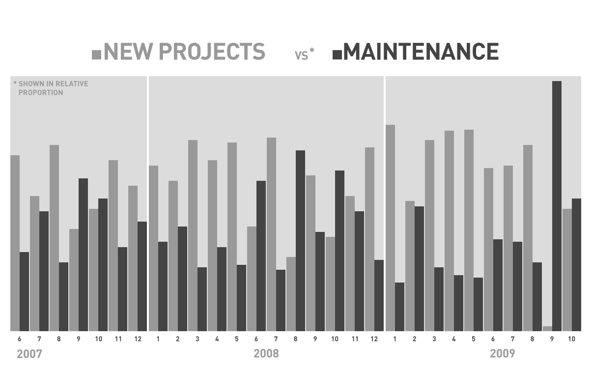
Another day, another set of data… I’ve been investigating what I call “peripheral” data sets in order to get a different perspective on how previously unseen or unmeasured activity affects the overall operation of our company. In my last post, I looked at how our busyness could be represented by the volume of communication over our internal project management system from one month to the next. In looking at that picture, I realized that the volume of activity is much more drastically affected by maintenance work for our clients than by new projects. I classify “maintenance” as any work done for an existing client- it’s a pretty broad spectrum, but since our new project process is so regimented, the split in categories is pretty realistic as far as our company’s day to day experience is concerned. When I noticed that October of 2008 had the highest volume of communication, I wondered what our maintenance sales were that month and how they related to new project sales. Sales data is the easiest information for me to dig up, but I wasn’t interested in the particular sales totals as much as the relationship between the numbers.
This brings me to the graph you see above. As I said, I wasn’t so much interested in how much we sold from one month to the next as I was about the breakdown of sales- how much of it was new business and how much of it was maintenance. So, I determined the percentage of each month’s sales total for the past few years that came from new projects and maintenance. For example, the graph above shows that in October, 2008, 37% of the month’s sales total came from new project sales while 63% came from maintenance. No wonder we had so many posts to our project management system that month! As you can tell from glancing at the graph, this is a relatively infrequent occurrence; more often than not, the new project sales account for the majority of the total. When I first plotted the data, I didn’t add the percentage values because I was more interested in the general relationship, as well as any trends that might be perceivable from visualizing the data. Again, glancing at the graph seems sufficient to conclude that there are no obvious patterns, nor an obvious trend in any direction (i.e. maintenance percentages trending upward or downward).
Averages and Average Averages
Then I wondered about averages. The data set covers three years, but it isn’t three full years. Additionally, the current year has a couple of extreme cases (January, in which maintenance accounted for only 19% of the sales total, and September, in which new projects accounted for only 2%), so I decided to look only at 2008’s average.
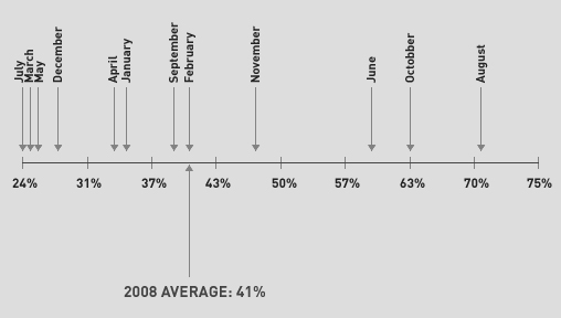
In the chart above, I plotted out a spectrum displaying only the percentages of total sales accounted for by maintenance sales– the lowest, 24%, came in July of 2008, while the highest, 71%, came in August. Two concurrent months bookending the spectrum seems to clearly show that there isn’t a seasonal correlation. But back to averages, the average maintenance sales percentage for 2008 was 41%. What’s interesting about this is that 8 months out of 12 were less than or equal to the average, leaving only 4 months in 2008 that exceeded it. If I isolate 2007, the average maintenance percentage for the 7 months plotted is 42%. If I isolate 2010, the average maintenance percentage for the 10 months plotted so far is 38%. These numbers are pretty close together. In fact, only 11 months out of the plotted 29 had maintenance percentages that exceeded 41%, which is a “score” of 40%. Maybe there is some significance to 40%…?
Ultimately, I’d love to see the percentage of maintenance account for more consistently higher amount. I think doing more work for fewer clients is to our and our clients’ advantage- it fits in with my motto of what we want to do: Serve fewer clients at a higher level. I believe we’ll get there.
One last thing: The graph above doesn’t show the number of new projects sold on a month to month basis. In 2007, the average was 4.1. In 2008, the average was 4. This year, the average so far is 2.6. To me, that’s the kind of decrease I want to see. It means that we’re selling fewer projects on a monthly basis this year, but at higher costs each (fewer at a higher level). So, all in all, one more piece of the puzzle…
Related Posts
-


Christopher Butler will be a keynote speaker at the 2015 ConvergeSE conference...
-


Chris Butler will be speaking at the concluding session of the AIGA's Web101 course...
-
Chris Butler is MC'ing at this year's Hopscotch Design Festival...