In the last few years, we’ve had tons of conversations about the fold and whether or not it still matters on the web. If you’re not familiar with the term, “the fold” is an old newspaper expression, and it refers to the stories that appear on the top half of the front page, above where the paper is folded for display on a newsstand. It is the most valuable real estate on the front page because it’s on display: You put your best attention-grabbing headlines “above the fold” to get passers-by to purchase the paper. They can’t see what’s below the fold, so the top headlines have to draw readers in.
On the web, “above the fold” refers to the area that’s visible in a browser window without scrolling. The big, obvious difference is that a website isn’t going to have the same, consistent size that’s visible to everyone without scrolling, especially today when we use responsive design to make sure things work and look great on thousands of combinations of devices and screen sizes. We don’t have a guaranteed area to work with that’s always going to be above the fold.
As a result, there’s a lot of debate among designers as to whether or not it even makes sense to worry about the fold. At this point, it’s more of an abstract concept than a real line you can consistently point to in a design comp. Also, many people argue, it matters way less now than back when scrolling was kind of a pain; now we have scrollwheels, trackpads with gesture recognition and touchscreens. You no longer need to mouse all the way over to the far right side of the window, and click the down arrow repeatedly, so is the fold even an issue anymore?
Remember me?
The answer is a resounding yes. Just recently, Amy Schade from Nielsen Norman Group wrote an article about how the fold still matters, with lots of great evidence that it is still an important aspect of content design. Her findings, distilled: The pixels above the fold get viewed an average of 84 percent more than pixels below the fold.
Whoa.
So why is the fold still important? There are a number of reasons you could point to (information scent, cognitive load, etc.), but it boils down to this basic, guiding principle that users on the web are easily distracted and typically make very, very quick decisions about whether or not a site is useful. If a user thinks your site isn’t relevant, they will click away before you can make your case.
So what does that mean for all of us, who just want to make sure we’re making good decisions about a site’s UX and content, and ultimately serving the site’s goals? Obviously, we can’t create mockups of every single device and screen size and change the content so that all the important stuff is above the fold every time. That would be lunacy, even for an organization the size of Google or Facebook, and they sure aren’t doing anything on that scale. Responsive design works in part because we’re not doing that: We create the content once and have a system of rules for how it rearranges itself to fit whatever screen it’s on, and still look good.
So what can we do? There are two basic approaches to deciding what needs to go above the fold, and you should probably be doing both of them: One is analytics- and data-driven, and one is is strategic. You should definitely do both of them at the beginning of a rebuild or redesign project, and keep it going after it launches on a regular basis.
First, you can look at your site’s analytics, and see what the breakdown of devices and screen sizes are for your actual, real-life visitors. Get a sense of what screen sizes your visitors are using. If your site is mostly being viewed by people on displays that are 1920×1200 and bigger (or conversely, mostly people on iPhones), perhaps that’s the place to focus more of your efforts. Don’t worry about the huge number of potential window sizes and devices that could be looking at your site, spend time looking at the ones that actually are.
Take all that information, and look at the smallest size/resolution for the three basic classes of devices (desktop, tablet, phone). Remember, you can always think about whether or not you want to define a fourth breakpoint for very large desktop screens.
Now comes the strategic part: Use that smallest view (of all three device types) as your canvas, and as you begin planning and designing, think about the content available above the fold as your elevator pitch: concise and extraordinarily clear about what’s important. While it can be really tempting to be clever, thought-provoking or unique, save that for the content that’s meant for users that have decided to engage with you. Lead with the best, clearest and most compelling expression of what you do.
Make your first impressions above the fold count for clarity. Assume that the person that’s looking at your site really is your target audience, but they’ve never heard of you before. If the site is doing it’s job attracting users, that’s going to happen. You’ve got a small amount of real estate and a short amount of time to explain yourself, so make it abundantly clear what you do and for whom. If you’ve got extra room, say a little bit about who you are, but the first two parts are the most important to convey to a qualified prospect who has never heard of you before.
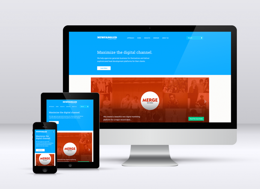
Our basic positioning info is going to visible above just about any fold, and there’s clearly more content below to scroll down and see.
Then, give the user a reason to scroll down — make sure there’s more content at least somewhat visible that helps support your basic positioning info below. While it’s really important to make sure that your positioning info is completely visible, it’s also worth making sure that something else is visible below, so the user is encouraged to scroll to see more. We see a lot of sites these days that put a huge focus on the positioning info up top, to the point where it completely fills your screen, no matter the size. An arrow icon indicating that you should scroll down does not count as a compelling reason to scroll.
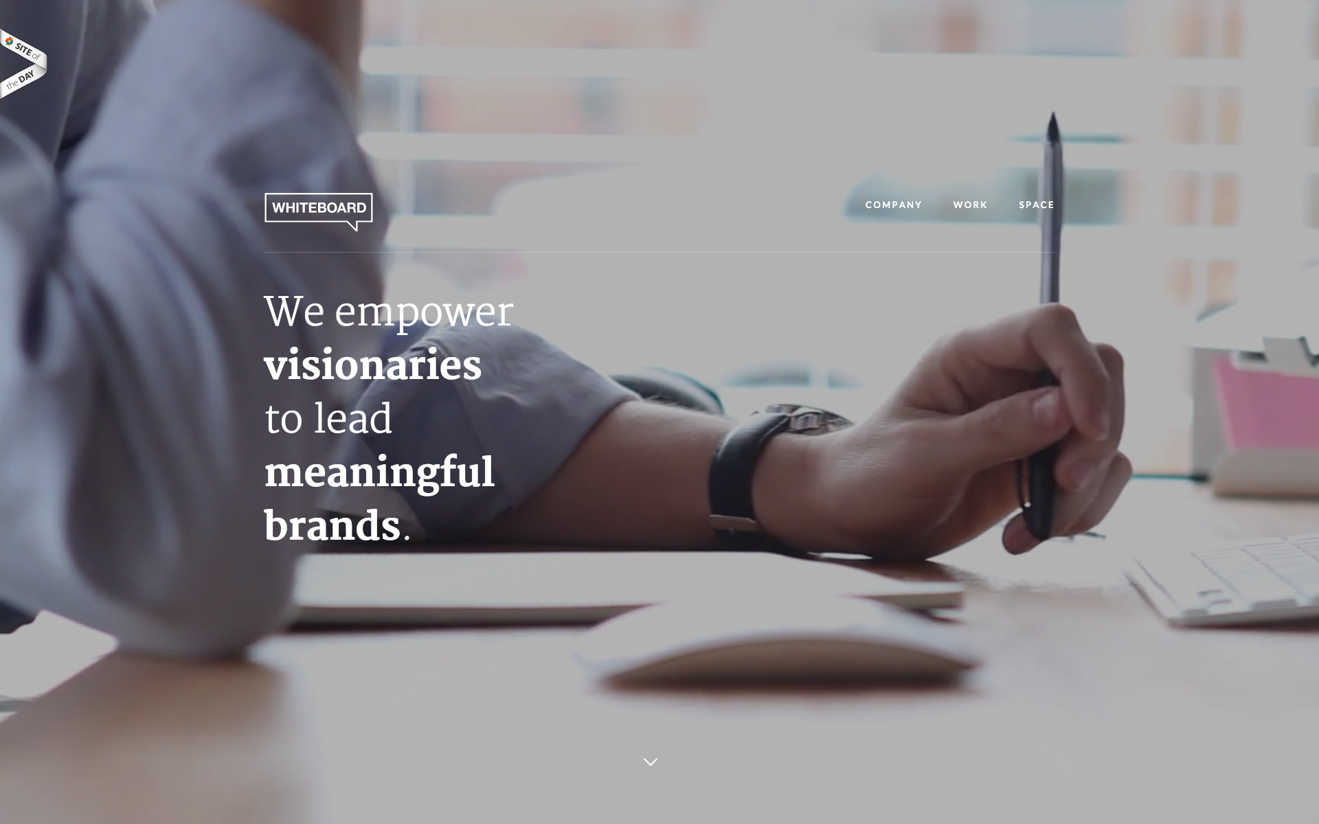
The positioning is good here (albeit a little vague about what they actually do), but because the image adapts to fill my screen no matter what size, it’s not clear that there even is anything below the fold. There’s a subtle arrow icon, but that’s not convincing me to do anything!
The opposite is also important: Don’t get caught in the trap of trying to squeeze more things to fit above the fold. We’ve all seen sites where there’s a ton of stuff all jammed up at the top of the homepage in an attempt to please all of the organization’s stakeholders, and it really never works. The basic positioning content isn’t clear, and all of the messages have less weight as a result of it. It’s a similar reason why homepage carousels aren’t all that useful.
Show your focus, your positioning, your discipline and your taste right up top. As much as I hesitate to use another newspaper metaphor: Don’t bury the lede. There’s plenty of room to get deep, to get creative, to show off unique ideas later, but you absolutely need to make sure that the area above the fold is extremely clear and gives users a reason to scroll. They won’t scroll down for any reason other than that you’ve effectively stated your case, so do it clearly, cleanly and concisely right from the top. There’s plenty of room on any screen size to do that.