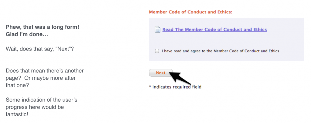
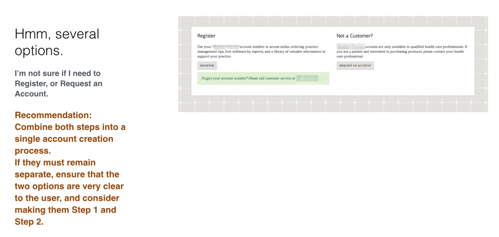
In recent months, we’ve began introducing a new tool to the very early planning stages of Newfangled’s process in certain cases. It’s called user onboarding analysis: a way of documenting the full process users go through when there’s a complex initial point of engagement, such as creating an account. It’s not applicable to every project we take on, but when it is, it’s a tremendously useful tool for focusing on user experience from the get-go.
User onboarding analysis gives you a better view of what the current onboarding experience is like when you’re beginning the process of redesigning it. It can give designers (and anyone else involved in the planning stages, like client stakeholders) a view of what it’s like to sign up for their service right now. It’s not meant to supplant user testing or A/B testing, but it can help you determine what things you should be scrutinizing in that sort of testing later on, places where the user experience of creating an account may have become challenging or frustrating, as well as where it may be currently working really well. This type of tool has been around for a while in the mobile app world, popularized by Samuel Hulick of useronboard.com with his thorough teardowns of popular apps.
The entire process of creating an onboarding analysis is to go through the sign-up process yourself and document every single step with screen captures and notes about what you were doing and thinking. The end product is typically a presentation of the experience, with a slide deck showcasing what the user is seeing. Recommendations for changes are typically presented in context; you get to show the where and why of every suggested improvement.

This allows you to share the experience with organizational stakeholders who may not have gone through that process themselves in quite a while. Walking clients through the current process of signing up for their service can be awkward, even if there’s already a pretty solid UX in place. Remember that you’re doing a very thorough and (relatively) objective critique of something they spent a lot of time and money to build. Your goal here is to build consensus around your recommendations for improvements — a good analysis deck can bring your audience to the same conclusions in real time.
Tips and tricks for good user onboarding analysis
When doing the analysis itself, you’re playing two parts: extremely persistent user who will complete the sign-up process no matter what, and expert usability consultant. These don’t have to be contradictory: As you’re going through the process of signing up for the service, take extensive notes about what you did, and why.
When preparing one of these reports, you simply go through the process all the way to the end, even if you really want to abandon it. Take a screenshot and notes for every single step, draw arrows or circles on the screenshots to note where you’re focusing, and you describe with your notes what you’re doing and what you’re thinking for every step.
Note any annoyances, bright spots and real-life interruptions that came up (if a phone call derails the process even when you’re committed to finishing it, imagine what that means for users that aren’t so committed). All you’re doing at this point is telling the story of what happened when you signed up. Quick tip: Make sure all your screenshots are the same size and aspect ratio, and crop them in a uniform way. It’s best to keep the browser window at a consistent size and take full-window screencaps.

Then when you’re preparing the presentation and your recommendations for changes, put on your UX expert hat. It’s as important to identify the parts that are working well as it is to find things that need improvement. You’re not just looking for problems to correct, you’re also looking for the parts that should be left alone! I’d also recommend that you collect all the best-practice recommendations that you’re offering in context and put them together in a final few slides or a separate document for the client (and yourself) to refer to later on.
UX principles that inform a great onboarding experience
As for the actual analysis, here are a few UX principles that can help guide a better onboarding experience. Keep in mind that these aren’t always applicable, nor is this list exhaustive, but these things will help you examine the user onboarding process:
- The more information you ask for, the less likely users are to complete the signup process (especially if that specific info seems unnecessary or intrusive to the user). The only way to know for sure if the field asking for the user’s Social Security Number is the culprit for a low conversion rate is to A/B test it.
- When collecting information, do so in a way that makes sense to the user. For example, don’t ask for their address until it becomes clear that you need to ship them something. Remember, the only reason they’re signing up for your product is to serve some need they have, so make your questions obviously tailored to reinforce their central position.
- For questions the user might have objections to, address those objections right when they arise. On a username field, a contextual hint that says “you can always change this later” helps address the user’s concerns that they’re locked into a silly screen name they thought of on the spot. Likewise, when requesting private info that people might not be happy to give, tell them the (true) reason that you need it from them, and what you’ll do with it.
- Avoid distracting the user. You only give them chances to wander away from the signup process with related content, additional calls-to-action, pop-up/over/unders, or modal dialogs with multiple options.
- Give the user a sense of how long the process is, and how much “work” they have left to do before it’s over. Don’t forget that filling out web forms is nobody’s idea of a good time, and it’s easier to push through when you know just how finite the whole ordeal will be.
- Think about ways to keep from completely losing the people who do abandon the process partway through. If you ask for an email address at the beginning, you always have the option to reach out later on.
- Tailor the experience as much as you can. If it’s a really complicated process, or your product has a lot of configuration options that you’re taking the user through, find questions at the beginning that will help identify power users and less experienced users, and fork the whole onboarding process in a way that will better speak to each group.
When onboarding analysis is useful
Where we’ve found the greatest value in user onboarding analysis is looking at sites where the website itself is the primary thing that users interact with. For most lead-generation sites, user onboarding may not be the right tool for discovering usability problems, since the main goal of these sites is to progressively build a profile of sales-qualified leads and get that info to the people in the organization who can close those sales. These types of interactions are typically shorter and have a less predictable path; account creation often only has one or two start-to-finish pathways to follow.
User onboarding analysis is absolutely essential if you’re building an ecommerce platform or a professional organization platform. On sites like these, the user is likely to create an account and get acclimated to the site without a human emissary — the process needs to be as smooth as possible to make sure you’re not giving potential users any excuse to walk away from completing it. Our biggest enemy here is entropy, in the form of the user abandoning the process partway through.
Pitfalls and drawbacks
It’s worth noting that onboarding analysis doesn’t really concern itself with why the user was convinced to sign up or convert; this process is just interested in the mechanics of what it’s like for a user to do so. As a result, this type of analysis won’t tell us anything about usability issues when attracting users, informing them, or winning them over with your content.
It’s also not based on user testing, which means a few things:
- It’s based on expertise rather than collected data, so it will always be colored by unconscious biases and assumptions about how users react to various things.
- It won’t catch all the usability issues that are present.
Both of these things are OK! This is meant to be a quick and somewhat dirty method of determining the overall state things are in before doing the hard work of redesigning. A good onboarding analysis can help you do a few things:
- Determine specific goals for the changes you’ll be making
- Identify the specific variables that should be subjected to more rigorous research (like A/B testing) later on.
It’s not scientific, and it doesn’t have statistical validity or reliability, and that’s completely fine. It’s cheaper and less complex than user testing and works really well when paired with standard user testing later on, after you’ve built (or at least planned and mocked up) the new version. Use the more complex multiuser-research model to check the product you have made for problems, and revise from there. Use onboarding analysis to look for the types of issues you’ll want to focus on, and figure a good pathway forward.