
I’ve read plenty of interesting analogies used to explain what building a website is like. I’ve even written a few myself. From various points of view, a website could be compared to a car, a house, a cellphone, a movie, or all kinds of other things. I’ve even heard a website compared to a clown (don’t ask)! Most of the time, these analogies are striving to find the most effective way of emphasizing the time, cost, complexity or purpose of a website project. Rather than construct yet another metaphor around that point, I’m just going to come right out and say it: Building a website is a complex task that takes a lot of time and costs a lot of money. But that’s not the really interesting part, is it?
The really interesting part is how it gets done. Think about some of the analogies I listed–a car, a house, or a movie. Each of these is obviously the result of a long, costly, and complex process. But a striking difference is where a car, house, or movie can be made with almost no direct input from the consumer, a good website cannot be built without significant involvement from the client throughout the project. It’s this difference that makes it so critical that anyone anticipating a web project be well versed in the process.
Over the next two articles, I want to show you what it takes to build a new website. This month, I’ll cover the planning, design, development and quality assurance stages of a project, focusing on how it all comes together through the work of developers like us and the people we work with.
In last month’s article, I reviewed ten questions that you should ask if you are planning ahead for a web development project–the kind of questions that are necessary to at least consider, if not answer, before you engage an interactive firm officially. That kind of planning is a bit different from the initial planning phase of a web development project, the type of planning I’ll be discussing in this article.
The planning phase of an active web development project primarily involves two endeavors: creating personas upon which to base the structure and purpose of the website, and planning the site’s information architecture and functionality with an interactive prototype.
Web Personas
Steve Mulder, author of The User is Always Right, defines a web persona as a “realistic personality profile that represents a significant group of your website’s users.” Though creating consumer personas has been a common marketing practice for decades, applying the same principles to web planning has been often overlooked. Without going through the process of web persona development, we’re much more prone to making guesses (at best) or assumptions (at worst) about who our prospects are. In most cases, our guessed or assumed prospects will really look more like us than anyone else. Creating web personas prevents us from mistakenly building websites for ourselves rather than those we want to serve.
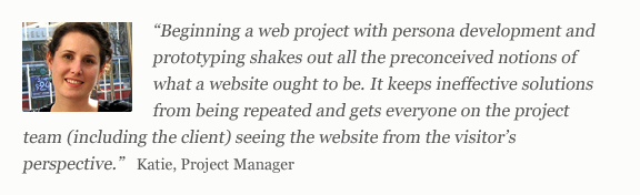
We recommend creating 3-5 web personas, focusing on a qualitative assessment–akin to creating a story about your persona–rather than a quantitative one which results in a large and often unnecessarily peripheral data set. From start to finish, a qualitative approach will probably take you 2-4 weeks, whereas a quantitative approach could easily take twice that amount of time without representing a significant value gain to you in this planning process.

Creating web personas involves a four-step process of research, segmentation, creation and testing. To properly research personas, you’ll want to conduct one-on-one phone interviews with a group of active and valued clients as well as prospects familiar with you or your firm. Have another person on the call with you to listen and take notes so you can focus on having a natural conversation that covers the goals, attitudes and behaviors of your interviewee. Once you’ve completed your interviews, you’ll want to translate your interviewees into 3-5 segments. Segmenting personas is an intuitive, rather than scientific, process that generalizes your personas and qualifies them for uniqueness, realism, describability, user-base coverage, and influence upon the decisions you will make about your website during prototyping.
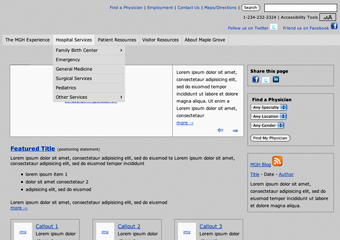
The persona documents you create (like the one shown above) should include basic identifiers, like a name, description, and photo of a representative user. Rather than referring to your personas by actual names from your interviewee pool, refer to them based upon their description (i.e. the “analytical influencer”). Your persona profiles should also include a longer description that focuses on what that person values and the way they make decisions as well as some personal information. Precision here is more important than accuracy. In other words, a realistic description is more important to your decision making than whether the description actually applies to the person upon whom you’ve based your persona. Finally, to test your personas, use and act out decision-making scenarios. A basic testing scenario might start with a search engine query for a description of your service or product (no specific names, though–we’re acting as people who don’t yet know about your firm) and follow the path from landing on your site’s homepage to finding a low level detail page and responding to a call to action. If you construct your site to allow for this kind of procedure, you’ll make better choices as to the types of content and calls to action that would be available based upon your personas.
For a more in-depth look at web persona development, download our webinar on Using Personas to Build Better Websites. You’ll learn the details of how to research, segment, test and implement your web personas.

Website Prototyping
In the early days of the web, the standard way of planning website information architecture and page layouts was to create wireframes–symbol-based static illustrations of how a website will look. The problem with this approach is that wireframes attempted to communicate a complex system that responds to user feedback using paper! Everything changes once you actually start interacting with a website, which meant that most of the decisions that were thought to have been resolved during wireframing had to be revisited with the actual site.
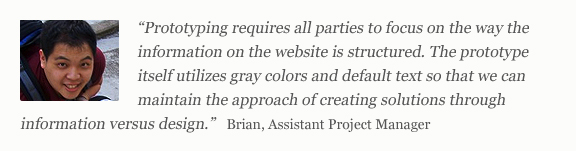
Our solution to this, which we put in to practice ten years ago, was to build interactive wireframes. Actually, calling them wireframes at all is a misnomer; we call them Grayscreen Prototypes.
Interactive prototypes are a full representation of how the website will work, from the big picture structure represented in the various navigation systems to the granular business logic of individual pages. Every screen or function on the final site should be represented in the prototype. While an interactive prototype would not be built on an actual database, as the final site obviously would, complex functionality such as advanced search tools, data filtration, forms, galleries and the like would be represented. The prototype itself, along with the many on-page annotations added throughout the process, becomes a functional spec for our design and development teams moving forward and a comprehensive documentation of the scope of work agreed upon by the entire team.
An efficient prototyping process should take roughly one month. Our model establishes a fast-paced routine of several meetings per week with the client, first addressing the larger structural decisions and working toward approval after the resolution of issues of finer detail. This “narrowing-funnel” of decision making is an effective model to follow for the visual design phase, as well. Incidentally, we intentionally keep our prototypes unstyled so that we don’t confuse decisions involving information and functionality with those that involve design. Design, which we’ll explore next, is very much its own process.
Design for the web involves much more than simply styling what has been prototyped with images, colors and fonts. It is also more than selecting a fashionable template that fits with current visual web trends. Design is a process that continues to build upon decisions made in the prototype, focusing on how the visual presentation reinforces the purpose of the website while also clearly communicating the character of the brand. Beginning with a discovery stage that combines the personas created in planning with other critical information, like existing brand standards and marketing campaigns, positioning documentation, and other feedback we gather, the design phase then proceeds with the creation of mood boards and lastly, the template-specific layouts.
Website Mood Boards
Creating mood boards for the web is like visual prototyping. Like traditional mood boards, web mood boards compile inspirational elements, color palette, typography and texture in a context that emulates the screen but is not page-template-specific.
At this stage in the design process, it is more important to make bigger-picture design decisions than to consider how specific pages of the website will look, down to the pixel. In other words, mood boards establish a site’s look and feel in the same way that a brand standards document specifies how a brand is represented in various contexts. Rather than including the actual layout of a products list page, it will specify which type styles, sizes and edge treatment of images, and other details, such as buttons and spacing, are used in lists throughout the site. Once the mood boards are approved, the design of site page templates is a much more efficient process since the more personal issues that tend to stall design decision making have already been made.
Because the mood board is not concerned with specific page template layouts, it can be developed concurrently with the prototype. This keeps design-related discussions from interfering with the prototyping process, but also engages the client in design thinking early in the process. Being able to see the look and feel take shape this early is often encouraging and motivating to the client–a good thing since maintaining pace is critical to keeping the design phase on schedule and budget.
The Narrowing Funnel of Decision-Making
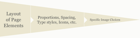
Like any other design process, foundational decisions support and enable other, more detail-oriented decisions. Since the mood board has already worked out the valuable thinking that goes into the design, the subsequent articulation of that design can be a much more streamlined process. Beginning with the basic arrangement of elements within the layout, decisions in this phase should become more narrow and focused, ending with less consequential issues, like what particular stock image is used in a promotional area far down the page.
Violating this funnel can be quite costly. If the entire color scheme is called into question several weeks into the design of page layouts, or even after the mood board has been approved, the entire team would have to consider the cost (in time and resources) of going back to the start of the process. Something so foundational will naturally have a broad, sweeping impact upon other design decisions, which, in and of themselves, are less significant.
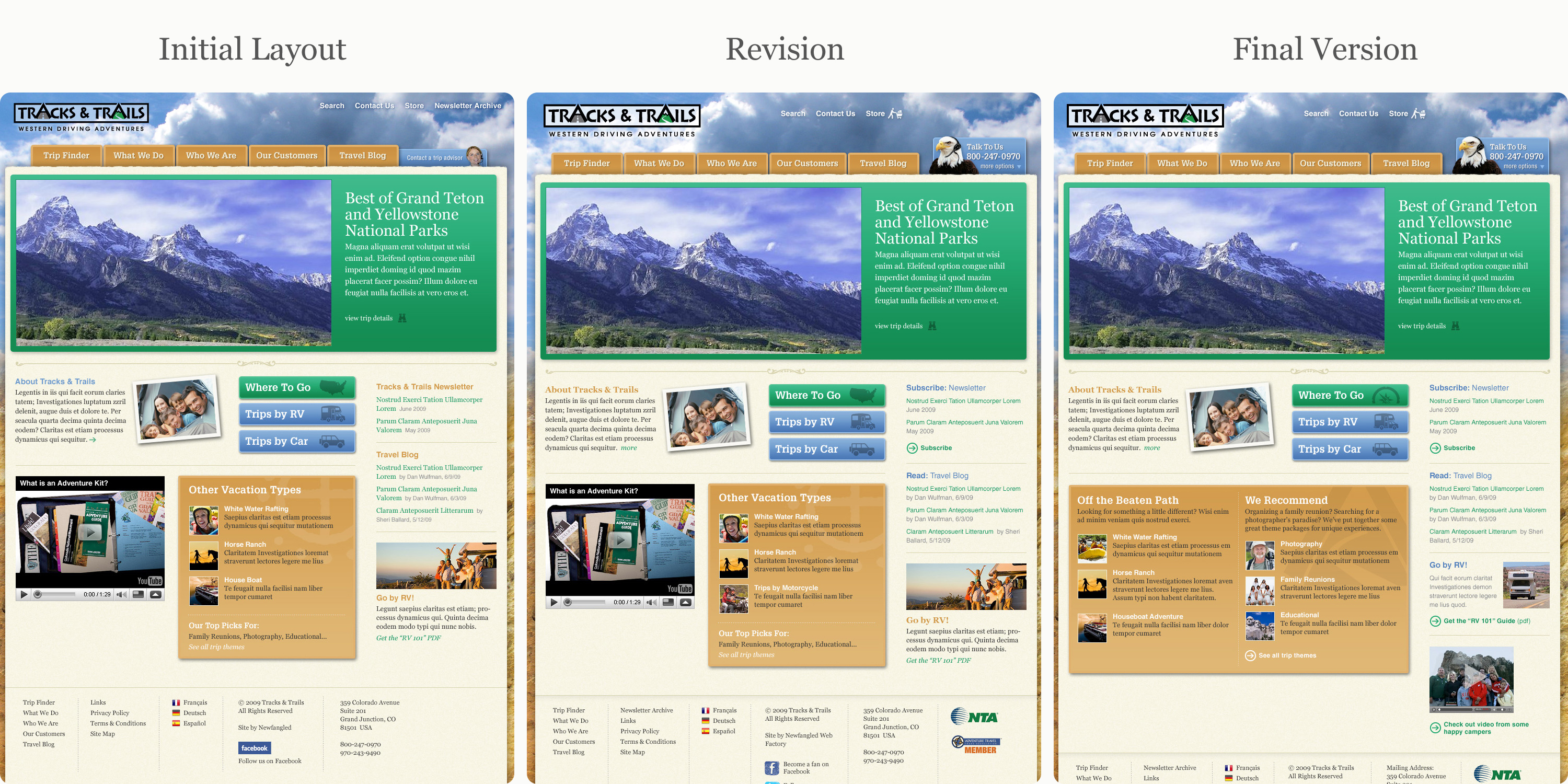
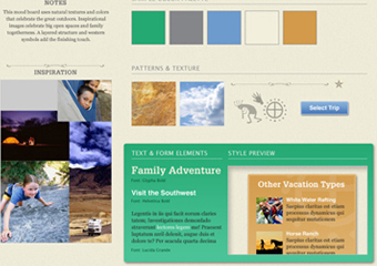
In this example (click image to enlarge), 3 versions of the homepage we designed for Tracks & Trails are represented. At first glance, all three look quite similar. However, first revision contains changes in proportion, specific type styles and icons used, the location of the global navigation, and the logo. In the final version, the size of the “vacation types” box changed, as did some of the specific images used in promotional content areas.

Before the layout design process is complete, it’s important to do one last review to make sure there are no remaining inconsistencies with the prototype, that the correct fonts are embedded, and that any stock imagery used has been accounted for and purchased. Once the design is approved, the designer can pass them (ideally, in layered and labeled Photoshop documents) on to the developer to apply to the site, which should already be in progress.
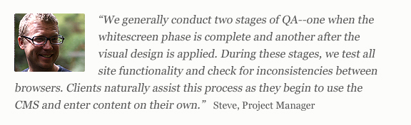
Once the prototype has been approved, the developers have all they need to begin building the actual website. The development process consists of constructing a database integrated with a content management system (we use our own NewfangledCMS), creating the site’s structure and unique page templates, which we call the “whitescreen,” and then applying the final visual design to the site.
Programming with PHP
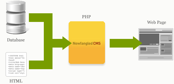
Our developers program in PHP, an open-source language created especially for web development. What it basically does is process the raw data that sits in a website’s database and matches it with the correct HTML for the page template it belongs on, producing the web page as we know it. As the diagram below indicates, the PHP exists within the CMS, executing scripts that are written to produce specific results.
An example of how this works is just one click away. The page you are viewing right now displays only some of the content associated with this article. Our CMS defines this page as only a portion of a type of content called “newsletter” and serves up the rest of the content as you navigate the various parts by clicking the “In this Newsletter” menu at the top of this page. But, if you click on the link that reads, “View on single page,” a script will execute to reconfigure the data associated with this content type and spit it back out so that all five sections display on one page. This kind of communication between the CMS and the database happens on every page of a website, which underscores how important the prototype is in describing to the developer how each page is intended to function.
Building the Whitescreen
Just as we separate prototyping and design as distinct processes, we isolate the programming of the website from the application of the visual design. This allows the developer to focus on the logic of how a site operates before worrying about how the site actually looks.
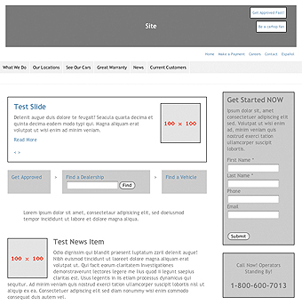
As a new site is being built, it looks just like the image to the left. We call this the “whitescreen.” While similar to the prototype–in that no visual design has been applied yet–the whitescreen actually works. Remember the simple diagram above? Well, the developer defines every type of content (i.e. products, articles, blogs, whitepapers, etc.) as unique records in the database. Each content type’s record will be defined by various variables, like its title, abstract, main content, images, etc. Then, the developer configures the main templates to retrieve that content as needed.
The whitescreen homepage at the left is a good example of how retrieval works. At the top of the page, a “test slide” is displaying. In this site’s database, a “slide” is particular type of content that, in addition to having a main image, has a title, a description, and links to another page on the site. However, the homepage has been designed to display an interactive slideshow that allows the user to browse through all the slides. This is achieved by the CMS, which runs a script to retrieve each “slide” record in the database and place it in the page. Now, the user can use the arrow buttons to view multiple slides without having to refresh the page.
When I said that the whitescreen actually works, I meant that literally. Because the site is so thoroughly integrated with the CMS, we can actually train our clients in how to use their site before the visual design is applied. In fact, that test content you see in the example above was entered by the developer using the CMS in the same way the client would. Giving the client access to the site once the whitescreen is complete can sometimes be a great way to maximize the amount of time they have available for content entry–something we’ll discuss in next month’s article.
Applying the Design
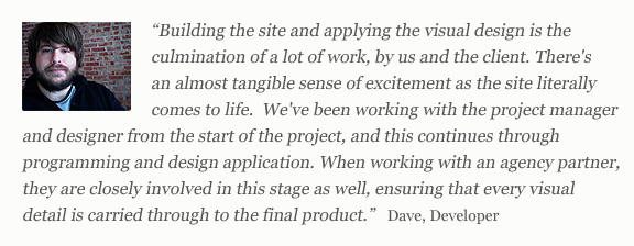
As Dave’s quote above says so well, excitement really does build as the website takes shape–particularly when the visual design is applied. Because the client has already been working with their site, they’ve been well trained to see it as an interactive vehicle for content, not a slick, two-dimensional presentation. But that doesn’t mean that applying the design is simply decoration.
The design is a critical component of the website’s ability to properly communicate its content. It sets the tone and gives voice to a brand speaking to a wide audience across the web. Because the structure and logic of the site has already been worked out during the whitescreen stage, the developer can focus solely on the visual detail and interactive effects that enable the website’s voice during design application.
The developer refers to the Photoshop document (PSD) created by the designer, which contains every image, color, and typeface used in the design. The designer also provides a stylesheet which specifies the specific colors, sizes, and weights of various text styles that will be used repeatedly throughout the site (i.e. headlines, subheadlines, link styles, etc.). With all this information, the developer can create cascading style sheets (CSS) that the site templates are matched with in order to display according to the design. With one master CSS and others related to unique templates, any future changes to the style of the site only need to be made in one place.

Once the design and development work is complete, it needs to be checked out thoroughly to make sure everything works properly and looks as it was intended to…
Quality Assurance (QA), according to the online Project Management glossary, is defined as “a planned and systematic pattern of all actions necessary to provide adequate confidence that the item or product conforms to established technical requirements.” In other words, QA is a standardized method that ensures that everything works as it was intended to work and looks as it was intended to look. QA for the web should include an initial site-specific test plan, a round of browser testing, and a generous integration phase during which the client can evaluate functionality while entering content.

Quality Assurance Test Plans
Every website built around a content management system (CMS) will have a significant amount of common functionality that will require testing. This kind of general evaluation might include anything from testing the CMS login to exporting website form data, but is not primarily concerned with how things appear visually. Of course, if something is radically out of place visually, it should be noted. However long the testing list, this first step should be to identify any flaws in the standard operation of the site and CMS and can probably be performed once the whitescreen is complete and before design application has occurred.
The second step is to evaluate functionality specific to the website. Again, this stage is less concerned with how things appear visually than with how things operate. For example, an e-commerce website’s store should be thoroughly tested with every relevant combination of products, accessories, and discount codes to make sure that even the most minor variable isn’t overlooked. A site with a large content database that relies heavily upon an advanced search tool should be tested by running a large number of various search queries. A site with complex form options should have many test form submissions sent covering all options and combination of options, and so on. While the test plan should be drawn up by the team–naturally, those most familiar with how the site is intended to function–the person performing the test plan should be someone familiar with the technology, process, and purpose of QA, but new to the particular project being tested. Even if you don’t have a dedicated QA role, you should endeavor to have fresh eyes on the site for this stage of QA.
Browser Testing
Realistically, there is going to be some overlap between the test plan and browser testing. Common site functions, like form submissions, for example, can have unpredictable issues in different browsers. But once the site functionality has been thoroughly vetted, the site needs to be tested, page by page, in every browser you officially support.
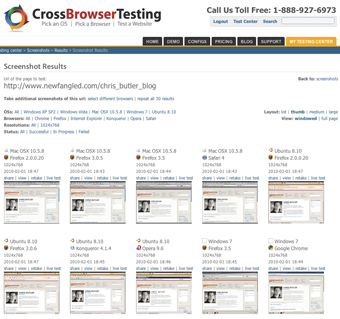
Browser testing can be done in a variety of ways, including running multiple physical machines, running virtual machines locally, running a centralized virtual machine server, or using a third-party testing service. We’ve been experimenting with using CrossBrowserTesting.com, which can test browser performance and some interactive functionality for any URL you submit. It can even generate screenshots of any URL in every current browser simultaneously (I ran this test on my blog page, which you can see in the image above). Plans range from as low as $19.95 per month to as high as $199.95 per month, but the value of being able to quickly check against the particularities of multiple browsers is well worth the cost.
By the way, despite being nine years old and out of compliance with today’s web standards, Internet Explorer 6 is still being used by a considerable portion of the population. While tools like CrossBrowserTesting.com make it easy to check out how a website looks in IE 6, they don’t change the fact that it often requires a lot of extra effort to make a current site look and function correctly in it. At this point, it doesn’t make much sense to do more than ensure that websites degrade well to IE 6; guaranteeing perfect performance in it is a losing battle. Even our site isn’t perfect in IE 6!
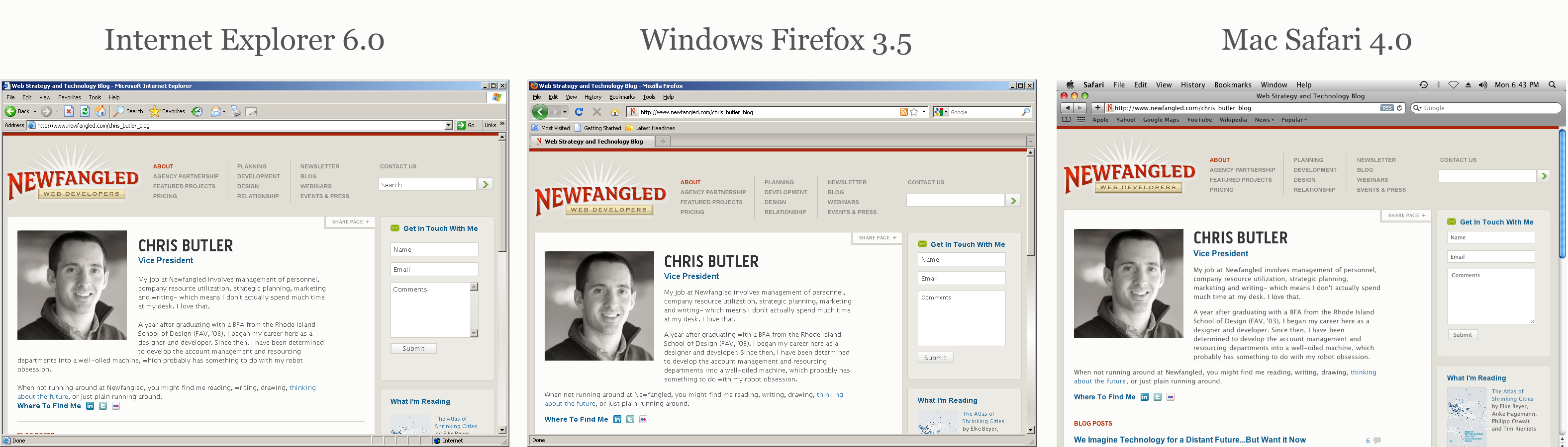
These screenshots of my blog page (click image to enlarge) were automatically generated by CrossBrowserTesting.com. At first glance, they look pretty close, but there are some slight spacing differences in the page as viewed by Internet Explorer 6.0.
Integration is QA
Once the test plan is complete, the site is probably ready for content entry (we’ll cover this a bit more in next month’s article). Remember, this often happens before the design has been applied, so it’s important that the client is prepared to see and use a work in progress. Though it’s not officially considered a QA method, I believe that content entry, or integration, is one of the most effective and important QA efforts for any project.
Typically, integration is the point in a project when a client is able to fully experience the reality of their site for the first time. While they have worked closely with the team on prototyping and design, the process of using the CMS to create and enter content is when all the “dots” are connected and made real, and often the first point at which expectations are clarified. With that in mind, here’s some straight talk:
No matter how thorough the prototype is, sometimes there are concepts or needs that cannot be communicated until you are immersed in an actual working and producing environment. This is similar to the “blank-slate-shopper” phenomenon: Have you ever seen a review of a book and thought that you’d like to purchase it, only to find that the next time you are actually in a bookstore you have no idea what you want or where to start? This is because we tend towards reactive rather than proactive thinking. We hear about a book and react to it with, “Yes, I’d like to read that,” yet when we get to the store and are surrounded by thousands of books, we react to them all by drawing a blank. In web development, things are reversed a bit. Prototyping can be like the store, offering lots of attractive options unrefined by the future reality of how a site will be used. “Yes, I’d like my site to do that!” But integration will always catch the flaws in a site, be they many or few, because users will quickly react when they can’t do what they expected to be able to. “Sure, the slideshow is nice, but I need to change the address in the footer!”
Finally, QA does not ensure that a project will be 100% bug free. While some bugs are due to sloppiness or haste and can be quickly identified by QA, others are the result of unforeseen functionality conflicts that may not become evident until a site has been used for a while–despite the best intentions and foresight of the team. As with any development project, bugs like these should be expected and encountered with patience. (Need I remind you of how buggy some expensive operating systems are when they launch?) While we hope that the various steps of QA will mitigate the frequency of any bugs occurring, we are definitely not surprised when they show up.
Coming Up in Part 2…
It’s not done yet! Next month, we’ll look at the last two steps of a web project, content entry and going live. Once a site is live, it begins its real life, so we’ll also cover content strategy and nurturing for the future of a website.