
My first Interaction column for Print Magazine is now out in the June issue! (Hi, Mom!)
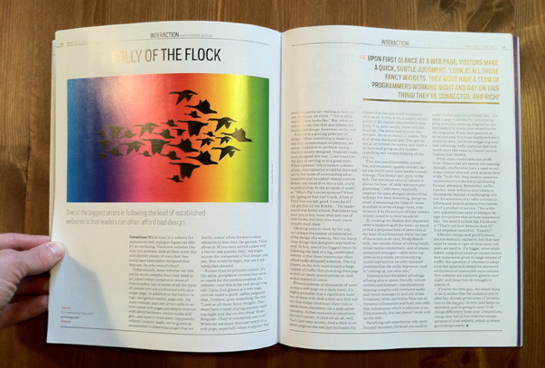
After a long search—it’s tough to find design magazines in my neck of the woods—I was able to pick up a copy and take a close look at it. I’m of course proud of the article, and very thankful for the opportunity to write for the same design magazine that inspired me so much as a student at RISD. I am also pretty excited about the illustration that Jennifer Daniel created to accompany the piece—it’s very cool! I hope you’ll be able to see the printed version at some point, but in the meantime, the editors at Print have graciously ok’ed me republishing the text of the article here. Enjoy!

Sometimes I’ll just stare at a website for minutes on end, trying to figure out why it’s so confusing. You know websites like this; you probably look at them every day and identify plenty of ways that they could have been better designed than they are. So, why weren’t they?
Unfortunately, most websites we visit are far more complex than they need to be. I don’t mean complex in terms of functionality, but in terms of the content you are confronted with on a single page. In addition to the basics—a logo, navigation menus, page title, the main content, and one or two calls to action—most web pages are simply overrun with advertisements, social media widgets, and lures to even more (supposedly related) content. Sadly, we’ve grown so accustomed to these busy pages that we hardly notice when the main course amounts to less than the garnish. If you were served a plate with a two-to-one parsley ratio, you might accuse the restaurant of bad design (and yes, that would be legit), but you’d definitely feel cheated.
Rather than its primary content, it’s the extra, peripheral content that tends to vouch for the professionalism of a website—this is the real design tragedy. Upon first glance at a page, visitors make a quick, subtle judgement that, I believe, goes something like this: “Look at all those fancy widgets. They must have a team of programmers working night and day on this thing! Woah, Bing ads. They’re connected, and rich!” When we see more than just words on a web page, especially when it appears that multiple parties are making a claim to our attention, we think, “This is what real business looks like.” But, when everyone thinks like that and follows the leader, bad design flourishes on the web.
Purpose is a guiding principle of design. When something is made in a way that compromises its purpose, we sense, and have no problem saying, that it is badly designed. Suppose books were designed this way. Gone would be the days of settling in to a good story: When squeezed into a narrow column of text, that narrative would be drowned out by the noise of surrounding advertisements and so-called related content. Before you could dive into a tale, you’d be pulled away by the promise of another. “Who’s Pip’s secret sponsor? When am I going to find out? Oooh, A Tale of Two Cities sounds good. I wonder if I can get that on my Kindle..?” No reader would ever finish a book. Publishers may want you to buy more than just one of their books, but they also want you to actually read them.
Allowing users to read, by the way, isn’t always the central consideration of the design of a website. Nor are many other things that designers may hold sacred. In fact, one of the biggest errors in following the lead of a big, established website is that the leaders often can afford badly designed websites. The big players on the web receive such a large volume of traffic that crowding their pages with as many opportunities to click makes statistical sense.
When hundreds of thousands of users access a web page on a daily basis, it’s highly probable that a significant number of them will click a link (any link will do) that either continues their visit or sends them elsewhere via a paid advertisement. Either scenario is valuable to the site’s owner. A click on an ad, well that’s just easy money. And a click to another page on the site just increases the chance that the visitor will eventually click an ad. At this level, it simply doesn’t matter if the visitor’s experience is satisfying. It is, quite simply, about volume, that’s all. The more visitors a site like this gets, the more money it makes. This is shock and awe. The special ops go on behind the scenes, and there’s no hero stuff going on. It’s number-crunching and content farming all the way up.
It may sound cynical, but quality couldn’t factor any less in most mass-media content strategy. This isn’t just true on the web. The statistical value of volume is the heart of cable television programming, as well. Cable news, especially, employs the same shotgun tactics of the websites I’ve been describing, except instead of measuring the value of viewer attention in terms of pageviews, they measure it by the amount of time viewers remain dialed in to their broadcast.
By creating the illusion that important news is happening all the time—so much so that a perpetual feed of news runs at the base of any broadcast while the rest of the screen is divided, Brady Bunch style, into smaller boxes of talking heads, social media commentary, and of course, sponsored messages—cable news captures us in a steady yet unsatisfying trance and leads us on with repeated promises that the really important stuff is “coming up, just after this.”
Television has the added advantage of being able to speak, literally, to both viewers and listeners, simultaneously weaving complex and unrelated audio and visual messages in and out of the broadcast, while our brains filter out only the information that is relevant to us. Unfortunately, that just doesn’t work well on the web.
Satisfying web experiences rely upon focused attention, the kind you need in order to read and comprehend text. The more a page is divided by non-overlapping, attention-seeking magisteria, the less likely it is to win your attention for the long-term. If you were granted an all-access pass to a mass-media website’s analytics data, you’d see staggering numbers reflecting traffic patterns that look much more like visits to Grand Central Station than the MoMA.
While mass media sites can profit from visitors that are mostly just passing through, smaller sites need to cultivate visitors who will stay a while. To do this, they need to create an environment conducive to cultivating focused attention. Remember, unlike Gawker.com, most websites aren’t ends in themselves; instead of exchanging content for attention, they offer content to inform and inspire prospective customers of a product or service. This is the very argument you need to bring to design discussions that include statements like, “we need it to look like Facebook,” or “that’s not how Amazon does it.” Your response should be, “Exactly!”
Effective design and good business are not mutually exclusive, but that case must be made in light of what most web users are used to. If a bigger, more established competitor employs certain tactics that make sense given their large volume of traffic, the question of whether to adopt a similar approach should be answered on the basis of reasonable expectations. Few websites see explosive growth overnight, and those that do struggle to sustain it.
If you’re the little guy, the smart thing to do is realize that the audience you’re after has already given some of its attention to the big guy. To win (and keep) their attention, you’re going to need to do things differently from your competitors, things that fall in line with the unique purpose of your website, which is where good design starts.