
A little over a year ago (May, 2010), I wrote an article on using advanced measurement techniques to tell the real story of how users engage with your website. There were three main points I wanted to share in it:
- While Google Analytics is a wonderful tool, it is sometimes necessary to extract data from it in order to get a clear picture of what’s really going on.
- Bounce rate, in particular, is a metric made even more confusing by the fact that key reports in Google Analytics display it in a potentially misleading way.
- The value of traffic referrers tends to distribute in a scale of familiarity, with the least familiar yielding less value, but the most familiar not necessarily yielding the most value.
In gathering data for a chapter on measurement in my forthcoming book, Thinking Before Doing, I needed to first update the set I had put together for last year’s article. The data I used in the article represented two years of traffic to our site (from mid 2008 through mid 2010). Surely enough had changed in the last year to merit taking a second look rather than assuming the arguments I made still made sense. I especially was interested in seeing how our top referrers distributed over the familiarity spectrum and whether the observation I’d made back in 2010 was also still accurate. After I compare last year’s data with this year’s, I’ll explain what I mean by the familiarity spectrum and hopefully this will all make sense…
Referral Data in 2010
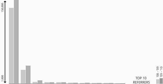
Last year, I gathered the top 10 referrers to our website from the preceding two years and plotted them on the graph above. I didn’t label the individual referrers—the main point was to emphasize the disparity between organic search engine traffic (the big bars on the left) and everything else. I noted the following:
I think the problem with this kind of visualization is pretty clear: because the top contributing referrer (organic search) brings almost 5 times the visitors as the next one (direct visits), the graph portrays the remaining 8 referrers as contributing relatively the same amount of traffic. Consequently, it could be simplified down to direct traffic versus everything else. But that isn’t a very helpful story, especially in light of the fact that despite bringing huge numbers of traffic to our site, organic search performs dismally when it comes to conversions.
So, as long as organic search exceeds all other referrers by such a high number, a straight comparison doesn’t make much sense. The obvious distinguishing factor was conversions—what is the ratio of conversions to traffic referred by each source? My next step was to plot that data out for the same time period, which I did in the graph to the left. Here’s what I wrote about that process last year:
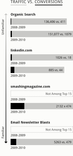
Organic search traffic accounts for the largest portion of incoming traffic, but a comparatively small amount of conversions (.3% in 2008/2009 and .7% in 2009/2010), while LinkedIn brings far fewer visitors but performs much better in terms of conversions (2% last year, 5% this year). But then I noticed something else. Smashing Magazine has referred to us a few times over the past two years—not enough to make the top 15 I pulled in my report last year, but plenty this year—and is proportionately one of our most frequently converted referrers (22%). But our own newsletter blasts, which offer conversion opportunities by linking to upcoming webinars or being forwarded to non-subscribers, fall below Smashing when it comes to conversions (9%). In the grand scheme of things, its performance is still great. I consider anything above 1% as worthwhile. But, it’s less than Smashing despite targeting an audience that is far more familiar with us and what we do than Smashing Magazine’s diverse audience of over 200,000 readers. Why is this?
My conclusion was to invoke the idea of the “familiarity spectrum,” which is indicated by the vertical line on the left of the Traffic vs. Conversions graph. The general idea that emerged was that as familiarity between a referrer and its audience grows, so will the proportion of conversions generated by referred traffic—to a point. Once that familiarity reaches a direct publisher to subscriber proximity, like the relationship between us and our subscribers, the trend begins to reverse itself. It’s a pretty intuitive phenomenon if you don’t think about it too hard—which perhaps is exactly what I’m doing with posts like these—that recommendations from a source to which you are very loyal are likely to prompt action, but the already-converted are less likely to convert again. That’s why Smashing Magazine, which sent us some nice traffic in 2009-2010, had a much higher conversion ratio than our own email campaigns, which also present conversion opportunities to subscribers.
So, what about this year?
Referral Data in 2011
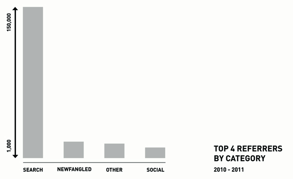
This time around, I tried to consolidate the sources and simplify the visualizations a bit. In the graph above, I’ve again grouped and plotted the top 4 referrers to our site, this time just over the past year. To assemble this data, I first needed to extract a much longer list of about 100 unique referrers from Google Analytics, the number of visits each referred, and the number of those visitors that converted. Once I had the full list, I grouped each entry into one of four categories: Search, which included all the major search engines, Social, which included any website that could be considered a social network (i.e. Facebook, Twitter, LinkedIn, Google+, etc.), Newfangled, which included our own newsletter and blog digest email campaigns, and Other, which included a very long tail of unique websites that linked to us. As the graph makes quite plain, organic search again generated far more traffic than any other category of referral sources. But, just like last time, the graph obscures the really interesting story the data tell.
For your edification, here are the actual numbers for each category:
| Source | Visits | Conversions |
| Search | 150,892 | 1,595 (1%) |
| Newfangled | 10,044 | 806 (8%) |
| Other | 9,704 | 2,856 (29%) |
The Familiarity Spectrum in 2011
Again, just like last time, here’s where things get interesting. For a site like ours, which receives such a large volume of referral traffic from search engines, simply plotting out the top referral sources is pretty much a waste of time. With thousands of pages drawing in thousands of visitors with all kinds of interests, only a very small subset of those visits are likely to be interested in making contact with a web development company. So, it’s no surprise that the percentage of visitors referred by search engines that convert would be low compared to other sources. The principle makes perfect sense when you think about it—and remember, I’m talking about organic search engine traffic here, not pay per click listings—people trust people and people act upon trust.
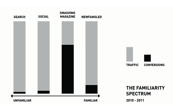
But the astounding thing is the traffic referred from those sites which fall in the Other category, a very long list which spans an equally broad spectrum of activity—a few sites referring very large numbers of visitors, but most referring less than 100 over the course of the year—produced significantly more engagement. As it was in 2010, Smashing Magazine (SmashingMagazine.com) was the elephant in the room. Though I included it in the “Other” category in the Top Referrers graph, I isolated it on the familiarity spectrum because it referred thousands of visitors on it’s own, 74% of which converted in some way. Again, our own email campaigns, which offer conversion opportunities by linking to upcoming webinars or being forwarded to non-subscribers, fall below the Other category when it comes to conversions (8%).
The reason for this seems to be the same this year as it was last year, but much more extremely so. At the top of the familiarity spectrum are those referrers that are the most unfamiliar with their own audience, like search engines. Search engines are robots and though they’re used by millions to find information every day, their “recommendations” drop in value compared to those users receive from other human beings. Social networks, on the other hand, are websites shaped by their users—where proximity in connection tends to increase familiarity. Between Twitter, Facebook, and LinkedIn, Newfangled has several thousand connections, which extends our reach considerably. By sharing information and soliciting feedback over these networks, the familiarity anyone within them will have with my firm will obviously be greater than a searcher referred to us by a search engine, but in many cases, the “connection” is still, for all intents and purposes, a stranger, which places this category next in the spectrum. Smashing Magazine, on the other hand, has a different kind of connection with its readers, one strengthened by brand-loyalty. Like any popular publication, Smashing’s readers trust them to give valuable information and recommendations and are likely to act in response. This is evident from the participation level of the readers on Smashing’s own site, and from the value of the traffic we’ve received from them—the familiarity here is what keeps the magazine afloat. Thus, Smashing Magazine represents the Other category next on the spectrum. But at the most familiar end of the spectrum is our own subscriber base, who are as engaged with us as anyone could be without being a client or employee. They already converted in the past—when they signed up to receive our emails—and it’s going to take a bit more for them to convert again.
Think about it this way: given the choice of professional recommendations from a robot, a stranger, the President, or your grandmother, which one are you likely to act upon? Sometimes closeness doesn’t equal priority!
As these visualizations demonstrate, referral traffic is one of the most important sources of data that you have available within the analytics environment. Beyond the inclination to be gratified when someone else links to you, studying referral traffic will yield a deep understanding of the rich ecosystem in which your website exists. Look at your own referrers. You’ve probably got some robot-referred activity (Search), some less-than-familiar social network stuff (Twitter, Facebook, LinkedIn, etc.), and probably even some from your own marketing initiatives, like email campaigns. But what about more influential recommendations? You may not be able to get a nod from the President, but I’m sure there are influencers within your network that would love to point people your way. If you haven’t done so already, seek them out. Don’t ask for links. Instead, build a relationship with them so that the referral is implicit in all kinds of activity between you, whether that be within social networks, participation in blog conversations, or something else. You may even be able to deepen that relationship by writing articles or creating other content for them on their turf. But don’t expect to re-convert the already converted—those who already subscribe to your content or have engaged with you in some other way. Focus your efforts on spreading new seed, in the most fertile ground you can find. The “sweet spot” of the familiarity spectrum is going to be just shy of the most familiar audience you have, probably among those connected strongly to an influencer with whom you could build a strong, mutually-beneficial relationship. Looking closely at your conversion data, using the techniques I have described in this post and last year’s article, should help you to pinpoint who that might be.
Related Posts
-


Chris Butler presented on "You, the Other Kind of Business Leader"...
-

Christopher Butler will be a keynote speaker at the 2015 ConvergeSE conference...
-

Chris Butler participated in a moderated discussion on rethinking entrepreneurship...