
The sites through which we mostly experience the web are more complex than they need to be. In addition to the basic necessities—a site logo, main navigation, page title, content area, and one or two calls to action—the web pages we spend most of our time reading are overloaded with advertisements, social media widgets, and lures to ostensibly “related” content. We’ve gotten so used to this that we barely take notice when the page’s main content amounts to far less than the extras. A fresh look (try squinting) at the page reveals no sense of order or priority to the information it contains. That’s bad design.
Ironically, all the extras often vouch for the professionalism of a website. After all, anyone can write an article, but not everyone has advertising relationships or can afford to pay for custom programming of all those fancy widgets. When we see more than just words on a page, we think, “this comes from something bigger than me, something I can trust.” But bad design flourishes on the web when everyone thinks like that, such that if you were to actually do it better, users would be confused or disregard your page because it didn’t look like what they were used to. How many designers can attest to this when they hear follow-the-leader requests like, “it’s got to look like Facebook,” or “that’s not how Amazon does it?”
The error in the follow-the-leader mentality is that the leaders can afford to be wrong about design, but the followers can’t. Mass media sites receive such huge amounts of traffic that overloading their pages with opportunites to click makes statistical sense. When hundreds of thousands of users access a site on a daily basis, it’s guaranteed that just about every link on every page will be clicked at least once. At this level, it doesn’t matter if any of that click activity is satisfying to the individual user. This is shock and awe, not special ops. But a site that receives a few hundred visits or less a day—the majority of the web—has no such luxury. One confusing interaction could cost a potential client or customer.
Why do we continue to trust the methods of the mass-media sites? We should know better than that. It’s because when it comes to solidly debunking their strategy and providing a better one for our clients, we fall short of a good argument. We—designers, developers, and agencies alike—don’t do a good enough job reassuring our clients that following the leader is not only unecessary, but bad for their business. So, for the remainder of this article, I want to dig a bit deeper into two examples of influential but poorly designed sites we’re likely to take cues from and then provide a, well, simple plan for staying simple.
Mass Media? Mass Carnage!
Aside from search engines, portals, and social media sites, the sites we spend most of our time on are content-driven sites that profit from clicks. The deeper your session—the more pages you view during your visit—the more money they make. If a large number of users get frustrated or confused by too many choices, they’re expendable. In other words, the shock and awe content convention is a proven money-maker, despite being a disappointing user experience. Unfortunately, the ubiquity of this convention, and our experience using these sites, begins to craft how we think a page should look and work.
Below are 5 examples of detail pages from some of the most popular mass-media sites on the web. From left are HuffingtonPost.com, Icanhascheezburger.com, PerezHilton.com, Engagdet.com, and Gadling.com (a nice cross-section of our guilty-pleasures, by the way). Taking a bird’s eye view of these pages makes the point pretty clear: Each one has more secondary content than primary content—in some cases absurdly extending the length of the page to more than twice what it needs to be—and no sense of visual hierarchy or intent to guide the user.
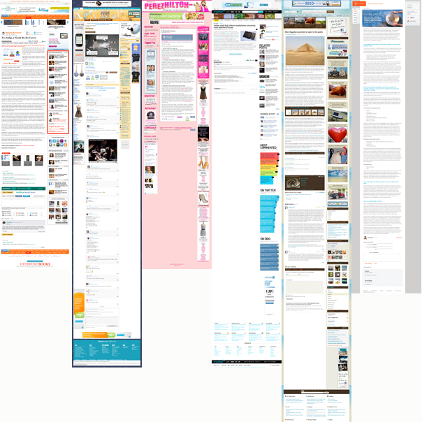
Oh, I forgot to mention the sixth page. On the far right is an article page from CloserLook.com. With an Alexa traffic rank of 2,412,345 (compared to 150 for HuffingtonPost.com), they are certainly not even in the same universe as the other sites. But of these six sites, which one is clearly designed with a focused intent in a way that has actually considered the human at the other end of the signal? I think that’s obvious.
Closerlook is a mid-sized, finely positioned healthcare marketing firm. The purpose of their site is probably similar to yours—to communicate their expertise to prospective clients and build trust with them before they are hired. Because their audience is so specific, it’s imperative that Closerlook make extremely clear what they want their readers to do after reading an article. On the page I captured above, there are only two calls to action, contact Closerlook or subscribe to their newsletter, as well as options to download the article or email it to a friend. While a deep session on their site would be indicative of interest in their services, it’s not going to directly make them money (there are no third-party advertisements of any kind on their site). Sending their readers down an endless rabbit hole of content is not necessarily to their advantage; hearing from them directly is.
Yes, Closerlook’s simple site makes them look small. They are small. But who cares? They know exactly what they are doing and don’t need to appear any other way. You’d never hire a marketing company that served 100,000 other clients. Bigness, or the appearance of bigness, just should not matter.
So far, I think Closerlook’s example makes perfect sense for any small to mid-sized business to business services company on the web. But what about small to mid-sized retailers? All kinds of things change when designing a transactional ecommerce site, but the value of simplicity is not one of them.
Just Because We’re Used to It Doesn’t Mean it’s Good
I think Amazon.com is great. I use it all the time, both to buy and sell books. I often go there to research a book and read reviews even if I plan to check it out from the library rather than buy it. For me, and I’d wager for most of our clients, Amazon is the ecommerce site on the web. It’s been looked at as an example to emulate in every single ecommerce project I’ve been involved with over the past few years. But I also think that Amazon.com is a mess.
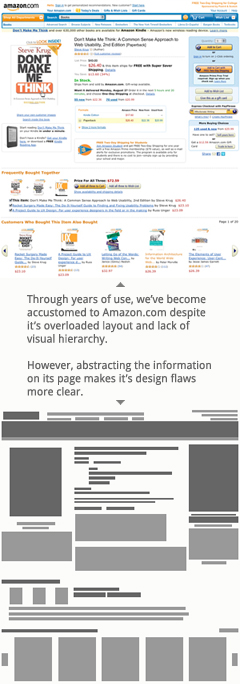
Just like the mass media sites I looked at earlier, Amazon offers significantly more peripheral content on a product detail page than information about the product itself. In the example to the right, I’ve captured the detail page for one of our old favorites, Don’t Make Me Think, by Steve Krug. The most important button on the page, the “buy” button, is lost in the noise of hundreds of other links. Yes, Amazon wants me to buy this book, but they also see the big picture: the longer they can keep me in the store, the more likely I am to buy something. So, they inundate me with other opportunities to buy. It’s really rather obnoxious.
Fortunately, I know exactly where that “buy” button is, and if I’m certain I want to buy something, I can make a break for it and be checking out in seconds. But what if I’m interested in buying something but I’m not yet committed? All the extra information on this page—the lists of related books, other formats, reviews, and the like—could be very helpful to me provided I felt guided through the page. But I really feel like I’ve just been dropped in the middle of a ransacked Walmart. I can find my way out because I’ve learned how they lay out their store, but that doesn’t mean they couldn’t do it better.
By abstracting the page, which I’ve done beneath the screen capture to the right, the design problem is made more clear. The crowded and unstructured page is the result of years of ad-hoc development, not a thoughtful or human-centered design. But because we’ve all grown used to Amazon’s page layouts, a complete redesign—even a very good one—would probably create more confusion for users returning to the site and cost millions in losses. In the meantime, Amazon likely spends large sums on usability testing, but all of that is pretty meaningless unless they can consistently test users whom have never seen the site before. “Ever heard of Amazon.com?” Um, ever heard of McDonald’s?
There are better examples than Amazon. I’ve taken screen captures of three other online retailers from whom you can purchase the same book we looked at above. Again, zoomed out (so to speak), some design advantages and disadvantages become more clear. From left to right, these are probably ordered from most to least popular, but also from worst to best designed.
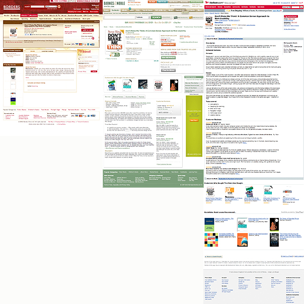
On the left is the detail page for Don’t Make Me Think on Borders.com. While it’s certainly more simple than Amazon’s detail page, it does feel a bit clunky since the template seems to expect more content than this page has. In the center is Don’t Make Me Think as listed by BarnesandNoble.com. Like Borders, it’s simpler than Amazon, and makes abundantly clear how to purchase the book while also including additional and helpful information like related books and reviews. I’ve never purchased a book from BarnesandNoble.com (and probably never will), but on the merits of design, this page is clearer than Amazon’s. Lastly, on the right is a screen capture of the listing for Don’t Make Me Think on AbeBooks.com. This site offers used books only, but has the simplest and clearest design. While certainly not as aesthetically pleasing as the the others, its precisely ordered design makes the prioritization abundantly clear, by compartmentalizing the different kinds of information. It’s one of the only stores that lists related books beneath customer reviews (prioritizing people over robots, by the way). Of the three, it’s functionality is the most clearly recognizable at such a reduced size.
KISS (Keep it simple, stupid!) for Your Audience
So far, we’ve looked at some of the most popular sites on the web—sites we spend huge amounts of time using—and how the weaknesses of their designs have shaped how we go about designing sites for ourselves. But we don’t have to do what they do. In fact, the simple difference in user traffic between our sites and theirs is the main reason why we shouldn’t. I hope my agenda is clear: I want to convince you that you don’t have to do what they do. You can simplify.
Before you even start designing a page, keep in mind the following four principles, in this order:
- Identify Your Audience
Properly identifying your audience is the most critical step to designing an effective website. Chances are, you think your audience is bigger that it actually is. Take time before any prototyping or design is done to create user personas — realistic personality profiles that represent a significant group of your website’s users. Without accurate personas, we’re much more prone to making guesses or assumptions about who our prospects are, and creating content based upon that mistake. - Focus Your Content on Your Audience
Once you’ve correctly identified your audience, you can figure out what they need from you. Your content strategy should be informed by your personas, the opportunities you give them to connect with you, and the methods that are most effective for measuring the success of the site. - Include one or two calls to action
One or two at most. If you have more than that crowding the sidebar of a page, it’s probably because you haven’t thought through who the page is for and what next step makes the most sense for them. - Use Related Content Sparingly
Providing links to related content is a good thing to do. It provides opportunities for a prospect to learn more about what you do based upon the material they’re already reading. But make sure that the way that related content is generated results in a few links to pages that are actually related. What you don’t want is to direct a captive audience to something which will cause them to lose interest.
Remember, these are basic, underlying principles. They don’t close any aesthetic doors. They provide a stable foundation upon which there is much freedom to design something as unique as it need be. But they will result in a page that is simpler and more effective than much of what we’ve reviewed today.