You’ve just launched your new website. It’s been redesigned and optimized to feature all kinds of great content in an easy-to-find format with strategically placed conversion points. Now you’re faced with the task of continually generating new content to keep your readers informed and engaged. You’re on top of the written content, no problem. But visual content is a challenge. Where are you going to come up with an image to accompany the 2,500 word newsletter you just put the finishing touches on? Or that series of blog posts you have scheduled for next month?
Maybe you don’t have anyone on staff with a design background who can help you out. And using something from the collection of clipart that came with your office software suite is tempting, but you wisely resist the urge. Stock photography is an option, but you want an editorial image not a generic shot of three business people crowded around a laptop in a conference room. Fortunately, there are alternatives to stock photography: high-quality stock and custom illustrations to fit a variety of needs and budgets.
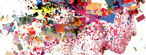
A well-placed editorial illustration or info graphic is a great tool for helping your audience visualize data, concepts or opinions that could not be served by a photo or a lengthy written explanation.
Last year, I wrote a post about the value of good visual content and offered tips on how to incorporate it into your site. A well-placed editorial illustration or info graphic is a great tool for helping your audience visualize data, concepts or opinions that could not be served by a photo or a lengthy written explanation.
However, in this post I want to focus on sourcing good illustration, whether you purchase a stock image, commission a custom image, or create one yourself.
Stock Illustration Sources
There are several companies that provide stock illustration (see list below). Stock imagery is divided into two types of licences, rights-managed and royalty-free. Royalty-free images are purchased one time and can be used freely in as many applications as you wish. The advantage of royalty-free is that it is the less expensive option of the two licenses. With a rights-managed license, you are in effect leasing the image. The image is purchased for a pre-determined period of time (usually up to one year) and prices are based on where the image will be used (web, print) and for what purpose (commercial, editorial). The advantage of rights-managed is that the selection of images is usually larger and, because of their exclusive nature, of a higher quality.
Royalty-free
veer.com/products/images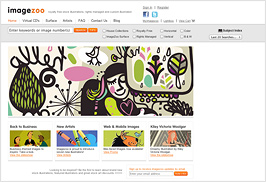
istockphoto.com/illustration
imagezoo.com
havanastreet.com (retro style)
Rights-Managed
imagezoo.com
illustrationsource.com
Custom Images
If you’re looking for a custom illustration and are willing to expand your budget a bit, you can hire an illustrator. Several stock sites provide access to artist portfolios (searchable by keyword) to purchase an existing image, or you can select an illustrator based on style and contact them directly to commission work. There is no shortage of talent available and competition among illustrators allows you to shop around for the best value.
directoryofillustration.com
theispot.com
illustrationsource.com/oas/
havanastreet.com/custom.htm (retro style)
Local art colleges are also a great resource for freelance illustration work. There are obvious economic advantages of hiring an illustration student but you’ll need to be flexible with your deadlines. The Rhode Island School of Design (here in Providence) offers ArtWorks, a website for employers who are looking to hire students and alumni for short-term or freelance work.
Info Graphics
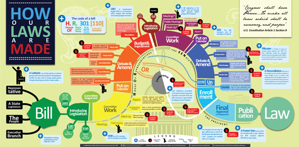
One of the more popular types of visual content on the web is the info graphic (aka data visualization). You can turn dry statistics, data or case studies into a graphic that tells an engaging story. The site visual.ly showcases thousands of info graphics and their creators from around the web. You can embed an existing graphic on your site or have visual.ly create a custom one for you.
DIY
Chris Butler and I produce all the custom graphics for the Newfangled site. Chris creates the newsletter illustrations and I’ve designed most of the webinar graphics, as well as the home page banners on our previous website.
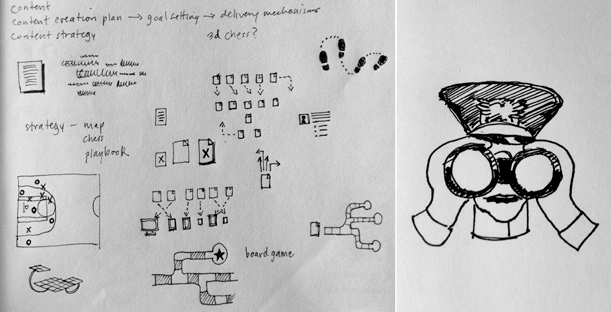
Maybe you have a design background but don’t think you have the time to create custom graphics for your site. That doesn’t necessarily have to be the case. I recently created an illustration for an upcoming webinar that, from concept to finish, took just a few hours (coming up with the concept was actually the lion’s share of the work).
Concept
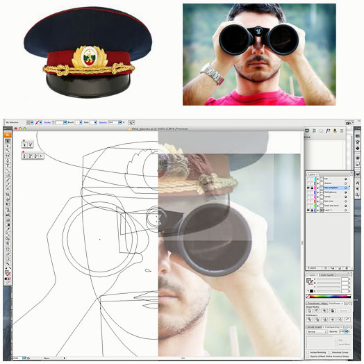
The webinar is about advanced content strategy tips and techniques so I began by thinking about how to visualize one or more of those words, specifically “advanced strategy.” At first I considered and discarded all the visual clichés of a chess board or dart board (I had already used a playbook diagram for an earlier webinar graphic). What about military strategy and those large war room maps with the game board pieces representing armies? I liked the military motif because it would have an edge, but the map seemed too similar to the chess board metaphor. I also wanted an illustration with a person in it. Then the image of a soldier looking through binoculars popped into my head and I made a quick sketch. I liked that the soldier would be looking directly at the viewer.
Sourcing the Images and Creating the Illustration
Once I’d settled on the concept, I needed to source the images that would make up the illustration. After a quick Google image search I found a man looking through binoculars and a photo of a military officer’s hat. I brought each item into a drawing program and traced them, outlining key shapes and assigning each one a grayscale value.
After merging the man and the hat together into a single illustration, I imported it into an image editing program to play with the colors. I wanted a bright, punchy image because most of my previous illustrations had a somewhat muted color palette. A happy accident while blending different layers produced the red and cyan combination.
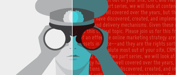
Adding Some Detail
The illustration was still a bit flat visually, so I filled the background with text (the webinar is about content, after all). I started with dummy copy (lorem ipsum), adjusting the size and line height of the type, but decided to use the webinar’s synopsis instead so the illustration would have more than one layer of meaning.
So before it was time for lunch, I had a custom illustration to accompany the webinar description.
Feedback!
Do you have a great lead on stock illustration or custom imagery? I’ve identified a few resources in this post but I’d love to hear from other content creators. Comment form is below, you know what to do.