“Parallax is sooo 2013.”
This is something we’ve been hearing a lot over the last year. As of this writing, we’re mere weeks away from 2014. Here’s what I bet people will be saying about parallax design a month into 2014 (and beyond):
“Parallax is sooo 2013.”
In case you’re not familiar, parallax sites have background elements that scroll at a different speed than foreground elements. They’re often horizontally-oriented, with full-bleed images or color bars, and text sliding on top.
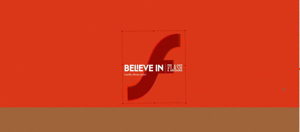
Yes, that is a parallax site that says, “Believe in Flash”
It’s a cool effect, giving a sense of depth that in certain circumstances really has a “wow” factor.
In certain circumstances.
Here’s the thing: it’s very much in vogue right now. It’s also a very visible design trend, one that’s as immediately recognizable as it is noticeable. Which means that the single easiest way to make your site look dated in the next 18 months is to design it around the parallax trend.
Remember the era of the Flash-based website? Where every site you went to had a loading splash full of animations when you first entered? There were a ton of beautiful sites built around Flash. I mean properly stunning stuff, where the designers were really pushing the envelope and creating immersive experiences around that tool.
Imagine if you still had a Flash-based site right now. Unthinkable in 2013, right? There are a lot of good reasons why Flash fell out of fashion. Some were technical (slow performance), some were platform-related (the iPhone didn’t support it), some were about SEO (Flash sites aren’t good for search engine rankings), and a lot were design-oriented (sites that were heavy on the animations had a lot of usability problems). Once Flash faded, all those sites based around it looked dated. Immediately.
I’m not saying that parallax doesn’t have some great uses; it certainly does. But it’s often not the best tool for the job, and it’s always worth considering the drawbacks. Let’s talk about a few reasons why parallax doesn’t always work, and a few instances where it shines.
Parallax makes your site less usable
Your site’s first impression is made really, really quickly. Seconds, usually. While the parallax homepage can look really cool right off the bat, most of the time it’s confusing to actually use. In fact, even some of the truly great examples of it seem to require extra design clues, like the dancing arrow below, to teach their users how to view the site.

By the time your user has figured out how to interact with the site, a fair amount of time has gone by, and they haven’t even figured out what you do yet. While writing this post, I happened upon a site that was parallax-based, and quite literally (not figuratively) couldn’t tell how they intended for me to use their site for 10 full seconds. This was while I was writing this article and had parallax behavior in the forefront of my mind!
Furthermore, parallax doesn’t provide a predictably good experience on a range of browsers and devices. Nine out of 10 parallax sites are jumpy and jittery; many of them prioritize mobile to the point that scrolling on a desktop works terribly (or vice versa). There are many examples where the site takes away control from the user, causing a runaway scrolling effect so that the next animated block is guaranteed to display.
Let me tell you, users love it it when you hijack their mouse cursor.
Finally, a lot of these sites are based around a single-page metaphor. There’s no depth to the site, no real content for Google to index, nothing really there. It’s a series of immersive images with nothing to back them up. You can’t do SEO on two pictures scrolling across each other at different speeds. It looks nice, but if no one ever sees it…
Parallax is great for immersive stories
Parallax is really, really fantastic for an immersive experience. In most of the instances where it really wows, it’s used in a narrative, linear fashion. It really shines a spotlight on the main content and pushes other elements to the periphery. Which is fantastic for it’s original applications, things like the NY Times’ Snow Fall story. Stunning, right?
Sites like that are why we’re all drawn to parallax as a technique. It’s so effective in those areas that the temptation is to use it in other kinds of sites, where it isn’t as fitting. As a result, we see a lot of less-than-thoughtful parallax implementations in places where it doesn’t fit so well.
Parallax is for brochure sites
Those immersive story sites are great at focusing your attention. You’re right in the midst of that whole experience, with nothing else to catch your eye or otherwise interrupt your reading flow.
Nothing for you to, say, sign up for more info. Nothing for you to contact the authors. Nothing for you to give a little info to them, and get something of value back.
No calls-to-action.
In case you don’t know, we at Newfangled are pretty big believers in calls-to-action. In fact, they’re a requirement for us for a website that works. When we say a site that works, we mean a site that has a measurable impact on your business. A site that is used to attract, inform, and engage your audience. One that encourages your users to give you a little info about themselves. A website that you can demonstrate was integral in winning actual business.
Nothing against beautiful sites that don’t work in the sense we’re talking about. They can be great–so long as the goals of the site merit that sort of treatment. But for most firms, they’re digital brochures, not tools to win business.
That’s soooo 2013.