Last week, Chris Butler provided some back-story on how our book series, “A Newfangled Approach To Your Website, Volumes 1 and 2” came to be. I thought it would be appropriate to round out that post with one that covers the design of the books.
I’ve only done a handful of print projects over the past few years; so it felt good to tackle a large project like designing a book. I had forgotten about some of the benefits of working in print such as, “things stay where you put them.” You can force lines of copy to break where you want and adjust the letter spacing to eliminate widows and orphans without someone destroying your careful edits by expanding the browser window.
Layout
 I began laying out the book in an ancient version of QuarkXpress, but after the application unexpectedly quit three times, taking all of my unsaved changes with it, I bit the bullet and purchased Adobe InDesign. What a difference the right tool makes. There was a small learning curve as I got acquainted with the user interface, but the seamless integration with Illustrator and Photoshop makes working with ID a real pleasure.
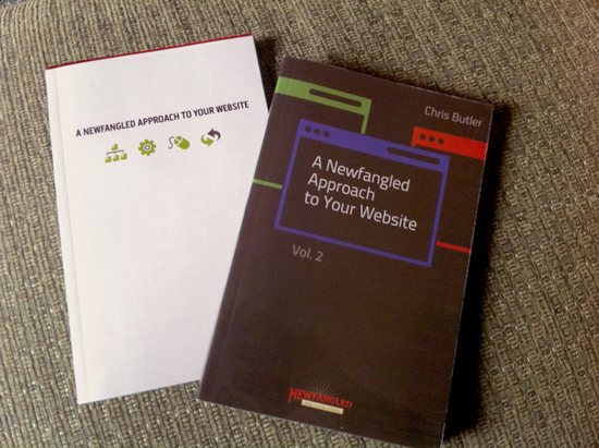
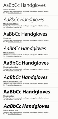
Since we were publishing the book on Lulu.com, it was important to find a format that was a comfortable size for reading as well as economical to produce. Chris and I settled on a 5.5 x 8.5 inch perfect-bound book with black and white interior pages and color cover. To keep the design simple, I selected Myriad Pro for the typeface since it has a good range of weights and styles and is very readable even at small sizes. Most of the design work involved setting up the book’s page structure (column widths, gutters, font sizes, leading etc.) and then printing out a sample chapter to check the design. One of the advantages of web design is a 1:1 relationship between design and finished product, also known as WYSIWYG (What You See Is What You Get). Print design, on the other hand, involves an interpretation gap between what you see on the screen and what you will eventually hold in your hands.
Images
One of the challenges of the book’s black and white interior was the conversion of sharp, color images from the online newsletters into black ink on paper. Not only did the images need to be adjusted for contrast, but they also had to be lightened significantly to account for ink spread. On screen, a pixel is a pixel, but the size and shape of a printed halftone dot changes with the quality of the paper— the cheaper the paper, the greater the ink spread, and less fine image detail. 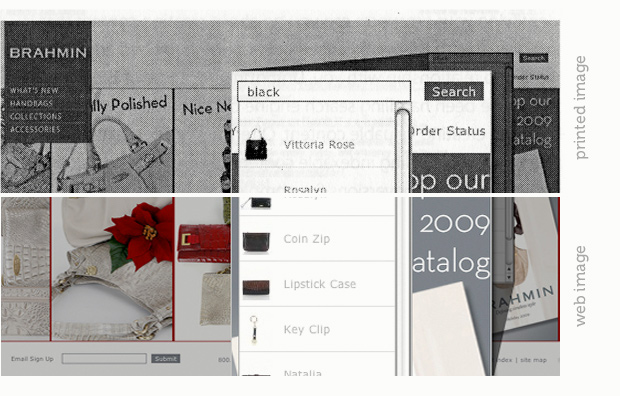 Also, the images from the online newsletters were created at 72 DPI (dots per inch) while the book would be printed at approximately 300 DPI. So, a few Photoshop tricks were necessary to make sure the images would look decent in the book; I even rebuilt portions of some of the images because they contained too much digital noise.
Cover Design
Chris wanted the cover of Volume 1 to reflect the look and feel of our recently redesigned website, so I incorporated the headline font, color palette and site icons into the final design. There were other concepts we explored, but ultimately, Chris and I chose the simplest design that best represented our process and philosophy.
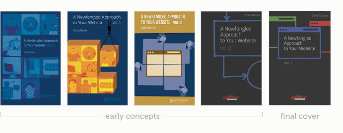
The cover of Volume 2 started out fairly ambitious. I wanted it to represent our web development process and designed some layouts that included the lead-in images for each chapter. Once again, simplicity won out and, after a few more concepts, the final cover design displayed the simple metaphor of a browser icon in red, green and blue.