
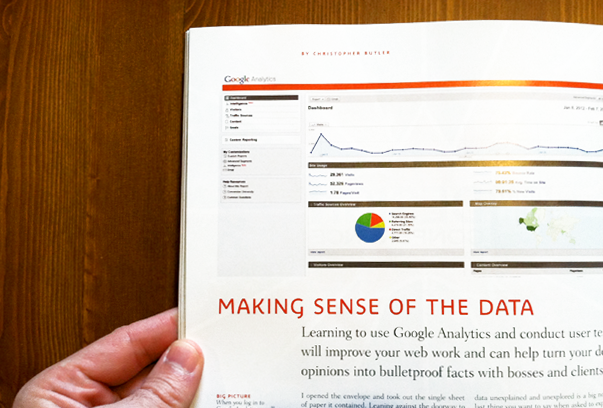
I have a feature article in this month’s issue of HOW Magazine all about getting feedback from your website’s users — via Google Analytics as well as from users themselves. I’ve posted the text below, but I hope you can read this in print as it includes many images of Google Analytics screens as well as several how-to sidebars. Here’s the gist…

I opened the envelope and took out the single sheet of paper it contained. Leaning against the doorway to my kitchen, I stared at it for several long minutes. It might as well have been another language entirely. Eventually, I gave up and called the number at the top of the sheet.
“I just wanted to know if everything was normal — the test results, I mean.”
“Yes, everything is fine. Your blood work showed nothing out of the ordinary.”
Just days before, I’d had my first physical in years which, in addition to the usual poking and prodding, included a routine blood test. Receiving the results in the mail made me feel good, that my doctor was looking out for me. But then I tried to read the report assuming it would tell me a simple story — whether I was healthy, or not. Instead, it contained rows of numbers that I wasn’t able to interpret on my own. If I can’t make sense of the data, why send it to me?
We’re handed documents like this all the time, especially on the job. Instead of telling you the story you need to hear, they deliver you a confusing new mystery to sort out. For designers, especially, leaving a mystery unsolved is a big no-no. The last thing you want to say when asked to explain your decisions is “I don’t know,” even if it’s true.
After all, an important part of design is telling a compelling story: of why something doesn’t work, how it could be done better, and why our solution could help. Without grounding that story empirically, all we have is a hunch. That’s where measurement comes in. It connects action to defensible outcomes.
We designers need to be proactively involved in measurement. Knowing how to gather and interpret interactive data will better position us strategically, not to mention prevent inheriting unhelpfully data-glutted reports and being held accountable to someone else’s vague interpretation of them. But, it’s more important that the data ground our vision in reality than be used to build credibility with clients. We want our clients to trust our judgement, but our measurement process should lead them to the same conclusions we’ve made if they were to do it themselves.
Unfortunately, measurement is a discipline that tends not to be under the umbrella of design. It’s time to change that.
Focus on Questions, Not Numbers
If you’ve ever examined a report with rows and rows of quantitative data, you know that numbers easily lead to conclusions. If only. Numbers can be helpful answers to questions, but if you don’t ask the right questions, you won’t get the right answers, and you won’t be led to the right actions. If no questions are being asked, then no action will take place at all. This is why reporting tends to be a repetitive action with no results.
In a typical website report, each number represents some metric: The number of visitors and pageviews, the length of a user’s session, and so on. All of these things are of interest, of course, but if they’re not assessed by some kind of qualitative evaluation, they’re meaningless. After all, these metrics will vary greatly depending upon the purpose of the website and its unique audience. So pulling the numbers isn’t really enough to evaluate success or failure. We need to be asking different kinds of questions than “How much?” or “How many?”
Truly meaningful measurement can be reduced to five key questions. They are:
- Who is using my site?
- Where are they coming from?
- What content are they consuming?
- How are they engaging with that content?
- What can I do to make their experience better?
Numeric visitor data will help us to answer these questions, of course, but they won’t suffice as answers in and of themselves. Measurement is not about numbers as an end, it’s about numbers as a means to an end.
Question one is about the identity of our websites’ users. Practically, there’s only so much we can know about them (out of respect for their privacy, there’s a limit to what we should try to find out). For our purposes, simply observing their behavior is going to be of much greater value than knowing specific details like their name, address, and the like. We’ll be able to learn quite a lot about their behavior and answer the question generally after we’ve answered questions two through five. So, while it’s the first question we have in mind, it will be the last one we answer.
Questions two and three are best answered by gathering data from an analytics tool like Google Analytics, where we will begin. Afterward, we’ll use a simple usability testing procedure to answer questions four and five.
Using Google Analytics
We now know that numbers aren’t really the answers we’re looking for. But it bears repeating this principle in our minds while actually using Google Analytics. Because it is structured around traffic data — specifically the number of visitors within a particular date range parsed in various ways — it can be easy to fall victim to “Analytics Myopia,” or in other words, the tendency to focus in too closely on a particular metric while ignoring the big picture. These metrics, however, are all interrelated, and it’s in the connections that the important information resides. So before spending any time in Google Analytics, it’s worth committing this motto to memory: There are no independently meaningful metrics. Let me also introduce one caveat: Google Analytics is an enormous and powerful tool, far too large to cover in comprehensive detail in an article like this one. Rather than attempt to describe all of its functionality, I’d instead prefer to offer a simple, two-step routine from which you should derive plenty of insight. Each step will involve looking at a qualitative metric and then evaluating it on the basis of a quantitative one.
Upon logging in to Google Analytics, you’ll first see a dashboard view, which will give you big-picture glance at your website’s traffic. By default, it will show you this data for the last month, but you can reconfigure the report for any date range you prefer. There’s lots to see here, of course. But, once I’ve glanced at it, assuming no major traffic dips or spikes, I usually get right into my two-step routine. The first step is to check in on my website’s traffic sources.
STEP ONE: TRAFFIC SOURCES
The Traffic Sources report will provide a list of all the other websites that link to yours, and of course, help you to easily answer Question #2. For this particular website, I can see that most visitors are coming in from Google searches — almost four times the number of visitors who came in directly. That’s a good thing. When the number of people discovering a website by searching for the information it contains is larger than any other group of visitors, it means that the website’s reputation is growing on the basis of the value of its content.
It’s helpful to also see that visitors are coming in from a variety of sources, like email marketing campaigns, social networks, and other websites with large and active audiences. These different sources indicate that awareness of this website is spreading through referrals across a wide range of familiarity — from more “objective” sources like search engines to much more “subjective” and intimate ones like someone’s Facebook wall.
Now that we’re digging in to these sources, we should evaluate: Which sources are bringing in users that engage more deeply?
One simple way to answer this is to look at goals. A goal can be any opportunity for a user to engage, whether by filling out a contact form, making a purchase, registering for an event, or even just downloading a file. Assuming we’ve configured our Google Analytics accounts to track specific goals, we can filter traffic by visitors that have completed goals. By applying an advanced segment, which is just a sub-routine telling the program to show you only the traffic that corresponds to any set of rules you determine, we can now see a new graph running in parallel with the basic Traffic Sources report. This particular segment has parsed the traffic sources data by those visitors who have completed at least one goal. The resulting orange line traces goals that have been hit from day to day — obviously, less than the overall traffic. In the list below the graph, each source is now also broken out by a goal conversion rating, shown in green.
While traffic is exciting, it’s only meaningful once it’s valued.
STEP TWO: CONTENT
The Top Content Report shows us which pages on our websites are getting the most views, how long users are spending on them, and which pages have the highest bounce rate.
The bounce rate, by the way, is one of those myopia-inducing metrics I mentioned earlier. A very simple definition for bounce rate is that it measures the percentage of traffic that landed on a page and then left the website without looking at anything else. Google Analytics will display the site-wide average bounce on the first dashboard screen we see when we log in, but it makes more sense to look at bounce rate as a means of evaluating the performance of individual pages, instead. A page with a high bounce rate is likely not meeting the expectations of visitors who found it in a search. But a page with a low bounce rate is successfully engaging visitors, either by leading them to a goal or more information on other pages. Like goals did for traffic sources, bounce rate helps us to better understand how users engage (or don’t) with our website’s content.
Be aware, though, that the way bounce rate is displayed can be misleading. On the Top Content report, Google Analytics will display the bounce rate for a page along with the number of views it has received. If the report displays a page with 870 views and a bounce rate of 67%, it implies that 583 (870 x .67) of those views bounced. But that is not correct. Remember, bounce rate measures the percentage of traffic that landed on a page and went no further. To clearly see how many actual bounces occurred, we need to look at the same page in Google Analytics’s Top Landing Pages report, which isolates only the traffic that entered the website by landing on that page. If the report lists 726 entrances through that same page, it means that only 488 bounced (726 x .67). That’s almost 100 less than we would have thought had we not looked at both reports!
Digging in to our website’s content and measuring it on the basis of goals and bounce rate reveals plenty of examples of how there are no independently meaningful metrics. Analytics data can mislead us just as easily as they can empower us, which means we’ve got to keep our big-picture questions in mind at all times when interpreting these reports.
Gathering Data from Users
Our last two questions — about how visitors are engaging with content and what we can do to make that better — are best answered by observing users.
But another caveat is in order: The type of user testing that I’m about to describe is not the most scientific process you could pursue. The amount of work and the high cost to conduct truly scientific usability studies — using heat mapping technology and the like — is so great as to be a very real barrier to entry for most of us. But a much simpler version isn’t necessarily going to offer illegitimate results. In fact, my experience has been that the simpler the process, the greater the actionable insights.
The setup you’ll need is minimal: A quiet space, free from distraction, a laptop running some kind of screen-capture software, a volunteer, a webcam to capture your volunteer’s face while working, a test plan to follow, and a moderator. Your volunteer need not be an expert in your field or have any deep familiarity with the information or concepts contained by the website you’re testing. The fresher the better. You — the moderator — are there to provide the context, technology, and guide the test, but most importantly, to observe.
TEST PLAN 1: GOAL-FOCUSED SITE TEST
This testing procedure can be broken down into 3-4 steps. Once you’ve began recording their session, the first step is to have your volunteers orient themselves on the homepage. Give them 1-2 minutes to explore — scrolling only, no clicking — before asking them to explain what the website is about. Their answer will help you evaluate the clarity of your website’s purpose to the outside user.
Next, your test plan’s remaining 2-3 steps should match the goals of the website — those, like form submissions, purchases, registrations, or downloads that you might track in Google Analytics. For example, one task may be to have the user find a particular article on your website, leave a comment, and then subscribe to receive website content by email. Observing this flow will demonstrate all kinds of things you need to know, like whether your website’s navigation and search tools are working, content is legible, and calls to action are clear.
This kind of test can be customized in any way that makes sense for the goals of your website, but should be kept to under ten minutes. As soon as fatigue sets in, the quality of the results will drop considerably.
TEST PLAN 2: 10-SECOND TEST
User experience expert Jakob Nielsen recently published a study showing that most users decide whether to stay or leave a webpage within 10 seconds of opening it. That may seem like a tiny window of opportunity, but we’re actually able to perceive and make judgements about information in even less time. Rather than evaluate an entire website, a ten-second test will focus on just one page and help us to observe the factors that contribute to that decision.
The setup here is the same as before, but the procedure is slightly different. Once you’re rolling, give your volunteers 10 seconds to view a page (again, scrolling only). After ten seconds, close the browser and ask them to explain what the page was about. Just like before, their answers will help you to evaluate the clarity of your page, especially how design decisions can either help or hinder a user’s ability to get the right first impression of a page. Design is often the difference between a bounce and a conversion.
In either testing scenario, feel free to ask follow-up questions that draw out more information from them, but be careful not to lead them to conclusions.
Questions > Answers > Action
Reducing complicated measurements to meaningful questions and pursuing answers to them through simplified analytics procedures and usability testing is all about one thing: Producing the right action. Don’t wait to be handed someone else’s number-heavy and insight-light report. Making measurement a part of your repertoire today will help you find the answers you need to take action.