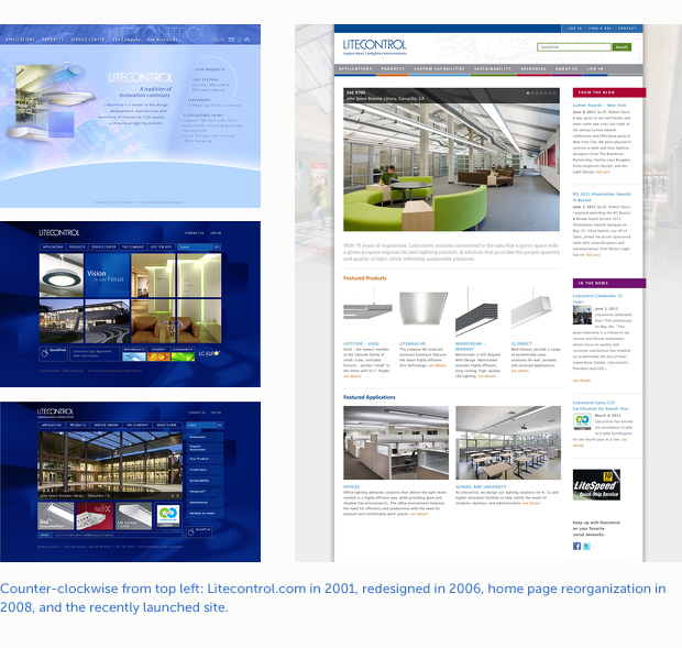
It’s not often that we get to redesign a site for a client that has been with us for 10 years. A few months ago, we sent a refreshed Health Enterprises live. This month sees the launch of a totally new Litecontrol.com.
The last time we redesigned Litecontol’s site was in 2006 (with a home page facelift in 2008). This time, the site was built from the ground up; completely restructured with a new architecture and design that takes advantage of some of the best capabilities of modern browsers.
Revamped Design Process
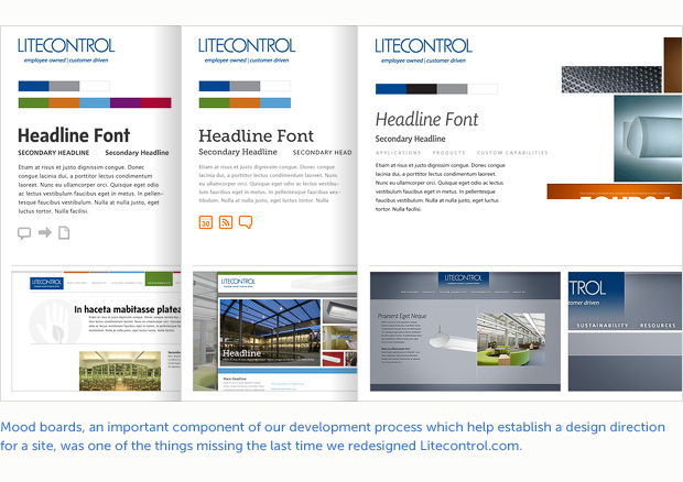
One of the biggest differences from the last redesign was the addition of mood boards to our design process. I met with the client to talk with them about the latest trends in lighting and review some of their recent print collateral. Rather than dictating the design direction, the client simply said, “Show us your best ideas.” (evidence of a good relationship built over time). A couple of weeks later, we presented three different mood boards for the client to choose from.
Each mood board had a unique look and feel while honoring the nature of the products and the target audience. The selected mood board was one with a bright, open structure and an emphasis on Litecontrol’s product photography. A broad color palette was used to brand each main section of the site.
Another difference from five years ago was that we started designing using one of the product detail pages instead of the home page. This reflects a content-driven design process rather than an aesthetic-driven one. A site’s home page is usually a single, unique template. Starting with a low-level page that contains a lot of detail and working backwards toward the home page allows us to solve many of the design challenges up front and set the standard for styles throughout the site.
Bigger, Better Site
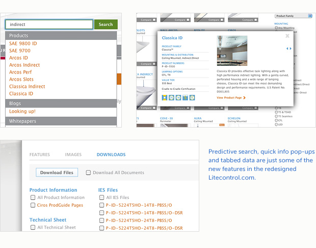
Changing technology and wider browser support allowed us to include some features that brought Litecontrol’s site up to date. Taking advantage of today’s larger monitors and higher screen resolutions, we widened the site from 660 pixels to 980 (an increase of 33%) to provide room for larger images and more content at the top of each page. We also used embedded custom fonts throughout the site. Customizable slide shows featuring product application images appear on several pages, not just the home page, and a new predictive search feature gives viewers easier and quicker access to products data.
 Litecontrol has great visual content and this gave us plenty of raw material to work with when building the page templates. We used their application photography to create a unique background image for each section of the site, while sketches, diagrams and product details gave each section header additional visual interest.
In regards to information design, we layered data with tabbed sections on product pages to maximize page real estate and avoid pages that run a mile deep. We also provided ways to easily access product information such as info pop ups on product overview and application pages.
We expect there will be some tweaks that need to be made as the site clocks its first 20,000 miles and many of the new features are real-time tested but, overall, the new Litecontrol.com is a great improvement over its predecessor in both form and function.