It’s easy to get stuck in a rut. Plodding through the same process you’ve used dozens (or hundreds) of times before is comfortable, even predictable. And time and project constraints don’t always allow for experimentation.
But occasionally, a new wrinkle can be added to the process because a particular situation demands it. Or you think “there’s definitely a better way to do this.” I found myself in that situation recently, while working out some responsive design issues.
My approach to responsive design has changed over the last four years since Newfangled decided that every site we build would be responsive, regardless of how simple or complex the site architecture.
Responsive as an afterthought
When I first began including responsive design in my process, it was an afterthought. Figuring out how a site was going to look and behave on a mobile device was left to the end, after the client had approved the full-size (desktop) layouts. This created a lot of issues because responsive design is more than just shrinking and rearranging content to fit into a smaller container. Leaving all of the responsive thinking to the end of the process produced solutions that were not very elegant or user-friendly.
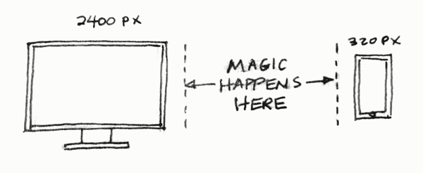 Eventually, I began to create mobile mockups at the same time as the desktop ones. This improved things a bit and allowed me tackle certain responsive issues sooner, sometimes even incorporating mobile UI elements into the desktop layout. But I was still producing individual mobile mockups, usually one for a smartphone size (~320 pixels wide) and one for a tablet size (~650 pixels wide) without thinking of how page elements would behave at all of the sizes in between a desktop monitor and a smartphone.
Eureka
The “there’s definitely a better way to do this” moment came about a month ago while I was working out how a site header was going to morph as it moved from large screens to smaller ones. For reasons I don’t recall, I took a screenshot of the smartphone mockup and pasted it into the desktop mockup.
Then I realized I could create multiple breakpoints in one document. This is one of those eureka moments when you feel brilliant and stupid at the same time. Why didn’t I think of this before? Of course it made sense to work out responsive behavior in a single document instead of creating separate ones.
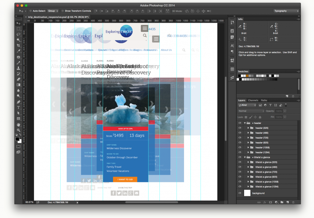

Click image for full size view

Once I had the two different mockups in the same space, I grouped the two major components of the mockup (header and page content) into layer folders and labeled them 320 and 1294 (representing the smartphone and desktop breakpoints). I duplicated the 1294 layer folder, created guidelines for my next break point (1058 pixels) and began to adjust the content elements to conform to the new size. Altogether, I created four new breakpoints between 1294 and 320.
This allowed me to see the progressive changes in the same space, and the resulting layered responsive template would help our developers see how content elements behave at each breakpoint. It’s similar to creating a storyboard for a movie; it doesn’t map out the story frame by frame, but it does show the key points of transition.
Our production schedules don’t allow me to do this for every page template in a project but if I select a template that contains a majority of common design elements I can create a responsive stylesheet that will help me make better responsive design decisions and reduce some of the “black box” effect for our developers.
Conclusion
This was a small change in my design process but I think it represents a larger change in my thought process about how responsive design really works. It closes the gap (a bit) between representing a dynamic medium (the web) with static design vs. designing in a dynamic platform (i.e. writing code). Who knows, a year from now I may be creating mockups in a program like Macaw instead of Photoshop. Stay tuned.