If you have a smartphone, you’re surely aware that there are roughly a quadrillion weather apps available. I’m constantly trying a new one, because I’m exactly that type of glutton for punishment. Many of the them are absolutely beautiful, and almost totally useless. When I use a weather app, I apply what I call the Morning Coffee Test.
When I get up in the morning (and I’m gripping my poor coffee mug so tightly that I could crack the handle) I don’t need to think extremely deeply about how to interact with my weather app. I simply want enough info to be able to choose what to wear that day. I need, from the moment I open the app, the following info: Current Temp (this is actually optional for me), High Temp, Low Temp, % chance of precipitation for the day. If there’s going to be an unusual weather event, that’s nice to know too. That’s all I need to know in order to choose my clothes for the day.
So, why do so many weather apps fail at this?
They’re design first. Well, really decoration first. Beautiful, minimal visuals, where the color palette displayed refers to the mean temperature for the day, and you use swiping gestures to see a variety of different facets of the week’s weather… are not what I need for my morning coffee. I don’t need a major innovation in user interfaces to see the high temperature for the day. Further negative points to any non-standard way of interacting with the app, like hidden swipe-able edge gesture areas.
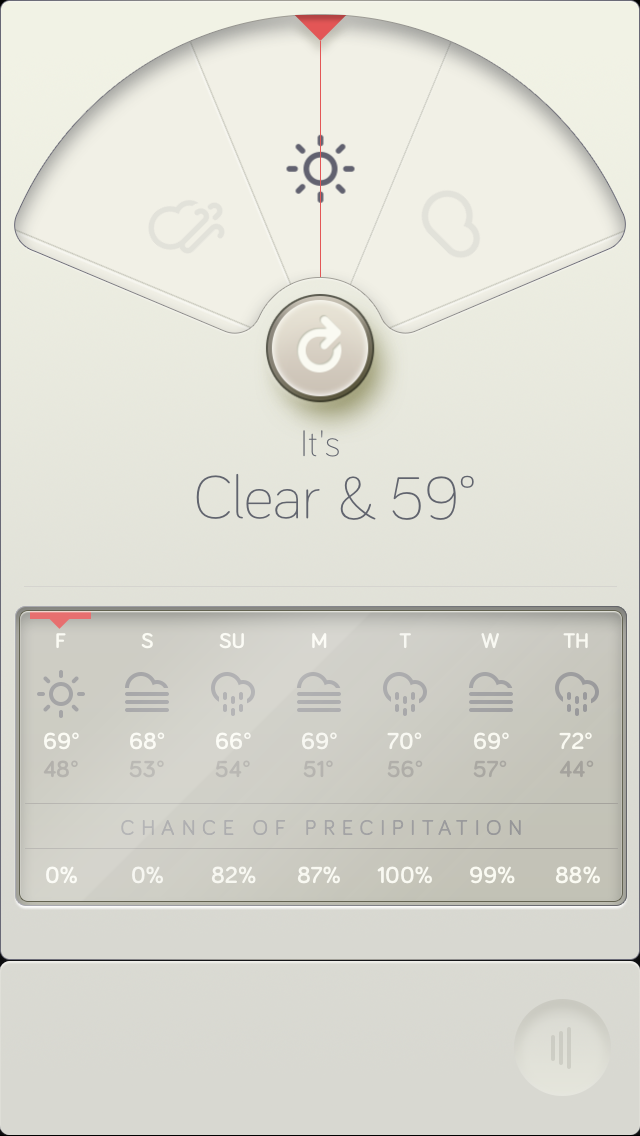
On this one, I think the downward gradient arrows in the background means something about the temperature trend for the day or the week, but my early-morning brain doesn’t care. I guess I have to swipe in some direction to see more, but where and how?
Beautiful designs complete the picture, full stop. But a good visual design isn’t just decoration, it elegantly solves problems of how the eye sees things. It guides someone’s attention through complex settings without overwhelming. However, if the aesthetic design isn’t working with a well-thought out structure and information design, then it’s not going to be able to solve problems. It will just be decorating them.
This isn’t meant to demean design in any way. If anything, I think of design as much, much more important than just look and feel. Good design is half of the user experience, and without it, things suffer dramatically. People react to design on an emotional level, and it’s crucial to inspiration. But for design to do its thing well, it has to work in concert with what’s being presented in order to have a great user experience. This is even more crucial if you want a clean, modern, minimal look-and-feel. This should be a mantra: if you want clean design, you’d better have knockout content. And, that content better be organized really, really well.
I should take a moment here to acknowledge that what I’m really talking about here are the two prongs of design: information design and visual design. We often call information design information architecture, though they’re not exactly the same thing. This gets a bit sticky, but at Newfangled, we approach these two things one after the other. We start with prototyping a site, which is the information architecture process. We decide what gets shown where, and how it’s organized, without thinking about how it will look. Then, once that’s complete, we decide how it’s shown, and what it will look like.
Both are problem-solving processes, but it’s really important to approach them in that order. Otherwise, neither type of design is playing to its strengths, and you get something like a weather app that will beautifully fail to tell you what to wear that day.
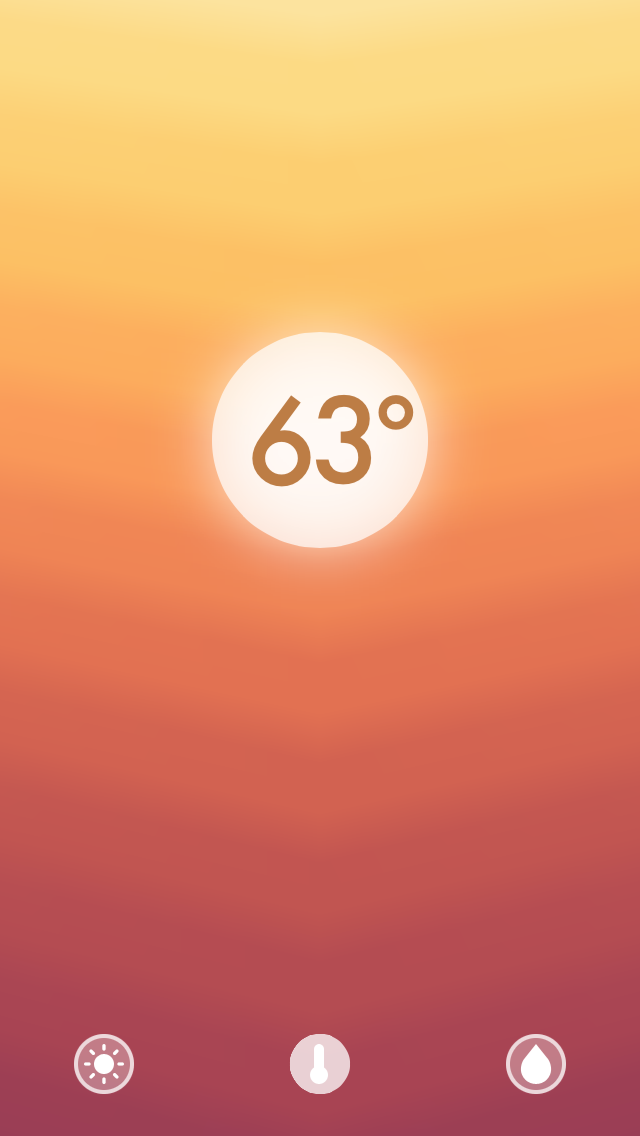
For this one, the grey-on-grey text is a bit hard to read, but the info I need is there. Still, there’s a weird preoccupation with the current conditions. How often do you need to know exactly what it’s like right now, and right now only? I want to know the range for the day.
Ulitmately, it’s because I’m not looking to this app for a piece of info that won’t really affect my decision-making at all. I’m not dressing myself for the temperature at this exact second, which is what is prioritized here. I’m deciding whether or not to grab my rain jacket, or a coat. It being nice to look at is great, but not if the minimalism makes using this tool difficult. That’s not design, that’s decoration.