
What a thrill–the latest version of Newfangled.com went live this morning! After six months in development, I’m so pleased with the results. The success of this redesign really comes as a result of one simple decision–to follow, for the first time, the same process we use for every one of our client projects. Our process enables the success of many new projects ever year by diligently pacing the client through every step, from planning to go live. Why not give ourselves the same value. So, starting with the budget and scope planning that happens in every sales negotiation, we treated ourselves just like a client. Once we determined our budget, we handed the project over to Katie and Brian to manage. They, along with Justin and Dave, showed us first-hand how valuable our process and people really are.
Planning and Prototyping
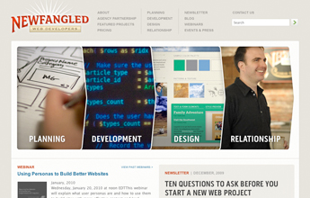
Our goals for this redesign were pretty simple. We needed our site to more closely reflect the identity of our company, to make clear and more easily accessible the huge amount of content it contains, and to simplify and focus the user experience to enable readers to more easily connect with us and our content.
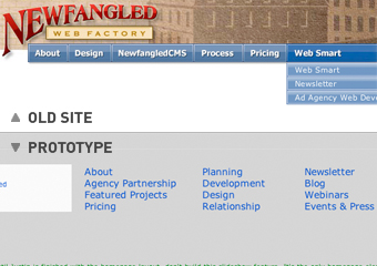
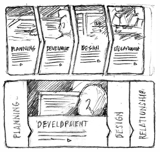
During prototyping, we settled on a much simpler main navigation that exposed all the site’s main pages without requiring the user to explore any sub-menus. Our most important content, those pages that outline our process and contain our newsletter, blog, and webinars, had been buried beneath top-level pages that did not clearly indicate what they were about. This new approach divided our entire navigation system into three simple verticals: pages about our company, pages about our process, and pages containing the content we create to educate our industry. The image to the left shows a comparison between the old version of the site’s navigation and what we prototyped for our new version.
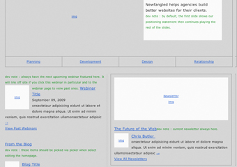
Another major change that we settled on early in prototyping was in making the homepage a much richer display of the most important and current website content. Our previous site’s homepage contained a long positioning statement, three videos, four calls to action, and several tiny links to new projects. In rethinking this experience, we realized how foolish it was to think that any user would respond to a call to action from the homepage when there was no real content to compel them. In our new version, we followed a simple principle for the homepage. Links to our most valuable and current content on the homepage ARE calls to action. If a user comes to the homepage, what’s most important to them is to see current activity and be led to experience new and engaging content. With that in mind, we replaced the positioning statement with an interactive overview of our process, and then added links to the most recent entries to our most valuable content, like our newsletters, webinars, blogs, case studies, and events.
Other key functionality decisions were made during prototyping, including adding a related content widget to subpages, creating a global advanced search tool, and replacing our portfolio gallery with a case studies section. More on those later.
Design
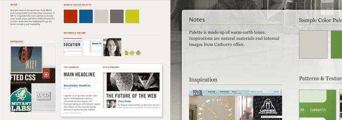
In redesigning our site, our main priority was to give it an updated look that accurately represented the personality of our company–a warm, vibrant, confident, and intelligent group of people–while not obstructing the content itself. Mark had received feedback on several occasions from people who really loved the mood of our people page. The images there were large and authentically communicated the warmth of our staff. So we knew that featuring our people and space in the design was key. Justin’s moodboards, shown below, focused on fusing a more contemporary look with more personal imagery.
The large interactive slideshow at the top of our homepage was designed to replace our positioning statement. We’d already (unsuccessfully) worked through several different approaches to this element during design when Justin created the sketch shown here. I love the way he rethought the interface, which starts by showing a glimpse into each of the process steps, ordered left to right, but then expands to reveal a fuller view with more text when the user selects one. As I said, we’d been batting around several sketches done in Photoshop for the slideshow, but Justin’s hand-done sketch really nailed it and restored everyone’s excitement about the project.
As for the rest of the design, be sure to spend some time clicking around the site. Justin exceeded everyone’s expectations by creating something that satisfied all of our goals while being completely different from what we may have envisioned at the start of the process.
Key Functionality
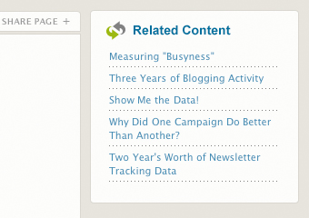
I mentioned earlier that we felt that our most important content was not as accessible as it could be. While the changes to our main navigation will help in making globally clear what kinds of content are available, we wanted to make another change that would help users connect to more content once they’d already made their way down to a lower-level page. Reviewing our Google Analytics over the past year lead us to conclude that we could improve our bounce rate by providing links to related content on our newsletter and blog pages. Many readers were coming to our site looking for information on a wide variety of topics, from design to web marketing, but once they’d read through the article they landed upon, they had no way of knowing that we probably had several other articles on that same topic. Dave built our new site to allow each piece of content to be categorized and tagged. We have a set number of general categories and an open tagging system; categories allowing for larger themes and tagging for specific topical connections. Rather than representing this taxonomy visually with a tag cloud or list of links, we chose to use it to drive our “Related Content” widget, which sits at the top right of every article and blog post on the site. The links to other articles are determined by a match in category and tags, and then ordered by recency.
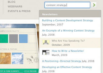
Our previous site had a pretty basic text search option, which, frankly, was not that helpful. Users that are search-oriented rather than inclined to browse for content were likely to leave our site as soon as it returned a list of results to their query and never know how much helpful content we really had. Rather than building a complicated advanced search tool that required the user to filter through numerous types of content, we decided to follow the same approach as the search tool we recently built for Brahmin.com. Like Brahmin’s search tool, ours allows you to use intuitive search queries, which are matched with various kinds of content and ordered by type and relevance as you type. Dave even built this tool to pull images from the content and display them right with the listing in the search results. Spend some time playing with it. I’m pretty sure you’ll find something of interest to you.
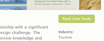
Finally, we added case studies to our site. In the last version of our site, we had a buggy, flash-driven gallery showing all the various projects we’d done. By showing images the final designs, it may have been visually enticing, but it didn’t communicate the value we brought to each of our client relationships. Also, the list of projects was long, which mistakenly communicated a focus on quantity rather than quality. Today, we have a “Featured Projects” page that displays a focused group of in-depth project case studies. Each study reviews the project goals, major decisions made during the process, the budget and industry, and of course includes a beautiful slideshow of images from the final design. Take some time to read through them.
More Faces!
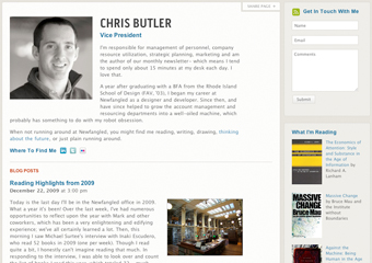
One last thing: Earlier I mentioned the compliments we’d received about our “People” page–particularly the images of each employee. We kept those images, but added landing pages for each person, which include a brief bio, a listing of projects from our “Featured Projects” section that they worked on, a listing of their most recent blog posts, what they’re currently reading, and links to other ways to connect to them online. I’m showing mine to the left because at the time of this writing, my page is the most “tricked out.” But be sure to read them all to get to know the wonderful people that work here and who deserve all the credit for our new site!
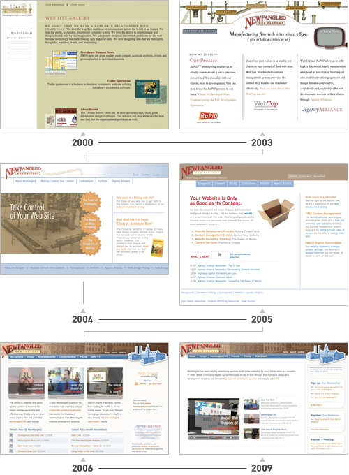
P.S. Ten Year Flashback!
Here’s a quick visual review of how Newfangled.com has evolved over the past 10 years:
Related Posts
-
An intimate, all-inclusive educational retreat exclusively for agencies...
-
An intimate, all-inclusive educational retreat exclusively for agencies...
-


Chris Butler presented on "You, the Other Kind of Business Leader"...