In my last two posts, I wrote about a website’s content on a macro level: styling the overall page and how to best incorporate images. Now I want to talk about a very specific and important piece of content: the text link. Without links, the internet would be nothing more than the world’s largest digital card catalog— a vast collection of unrelated articles and bits of data.
Text links are key to how visitors will digest your content. Most people scan web pages the same way they scan newspapers and magazines; looking for content that is interesting or useful to them (I’m sure you’re as shocked as I am to learn that your readers don’t savor every single word as if reading a Browning poem). By providing clear, thoughtful and conspicuous text links you’ll help your readers find the content they’re looking for rather than sending them off to another page, or another site.
Use clear, descriptive text
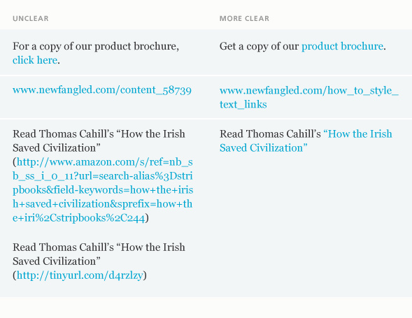
One of the most common errors is using “click here” for your link’s text descriptor. It’s a commonly accepted usability rule that a highlighted piece of text is interactive and can be clicked. If you’re creating an internal link, the text should describe the destination. If the link points to another website, use the website URL as the descriptor if it’s easy enough to understand (content creators are becoming more savvy about using friendly link names in their URLs). But if the URL contains a meaningless string of letters or numbers after the domain name, replace it with your own description.
A note about link targets: if the link points to a page on your site, set the link to open in the same browser window. If it’s an external link, set it to open in a new window.
Keep it short
Link text should describe what it’s pointing to clearly but quickly, like a highway sign. Long text link descriptors will only muddy comprehension and, in some cases, wrap to the next line of copy. You will also obscure your content by including your organization’s name in every link. Visitors naturally assume links relate to your product or service unless specifically told otherwise.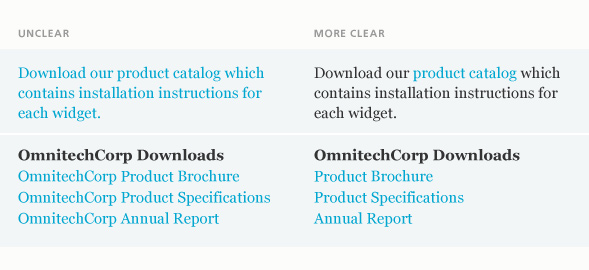
Make your links visually distinctive
There are many ways to visually style a text link, all of them with advantages and disadvantages. You’ll have to weigh the options and decide which one works best for your site. The key is to create enough visual contrast between the content and links so that the links stand out, but not so much that they impede readability.
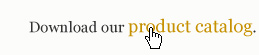
 Text Color: text links are automatically assigned a color but you can change it from the web-default blue to something more appropriate for your website’s color palette. Again, the key is contrast.
 Underline: usability gurus like Jakob Nielsen consider underlining (in addition to text color) the preferred method of styling a text link because the horizontal emphasis of the underline interrupts the vertical flow of scanning a page. Also, underlining can aid the sight impaired who may not be able to see certain colors such as red.
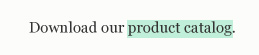 Background Color: similar to text color but, since it covers a far greater amount of real estate and is thus more visible, you can get away with a more subtle color selection.
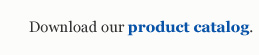 Bold: effective, but best used in conjunction with text color so that it stands out and isn’t confused with non-link, bolded text.
 Font Size: increases the size of the text when a visitor places their cursor over a link. Visually effective but it can cause the surrounding text to shift position, which some viewers find distracting.
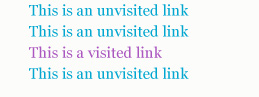 Visited Link Color: changing the color of links that have already been visited is helpful in regards to user experience (UX), especially with a long list of links or when a visitor returns to a previous page.