
In my last post, I began a series focused on what I call purposeful user flows. I define a purposeful user flow as an intentional, directed flow of information and choices designed into your website’s most important positioning content that does not rely upon a visitor exploring and using a navigation menu. If you’re new to this concept, you might want to get caught up before reading this.
Your Pitch Begins at Home
For some users, their experience getting to know your firm and understand what you do will begin on your home page. For most, it will begin on a lower-level page that they discover through a search engine or were referred to by a friend on social media. But if the content they discover on your site matches their search intent, the data show that they will either follow links to related content or follow what I refer to as a common orientation pattern, which is to return to the home page to better understand the source of the content they’ve just read. They may follow this orientation pattern after their first page view or after their third, but as long as they remain engaged on your site, it is inevitable that they will follow it. That is why your home page is always the beginning of the purposeful user flow.
I have written several other articles on best practices for home page designs. I’ll summarize them here first and then outline exactly what I recommend to almost every agency I consult.
Your Home Page’s True Purpose
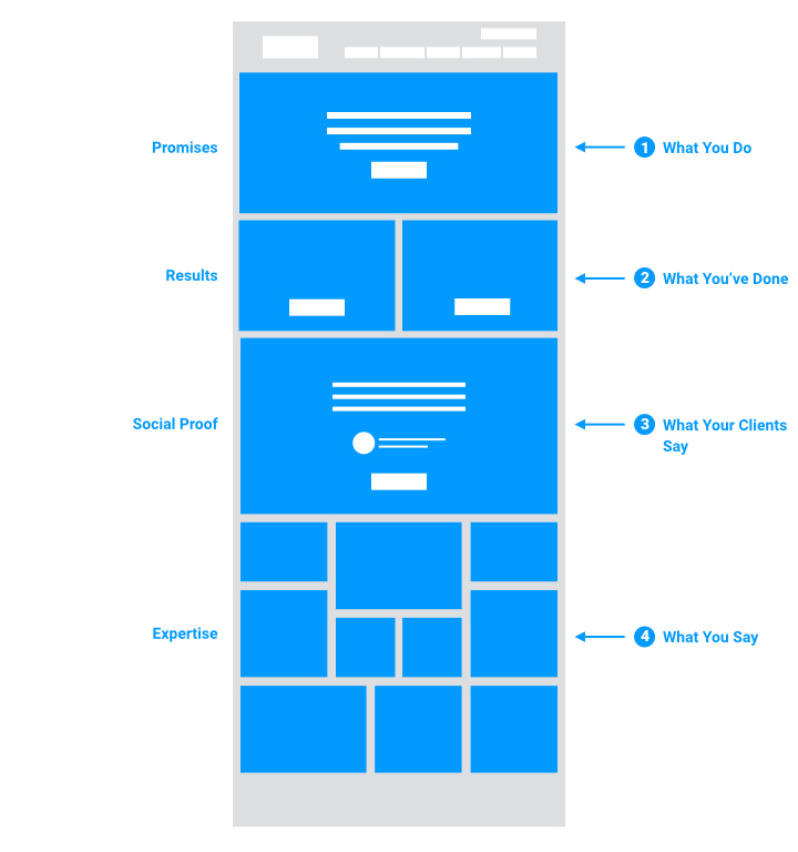
An agency’s home page does not exist to excite or entertain an audience. It exists to attract, inform, and engage future clients. The best way to do this is not to fill the screen with moving images, but to follow a simple strategic outline — which can be handled completely with text alone, if one so chooses — covering four concepts in the following order of priority:
- What you do
- What you’ve done
- What your clients say
- What you say
I have already written on this outline in more detail in a previous article, but let me summarize here:
- What you do
This is your positioning. Your promise. Ideally, you’re able to say what you do (horizontal positioning) and for whom you can have the greatest impact (vertical positioning). Keeping this very brief, your main goal is to guide a future client to take the next step and click “learn more” to go deeper within the site. - What you’ve done
This is your work. Your results. Ideally, you’re featuring one or two case studies of your best, most positioning-relevant work. Again, the goal is to be brief and to quickly direct visitors to learn more by digging deeper into the site. - What your clients say
These are testimonials. Social proof. A satisfied client will always be a better salesperson than you. Let them speak for you. Ideally, you are able to connect a compelling testimonial to a case study, and direct a visitor to the home page to read that case study deeper within the site through this testimonial. - What you say
This is your content. The evidence of your expertise in the form of blogs, white papers, webinars, videos, podcasts, news, etc. Too many agencies put this material above everything else, typically because it changes most frequently, and there is nothing an agency tends to fear more than a home page that isn’t continually changing. But, I always remind my agency clients that the purpose of the homepage is to introduce their firm to new people, not satisfy the need for novelty among return users, existing clients, or themselves.
But What About Creativity?
Now, let me assure you of a few things. First and foremost, nothing about this outline should stand in the way of good design. The notion that an agency can either choose good design or good marketing is, obviously, a false dichotomy. But I understand why that comes up as often as it does. In fact, the question I get over and over again — indeed, almost every time I begin discussing this particular recommendation with an agency — is, “well, then how creative are we allowed to be?” My answer is always the same: If you clearly communicate these concepts and maintain their order of priority, and if your creative choices don’t compromise that in any way, then you can be as creative as you like. The sky’s the limit!
The key is in keeping the business purpose of the home page in proper balance with the personality of the business. Both are important, neither more so than the other. But in my experience, an agency’s personality is often far more emphasized than its purpose. My job is to help restore the balance.
The most important thing to how a home page’s design works isn’t necessarily how it looks, but how the information it contains is prioritized.
Interpreting the Outline
Second, the recommended outline-style approach to an agency home page does not have to be taken literally, nor need it be austere in its visual treatment. Yes, I did say that it could be achieved with text alone — and I have seen some agencies do that well — but it doesn’t have to be done this way. There is nothing wrong with embracing the visual nature of what we do. In fact, few things excite me more than seeing an agency achieve a strategically strong and aesthetically rich design. So, as I said before, if you can go nuts without compromising the business purpose of your design, go nuts! As for how you interpret the outline itself, that is up to you. The most important thing to how a home page’s design works isn’t necessarily how it looks, but how the information it contains is prioritized. It must reliably guide a visitor to a deeper understanding of the business. If it does not do this, it is of no use to you.
Let me show you what I mean. The most important information your home page contains is an explanation of what you do. You may have heard this referred to as your positioning statement. It should be clear and concise and quickly direct visitors to learn more about what you do deeper in the site. However, in the examples below, both agencies have added additional information that expands upon what they do.
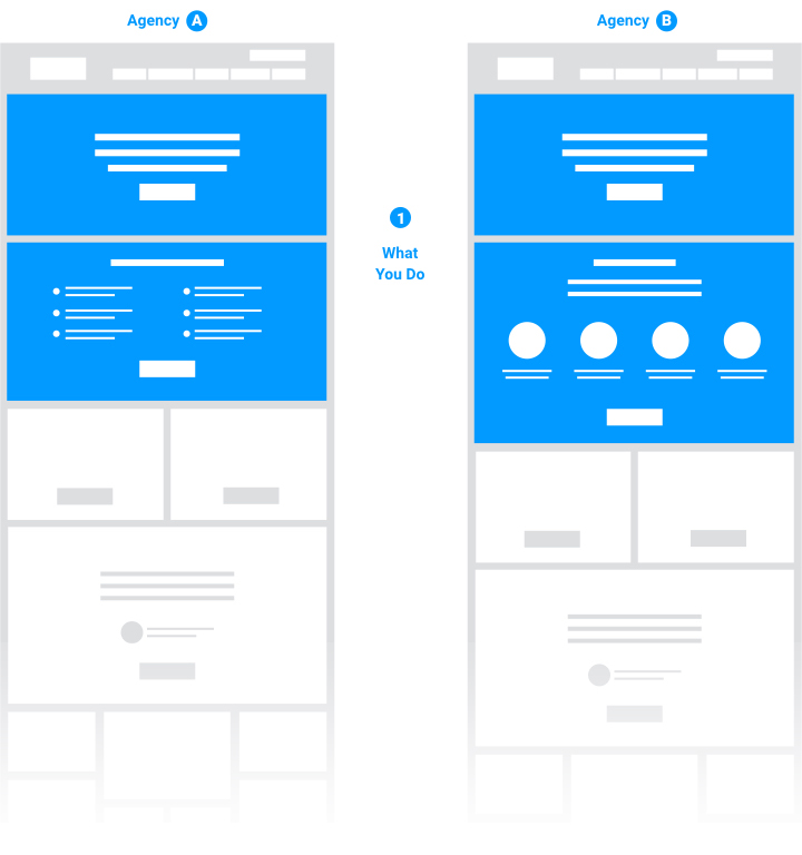
Agency A, shown on the left, has added a row listing client qualifications or pain-points (e.g. “We can help if…”). Agency B, shown on the right, has added a row listing specific services they offer. Some agencies find this necessary; others do not. That is entirely up to their discretion, and as I’ve said, it need not be a creative limitation. What’s most important here is that neither of these examples changes the overall order of priority. Both home pages, though they go about it differently, are designed to prioritize the communication of positioning.
Just as a home page can include more without compromising the order of priority, a home page can also contain less. I have worked with many agencies — and simply observed many more — that design what I refer to as single-focus home pages. Instead of a longer home page designed to contain a wider variety of information, a single-focus homepage contains only one piece of information. This can work quite well, provided that one piece of information is the right one.
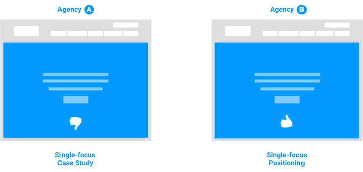
In the examples above, both agencies have designed single-focus home pages. From a wireframing standpoint, they look exactly the same. But, one is likely to attract, inform, and engage future clients far more effectively than the other. Why? Well, Agency A — shown on the left — has prioritized their work over their positioning. In terms of our outline, they’re elevating the “what we’ve done” content over the “what we do.” What do you suppose this means for brand communication? If the first thing a new visitor sees is an agency’s client’s logo and copy, then what’s really happening is they’re putting their client’s brand in front of theirs. If I see their work before I see their positioning, what do I learn about this firm? I learn more about their client than I do about them. Some may argue that’s all that matters — that a prospect see what an agency is capable of — but I disagree. I do believe that an agency’s output is a critical factor to evaluate, but not at the expense of positioning. While the output could be attractive at this stage to just about any potential client, an agency’s positioning may exclude that prospect. It’s better that be clear first. Agency B, on the other hand — shown on the right — has devoted its entire home page to communicating what they do. They understand the role of the home page, and as a result, will more effectively guide the right future clients through a process of better understanding their capabilities and outcomes deeper within the website.
That is the purpose of the home page — to best use the attention it attracts and filter it appropriately according to the nature of the business.
In my next post, I will share best practices for the next step in a purposeful user flow: the agency capabilities landing page. If you’re ready, you can read it here: The Five Essential Elements of an Agency’s Capabilities Landing Page.