
This is the third post in a series on designing a purposeful user flow, which is an intentional, directed flow of information and choices designed into your website’s most important positioning content that does not rely upon a visitor exploring and using a navigation menu. If you’re new to this concept, you might want to catch up with the previous two articles first:
- How the Right Design Will Turn Researchers into Buyers
- The Four Things the Best Agency Home Pages Do
Tell Them What You Do
The most important information your website must communicate is what you do. All the blogs, webinars, white papers, case studies, podcasts and videos in the world — no matter how good they are at communicating your expertise — won’t help your business unless it is clear to a prospect how your expertise is formed into a service or product that can help them.
The nature of a purposeful user flow is to intentionally guide a prospect to a clear understanding of what your business does and how it does it, beginning with a simple articulation of what you do — your positioning — and then making clear to them what they should do next. The pressure you apply is central to this concept. As I mentioned above, a purposeful user flow is an intentional, directed flow of information and choices that does not rely upon a navigation menu. This is critical, because a navigation menu is, on the spectrum of the various forms of information architecture (IA) we might encounter on a website, lacking in a point of view. Let me take a moment to explain that.
Lists and indexes are intentionally structured by objective criteria; alphabetically, for instance, or by recency. Search tools and filters, too, deliver results to users based upon relatively objective, but chosen, criteria. All of those forms of information architecture function best when they remain neutral toward the action a user might take. Navigation menus begin to demonstrate a point of view toward what information is most important on a website, as they are most useful when they offer fewer options and incrementally expose users to more. So, on that hypothetical IA spectrum, navigation menus might sit somewhere in the middle. But on the right are things like calls-to-action and buttons. These elements are designed specifically to elicit action. They visually represent a point of view toward what action is most important to take.
On your home page, this concept takes shape as a clear positioning statement accompanied by a single, prominent button prompting a visitor to “Learn More.” Without it, no visitor should be expected to do anything but keep scrolling. As obvious as that seems, I can’t tell you how many times I’ve reviewed agency websites that design beautiful home pages with well-written positioning statements and no clear indication of what a visitor should do. It’s too many to count. No buttons, no links, nothing. When I ask designers what they expect a visitor to do on the homepage, they usually say one of three things:
- scroll down all the way and choose what they think is most interesting
- explore the navigation menu and choose something from it
- click an image, usually representing a portfolio piece or case study
Tell Them What to Do
But then I ask, what do you want them to do? I get all kinds of answers to that question, too, but they — just like the typical expectations I hear — aren’t quite right, either. The most important thing you should want every visitor to your home page to do is begin to understand what your agency does and quickly make a decision to go deeper into the site to learn more. Every other choice a user could make, whether it is to read a blog post, a case study, or something else, only delays their ability to understand whether your firm can actually help them. It’s not that any of that content experience is less valuable. Many visitors will become buyers because something you wrote convinced them. But no visitor will become a buyer without understanding what you are selling. The predictable orientation pattern — in which a visitor who lands on a lower-level content page either bounces or eventually returns home to understand who produced that content and why — proves that. Your website’s job is to graduate researchers into buyers. So your home page’s first job is to make clear what is being sold. If you don’t tell them they won’t know. Most of us understand that well by now, as the many agency websites I’ve seen with great positioning statements show. But, if you don’t tell them what to do next, well, then they probably won’t do it.
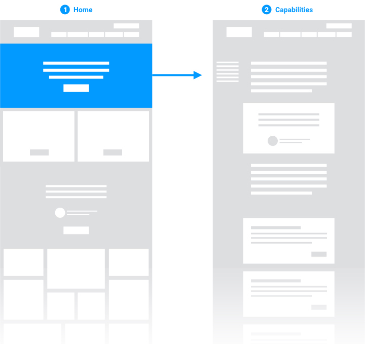
Your home page’s positioning statement and call-to-action should direct visitors to a landing page dedicated to explaining what you do in more detail. Regardless of what you choose to name this page, I call it your capabilities landing page.
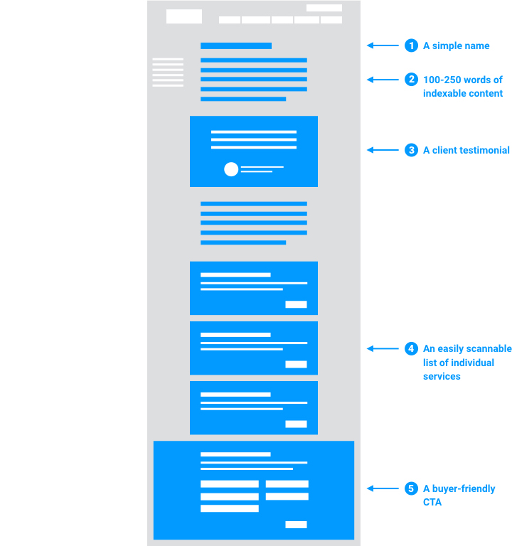
An ideal agency capabilities landing page has 5 key attributes:
- A simple name
- ~100-250 words of indexable content
- A client testimonial (social proof)
- An easily scannable list of individual services
- Buyer-friendly call to action
Most of these attributes are self-explanatory, but let me briefly elaborate on each one.
1. A simple name is a recommendation I make over and over again, mostly in reaction to a common agency habit of giving proper names to common work. For instance, if you’re a branding firm, you may have a unique name for your “proprietary” branding process (however dubious its uniqueness may be). But don’t give this page that same name. No one will know what it means. A page like this is better named something that clearly sets up any visitor’s expectation for what information the page contains. So, stick with something simple, like, “What We Do,” or “Our Services,” or “Capabilities.”
2. Be brief. This page needs to elaborate on your positioning statement, but it need not be a long-read. The goal of this page is to continue to guide a prospect on a journey of better understanding what your firm does, so the most important next step they can take is to go deeper and learn about the specific services you offer. The words on this page that precede your list of services should explain your firm’s mission and how, generally, you work to achieve it.
3. Social proof: As I’ve said before, a happy client will always be a better salesperson than you. Try to feature a testimonial here that speaks to the full scope of what your firm offers and the transformation you’ve made possible for them.
4. List your services, not your deliverables. This list should not be long. It should name the service, include a brief abstract, and a clear button that directs them to another page dedicated to explaining it in more detail. This is the most important choice you want a visitor to make on this page. You want them to go deeper in their understanding of what you do. Now, another important detail to remember is that this list should either be a list of discrete engagements a client might hire you for or a list of discrete programs that are the individual, discipline-specific steps of your ideal client engagement. It should be a list of what you sell. But, it should not be a list of everything you produce. Avoid the Cheesecake Factory menu! You sell branding, not brochures, right?
5. A buyer-friendly call-to-action is one that invites a prospect to get in touch with you directly to discuss working together. Though the most important step you want to design in to this page is the one that takes a prospect deeper into a page dedicated to one of your individual services, if a visitor is ready to go, don’t block their way. Make it clear that they can “get started” or “request a meeting” at any point along the way in your purposeful user flow.
That is the purpose of the capabilities landing page — to best use the attention it receives by explaining the purpose of your firm and directing visitors to learn more about the individual services you offer.
In my next post, I will share best practices for the next step in a purposeful user flow: the individual service landing page. If you’re ready, you can read it here: The Four Essential Elements of an Agency’s Service Landing Page.