
No, it’s not the prettiest interface in the world, and there are definitely some trade-offs in using a cloud-based eBooks tool, but at this point, I’m willing to say that Google Books is my favorite (besting Kindle and iBooks).
Even Compared with iBooks and Kindle?
Apple’s iBooks has some great attributes. Their store has the best interface (though I’m perplexed that I can’t browse and purchase books via my desktop iTunes) and easiest checkout process (one very instant click—dangerous!) among the “big three.” But their selection is still pretty hurtin’. Most of the books I want to read—the ones I learn about from all kinds of other sources—blogs, reviews, Twitter, etc.—are not available in their marketplace. If the inventory isn’t there, it doesn’t matter how pretty the store is to me. The reading experience is great, but if I want to sync my books across my iPad and iPhone, I have to plug in my iPad, sync it with iTunes, then plug in my iPhone and sync it too. That could take a while (seriously, syncing the iPad can take 5-10 minutes), but it’s instant on Google Books.
Since I don’t own a Kindle, I’m not expecting the Kindle store or reading experience to be great on other devices like the iPad or iPhone. And frankly, it’s not. It’s slow, unattractive and a pain to browse and purchase from. So Kindle is out. I’ll check back in on that if I ever buy a Kindle.
Why Google Books Wins
That leaves Google Books in the lead for me. The big win for them is inventory—their selection is huge and diverse. Maybe that has more to do with the kinds of things I want to read, but hey, it is what it is. The store isn’t that smooth (typical with Google-sprawl), and I had to work through a few setups and cancelations of my GoogleCheckout account to actually be able to purchase books (really, Google?), but once that was all worked out, I found myself very happy using it.
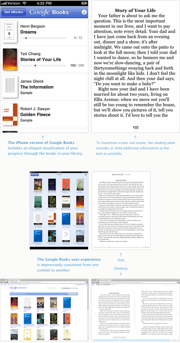
The very big deal to me is the smaller UI details that prioritize the reader and reading, which should be the point of this whole thing. I love that I can read a bit of a book on my desktop, pick up my iPad later and be in the exact same place, and then pick up again on my iPhone if I’m on the bus. Because all three devices sync with my book in the cloud, I never have to worry about bookmarking where I am. The iPhone has a cool little idea for how to display my progress, too, which would be cool to build in to the desktop and iPad versions as well (see below).
Finally, Google Books offers the reader more visual options than the other platforms, including the ability to read the original page scans instead of the flowing text. Depending upon the “vintage” of the book, there are pros and cons to each method. For a much older book, the scans will probably be the way to go as the flowing text has a hard time interpreting various page layouts. Newer books don’t have this problem as the content has been intentionally prepared for eBook formatting.
Below are some images. In the meantime, I’m interested in observing how these interface trends will make their way back through the feedback loop and in to web and software interfaces of other media… especially the progress visualization…
Oh yeah, happy St. Patrick’s day!