If you read back through my past blog posts, you’ll probably notice that I don’t write much about design. I tend to leave that to the pros with design backgrounds – people like Chris Butler. However, one thing I do talk about with our clients, almost daily, is forms.
Forms are arguably one of the most important features of your website. They are what allow you to learn who is visiting your website and who is interested in what you have to say. They allow you to capture meaningful data on those who engage with your content. Forms enable marketing automation. They’re the trigger point at which you can begin nurturing leads through the buying cycle. Without forms, your site would be a brochure and you wouldn’t know who is interested in your services until they picked up the phone to call you.
But, forms are ugly.
I’ve never met a designer who liked forms. They’re clunky and distracting. And I’ve seen some pretty clever ways to put them out of sight – tuck them away so that they don’t interfere with the design of the website.
What I’d like to do is talk about what to do (and what not to do) when designing forms on your website. The end goal is to end up with forms that are designed to be functional, easy to use, and to convert visitors into new business prospects.
1. Design room for the form to expand or contract.
Progressive Profiling is a great tool. It allows you to collect a couple of new pieces of information from a visitor to your website each time they fill out a form. Over time, the result is a robust profile on your site’s most active users. However, if you are using progressive profiling (which we highly recommend), remember that your form could vary in size. The first time a user sees the form, it may only ask for their name and email address. Then, the next form they see may show their pre-filled name and email address while also asking for their company name and title. Thus, the same form could show at a different size for different users. That means that you will need to be sure you design room for the form to expand or contract. This could be done by having the forms open in an overlay, placing them in a sidebar where they have space to grow or contract, or adding them at the bottom of your posts so that the growing forms don’t take away valuable content space. Whichever option(s) you choose, make sure that your design considers what the form will look like at different stages of progressive profiling.
2. Always place field labels outside the fields themselves.
This is of particular importance if you ever intend on pre-filling form fields for users, which we also recommend. While placing the field labels inline may look nice in a static design file, it can cause usability issues when the form is pre-filled, or even when the user first clicks into the field and forgets what information that particular field is collecting.
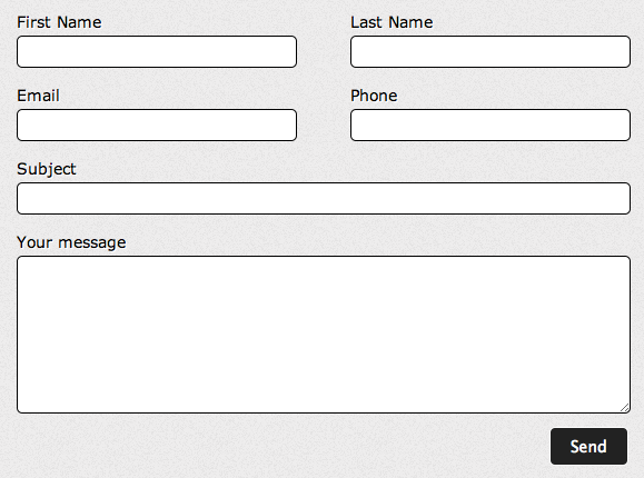
Here is an example of what not to do with your form fields: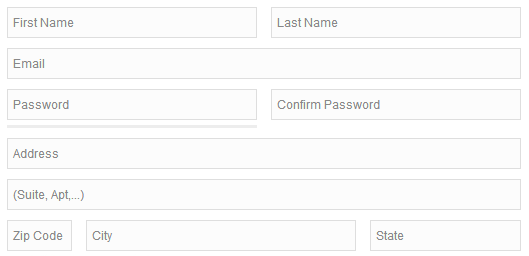 Instead, try something like this:
3. A hidden form is an ignored form.
We have found it to be a best practice for the form fields to be visible on the pages of your site. If a user has to click on a button to access the form before they know how long the form is going to be, or if they’re going to be redirected off the page they’re reading when they click, they are less likely to engage with the form. If the user can visually see that the form is short, they are more likely to fill it out. Additionally, form fields are a visual cue for visitors, letting them know there is an action they can take. If they can see the fields on the page, they will more quickly recognize that there is a call to action on that page.
4. Don’t decorate, contextualize.
Forms should be placed contextually. Consider how a user would engage with a form, taking into account the content on that page. If you’re placing a form to request a quote on a page that describes one of your services, the form should likely be placed at the end of the copy. A user is not likely to complete the form until after they read the content. However, if you have a form to subscribe to your blog digest, you may want to place it in the sidebar of all of your blog posts pages, so that readers can subscribe at any time, not only at the end of a post.
While forms will likely never be the most fun aspect of your new website to design, they play a critical role and shouldn’t be treated as an afterthought. The design and placement of your forms can impact whether or not your site is successful at converting visitors into new leads, which at the end of the day, is one of the key roles of your website.