Last month I wrote about “the fold” and how it has been misinterpreted and incorrectly applied when it comes to prioritizing a web page’s content.
Drawing an imaginary line across the page and placing a majority of your content above it really misses the goal, which is to expose users to important content and site features in a timely and clear fashion. Sometimes this involves scrolling, sometimes it does not. There are many ways you can call attention to content (color, size, contrast, positioning, etc.) without having to cram it all in the first 600 pixels of your page.
According to research by Clicktale, the length of a web page has no influence on whether a user will scroll down the page. It’s natural for a user to assume that the first thing they see is the most important content on the page (who, what, how and why), but “the fold” will not keep them from scolling if they are interested in moving deeper into the content.
In this post I’ll highlight some instances when thinking about the fold makes sense, and when it doesn’t.
What Fold?
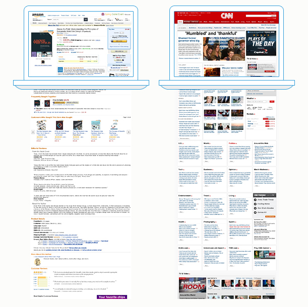
Amazon and CNN don’t really have a “fold” but they do have content zones in which information is organized. The upper part of the page contains the most critical infomation. Amazon makes sure you see the product image, name, price and shipping info first, with a conspicuous “add to cart” button nearby. CNN’s lead story takes up a good chunk of the page, but you can also see the upper part of a list of recent stories as well as a group of featured videos; both of which lead you further down the page.
In part one of this two-part post, I stated there were instances in which thinking about “the fold” made sense, such as key landing pages and calls-to-action (critical conversion points for your site). Following are some examples of sites that either hit the bullseye or miss the mark when it comes to optimizing page real estate.
You’ll notice the first 760 pixels of each example page is shaded, which indicates a minimum viewing depth based on a screen resolution of 1024 x 768. Screen sizes and resolutions vary widely so 760px is not to be interpreted as a hard standard, but a minimum desktop range to consider when organizing page content.
Calls-to-Action
Microsoft is not a newcomer to the web so you’d think they would be more strategic about placing the conversion point (the download button) for their Windows 8 landing page. Instead, it’s buried in the bottom third of the page. An additional button placed somewhere near or inside the marquee image at the top would make this page more conversion-friendly.
AOL has a similar issue with their “advertise with us” and “work with us” landing page calls-to action (CTAs)— they’re at the bottom of the page. However, they do get credit for a clear and conspicuous positioning statement as well as a unique arrangement of content that draws your eye farther down the page.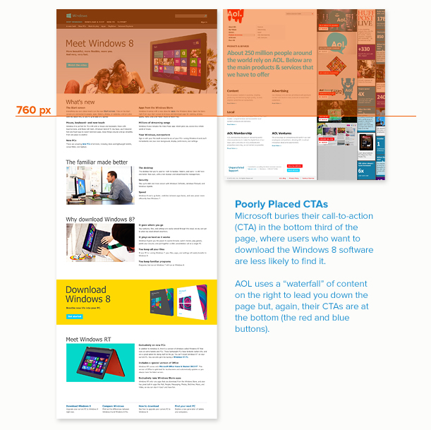
10… 9… 8… 7…
According to user experience research, the average amount of time a user spends on a web page is 10 seconds. Given this fact, the wise choice is to prioritize and minimize the content the user will see when a page loads so the message doesn’t get lost.
Two sites that do this very well are issuu.com and clickbank.com. Both landing pages use the valuable real estate at the top of the page to answer who, what, how and why as clearly and quickly as possible.
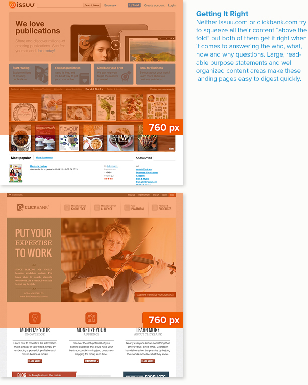
Issuu sports a clear purpose statement and four content features (that double as main navigation) in a very attractive design. ClickBank’s uncluttered home page presents a simple navigation with a slide show below. Each slide features a customer testimonial and a “learn more” button. To further draw your eye down the page, large icons introduce three key content areas.
Hopefully, you realize by now that I have nothing against the concept of “a fold” as it relates to optimizing page real estate so that your most critial content is seen first. Requesting that certain content live “above the fold” is fine as long as it leads you to carefully consider which content takes priority and the purpose of each page on your site.