
Today I gave a design-centric talk at HOW Design Live in San Francisco on the web design and development process. I’m posting a full writeup of the talk here with all the key slides…

Good afternoon!
So, look. It’s the last session of the day. I know what that means. You’re brain is full. You’re tired. You’re ready to take the edge off at the happy hour. I get it. So I’m going to keep this light, loose and simple. I do have a bunch to share with you, but to keep us all from snoozing, I’d like to keep it open for questions as we go. There will be about three natural stopping points before I wrap up and we do a general Q&A. But if anything feels urgent before them, raise your hand.
And by the way, thanks for coming to this session. You had 5 other choices you could have made. I have to imagine that Heather from ICanHasCheezburger’s session is overflowing right now. That’s where I’d be if I weren’t me. So maybe I’ll pause for a sec if anyone wants to reconsider. No? Phew. That would have been somewhat uncomfortable. For me.
Ok. Let’s do a quick survey of the group.
Raise your hand if you’ve ever written any code. Keep your hand up if you’d call yourself a Developer.
Raise your hand if you’ve ever been responsible for managing a project. Keep your hand up if you’d call yourself a Project Manager.
Raise your hand if you’ve ever given advice to a client. Keep your hand up if you’d call yourself a Strategist or a Consultant.
The disparity is interesting, isn’t it? So what *do* we call ourselves? Designers? Creative Directors? Maybe something like those. But being a “designer” today does involve development, project management, strategy and more. Yet we don’t own this knowledge or expertise, do we? Even when we’re offering it. Now, maybe we’re just being humble. But I actually think it’s more than that. I think we don’t claim that expertise because we know we’re not able to do much more than scratch the surface when it comes to things like code and project management, and we’re terrified that if we were to dig deeper in those areas, we’d find ourselves far away from doing the thing we truly care about: design.
But that’s the whole problem. As the requirements of our profession have become more complex, we’ve succumbed to a sort of improv-style approach to working: “Yes, and…” Yes, and code. Yes, and project management. Yes, and consulting. These days, the design conversation tends to be dominated by “designers need to: learn project management/learn code/learn strategy.” And that’s all true, to a point. But what if we tweaked it a bit, and instead of thinking about this as an additive process, we thought of it as a process of better integration. Of finding design in the process, rather than adding to the design process.
If we thought of it that way, I think we’d find that every step of the process is, fundamentally, grounded in design.
Is this resonating with you?
Good. So where do we go from here?
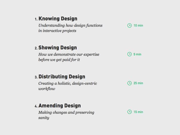
Well, I’d like to look at this idea in four stages.
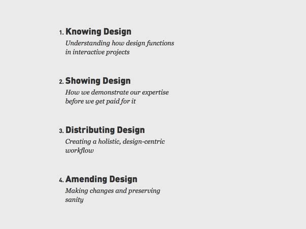
First, we’ll take a big step back and look at how design functions in interactive projects. Design for a usable screen, rather than one we just look at, inherits some of the obviously fundamental elements of design, but also introduces some unique challenges of its own. The reason I’m calling this “Knowing Design,” is because like any other philosophy, there’s a huge difference between knowing something and showing it to someone else. You know you exist, for example. But try proving that to someone else. Don’t worry, though: I know you’re not here for a theory lesson, so I’m going to keep this brief. There are few things worse that attending a session you think is going to offer something practical only to hear, “What is design anyway? Can we all just process that together?” I’m aiming for TEN MINUTES here.
Naturally, that leads to “showing design,” which, believe it or not, is a big part of how websites get made. This is how we demonstrate our expertise before we get paid for it. Even better news here: FIVE MINUTE maximum on this stuff.
After that, we’ll get into the process. But remember, this is about design, so I’m calling that “distributing design.” Instead of taking a staged, assembly-line approach to this process, I want to advocate for a holistic, design-centric workflow. Here’s where we’ll review what that looks like, and where your handout will come in, well, handy. You’ll notice I changed the title — they make us finalize the handouts months in advance, you know — but the steps and fill-in-the-blanks will be covered exactly as you see them. There will be GANNT charts. We’re looking at about 25 MINUTES here.
Lastly, we’ll look at how that workflow evolves into an iterative process of amending design decisions. The main point here is to figure out how to do that and not go insane. That will be about 15 MINUTES, which, by my watch, leaves us roughly 15 more for more Q&A.
Ready? OK, let’s go.
1. Knowing Design
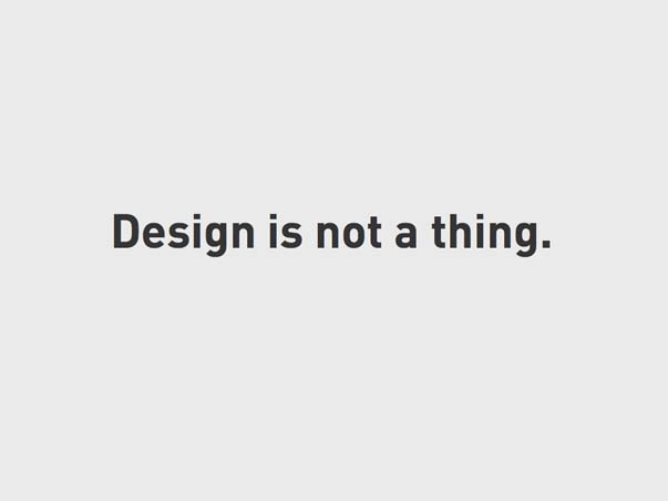
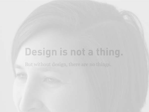
Design is not a “thing.”
But, there are no things without design.
You’re designers. You already know this. The fact that design — especially good design — is difficult to see is the very power of design. But it’s also a stumbling block to us. Why?
Because we’ve got egos. We want to be seen! But when success is imperception, that sets up a problem for us, doesn’t it? This is true of all forms of design, but especially so on the web. Here’s why:
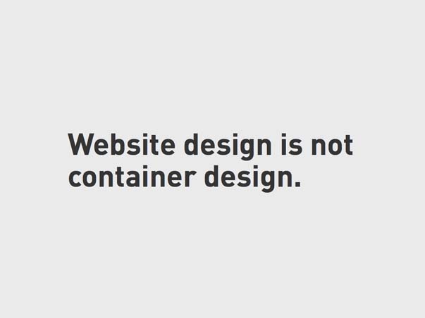
Website design is not container design. That’s just one thing that makes it so different from other forms.
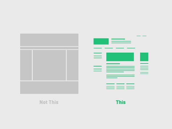
It’s not about this — the rectangles we make — but this — the content we make for the web.
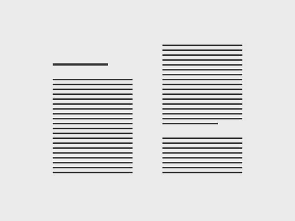
Let’s consider books, for a moment, as an example. Once an author has written something, it becomes the designer’s job to give that something a physical form. We’ve got to consider all kinds of things — typography, paper, the size and shape of the book itself — in order to create something that amplifies its contents.

See, a book’s interactivity is one-way. It delivers information by way of a printed page that never changes. So, it’s got to leverage a variety of object interactions and, essentially, make them disappear.
A reader thinking too much about a book is not reading!
But then, a book must also convert a prospective reader into a reader. It’s got to seduce you. In order to do this, its design must do everything but disappear, whether it’s on a shelf or a rectangle in a grid. That’s what covers are all about. But there’s a friction there, right?
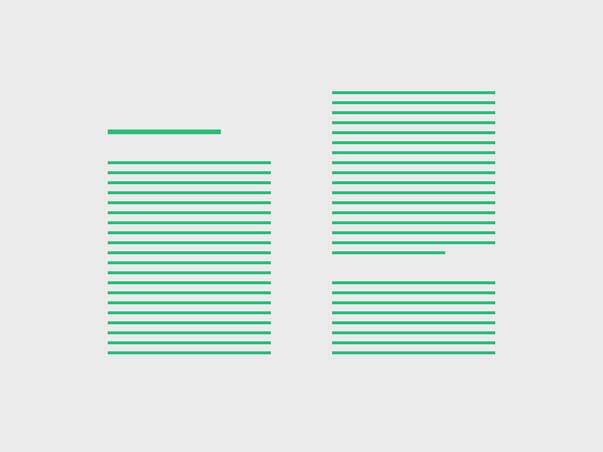
Unlike books, websites contain content that is always in flux. This requires a different approach to design. While a book designer must give physical form to a complete text, a web designer must account for an evolving text, most of which hasn’t even been written yet. Book design reflects content; web design anticipates it.
So, like books, websites require an invisibility that allows the content to come forward, but unlike books, they require an elasticity that adapts to content and to context. That’s what responsive design is all about.
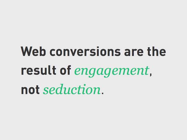
But a website must convert, too. First, a prospective reader into a reader — like books — but then a reader to, perhaps, a buyer or a subscriber or some sort of deeper level of commitment. This conversion pattern evolves quickly from an impression to an education; it requires a much deeper engagement with content than seduction alone can sustain.
That sort of engagement doesn’t just happen. Engagement is the result of an experience designed to capture, hold, and preserve attention. A book captures attention with its cover, but how it preserves it has just as much to do with its physical properties as its content.
Reader focus is object facilitated. From cover to cover, there’s only one experience to be had, so distraction must come from outside the book. But on the web, all content is wrapped in possible distraction. Design is our only means of gaining a few moments of a reader’s time before another tab, text or tweet becomes of greater interest.
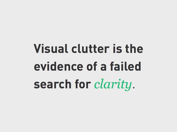
Imagery plays a significant role here. With beautiful images and smart copy, books say, “I’m special. I only do one thing, but I do it in a way that will change your life. I’m really, really worth your time.” If you pick up a book today, it’s made that argument successfully. If only it were that simple on the web. On the web, we’re working against an entropy that we’ve created by going with an all-cover strategy because we believe that seduction is our only hope of getting any attention to our tiny corners of the web. But let’s face it, nobody is likely to believe that a webpage is truly special, or will change their life, or is worth hours and hours of their time. No, our argument is a negative one: “I won’t waste your time.” If we want people to believe that, we can’t try to seduce them. That’s a surefire way to lose their trust. Instead, we’ve just got to get to the point, as simply as possible. When a designer cannot maintain the balance between seduction and simplicity, design is always degraded. It becomes decoration. The more container you see, the less meaningful content there tends to be. Visual clutter is evidence of a failed search for clarity.
In fact, sometimes the best design decision you can make is to put noting where something could be. We do know this — I really believe that — it’s just a shame we don’t practice it as often as we should.
To sum all that up: design isn’t so much a property to be seen — literally — as it is to be known and perceived on the basis of other things. Which also means that for designers, knowing design and showing design are two very different things.
So, let’s switch gears and think a bit about showing.
2. Showing Design
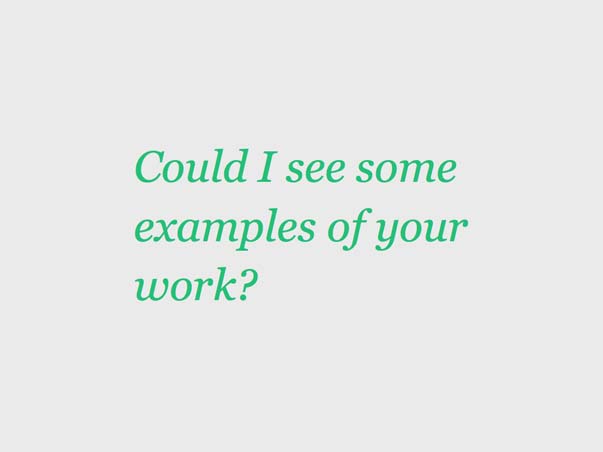
You’ve heard this before, right? What designer hasn’t? Of course, the subtext of this is more along the lines of, “Show me your best stuff. Assure me you can produce the impression I want.”
There’s a place for this. There’s certainly a value to making a good first impression. But, I want to take issue with this showing business.
Showing off your most attractive work is not showing design. It’s displaying outcomes.
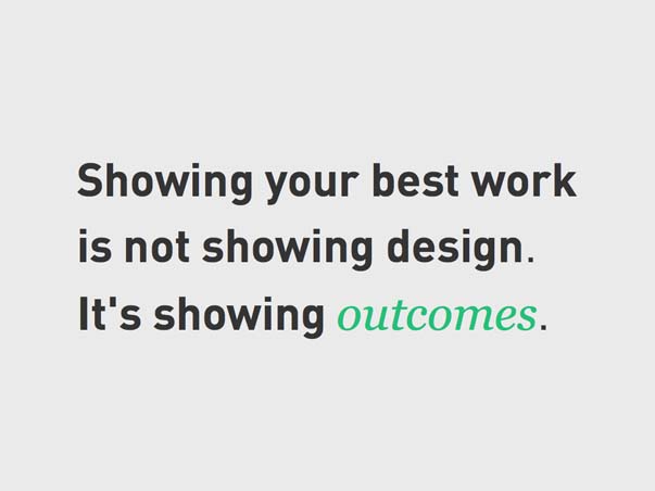
There’s a huge difference there! Without an explanation for how these outcomes have been reached, a portfolio is really just an index of taste or style.

Sure, it might help a prospective client feel out if there might be chemistry between you and them — by discerning a shared sensibility, maybe — but all you can really rely upon is that a portfolio will show that you’ve done stuff before.
But as a vetting method, it’s pretty weak.
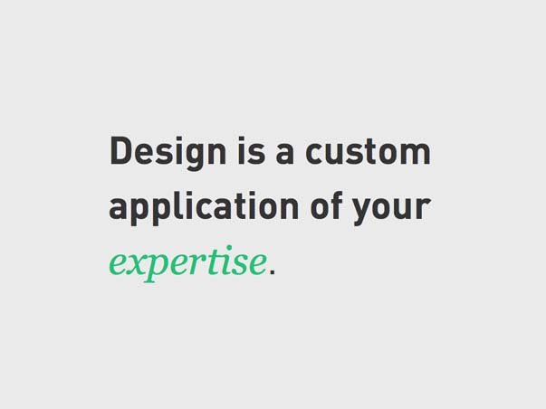
Good design shapes itself to a variety of factors, least of importance being your taste or style. Design is the custom application of expertise, every time.
In order to really understand a designer’s work, it needs to be discussed or observed in process — who is the client, what was the problem, what solutions were tried, what worked, and why. But really. Ain’t nobody got time for that.
That’s why selling design doesn’t work. It’s too vague to make someone feel secure upon embarking upon a long, challenging, and potentially expensive process. Talking about design is too vague; talking about outcomes is too specific. You’ve got a goldilocks problem.
But what about process? How you apply your expertise. Process is something a designer should be able to discuss in a specific, coherent, and concrete way. It makes people feel safe to know that there is a roadmap in front of them. It answers the questions you know they have: What’s going to happen? How long will it take? What will I need to do?
The trouble is, articulating a process still requires some way of showing when design is being done. And even that — when design is being done — is something I’m hesitant to say because thinking of design as a discrete task is all wrong. It makes us likely to do annoying things like call it “visual design.”
So let’s talk about design and process.
3. Distributing Design
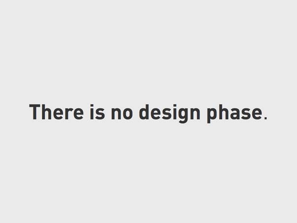
Really, design is being done at virtually every point along a website project timeline. Of course, saying that is only going to confuse people.
I mean, this isn’t really the impression you want to make.
The other option, of course, is to limit our mention of design to only those instances in which we can “show” design in a deliverable. This is the standard, “design-phase” approach. But design isn’t something to be line-itemed, anymore than, say, something like “creativity.” There are, obviously, discrete tasks and deliverables that often fall under the category of design, but as long as design is considered just one of many stripes of a GANNT chart, real, effective, design won’t happen. Why?
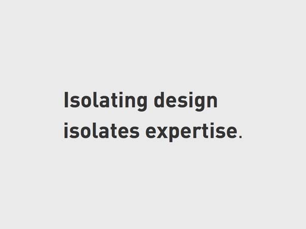
First, isolating design isolates design expertise. Designers need a place at the early-stage-discussions table, where they can listen and contribute when their ears and eyes are most needed. Believe it or not, design decisions are being made there. Every design requirement is established by an early-stage decision, which makes every early-stage decision a design decision.

Second, if design is isolated, it will unproductively spill over into everything else anyway. Either as unnecessary stress over the aesthetic implications of early IA decisions, or as legitimate stress over the usability chaos that results from assuming that design is just a layer of paint.
A basic rule of thumb is this: you’re going to talk about design all the time. It just goes better when you’re prepared for that.
So how do we express the process in a way that properly “locates” design?
I think that has to do with crafting a process anchored by decisions — that’s obvious — but decisions that are expressed in terms of “commitments.”
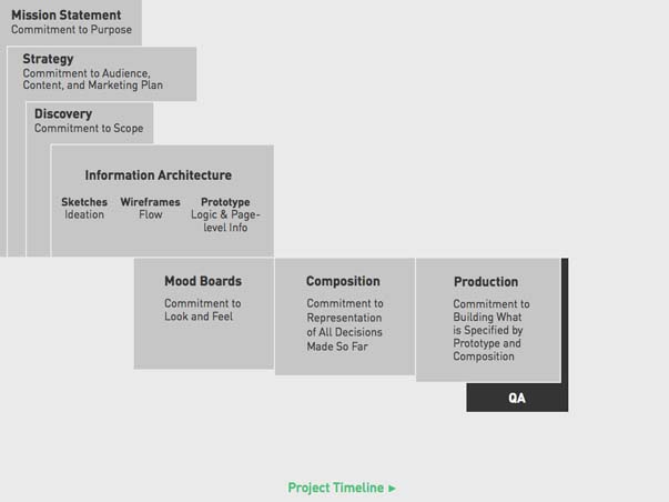
Here’s how that might look:
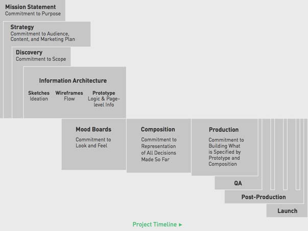
See, it’s kind of GANNT-y. It goes from left to right. There are distinguishable chunks, ones that lead to others, milestones you can infer, etc.
So here are the labels. I’ll quickly review these, and then we’ll look at each one individually.
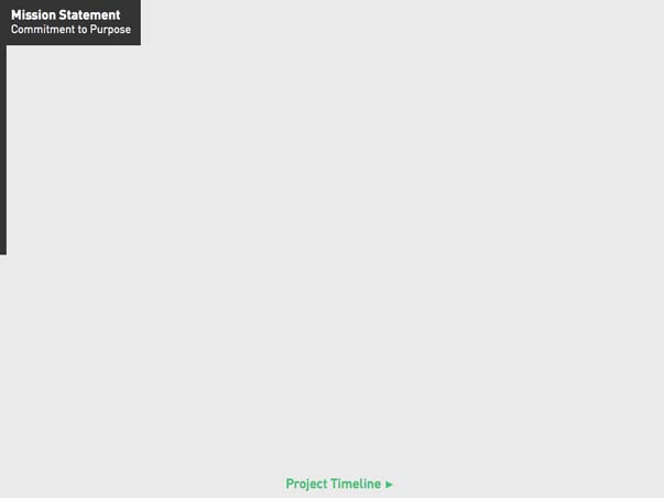
Mission Statement, or Commitment to Intent
This is where you’re articulating purpose. Who are you? What are you trying to do? For whom? How will you do it? It really helps to write this stuff down, whether as an official business plan or something more casual. I’m amazed by how infrequently this happens.
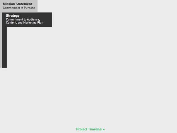
Strategy, or Commitment to audience, content strategy, marketing plan, etc.
This is another big-picture phase. The idea here is to gather everyone who will influence the direction of your thing to make a solid plan for its success.
Begin with the business objectives. Allow the group to strategize how to meet these objectives using their collective expertise. Identify the audience and develop a content strategy that suits them. Sketch out a data flow that properly locates the website you’re planning within the larger marketing ecosystem consisting of its content management system (CMS), a customer relationship management tool (CRM), and a marketing automation suite. Remember, a website doesn’t just display information; it gathers it, too. Then, get everyone’s opinion on how long they’ll need to do this work and how much it will cost. Write all of this down. That’s your plan.
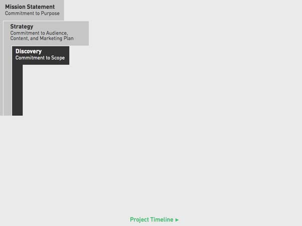
Discovery, or Commitment to Scope
This is often an extension of the strategic phase, but one that gets into much greater detail. In particular, you’d be narrowing in on a detailed assessment of the scope of work for an initial phase (from start to launch) as well as perhaps a more generalized idea of the scope of a potential phase two (post-launch). The goal here is not necessarily to produce an exhaustive functional spec, but to answer critical questions of how key objectives will be met and how to prioritize them given particular constraints like budget, timeline, etc. Sometimes this forces a revision of the timeline and estimate you put together in the strategic phase — either in terms of expanding or contracting it.
What’s more important than how planning happens is that it happens at all. It’s not a project if step one is making something; that’s like diving head-first into a concrete kiddie pool. The more complex the project, the more involved planning will need to be. So, extra points if you account for planning in your project budget because, yes, talking about work is work.
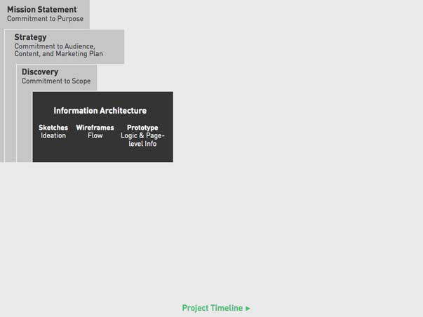
Information Architecture, which comes in three parts:
Sketches, or Commitment to Ideation
Of the many things paper and pencil are still quite good for, quick ideation is certainly at the top of the list. This sort of casual planning has a place in even the most serious development projects. Few things are as good at enabling the activation of creative thinking. As soon as you try to think creatively in front of design software or a text editor, the technology gets right in the way and fundamentally changes your thinking. Paper and pencil have that book-like object-magic of disappearing during use.
Wireframes, or Commitment to Flow
Paper isn’t great at exploring interactions and outcomes, though. So the next step is to create wireframes that articulate the logical flow of information from one screen to the next.
Prototype, or Commitment to functional scope, logic, and page-level information hierarchy
Wireframes aren’t detailed enough to carry a project into production, so that’s where prototypes come in.
A prototype distinguishes itself from a paper wireframe by being interactive (clickable!) and describing the information architecture of a website as well as its functionality and aspects of its user experience — aspects, because prototyping ignores how things look as much as possible. A prototype’s main job is to bridge the gap between printed site maps, lists of technical requirements, and the final website by serving as a form of documentation concerned with informational hierarchy and functionality, not aesthetics. Since it’s going to be handed off to designers and developers, it’s better if it’s ugly and clear than pretty and confusing.
The order in which you actually build a prototype may be, in some places, somewhat counterintuitive, but sequence is important to ensuring that big decisions provide a stable foundation for smaller ones.
Typically, I break the prototyping process into six stage:
- Resolve the general information architecture of the website, and determine what pages it will contain and how the pages will be organized.
- Specify the structure and informational content of business-critical pages, like product or service landing pages.
- Specify the structure and informational content for content marketing pages like articles and blogs, and determine the calls to action that correspond to each.
- Pause to consider the metadata each type of content will contain because that will become the backbone of search and filtration tools.
- Resolve the contents and structure of the homepage
- Account for third-party integrations, such as with CRMs or inventory databases.
In general, if you expect the website to contain it, then it needs to be in the prototype.
The interesting thing is that with each of these IA planning methods, design is focused on information rather than aesthetics.
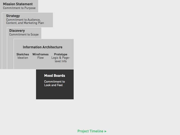
Mood Boards, or Commitment to Look and Feel
In parallel with Information Architecture, aesthetic decisions can be made. This starts with the creation of mood boards, which are actually another form of prototyping. A mood board focuses in on the visual elements that make up the look and feel of a website — imagery, colors, typography, etc. — and explores how they work together independent of specific page layouts. The closer they are to collage, the more effectively they focus everyone’s thinking on how a website’s aesthetics support the brand.
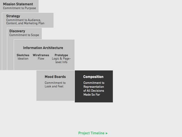
Composition, or Commitment of Visual Representation of All Decisions Made So Far
This is the phase most often referred to as “visual design” or “design” or “design creation” or something like that. But really, it’s the application of the look and feel committed to in the mood board phase to the information architecture committed to in the prototype. For the team, it produces documentation in the form of annotated, layered, graphical composition files (for each unique template a website may have) that a developer can use during production. For your client, the result will be what everyone expects of “design”: layouts that look like what the user will see.
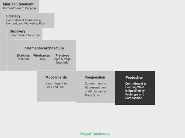
Production, or Commitment to Building What is Specified by Prototype and Composition Files
A lot happens here. Like, for real. Code and stuff. But I’ll keep it pretty brief. Production is the implementation of what you’ve designed in your prototype and finalized in your composition files.
Depending upon the makeup of your team, this could be an iterative experience, where there’s flexibility between what has already been decided and what is implemented. Or, it could be more rigid, where implementation is limited to only what has already been approved. Those dynamics are up to you — both have their pros and cons — but they’re typically the result of circumstance, not preference. I’ll get a bit more into this later.
Generally, though, you can expect production to be a bit quieter than previous phases, which makes it a good time to check in on third-party integrations while your developer is busy. In fact, if your site will be integrated with a CRM or marketing automation suite, you’ll need to have already set up those accounts and configured campaign logic before the code that enables the website to talk to these tools can be written.
Quality Assurance (Q.A.), or Commitment to Verification
…of proper functionality, of design consistency, and of contextual consistency (i.e. proper function across browsers and devices).
Once production has reached a “pencils down” moment, what has been built can be tested. You can call this quality assurance (QA), but I prefer just calling it “getting feedback.” This is when people start using what you’ve made or, better yet, when you start finding out if what you’ve made actually works.
So be warned: This feedback phase is a long stretch of time where you’ll feel like you’re repeatedly failing because, no matter how good the plan, no matter how beautiful the design, no matter how excellent the code, there will always be things that need to change once you’ve finished. And even after you change them, they’ll probably need to change again. There are simply no perfect launches. When what you’ve designed is used, better ways of doing things that you’ve already spent time and money doing differently will be revealed. It’s OK; that’s exactly what feedback is for. That’s the why of feedback. How it’s gathered is much more straightforward.
I’d recommend a preliminary round of quality assurance and testing before you reveal anything to a client. A solid plan should cover general functionality that would be relevant to any site (e.g., “Do the submit buttons work?”), as well as an emphasis on the functionality and logic unique to the particular site you’ve designed. In addition to all of that, you’ll need to take time to conduct comprehensive contextual testing, which means looking at every page and using every tool in every browser and every device you consider relevant. That’s typically a much larger set of variables than you want it to be, by the way. This is all internal feedback, of course. Be prepared to do it all over again once your client gets their first look.
I put an emphasis on describing how the feedback stage feels for a reason. What feedback does is pretty clear. But we’re rarely well-prepared for how it feels to receive feedback, and how we respond to it will determine whether a project is a success or a long, drawn-out nightmare. When feedback starts pouring in, we can quickly run out of steam. It’s when designers lose hope. It’s when developers lose patience. It’s when clients feel disappointed or mislead.
But there’s no reason why feedback can’t also be a thrilling experience, because when we expect setbacks in advance, we’re better able to appreciate the few steps forward we’ve taken. It’s a matter of perspective. I’ve heard it said that “expectation is disappointment waiting to happen.” There’s certainly wisdom there, however pessimistic it may sound. But if one expects a bump in the road, the jostling is far less unpleasant. Again, like the iterative vs. phased approach, more on this shortly…
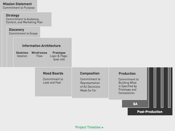
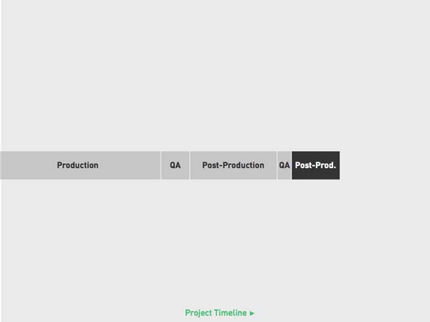
Post-Production, or Commitment to Alterations
So, as you can see, focused testing periods will produce new production work — bug fixes, change orders, etc. This is a scheduled period of time to address the lists of these items assembled during Quality Assurance.
Again, how production, Q.A., and post-production are handled could vary quite a bit depending upon how the team is structured, and the context in which they’re working. For firms like mine, which have teams working on multiple projects simultaneously, a phased approach is the best and safest way to preserve productivity and forward momentum. But for a team that is focused on one project only — like many in-house teams might be — they might be able to take a more iterative approach to these steps, going back and forth between them as needed.
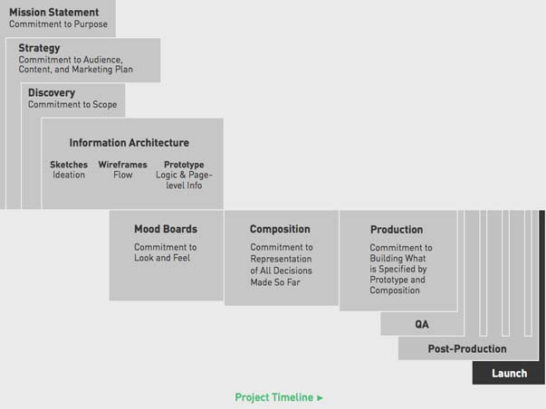
Launch!, or Commitment to Being Done with Phase 1
Launching a website, or “going live,” is a punctuation on all of your efforts so far. It typically takes just a couple of hours of coordination and technical maneuvering, after which comes another round of testing just to be sure that going from a staging environment to a live one didn’t break anything.
After that? Beers! Or whatever form of celebration you see fit. Cake is also nice. But be sure to enjoy it, because going live is really just a momentary pause in between bouts of working. For any website, going live is really just the beginning. Once the public starts using what you’ve designed, everything changes — and quickly!
OK, so this is really not all that revolutionary, is it? A phased approach to a project is fairly commonplace, though I’m sure there are minor points within this particular outline that are new and/or improvements upon what some of you might be used to. I know that it represents our most recent in a long line of years and years of minor, learn-as-you-go adjustments.
But the main point is to reframe the progression of this workflow in terms that are fairly familiar to design. Namely, commitments. We want to see this not as a hard, step-by-step procedure — one step of which is design — but instead see it as a flow of design. It’s a holistic process carried by the momentum of design commitments, which produces certain deliverables that are, for many, the concrete things that “show” design.
Of course, it doesn’t just move in one direction, and it’s never really this clean. In reality, a project moves back and forth quite a bit.
4. Amending Design
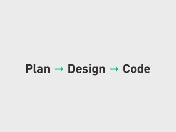
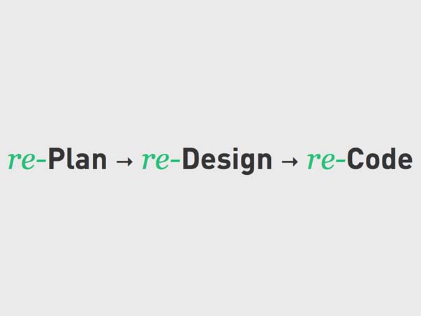
Plan → Design → Code.
This is how we assume things are going to go, and so, how we plan workflows. When there are setbacks, we treat them as aberrations and react to them — by going in to expectation management mode, quibbling mode, blame mode, CYA mode. You know what I’m talking about. This is because we know what comes after Plan → Design → Code:
Right. And not just once. But over and over again until it’s right.
Think back to the QA and post-production phases we looked at a few moments ago. The idea that these will lead to changes to how we think something should look or work is to be expected. We should plan accordingly!
We kind of do. You saw how there were multiple QA and post-production phases. The idea behind those is that they are when those changes will be made. But let’s think about that for a moment:
At my firm, we used to call that the “tweaks” phase. I’m not kidding. Tweak is such a ridiculous word. Most people use it to mean some little thing. But it’s never just a little thing. And even if it is, it’s probably a long list of them, which, in the aggregate, is a lot of work. But I’ve banned that word from our lexicon. Why?
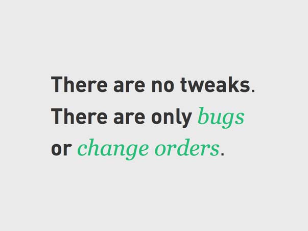
Because there are no tweaks. There are only bugs or change orders. Period. Both are expected. The only question is whether you charge for them or comp them. Sometimes yes, sometimes no. That’s not the real point I want to dwell on, though. The real tension here tends to be around timing. Sure, there are going to be changes, but when are they going to be done, and how quickly? And was that time something we planned for?
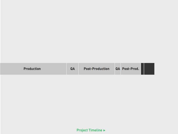
So, tweaks are out. Post-production is in. Here’s what it looks like:
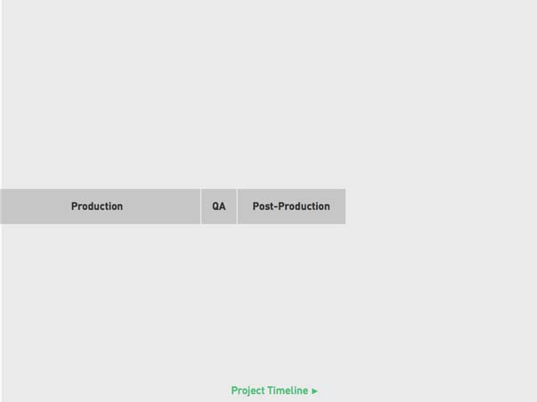
We’ve got this flow pretty clear, right? But here’s an important reminder. At this point, we still haven’t shown this to the client yet, remember? We got a round of internal feedback, and then did a round of internal post-production, to make sure that what we present to the client has all the kinks we can see worked out first. Then, we show them what we’ve done.
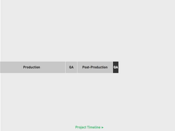
Which leads to more QA. This time, though, we give our client a week or so to use the site, start entering content, and compile a list. We give them a deadline to deliver that list — at the end of that week — so that we can review it, identify what’s a bug and whats a change order, estimate the amount of time we’ll need to address everything, and then work on it over the course of another post-production phase.
At this point, that cycle repeats.
The timescales are shrinking now. We’re dealing with fewer items, and trying to accelerate toward launch.
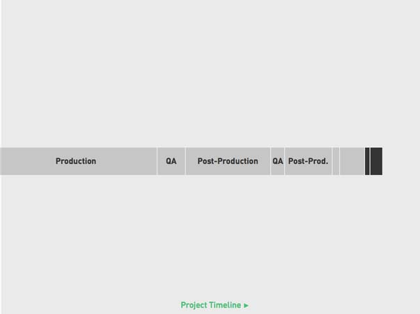
We repeat it again. Less stuff. Less time.
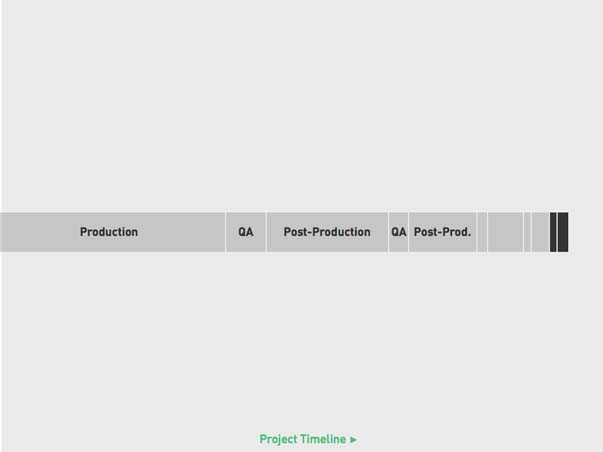
And again.
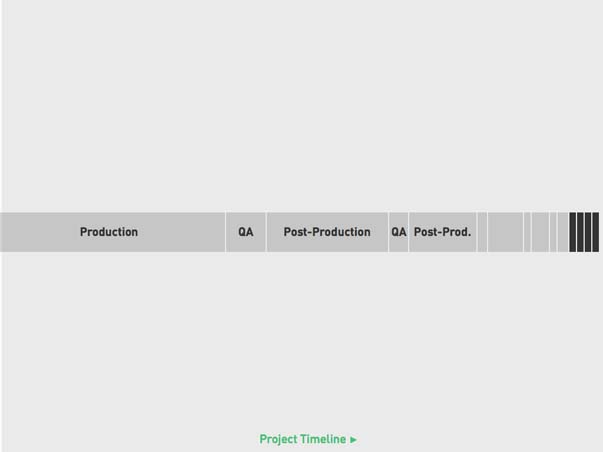
Until we get to a point where the QA and post-production timescales are about equal. It’s almost real-time iterative at this point, which makes sense because we’re ideally narrowing the funnel and working with really minor adjustments now. But they can only be so small before they’re essentially an unmanageable ad-hoc flow.
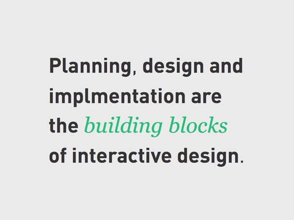
See, within production are many Plan → Design → Code routines. Think Powers of Ten — the more you zoom in, the more you’re able to see the connections between planning, design, and implementation. They’re the building blocks of interactive design.
Rethinking design once you see it and use it is inevitable, especially now that the possible contexts are so much more diverse. We’re still learning how we use different devices and how we interact with information contained by them. Think about mobile — we’re not used to mobile enough yet to be able to anticipate the issues that emerge from mobile device use before we implement. This is a bit of a shocker because we’ve created processes based upon our years-tested assumption that we know how to design things for screens. But not these screens. Not yet. We should expect to want something other than our first attempt once we start using it.
We started with a fairly abstract exploration of how design functions in interactive projects, and then worked our way down, deeper into how design and process work together to make projects happen successfully. In a way, we went from design to project management, didn’t we? I suppose that calls into question just how much the two overlap — how much design in practice is project management, and how much successful project management is the result of design thinking.
I suppose I’ll leave that question with you.
I want to thank you for listening. I do hope this has been helpful. Also, for those of you who are interested, I’ll be signing copies of my book, The Strategic Web Designer, directly after this at the conference book store.
Now, what questions do you have for me?