Newfangled recently launched a new site, quebradabakingco.com, with an old partner, ThomasBoston Advertising. The site is for Quebrada, a gourmet European-style bakery, and as Tom from ThomasBoston put it, the goal was to make people hungry.
It’s often hard for clients to respond to design, where the considerations can feel fuzzy compared to more straightforward questions like “Well, what pages do we need?” But this was a case where the feedback helped keep us moving toward a final result that clearly expresses the brand. Here’s a round-by-round look at the Quebrada design process as an example of the narrowing funnel of decisions and changes that we aim for, and how the feedback at each point fed into that process.
Pre-design prep
Aside from wanting to make people hungry, a couple of other key factors shaped the design from the beginning. One was that this site would be very image-driven; ThomasBoston provided us with product imagery to work with during the design process, and the page layouts were based around that imagery, optimized to showcase it. Another was that Quebrada is a small business owned by an individual whose personal sense of style has strongly influenced the company’s branding. There was a clear imperative to make a site that “looks like Kay,” so we started out by getting a lot of information about what that meant through our design questionnaire.
Mood Boards
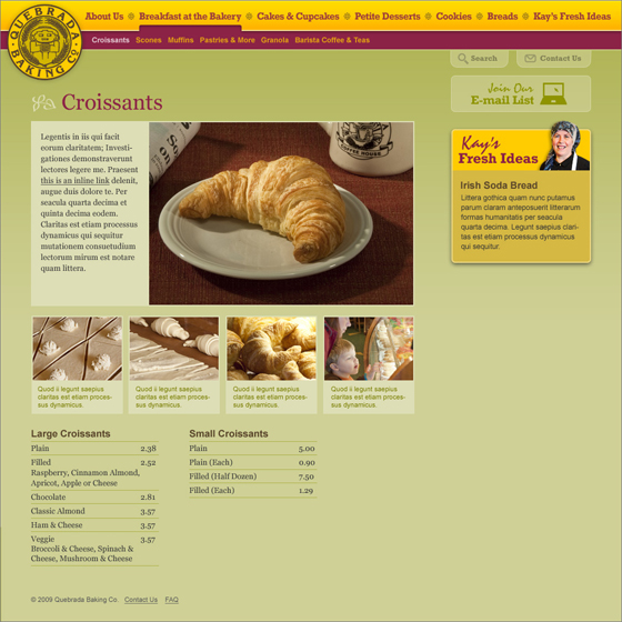
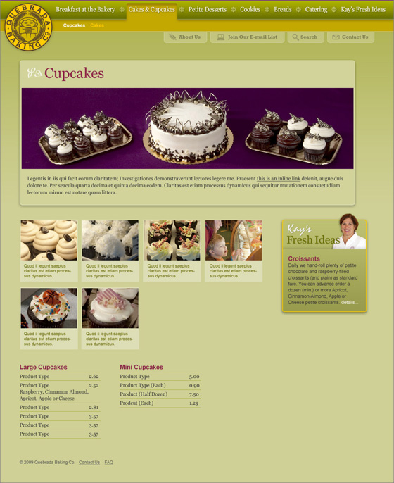
As with most of our designs these days, we started off with a round of mood boards meant to set the site’s look and feel. Justin, Newfangled’s Creative Director, gathered the information that we had about Kay and Quebrada, along with the first round of product imagery, and created three different mood boards based on different facets of the company’s branding. He includes a note with each mood board explaining what inspired it, so I’ll repeat some of those here to show how each version arose from one of the key points we learned about Quebrada.
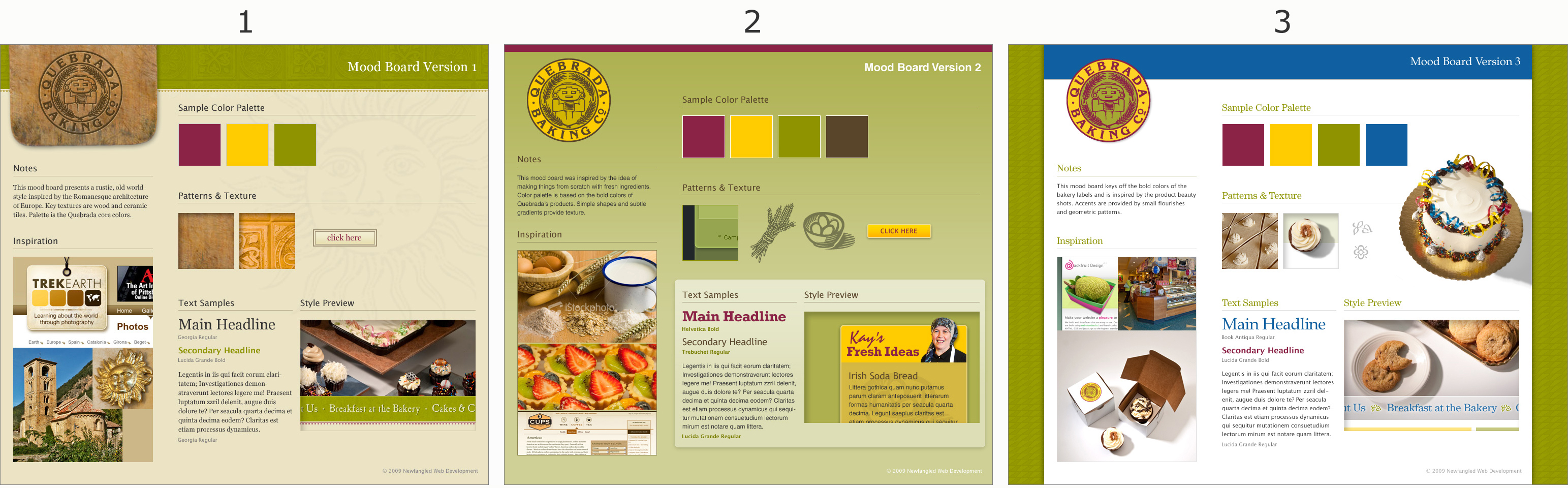
Click to see a larger view.
1. “This mood board presents a rustic, old world style inspired by the Romanesque architecture of Europe.” (From the original design questionnaire, this draws on the idea that Quebrada is “a neighborhood bakery with a world class tradition.”
2. “This mood board was inspired by the idea of making things from scratch with fresh ingredients. Color palette is based on the bold colors of Quebrada’s products.” (As the design questionnaire explained, and the site now shows, “Fresh Fresh Fresh” is Quebrada’s mantra and major differentiation point from competitors.)
3. “This mood board keys off the bold colors of the bakery labels and is inspired by the product beauty shots.”
After reviewing the mood boards, the Quebrada team chose option 2. On to…
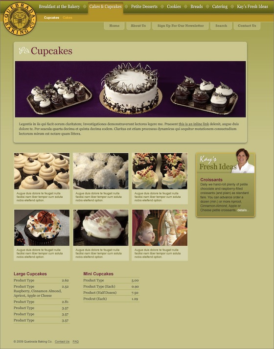
Product page layout 1
The page layouts are where the look and feel from the mood board get applied to specific elements that will be used on the site. Since the product pages are the core of the Quebrada site, we started with their template rather than the homepage. Here was the first version of the product page layout:
For this round, the feedback focused on big picture concerns. Most importantly, the feeling from the Quebrada team was that the tone of the page didn’t match what they had expected based on the mood board. There was also some concern about which elements were prioritized on the page, and what kind of eye track was implied.
This is the point at which design processes can go off the rails. Unsure of what is bothering them, clients may give a laundry list of specific changes—”Let’s try Comic Sans!”—that they hope will address the problem. Or they might go the opposite route and give very vague feedback: “I just think it needs more pizazz!” Suggestions come flying in from all directions, and the result is a Frankenstein-y site with no clear design vision.
That didn’t happen with Quebrada, and here’s why. ThomasBoston guided the client in providing the kind of feedback that designers can work with: rather than dictating point-by-point solutions, they explained the problem and let Justin decide how to approach it. (Here’s a great post by Justin explaining more about responding to design to allow for problem solving.) The feedback for this round was heavy on adjectives. The “calm” and “elegant” tone that had been appealing on the mood board was overwhelmed once the yellow and maroon appeared in context. The goal for the next round was to recapture those qualities without overreacting and veering into “quiet” or “boring.” The Kay’s Fresh Ideas callout was also too eye-catching for its importance, detracting attention from the top-priority product imagery.
With that feedback, Justin went to work and produced…
Product page layout 2
This round got us most of the way there. Justin used his mad design problem-solving skillz to address the concerns from the first round while still incorporating everything within a coherent vision. This is the advantage of problem-based rather than solution-based feedback; it lets Justin really make full use of his expertise in a way that’s not possible if he’s stuck implementing a laundry list. In this version of the product page, the tone, placement of elements, and type all took the forms that they would use on the final site, and the sense that the site really “looked like Kay” was there.
The feedback in this round focused on the details: the small images in the grid didn’t provide quite enough of a view of the products; the items in the top nav needed to be rearranged a bit to make more room. But with the major elements in place, the feel of this layout is very close to the final version in…
Product page layout 3
Here’s where we ended up: with the big decisions made, then the details squared away, and a final version that met all of the goals we had starting out.
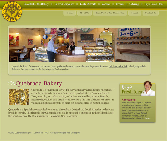
Home page
With decisions about most elements settled during the development of the product page template, most of the homepage fell into place. The main things left to determine were how to handle copy outside of the caption areas, and what the header would look like without the expanded subnav seen on product pages. With a coherent strategy already in place for the design, Justin was able to provide successful answers to both questions in one go.
Check out quebradabakingco.com to see how ThomasBoston’s product imagery works into the design on the live site.