Last time I wrote about our recent brahmin.com site build, it was to talk about the advanced product search. It’s a great feature, and especially important on a product-focused site, where you want users to be able to find the product they want as easily as possible.
But ‘easy’ won’t equal ‘search’ for all users; as Jakob Nielsen’s usability studies have found, while many people will always start by searching, others prefer to navigate their way through a site via links, and still others will vary their approach depending on circumstances. For the latter group, clearly-structured navigation can shift their preference toward browsing. And as Nielsen points out, clear navigation is important even for search-dominant users, since that’s what will give them a sense of where on the site their search has landed them. The complement to an easy-to-use search should therefore be an easily understandable nav structure; pairing the two lets users take whichever approach they’re most comfortable with, making it more likely that they’ll find what they’re looking for.
Here are a few things we did while planning brahmin.com to figure out how best to approach the nav:
Hacked up the prototype
There are some features of our prototype system that are standard and automated; one of the big ones is that it uses a top nav with drop downs, and an additional left nav on subpages. The gray screen is not supposed to represent design, and with any prototyping process, there will be some things that require stretching the imagination to envision. For this project, however, the design was one of the greatest driving factors, and we knew from the start what the general page structure would be. We therefore departed from the norm and had Dave, the developer on this project, alter the prototype so that it functioned a little more like we knew the site would.
We shifted from using our standard top navigation–something like this:
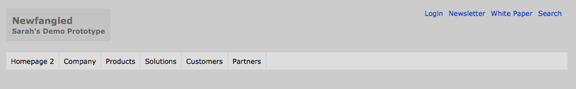
–to having the main nav on the left, like the site would. Here’s the prototyped navigation on the homepage, compared to how it ended up on the live site:
When you go into one of the subsections, the nav expands to show the range of options within that section. Again, here’s the prototype vs the live site:
As you can tell, the navigation in the prototype still doesn’t behave quite like the real navigation does. To accommodate all the options needed under important sections like Handbags, we built in an alternate area that appeared under the nav instead of within it–so some imagination was still required to picture how the nav would really work. But what we were working from during the planning stages was still relatively close to the real deal.
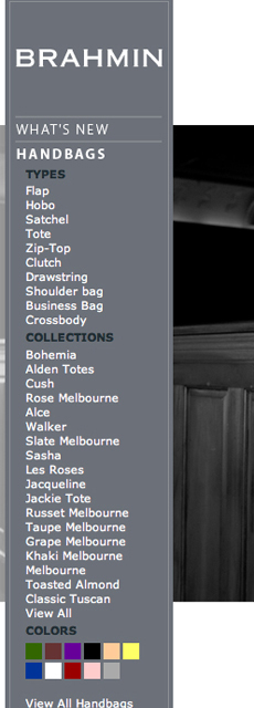
Included the most relevant product groupings right there in the nav
Inn deciding what categories to use within the nav, we asked Brahmin to think about the ways that customers would be likely to look for a bag. They pinpointed the most important as being the bag’s type (tote, clutch, etc), collection, and color. Focusing on those categories in the nav gave us a way to let users browse based on the most likely criteria without cluttering the field of possibilities with too many options.
One of the key decisions here was how to treat color as a category. For me, the color option is the best part of the nav–there’s something very satisfying about seeing the samples of the colors all together, and getting a page like this when you choose one:
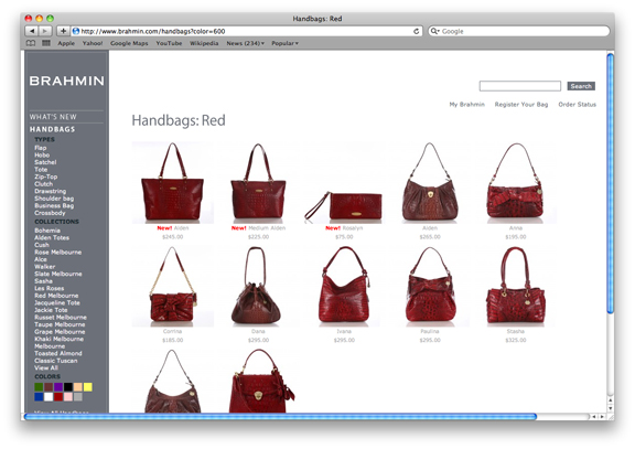
But it would have been impossible to create a nav that represented every color that every bag came in; that’s a huge set already and will expand frequently as Brahmin continues to update their product line. So we created a system where a product can have both a specific color (butternut, burnt sugar, brulee) and a more general color group (brown). Clicking the brown square in the nav will give you the bags that come in all of those colors and similar shades–a pretty way to shop.
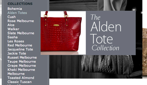
Added a mouseover for the collections
For one of the nav categories, there was a potential divide between usefulness for returning and new users: a bag’s collection might be an important factor for an existing Brahmin customer, but just listing the collection names wasn’t likely to give new customers the guidance they needed. To address this potential issue during prototyping, we added a box that appears when you mouse over the collection name and provides a better sense of that collection’s style:
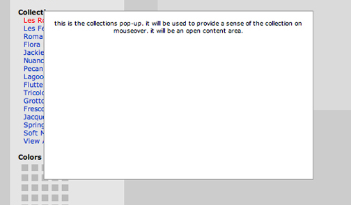
We spent some time considering what information would be most useful in that area. Ultimately, Duffy & Shanley created graphics for each collection that give a preview while maintaining the site’s style: