
%leftsidebar%
#macro:bloglist,3066,agencies#
While one is not better than the other, the fact is that designing for the Web is just very different from designing for print. This month, I’d like to review and update some fundamental Web design concepts, as well as make some recommendations that will help orient designers making the transition from thinking print to thinking Web.
%leftsidebar%
#macro:bloglist,3066,agencies#
There are two big reasons why the web is just a fundamentally different experience than print, for both designers and users. First, the context of the user experience is completely different and leads to a different set of design considerations. In most cases, people interact with print directly, meaning they can hold the printed piece in their hands. Direct physical contact changes everything, so designers must consider size, weight, materials, and many other factors before they get too deep into the creative process. Viewing web content is a much less physical experience; even though we use our hands to operate navigational controls, we don’t actually experience touch in the same way we do with print. So with web design, that whole set of print-specific considerations disappears– there is no texture, weight, or thickness to a web page, not to mention smell (print designers, you know you love the smell of a freshly printed poster). Instead, the context is now all about screens. Though they come in many different sizes and shapes, screens have a much more limited range of display options than paper. What a relief! But they also serve as somewhat of a barrier between the user and the content. Design has to take this distance into account, making sure to remember the web context so that it doesn’t introduce further barriers of its own.
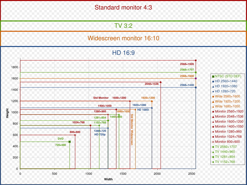
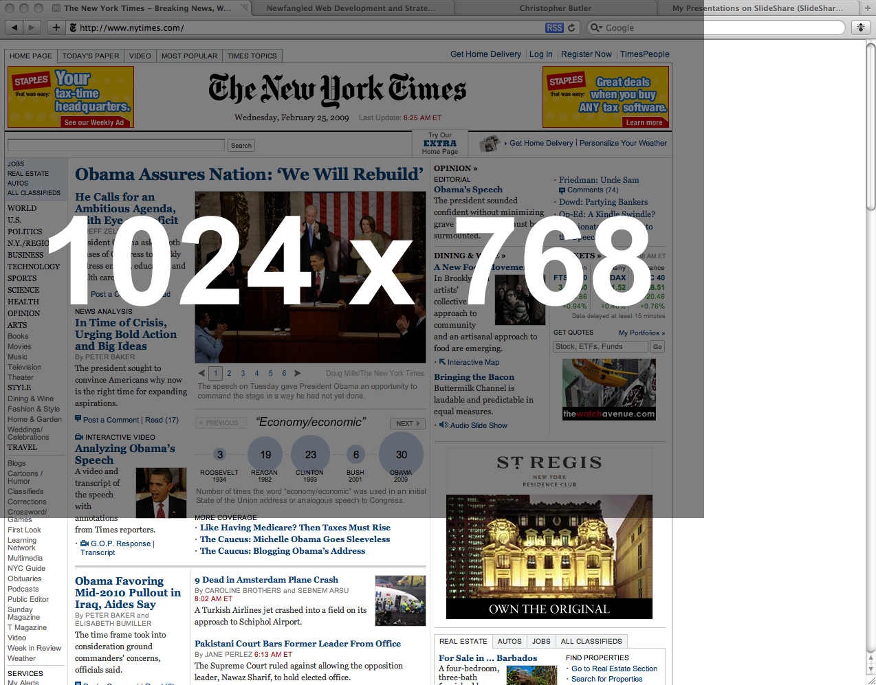
Below is an image that shows all the various screen resolutions that users could potentially have. Depending on your goals, it’s not always necessary to design to the lowest common denominator. Sometimes it’s useful to consider the industry for which you’re designing. For example, the lowest common screen resolution is likely to be higher among technology companies than retail consumer product companies. For this reason, I often recommend making sure that the design is functional within the 1024 x 768 resolution, which is wide enough to allow for a comfortable horizontal room but realistically account for the vertical limitations of many widescreen displays, especially those of notebook computers. As an example, I’ve also included below an image of how the New York Times homepage fits within a 1024 x 768 resolution.
The other significant difference between print and web design is change. Effective websites are always changing, expanding and contracting with their content on a regular basis. Because of this, it is virtually impossible to control things like the alignment of various elements. The designer establishes rules (things like fonts, styles, colors, background and other graphics, padding and spacing, etc.) that future content must “obey,” but those rules don’t determine the way two different kinds of content align in a layout. Each individual piece of content may grow or shrink every time it’s updated, which means that where its top or bottom line up could be different each time as well.
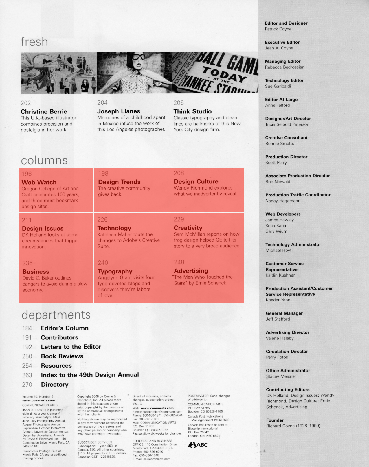
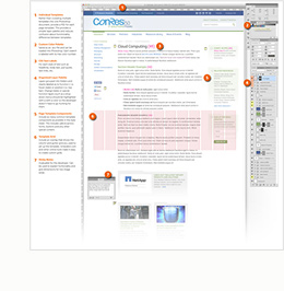
Below is an image of the table of contents page for an issue of Communication Arts magazine. I’ve highlighted the “Columns” listing in red to point out how it adheres to a perfect and evenly spaced grid. The layout designer has the luxury of designing in this way because the information listed in that portion of the page, specifically the titles and descriptions, will never change. Once it’s printed, it’s there for good.
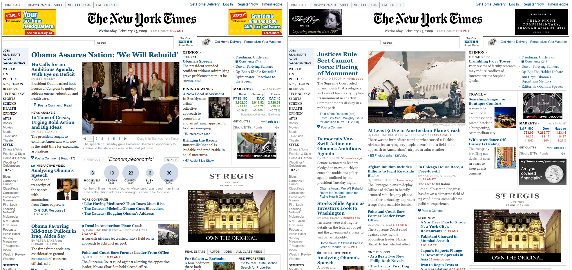
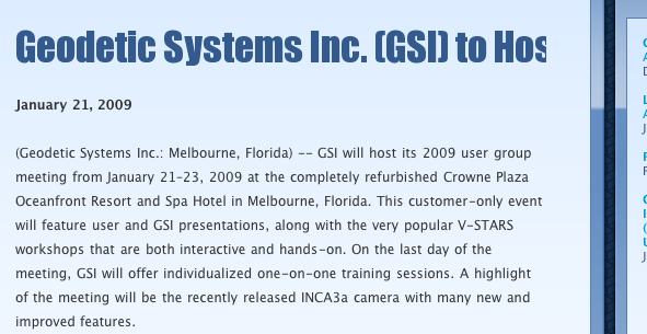
On the other hand, take a look at the following image, which shows how the New York Times website homepage changed over just a matter of hours. Notice that elements shift placement as content expands and contracts. The overall design is maintained by adhering to a particular palette of colors, graphics and styles. Still, no one can guarantee that the bottom line of one story will always align with the bottom edge of an advertisement, for example. (Click the image to view the full size version.)
%leftsidebar%
#macro:bloglist,3066,agencies#
One of the best examples of the web as a different experience from print is the issue of the fold. The term fold originally referred to the information that appeared on the bottom portion, or beneath the horizontal fold halfway across, of newspapers. Layout editors would put less important content beneath the fold based upon the understanding that people tended to focus more on the top of the page. This idea initially translated to web design based upon another assumption- that users would interact with web content in the same way they did with print. This may have been true initially, but, thanks to two technological developments in particular, I can confidently say that it is no longer the case.
The first development had to do with the mechanics of navigating a web page. In the early days of the internet, if a web page’s content made it longer than the vertical space of a user’s monitor, one would have to position their mouse over the scroll bar on the right side of the browser in order to see the lower portion of the page. Because this was not always obvious to the user, (and then, once it was obvious, pretty annoying to have to do), many users would avoid scrolling on longer web pages. However, computer mice then began to be manufactured with scroll wheels between the left and right mouse buttons. If a page was long, you could simply toggle the scroll wheel without having to move the cursor to the scrollbar on the right side of the browser. This was pretty handy and likely helped increase users’ willingness to scroll. But it was a second development, one in web content, that provided the incentive to actually do so; I think it was actually the popularity of blogs that began a paradigm shift in user behavior. See, blog pages were formatted to grow in “length” with each additional post, placing the most recent one at the top. Once blog commenting became more common, a blog post’s detail page could end up being quite long on its own, as each user comment would stack (again, most recent at the top) beneath the author’s content. Naturally, as blogs became more common, so did scrolling. Today, with newer laptop trackpads recognizing more sophisticated gestures, like two finger vertical scrolling (thanks, Apple!), dealing with longer pages is even more intuitive.
Is there still a fold on the web? Well, I’ll concede that point technically, since displays do have a fixed height. But should the fold continue to play a significant roll in information design, leading designers to want to cram everything important at the top of the page? Absolutely not. Users will scroll, and do so happily, because they have become used to valuable content being located at the top, middle and bottom of a page. Do developers tend to get annoyed when they hear designers fret about the fold? Oh, yes, they do.
(You can read much, more about the fold issue here and here.)
%leftsidebar%
#macro:bloglist,3066,agencies#
We’ve talked and written plenty already about this kind of Flash in the past, often specifically that Flash is just not a good platform for web development. Many creative agencies were quickly seduced by its visual capabilities, which were admittedly pretty fancy (still are), and would construct their entire website using Flash. The first big problem with this is that it makes updating a website pretty cumbersome, requiring access to the original composition file, not to mention a working knowledge of the program. The second issue concerns search engine optimization. When the entire website is constructed in Flash, the individual pages don’t end up having unique URL’s. In fact, from a search engine’s point of view, the entire website is just one file, no matter how detailed it might be. If your website is one Flash file, it’s as if it’s only one page. From Google’s perspective, a one page site is fairly irrelevant.
Now, it is true that Google is continually improving its ability to index Flash content. Currently, though, it’s still limited to indexing text. This is a good step forward, but keep in mind that even if Google can index the text of a Flash file, it’s still associating all that text with one URL. You are much better off having unique URLs for each page of your website, so that each page can represent a distinct body of content with a distinct set of meta data. The more unique and organized content your website has, the more Google’s indexing process will be effective in determining what your website is actually about and matching it appropriately to users’ search queries. To sum it up, building your entire website in Flash is simply an SEO FAIL.
Flash is better when it’s used for visual content that benefits from it’s “flashier” capabilities, but in a way that doesn’t compromise the website’s edibility or search engine optimization. In other words, good Flash is the use of Flash-driven elements within a database-driven website. Examples of this could be as simple as a Flash animation placed within the content of a page, or as complex as a Flash-driven framework for a page that uses an XML file to pull dynamic content from the website’s database and integrate it within the page. One of the most common examples of Flash content integration that we do is when we feature video on websites. We generally recommend that our clients use the Flash video format (.flv) with a Flash-based player. You can read more about this in our November newsletter, Video Just Got Easier. Just keep in mind that the more Flash elements you include in a website, the more dependent upon a working knowledge of Flash your client will be when it comes to maintaining and updating the website.
In general, what’s more important than the flashiness of your design is the effectiveness of your design. Have you taken in to consideration how the website will grow in content over time? Or are you more concerned with how it looks right now? These are the most important considerations to weigh before you decide whether to use Flash in your design.
%leftsidebar%
#macro:bloglist,3066,agencies#
I love typography. Unfortunately, the internet doesn’t- at least not in that printy way. Because most people don’t have many font files already installed on their computers, there is actually a very limited number of web-friendly fonts available (in general, it’s under 10). If you specify that a line of content on a website should display in Bodoni, each user out there would need to have the Bodoni typeface files stored on their computer in order to see your content as you intend. Otherwise, their browser will revert to whatever its standard typeface is. That means that your beloved Bodoni is much more likely to be your nemesis, Verdana. However, there are a few techniques that can open up your options for web typography.
One simple approach is to use CSS to define various font family options, which allow the users’ browsers and/or operating systems to supply the specific typeface. An example of this would be to specify “sans-serif” rather than “Arial.” This is not the approach I would recommend, though. Most designers justifiably care what particular typeface is used, and would prefer a method that ensures that their choice is what everyone sees.
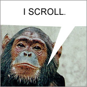
Another approach is to “cloak” particular text, such as page titles, headlines, or sub-headlines, and substitute them with images or flash files that contain the specific font the designer has selected. There are a couple of variations on this approach that are worth looking at. The first uses a script that cloaks the text and then converts it to a GIF image file using the specific typeface chosen (some people call this FLIR, not to be confused with “Forward looking infrared”). The advantage to this method is that it’s pretty quick to load and makes the list of available font options limitless. However, one disadvantage is that, because the text is actually an image file, it won’t be able to wrap. This could be a problem for long titles displaying in narrow content areas. In fact, below is an example of that exact issue:
The second method is called Scalable Inman Flash Replacement (sIFR). sIFR uses javascript to cloak the text, and then swaps it with a Flash element that contains the specific typeface the design has chosen. When compared to the text/image option I described above, the obvious benefit is that the text will indeed wrap since it has not been converted to an image file. However, the use of sIFR isn’t always going to guarantee that the correct font appears. If a user has disabled javascript or does not have the Flash plugin installed on their browser, the text element will display in whatever default CSS styling has been set up for the website. Additionally, this approach will increase the load time for the page- the larger the amount of text, the slower the page will load. Below are some examples of sIFR in action:
%leftsidebar%
#macro:bloglist,3066,agencies#
As is normally the case when I write our newsletter, there is a lot of good information that I collected as I researched over this past month that didn’t quite make it in the “final cut.” Below are some extras that would be worth looking over as well.
– – –
For each newsletter I write, I use LinkedIn to ask questions that will hopefully give me a sense of what information I may not know yet, as well as what information people in our network would be interested in hearing about. This month, I asked, What should every designer know about creating designs for the web? As usual, many of the replies were great. One comment that stood out came from our own Nolan Caudill, who wrote:
“One other aspect is that implementing advanced aspects of design such as alpha transparency, for example, is a painful exercise when dealing with Internet Explorer 6. I usually take it as a personal challenge to see if I can get these designs working in IE6, and succeed more often than not, but sometimes compromises have to be made in the design, with IE6 looking slightly different than the others. This is usually tough to stomach for a designer, and rightfully so, but with the diminishing importance of this browser, the designer should know that this user may have to see a slightly different version of the site.”
There are search engine optimization concerns with the cloaking methods I mentioned (FLIR and sIFR). Google’s webmaster help site says:
“Hiding text or links in your content can cause your site to be perceived as untrustworthy since it presents information to search engines differently than to visitors. Text (such as excessive keywords) can be hidden in several ways, including:
- Using white text on a white background
- Including text behind an image
- Using CSS to hide text
- Setting the font size to 0″
However, Google has officially endorsed the sIFR method. My opinion at this point is that the jury is still out, but if you can avoid hiding text, in general, it’s probably worthwhile to do so.
Finally, most developers would probably agree that one of the biggest headaches they encounter when working with a designer is the format in which the design is provided. We always request that our agency partners provide the designs as a layered Photoshop file (.PSD). It also helps if that file is well organized with labeled layers, rasterized type layers if the fonts can’t be included, instructions if needed, and any unneeded layers removed. Initially, I was going to make this a “chapter” of this month’s newsletter, but our designer, Justin Kerr, already said it all in his blog post Design Guidelines for Agencies, Part 4: Preparing Website Designs for Production. Justin’s whole series on design guidelines is really worth reading, too.
Also, check out The Myth of the Fold, by CXPartners.
Related Posts
-
Last month I spoke at the UCDA Design Summit — called The Empowered Designer —…
-
I recently wrote an article for HOW's Interactive Design site about the history of computer-based fonts and how "web-safe"…
-

For this post, I've created a diagram of one of my recent website style sheets…