 Last summer, Newfangled was hired to develop a new website platform for Merge Records, an established indie music label headquartered in Durham, NC. In this post, I’ll be outlining some of the challenges that arose during the design process and how we — Maggie Fost, Merge’s art director, and I — tackled them. You can read about Merge’s back-end development and their awesome music database in Steve Brock’s post, and you can also view a comprehensive project case study here.
I was a little intimidated when I found out I would be designing a site for an indie music label. My own music catalog ends somewhere in the late 20th century and, before this project, I had never heard of bands like Arcade Fire, Telekinesis, or Superchunk. So the first thing I did was immerse myself in Merge’s SoundCloud stream. This definitely helped me get inside Merge’s world a bit and expand my musical horizons with songs like Would That Not Be Nice by the Divine Fits and The Letting Go by Mount Moriah. I believe part of every designer’s job is to familiarize themselves with their client’s world, regardless of personal preferences or background. Spending time with Merge’s catalog gave me a feel for both their aesthetic and their values, both of which were key to thinking about their visual design. Another reason I was enthusiastic about the project (aside from the music) was because it would allow me to work with content that was unique, expressive, and a bit edgy.
From Dark and Dense to Light and Airy
To kick off the discovery phase, I reviewed Merge’s existing website and made notes about what I saw as user interface (UI) and user experience (UX) issues before receiving any input from Maggie. Even at the earliest stages, it’s important to enter discussions with the client already prepared with some design talking points. Merge’s legacy design was visually dark and text-dense with very little white space, making it difficult to scan content. I thought it would benefit from larger text sizes, larger images, and greater distinction between different types of content. These objectives could be attained through several means, like increasing space between elements, color contrast, and size contrast, or inserting visual elements like rule lines.
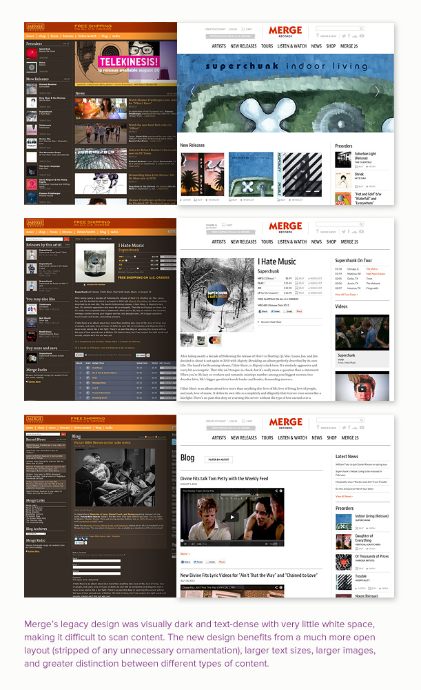
To supplement our early conversations about our vision for the new site, Maggie provided me with some reference sites for inspiration, and the look and feel of these indicated that she wanted a radical departure from their current design. This meant a much more open layout, and one that was stripped of any unnecessary design decoration. In short, we would not be bringing any of the old branding over to the new site. The meat of the new site’s look would be its content (represented through typography and photography), with a minimal visual structure to hold it together.
Typography
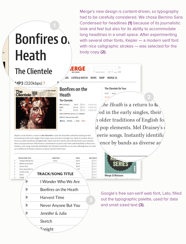
Once it had been decided the core of the new design was going to be content-driven, I began to explore some type options using typecast.com as my sandbox. Maggie and I settled pretty quickly on a san-serif headline font (Bernino Sans Condensed) for a journalistic look, but we went back and forth for a while on the font choice for the body text. I experimented with several popular web fonts, including Adelle Web and Tisa Pro, but none of them had the right chemistry to balance the headline font. Eventually Maggie suggested Kepler, a modern serif font with with nice calligraphic strokes, and I knew we had a winner. I filled out the rest of Merge’s new typographic palette with Google’s free font, Lato, deciding it worked well for site data and small sized text.
Next, we considered proportion. The font sizes used on the new site are quite large compared to Merge’s previous site. Oversized text is quickly becoming common in web design, mostly due to increased screen sizes and pixel density, which mean there’s more real estate available for content. I wanted the typography to be in proper proportion to Merge’s oversized images, as well as provide a comfortable reading length (~90 characters) for the wider text columns that would comprise the body of each page.
Taking the time to establish a solid typographic language for the site paid off throughout the rest of the project because it freed me up to consider the “what” of the content instead of worrying about the “how.”
Look & Feel
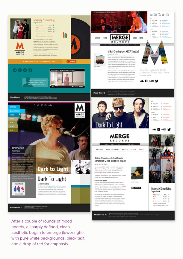
While Maggie and I were hammering out the typography, I was producing mood boards to establish a design direction for the site. After a couple of initial rounds, a sharply defined, clean aesthetic began to emerge, with pure white backgrounds, black text, and a drop of red for emphasis. We stripped the visual architecture down to its bones with the intention of letting text and images flesh out the design. This would have been risky with a client that didn’t have the tremendous content assets that Merge did.
Lucky for us, big, beautiful images were one of the key assets I had at my disposal: album art, music videos, artist photos, and merchandise beauty shots. And we were not going to use them as just simple thumbnails to catalog the artists and their music, but splash them across the full width of the browser window and immerse the viewer in the sights and sounds of Merge. Web developers are fortunate, at this stage of internet maturity, to have enough bandwidth to upload a 1650 x 595 pixel banner image and not worry about it choking someone’s AOL dial-up connection. On the flip side, mergerecords.com was going to be viewed on tablets and smartphones, so we needed to consider how to responisvely rearrange content so the experience, when minimized, wouldn’t be lost altogether.
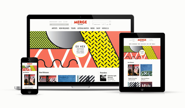
A Responisve Site
For large tablets, like the iPad, the site experience wouldn’t change all that much, but smaller devices like smartphones were going to be a challenge. When you take a site’s content from a screen resolution of 1600 x 1200 down to 320 x 480, you have to decide what is going to take priority and what won’t. Because the site was void of all purely ornamental design elements, I didn’t have to think about how to reduce them in size and maintain image quality, or how to deal with the inevitable questions about why a non-critical design doodad was missing from the mobile experience. I collapsed the site’s masthead into a simple triptych of the Merge logo, a nested menu icon, and a search icon. Since images are reduced on the fly by the CMS, Merge doesn’t need to upload separate images for large and small use, and we allowed images to fill the screen even at the smartphone range in order to preserve as much of the Merge experience as possible. There were sacrifices for mobile, of course, like calls-to-action residing at the bottom of each page instead of in a sidebar, and the removal of cool (but download-intensive) features like the multi-image banner at the top of the Artists section.
Collaboration
No designer should work in a vacuum, and any piece of design can benefit from a second set of critical eyes. My experience working with Merge’s art director, Maggie Fost, was a positive one despite the challenge we faced by virtue of working in different cities (Providence, RI, and Durham, NC) and communicating via email and phone. Both of us would have preferred spending at least some time collaborating across the table from one another, but that’s not always possible. Regardless, I believe the project benefited greatly from each of our insights and contributions to the design process.
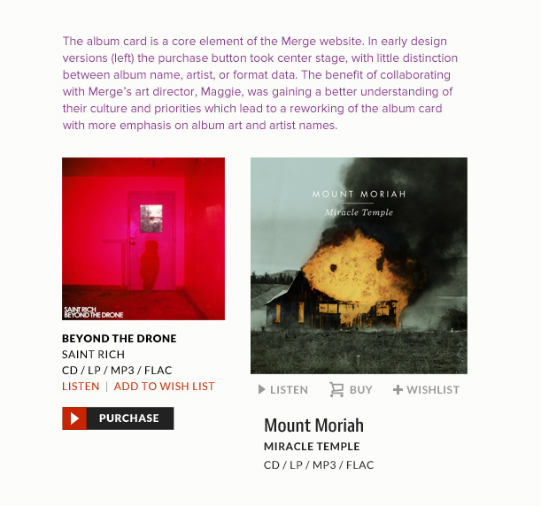
A case in point is the Merge album card, a core content element which appears in many different places on the site. Packed inside roughly 240 x 320 pixels of screen real estate are several ways to experience an album: album art, streaming tracks, links to the artist or album page, and the ability to add the album to a personal wish list or cart (in one of several different audio formats). In early layouts, I treated the card’s UI elements in a similar fashion to what I’d done for previous e-commerce clients. The “add to cart” button was given the most prominence (as a large black and red button), and the other interactive elements — “wishlist” and “listen” — were subjugated to a stacked list of album and artist data. There was very little hierarchy to the information placed below the album art. Maggie explained that each interactive element was of equal importance, but that all of them were secondary to the album information. I was thinking about the music in the strict sense of a marketed commodity, but Maggie’s feedback revealed that she saw the music as an experience first and a commodity second. So the album cards were redesigned based on a combination of my original layout and Maggie’s input.
A Few of My Favorite Things…
In a site of this size and complexity, there were many opportunities to explore interesting design solutions. Here are a few of my favorites from across the site.
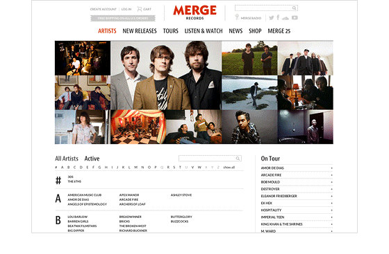
“Image Quilt” on the Artist Landing Page
We “borrowed” this idea from Instagram, and I think it gives some vibrancy to a page that would have been mostly a dry list without it. The “quilt” features images of Merge’s artists and slowly replaces each image with a new one on a timed sequence. When a visitor hovers over an image, an overlay reveals the band or artist name and provides a link to the respective Artist Detail page.
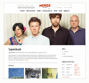
Artist Detail Pages
Other than the home page, these are some of the most striking pages on the site, with oversized banner images that remain a prominent feature even on mobile devices. I also like the comprehensive nature of these pages, which are really a one-stop, immersive experience for each artist.
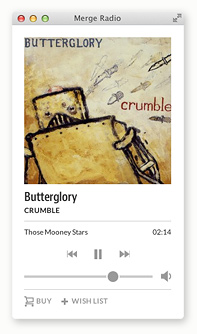
 Merge Radio
The radio pop-out existed on Merge’s old site, but we gave it a facelift for the redesign. It’s accessible from anywhere via a global link in the site header. The look and feel is clean and simple and provides one more way to experience the music. You can also make purchases and populate your wishlist directly from the radio player.
Parting Thoughts
Merge was one of my most challenging projects to date, partly because of its scope and unique marketing position, but also because of its visual complexity. Creating a bare-bones visual system that could support an enormous amount of content and data was no small feat, and I’m thankful for Maggie’s collaboration as well as all of the feedback and input from Mitch, Chris, and the rest of the Newfangled team. The new site has become the flagship of Merge’s marketing efforts, and I’m happy to have played a role in bringing it to life.