About six months ago, we here at Newfangled began to change our visual design process to include two new deliverables, the Visual Inventory and the Element Collage. We’d gotten a big shot in the arm from Dan Mall, who wrote a great intro to the Visual Inventory, and were eager to spring from there into other changes that included the Element Collage and a few other tweaks that we’ve written about elsewhere. To expand on the overview I wrote about how these deliverables fit into our continually evolving design process, this post is the first of three in a series that will provide a closer look at the Visual Inventory (V.I.) and its role in helping our clients get off on the right foot, design-wise.
In the big picture, the entire design process is about good communication between me and the client: understanding who they are, what they do and how best to represent it in a visual way. The Visual Inventory is a catalyst for conversation about the client’s goals; I use it to pose questions, make suggestions, and attempt to clarify their positioning (who, what, why), their concept (telling the story), the tone of their message, their color palette, and some basic site styling.
The Visual Inventory format is very simple: a Keynote presentation of collected samples from the web with some notes, but the real value is in the conversations leading up to the V.I. and the client’s feedback.
After securing the project, we give the client an intake form which contains questions about the goals for the site, who their target audience is, and other important details. Most clients are so busy with day-to-day tasks that they often don’t spend any time thinking about what they really do. The intake form is useful but only to a certain point, because we’re asking the client to think abstractly about their new site instead of placing something concrete in front of them and asking them to respond (i.e. what’s your favorite flavor of ice cream vs. do you prefer chocolate or vanilla?). The Visual Inventory puts some choices in front of them and allows them to either agree with my suggestions or provide alternatives for ones that don’t fit.
In this first post I’ll focus on two of our Visual Inventory categories: positioning and concept.
Positioning
Whether your organization has an established positioning statement or you’re a startup and still trying to formulate one, an effective positioning statement has three elements: It’s brief, it clearly states what you do and whom you do it for, and it tells your prospective audience what makes you distinctive.
Some of our clients have a single statement that capture all three of the above elements and some of them have split their positioning into a hook (short phrase to get your attention) followed by an abstract that provides an explanation. One of our clients went the single statement route:
“Bespoke interior design for upscale and luxury hotels and resorts.”
Tells you everything you need to know, right? Another client opted for the hook and abstract:
“Specialists in Considered Purchase Marketing –
We solve complex marketing challenges for global brands.”
Even if you’re not familiar with considered purchase marketing, the abstract lets you know it’s a complex process, and these guys are the experts at guiding you through it.
An adventure travel company that we’re working with had a very descriptive but rather lengthy positioning statement which we helped them distill down by using the Visual Inventory to highlight core elements. They started here:
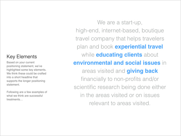
And finished here:

Once you’ve crafted a good positioning statement, it’s my job to emphasize it visually. This usually takes one form on the homepage, since it’s the front door of your website. But you should also consider including your positioning on every page of your site (in HTML text) so visitors can identify you quickly, especially if they arrive on a deep-level page of your site as a result of a Google search.
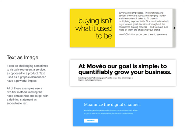
Text as a graphic element
Text as an element can be a powerful graphic device, especially when you’re selling a service and a clichéd stock photo is only going to water down the message. While you can do some pretty interesting things with a static graphic, I recommend using HTML text so your positioning statement is indexable and contributes to your site’s SEO.
Text with supporting image or video
The one-two punch of text and image is probably the most common example on the web. The challenge is to use an image that will reinforce the message of the text and not water it down or, worse, negate it. A simple looping video can also work well with the text, especially in providing a mood, or atmosphere. Here are some great examples of text with supporting images.
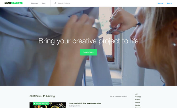
Kickstarter uses a series of simple images behind its value proposition that promotes the end result rather than a long explanation of how the process works.
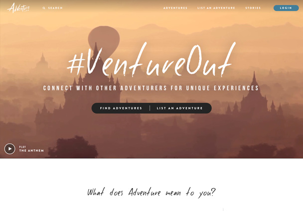
Adventure.com inspires their potential clients by using images of exotic destinations. The use of a hand-drawn script for the hook statement alludes to personalized travel.
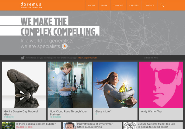
Doremus.com bolsters their positioning statement with a project gallery.
Globally positioned throughout the site
Including your positioning statement as a piece of HTML text, either in the header or footer of your site, will keep the message in front of your viewer no matter where they navigate. It’s also a good way to position your site for SEO. The homepage used to be the front door of everyone’s site but, as search has become better and more ubiquitous, the front door of your site can be any page. Having your positioning statement on every page will help a viewer understand your who, what and how no matter where they come in.
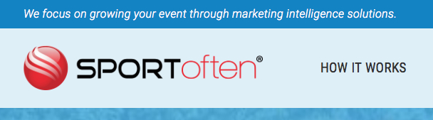
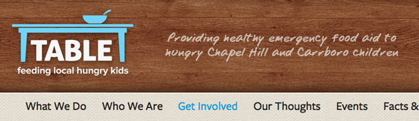
Both Sportoften.com and TableNC.org display their positioning statement as indexable text in the header of their site so that it’s universally visible to their visitors and to search engines.
Concept
The concept category of the Visual Inventory is about how to tell the client’s story. Story is how you connect prospective clients with your product or service in a way that makes them care about it. Don’t misunderstand: You don’t need to come up with a “once upon a time” allegory or rely on a company timeline (honestly, most of those are only interesting to the people inside the organization).
Telling your story is organizing your existing content in such a way as to promote your best features. It’s a combination of what you do for whom (services, client work) and providing knowledge and insight (blogs, articles, white papers). The visual aspect of story carries the message without getting in the way.
For our adventure travel client, their story is best told through the images of exotic destinations and the words of the travelers who’ve been there. For the “considered purchase” marketing firm, their story is told through case studies and the complex problems they’ve solved for their clients. Your story might be best told through blog posts, client testimonials, embedded Twitter feed or an infographic.
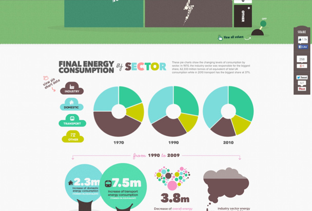
The EvoEnergy site uses colorful infographics to tell a story about energy consumption and conservation.
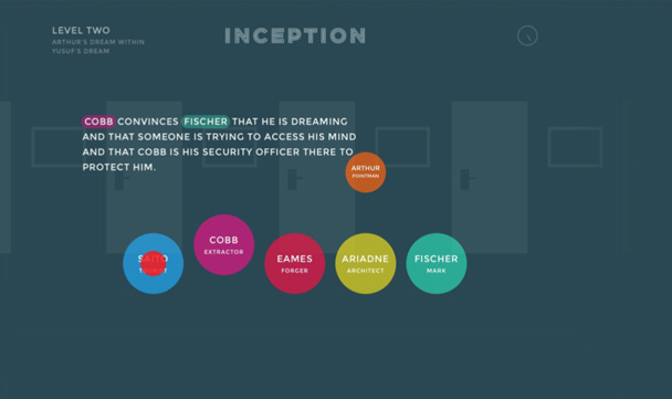
Inception-explained.com uses simple illustrations to tell each character’s story as you scroll through the movie timeline.
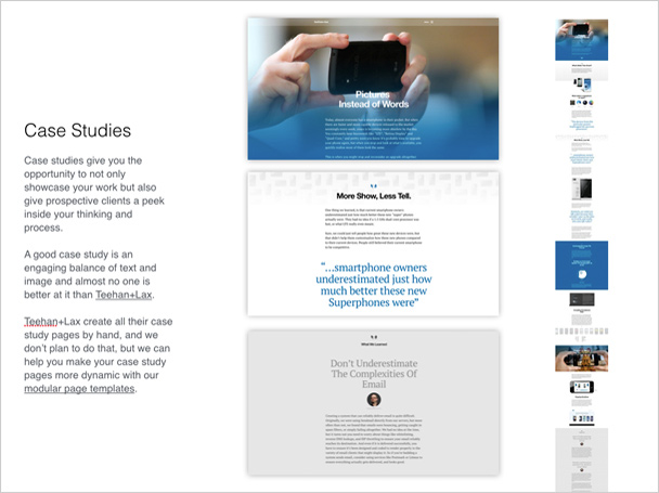
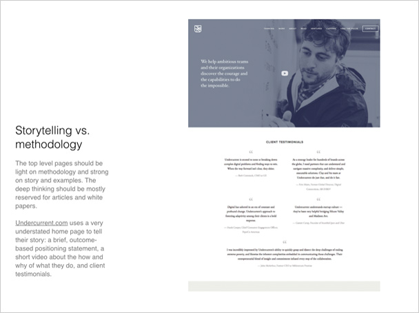
How your site’s content is arranged is important, too. The top-level pages should be a good balance of methodology, story and examples (testimonials, hero shots of your product, pages about how your process works, etc.). Deep thinking should be mostly reserved for articles and white papers.
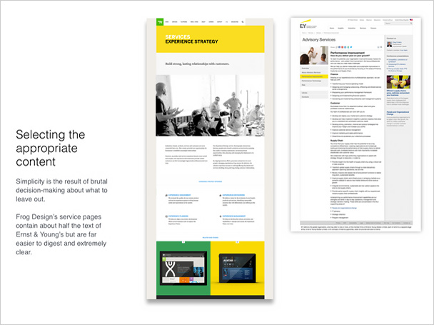
Simplicity. Less is more. You can say more with 150 words and a handful of quality images than you can with 1,000 words and cheesy stock images.
A full Visual Inventory reaches beyond these elements to address others like tone, personality and color. I’ll cover those items in a follow-up to this post next month.