
The other day a chat window popped up on my Google+ page from Vitaly over at Smashing Magazine. I assumed he was getting in touch to ask me to rewrite the piece I’d just submitted—with some trepidation, I might add—critiquing marketing culture (he wasn’t, it was published with barely a tweak!) or to let me know he was still intending to give me a blurb for my forthcoming book (he is!). But it was neither of those things. Instead, he asked if I’d be willing to receive and advanced copy of the Smashing Book 3 and write a review. I didn’t think, I just said yes.
Having worked in web design for just about a decade, I have a deep sense for the sprawl of the subject. Having just written a book on web design (out this summer), I know the challenge of figuring out how to do that sprawl justice in a manageable way and the humility anyone must feel at comparing their tiny slice of expertise with the huge field surrounding it. Besides the obvious angles—information architecture, design, markup, mobile, usability, etc.—I can imagine entire books just covering the business of the web, web project management, client services, heck, even how to think about the web. But imagining all of that in one book that isn’t the size of a pyramid’s cornerstone is tough. Smashing’s third book goes for it and provides an engaging and insightful survey that any designer would benefit from reading and adding to their library.
From the first sentence of Paul Boag’s opening chapter (“Redesigning a website is the most fun Web designers can have with their clothes on.”), it’s clear that the editors at Smashing—and the authors they recruited for this third installment—know their audience just as well as they do their subject. The web, while a thoroughly technical subject, is most often manifest in experiences that are themselves non-technical, and I like that the authors seem to implicitly understand this fine balance in their prose. There’s plenty of important technical detail, but it’s presented in a light, warm, and human-focused way. There’s really no other way to produce a 300+ page book about web design and retain any hope that it will be read!
I was especially interested in Stephen Hay’s chapter, Workflow Redesigned: A Future-Friendly Approach. Right away, he made this point that spoke directly to one of the things that I, as a manager of a web development firm, spend the most time thinking (and worrying) about—trying to predict the unpredictable flow of web work. Here’s Stephen:
Clients often tell us “You are here,” but our job as designers is to ask questions to discover whether that really is the case. Even “I think we are here” is a gamble. If you want to get to New York and you are in Paris rather than Chicago, you’re in some serious trouble: the car you rented is not the best mode of transportation. You might still get to New York, but it will take much longer.
Thus, a workflow should remain fluid, because every factor influences other factors. The combination of the starting point and the end point (the goal or target) shapes our choices for getting from A to B. Plane to New York, cab to the hotel, walk to the building.
In Web design, the territory changes quickly. Maps are only marginally useful. In multi-platform design, where websites and apps will be used on various and many de- vices, we are confronted with multiple destinations. The list of devices to be supported might be our map, but its usefulness in this changing landscape is limited. We cannot say, “It has to look good on Android,” because what does that even mean? You could probably come up with a list of variables that you have to deal with: screen resolution, pixel density, screen size, CSS support (or support for any technology, for that matter), accessibility, keyboard and mouse input versus touch input, the list goes on. And these are only technical factors; let’s not forget fuzzy (albeit still technical) variables, such as why the website looks different on the client’s BlackBerry than it does in your Photo- shop mockups. Oops!
So, how do we set up workflows for our website (re)designs in such a way that we re- main flexible and adaptable, yet do not wander all over the place?
Hay goes on to define a content-first approach that leads into a process of building what he calls “content reference wireframes” (very similar to our approach that we just call prototyping). I especially like how he recommends building interactive wireframes that are, themselves, responsive. This keeps the next design phase much more manageable. Anyway, read the entire thing—it’s worth it!
The entire book is wonderfully balanced between theoretical and practical, with each author contributing a strong point of view on their area of expertise as well as a thorough explanation of how to execute it in a way that is useful. In fact, that’s generally how I’d sum up what Smashing Magazine is all about now—curating the most cutting edge perspectives on the web and offering the tools and information that the rest of us need to build upon them. If you’re into that, check out this book.
How to Check Out this Book
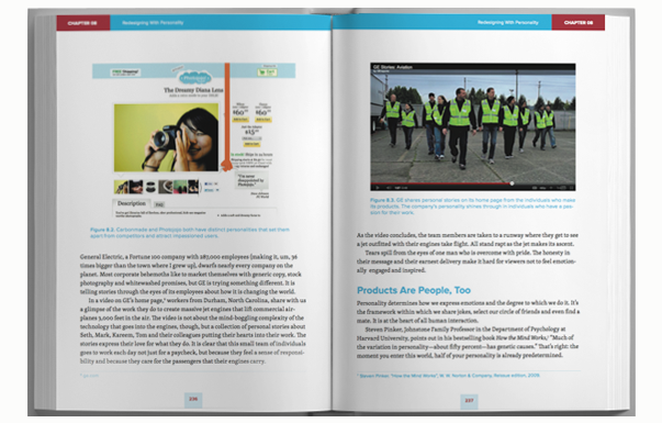
You can download a sample chapter, Redesigning with Personality, by Aaron Walter, here.
You can order a copy of the book here.
There’s an article up on Smashing Magazine by the cover designer, Veerle Pieters, detailing the creative process.
Everything else you might want to know about the book can be found here.
The Authors
If you’re not following these authors, here’s where you can find all of them on Twitter (you’re welcome):
Elliot Jay Stocks
Paul Boag
Rachel Andrew
Ben Schwarz
Rachel Andrew
David Storey and Lea Verou
Christian Heilmann
Dmitry Fadeyev
Marc Edwards
Aarron Walter
Aral Balkan
Stephen Hay
Andy Clarke
Stray Observations
- Each chapter begins with a large letter, which taken all together spells “Redesign the Web,” the subtitle of the book. Each letter is a colorful illustration centered around a particular animal — “R” for rabbit, “E” for eagle, etc. I like that they decided to give the book some space by allowing these visual breaks to not be overly focused upon technology.
- “To say that, ‘Now is an exciting time to be working in Web design and development,’ is something of a misnomer. It always has been and always will be an exciting time to live on the bleeding edge of the Web.” — Elliot Jay Stocks Agreed!
- The chapter of the book that actually presented me with the most new information was Designing for the Future, Using Photoshop, by Marc Edwards. I use Photoshop all the time, but really haven’t made the time in almost a decade to investigate what’s new there feature-wise or any of the new ways I can use Photoshop to navigate the changing factors all around me (e.g. pixel density). Other helpful info included things about using vector shapes, color management, etc.
- The longest chapter in the book is Chapter 4, Restyle, Recode, Reimagine with CSS3, by David Storey and Lea Verou. Must be all those code samples 😉
Related Posts
-


Christopher Butler will be a keynote speaker at the 2015 ConvergeSE conference...
-

Chris Butler will be speaking at the concluding session of the AIGA's Web101 course...
-
Chris Butler is MC'ing at this year's Hopscotch Design Festival...