
Card sorting has been a pretty common technique for early-stage organizing of website pages and/or information and is helpful on a pretty general level—though I honestly imagine that few web development professionals still do it. (But I am really over-simplifying it. Here’s a definitive guide to card sorting from BoxesAndArrows that goes into much more detail.) I was talking about this exercise with a friend a few months ago and thought it might be interesting to try at our next enrichment session, with a few minor tweaks to ensure it included some additional steps that ensure that the organization of a website is also influenced by client intent and user engagement.
So, we did.
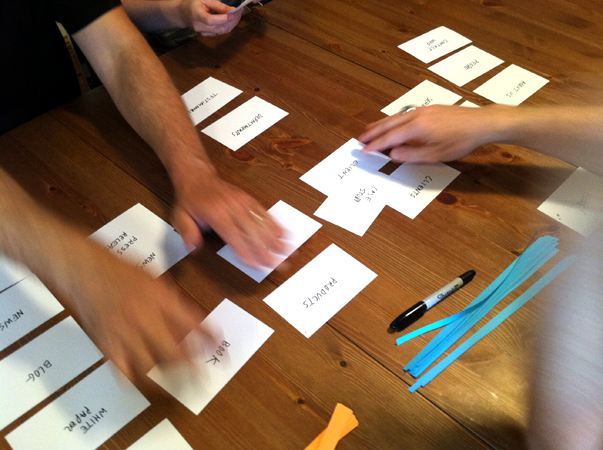
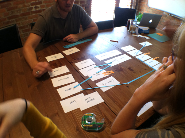
I prepped the session by labeling index cards with the common page and content types that our typical agency clients’ websites need—the kinds of information that you’d expect to find on a content-driven, pull-marketing website. These would be the cards that the team would need to arrange into a website-like structure. Then, I added two more steps. I cut a bunch of orange post-it notes into strips that the team could use to identify calls-to-action—literally by writing the directive on the note and adhering it to the appropriate page or content type. I also cut a bunch of blue strips of paper that the team could use to diagram logic connections betweeen pages and content (e.g. a link between clients and case-studies). With the cards, post-its, blue strips, tape and a sharpie, we had an offline prototyping kit ready to go.
We spread out in our conference room for an hour. I took a few minutes to explain how it would work and then stepped back to observe. The process the team followed:
Step 1. Arrange the existing cards into a logical structure/sitemap.
Step 2. Add or Remove Cards as needed.
Step 3. Identify CTAs and write them on orange post-it strips.
Step 4. Assign CTAs to pages/content types as appropriate.
Step 5. Indicate logic connections between pages/content types using blue strips.
So, what did the team think? Here are some pros/cons straight from Katie, Chris, Steve, Lauren and Lindsey:
Pros:
1. Ability to see how everything relates at once.
2. Easy to make changes, so more room for risk-taking.
3. Format was ideal for a group exercise, allowing for many opinions/ideas.
4. No clients with pre-determined ideas.
Cons:
1. No realistic indication of interaction.
2. Little indication of how page content impacts overall site.
3. Difficult to break away from bad pages/content when cards are pre-determined.
4. No client influence—they provide the entire purpose of prototyping (not to mention a lot of knowledge we need)!
Here are a few more pictures of the process:
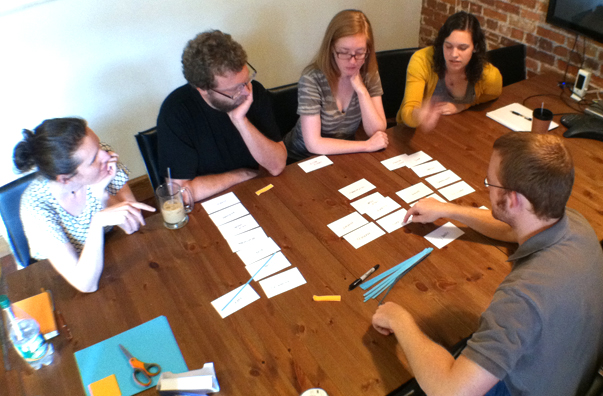
Katie, Steve, Lauren, Lindsey, and Chris discuss how the cards representing pages and content should be arranged. Some are weeded out, others are added.
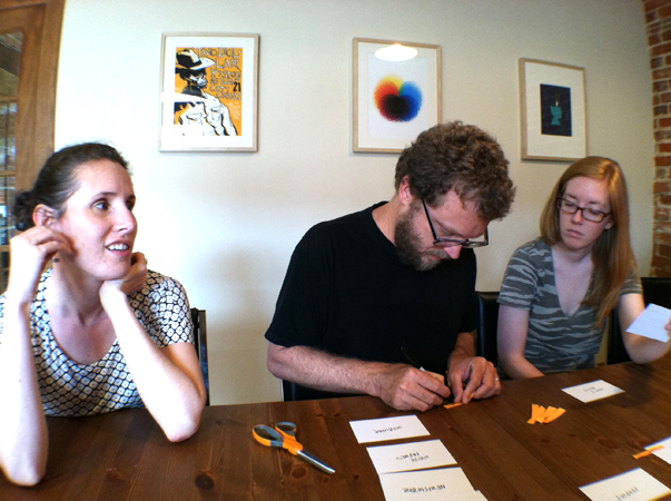
Steve creates a call-to-action.
Katie creates another CTA while Chris suggests a connection between pages.
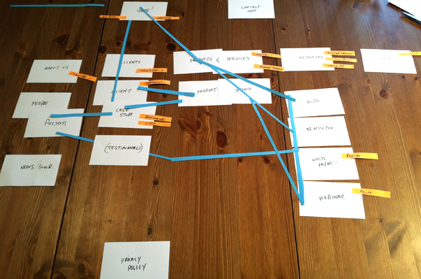
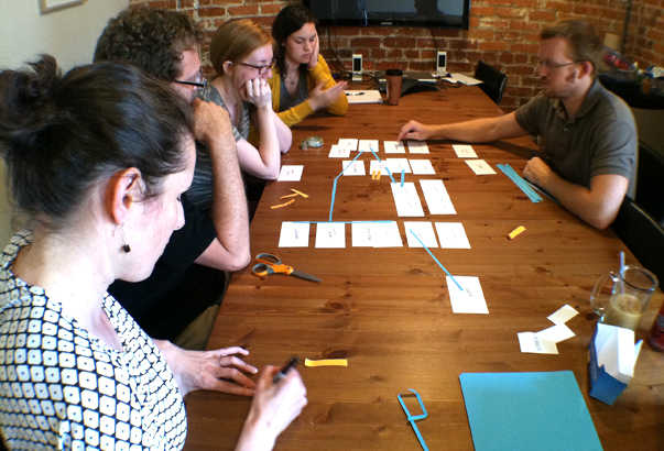
Voila, it’s done! Something about this reminds me of The Science of Sleep, or at least how Stéphane might dream about prototyping…