
Now that Eric, our former CEO, is off to new heights in his career, I’ve invited him to contribute a few guest blog posts. This is the second of a series that will be published in the coming months.

After studying at the Rhode Island School of Design, Eric Holter worked as an engraver and illustrator for Pagano, Schenck & Kay Advertising, then as a web designer at Leonard/Monahan. He founded Newfangled Web Factory in 1995. |
Positioning: Tim McAlpine founded his agency in 1990. But it wasn’t until 2003 that he took the bold step to re-position The McAlpine Group (their former name) as Currency Marketing, a specialized Credit Union marketing firm. It’s rare that creative firms overcome their initial terror at the idea of such focused positioning. Fears of opportunities lost or being passed over for other kinds of work (not to mention the fear of boredom from doing “just one thing”) often give agencies pause. It’s sometimes easier for agencies to warm up to the idea of positioning the way Tim did at the time, by maintaining two “brands.” In 2004 Tim created Currency Marketing for credit unions and Passport Marketing presumably for everything else. But three years later the fruits of Currency Marketing’s positioning were so profound he dropped Passport and now enjoys a laser focused specialization, which gives him valuable expertise and a leading position in credit union marketing.
Content: Any agency can (and should) pick a bold and narrow position and build their brand around it. But declaring a position is just the first step, proving it is what ultimately counts. That’s where a robust content strategy can be invaluable. And this is where Currency Marketing shines. I guarantee if you go to the Currency Marketing website and spend ten minutes (or many hours) you’ll be completely convinced that they have a profound degree of expertise and knowledge about credit union marketing. If you were a credit union looking for marketing help you would be sold before ever picking up the phone. The content of the site is focused, broad, and deep.
It’s focused because it always centers on credit union marketing issues. For example, in a recent blog post, instead of merely adding his two cents about the Seinfeld/Gates Microsoft ad (like everyone else) he asked the question, “Are your credit union’s marketing efforts worthy of comment?“
Their content is broad. They have a blog (that’s updated almost everyday), an e-newsletter, a podcast, whitepapers, and speaking seminars viewable as embedded slide shows.
And the content is deep. The blog is extremely robust, the podcast and newsletters are consistently created.
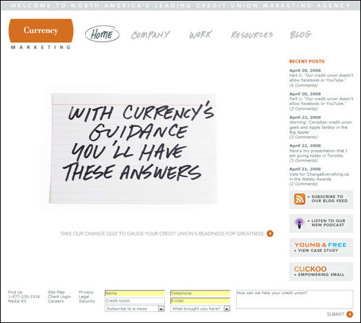
Currency has also created two programs that both extend their focused content and generate new business opportunities. The invented a “Young & Free” licensing program and a cuckoo marketing program for small credit unions. Not only do these two programs extend their offerings, they further demonstrate and prove their expertise and positioning.
Platform: From what I can tell their site is built on a Cold Fusion platform. I cannot discern the content management system though I assume it’s K1 Techology’s product. They’ve avoided all the main platform gaffes common to many agency sites (splash pages, Flash, overuse of graphics for text, etc.). They certainly have no barriers to getting their content online since the site is updated so consistently. They could stand to improve their page specific title tags and meta descriptions to improve search engine optimization. I also find it a bit strange that their newsletter links open up into a new browser window and have extended, encoded URLs. I assume this is for tracking/measuring purposes (which, if so, is great to see), but the new window seems unnecessary. I do like that they are using Google Analytics to measure their site’s traffic.
Design: I think the visual design of the site is very clean, balanced and easy to read. Navigation is fairly intuitive. I think their sub page navigation gets a little lost and could use a visual boost or get relocated closer to the main navigation bar. The only significant flaw is a problem with their home page call-to-action animation. There are a few different messages in rotation (which I’m not sure is a great strategy to begin with). One of these begins “Hi There…” and ends with a call-to-action link that goes to a quiz, but the quiz is not online yet. If a first time visitor happens to get this version of the animation and goes to the quiz page to find it’s not there, they might abandon the site without learning how powerful the firm really is. Another very minor detail is the e-newsletter list. The oldest is listed first, giving the impression that the newsletter hasn’t been published since February 2007. Since many people scan a site before digging in, it’s important to read a site quickly to find elements that may give an incorrect quick initial impression. Of course these are very minor flaws in an otherwise amazing example of strong agency positioning with a powerful content strategy to match!