
Now that Eric, our former CEO, is off to new heights in his career, I’ve invited him to contribute a few guest blog posts. This is the third of several that he’ll contribute in the coming months.

After studying at the Rhode Island School of Design, Eric Holter worked as an engraver and illustrator for Pagano, Schenck & Kay Advertising, then as a web designer at Leonard/Monahan. He founded Newfangled Web Factory in 1995. |
In the recent HOW magazine article, Rock Your Website, Chicago-based Remedy was one of the featured website examples. Remedy is a good example of an agency website, but I’m not quite ready to push it into the “great” column. It’s on the edge though, and with a few adjustments I think it could become one of the great examples of an agency website.
Positioning: Remedy has already done the hard part. They’ve taken the step of defining a narrow positioning in the healthcare market. And they’ve identified their approach to healthcare marketing–they move healthcare brands toward expressions that overcome our consumer aversions and negative pre-dispositions of hospitals and healthcare services in general.
The only positioning weakness (as it’s represented in their website) I see is on their services list. It contains a few too many categories, and uses the word “Brand” a bit too much.
I also see “public relations” listed at the end of the list. Whenever I see this it makes me immediately think that the list is just trying to cover too much ground. I may be completely wrong about this criticism as it applies to Remedy (for all I know they may have significant public relations expertise) but I see it so often, and usually at the end of the list–that it casts doubt. I’m always is favor of shorter, more defined service lists that relate more closely to expertise.
Content: The content strategy is framed-up and heading in the right direction. But this is where the site needs a bit of work. Their portfolio content is excellent. They’ve provided written details covering several facets of each project’s strategy and process.
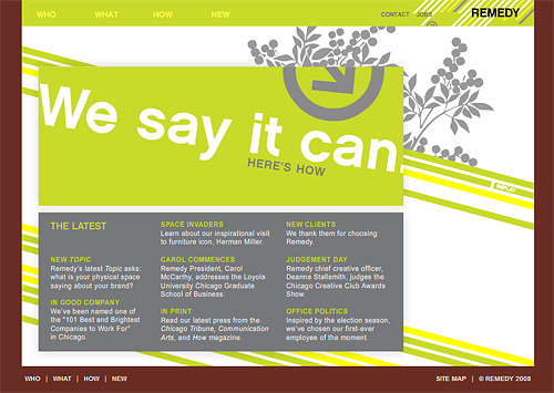
In addition, they just stared a quarterly newsletter–so there is only one issue so far. In my opinion quarterly publication is the absolute minimum schedule for an agency newsletter, bi-monthly would be better. Hopefully, they’re working on the 4th quarter newsletter. For some reason, the link to the newsletter (and come of the other areas of the site) launch new browser windows. I’m not sure why they’d do this, it feels awkward to me.
They also have a “New” section. It’s almost a blog–and that’s the problem. If it’s not a blog it’s purpose is a little confusing. It might be intended as a simple “News and Events” list, in which case I’d simplify the layout and add dates to each item. But if it is supposed to be blog-like, I’d press it further into blog form by including RSS, author, comments, categories, link bait, etc.
Platform: Y’all know what a big fan I am of Flash. While Remedy does use Flash for their homepage, they are commendably restrained its use inside the site. They also provide text links into the main sections outside of the Flash movie. Nevertheless, I always feel that the choice to use Flash for impact on the homepage is a poor one. It’s hard for me to understand why you’d relinquish the powerful opportunity to leverage your site’s content by linking to it from the home page–for the sake of one dynamic graphic. But that is the “creativity barrier” in action.
I can’t detect the use of a CMS. The site is written in PHP, so there may be some site updating tools available. I suspect, though, that it’s hand-coded, especially since I randomly encountered a broken link on the sitemap page (Jessica Daly’s bio). This is usually just a typo in the coding–an automated CMS wouldn’t likely have this kind of error.
And finally, as far as platform goes, the browser titles need optimizing. The home page’s browser title, for example, should contain “healthcare marketing” in it. This is an almost universal oversight so I don’t usually knock too many points off for this.
Design: My design comments relate primarily to information design and usability. Most agency sites are going to look good. The main navigation system is a little weird. When I click one of the main links (Who, What, How, and New) I don’t go anywhere. Yet if I click the same links in the footer navigation they do resolve to overview pages. The final critique on interfaced design is the main navigation for the portfolio. The navigation area allows for scrolling and clicking their list of clients and projects. But the space only allows four items to be viewed at any time. This makes it difficult to browse. A rollover, drop-down that lists all the items would be much more usable–especially since there are only about eight or so in the full list.
I think remedy is on a trajectory toward an excellent agency website. Opening up their platform and pushing the content strategy a bit further may get just them there.