
Now that Eric, our former CEO, is off to new heights in his career,
I’ve invited him to contribute a few guest blog posts. This is the
fifth of several that he’ll share in the coming months.

After studying at the Rhode Island School of Design, Eric Holter worked as an engraver and illustrator for Pagano, Schenck & Kay Advertising, then as a web designer at Leonard/Monahan. He founded Newfangled Web Factory in 1995. |
closerlook is a relationship marketing firm specializing in healthcare (pharmaceutical, health insurance, and health information technology). They have an excellent agency website that builds upon tight positioning with a significant content strategy. So let’s break it down:
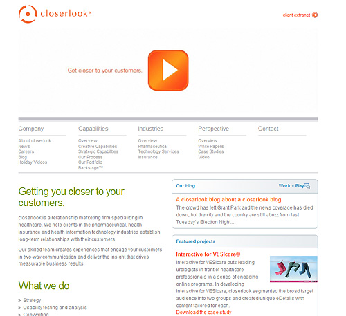
Positioning: Here’s how closerlook states their positioning in the first paragraph of their home page,
“closerlook a relationship marketing firm specializing in healthcare. We help clients in the pharmaceutical, health insurance and health information technology industries establish long-term relationships with their customers.”
This focused positioning is also evident by the industries listed in the main navigation and the two featured projects on the home page. If you dig one click deeper into the “About closerlook” page, their focus is restated in a big blue heading, “closerlook is a relationship marketing firm specializing in healthcare.” When executed properly an agency’s positioning and its content strategy reflect and reinforce each other–which makes it difficult for me to know when to segue from a review of their positioning to their content. Since the closerlook website does succeed in integrating positioning and content let’s proceed to a review of the content.
Content: The closerlook site strikes a balance in terms of the amount of content on each of their top level pages. They provide adequate depth and detail without overwhelming with too many words. They could do a little better job pulling their positioning down into these main sub-pages. For example the strategic capabilities page has excellent content, including descriptions of specific capabilities like “Segmentation and Targeting,” “Instructional Design,” and “Usability Testing and Analysis,” among others. However, aside from the case studies contained in the page’s side bar, there is little to reveal the firms specific expertise in healthcare relationship marketing. This is an important consideration since search engine traffic most often leads visitors directly to these content-rich sub-pages first. And considering how quickly visitors evaluate a site–especially when in “search mode,” getting to the point quickly–with as few additional clicks possible, is a high priority.
It’s a worthwhile exercise to examine each sub-page as though it were your home page. After all, these pages will function as surrogate home pages (at least in terms their first impression function). You’ll want to help the visitor who hits a sub-page first to catch the plot of the site without having to click much further. Adding phrases about healthcare and relationship marketing to each sub-page can really help. In addition, the use of a tag line in the logo and strategic browser titles can also help frame in the positioning on each sub-page.
closerlook fleshes out on their content strategy with whitepapers, case studies, a news section and two blogs. Their general agency blog is called “Work + Play.” I like the title because it points out how agency blogs can have multi-faceted effects. They can demonstrate expertise while at the same time offering a glimpse into the agency’s personality and culture. Blogs are also effective at simply sharing information and engaging with the design community at large. Their second blog is called “Experience RM,” and focuses on how their approach to customer relationship management is unique.
Oh, and closerlook also uses video quite effectively. They have a Flash based video on the home page (it’s okay, this is one use of Flash that is very appropriate and effective). They’re very considerate to only play a silent video montage by default–allowing the visitor to start the full video via the play button (thanks!). They’ve also used video on their Experience RM blog to explain their concept of relationship marketing.
One thing that is oddly missing is a section about the principals or employees. This is a fairly ubiquitous form of content for most agency sites, and is generally helpful in getting to know the firm. I’d add a section to the Company area with bios and photos (and link to any blog contributor’s posts).
Platform: I cannot detect a CMS under the hood, though the content is kept up-to-date, so I’m assuming there is a system in place. If so, it’s well configured with clean URLs, ability to affect meta info and browser titles. While the site does provide unique browser titles on each page, the choice of words could be refined, and made more effective for search engine optimization.
Design: The visual design is clean, professional, and easy to read. I like how they’ve consolidated content by truncating lengthy paragraphs with a “more” layer and link that reveals the rest on click (see the Strategic Capabilities page). closerlook has been very restrained in their use of graphic typography. They’ve managed to create a well crafted typographic design with straight text and CSS styling. Even their main navigation and sub navigation is text based!
My only area of discomfort with the user interface is the two click main navigation bar. The first click opens the sub panel then the second click brings you to your destination. This is a pretty minor issue, but I think a standard drop down menu would better serve the visitor and speed up site exploration. There is also a very minor bug in the home page video (at least on my computer–Vista/Firefox 3.0.4). It seems to start playing the audio on load but then stops–producing a one chord sound before catching itself.
All in all, this is a notable example of a successful agency website.