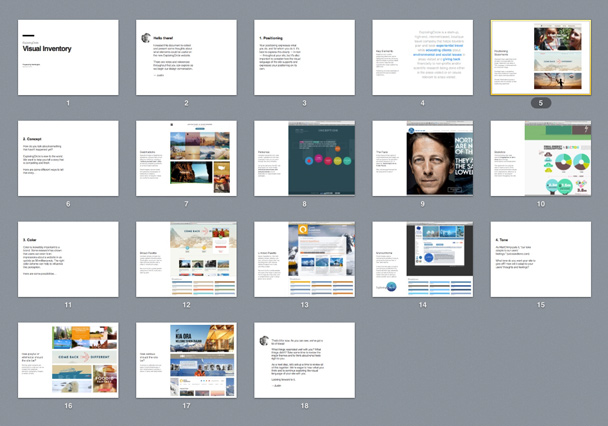
In my last post, I introduced one of Newfangled’s design deliverables, the Visual Inventory, a catalyst for conversation about the client’s goals which provides concrete examples for the client to respond to. In that initial discussion, I focused on two Visual Inventory components: positioning (what you do and who you do it for) and concept (how to tell your organization’s story). This month, I’ll wrap up our look at this design deliverable and talk about tone, color and functionality.
Tone
As MailChimp puts it, “our tone adapts to our users’ feelings.” Tone is about the voice with which you communicate to your audience. This can be expressed through color, imagery, typography and, most obviously, your written content.
What tone do you want your site to project? A lot of it has to do with the personality of your organization. Are you conservative and understated? Outspoken and controversial? Hip and playful? Look around your office. What are the people like? What’s the culture? Does it line up with your mission statement?
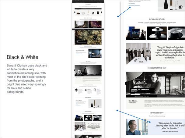
For a recent client, a high-end lighting manufacturer, we suggested a sophisticated look and feel with a minimal color palette and aspirational tone for their written copy. The Visual Inventory included examples collected from other high-end manufacturers such as Bang & Olufsen, Maserati and Rolex.
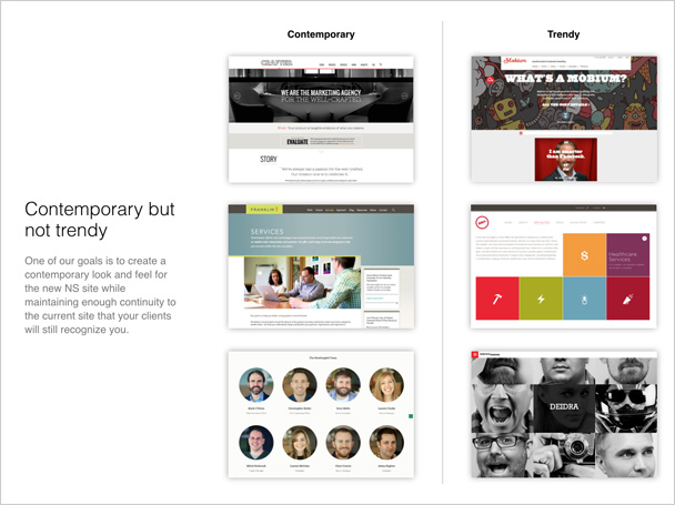
Another client wanted to update the company’s look to be more contemporary without relying on visual gimmicks or trends, so we created a do’s and don’ts comparison chart with website examples from their market segment.
Color
Color is incredibly important to a brand. Some research has shown that users can form impressions about a website in as quickly as 50 milliseconds. The right color scheme influences this perception.
Some of our clients come to us with well-developed graphic standards that include an established color palette. Some are looking to expand or adjust their color palette because they’re shifting their market focus. And some clients (especially startups) come to us with a blank slate, open for our best recommendations.
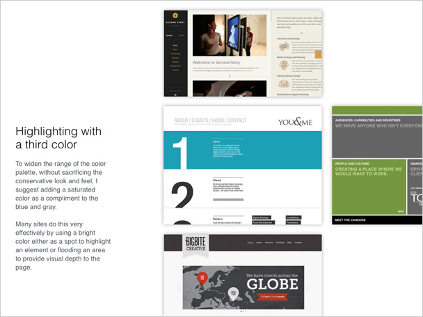
One of our clients came to us with a very limited palette of a muted blue and gray. We used the Visual Inventory to suggest they add a brighter third color to act as an accent and widen the palette.
Creating (or modifying) a color palette is more than selecting a handful of hues that work well together. It’s also about how those colors will be applied. In a successful color palette, each color plays a role. Sometimes a role is filled by two or more colors:
- The base is a color that can be a workhorse for the site and is flexible enough to be used in many different shades without shifting to another color altogether. Blues, greens and neutrals are good candidates.
- The compliment can be a direct compliment to the base on the color wheel (blue and orange) or a color that simply plays well with the base (blue and tan).
- The accent is usually a strong color, punchy enough to stand out even if applied to a small piece of text. Think of it like hot sauce: You want to use enough to bring out the flavor but not so much that it causes discomfort. Reds and yellows are the most obvious candidates, but a highly saturated (think neon) blue or green can work, too.
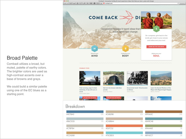
How broad or narrow should the color palette be? There is no set formula, but the site’s content can sometimes help determine this. A broader palette can be used to distinguish subsections of a site, like on Combadi.com. The travel categories of mind, body and spirit are branded in bright colors with red as an accent, over a base of neutral earth tones.
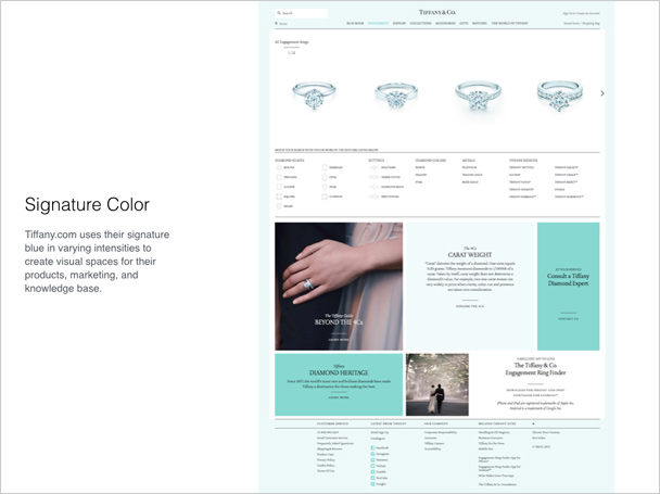
A limited palette can be used to create a sophisticated look and feel, as Tiffany & Co. does so well with their signature robin’s egg blue.
There are thousands of articles on the psychological effects of color, so I’m not going to get into that here. If a client is open to a new palette, we try to offer examples that match the personality (tone) of the client or, if they’re uncertain about tone, provide several examples, each with a rationale. Some clients think they want to be a lot bolder with color choice than they really do, and the Visual Inventory is a good place to explore just how daring they are willing to be with their brand.
Functionality
Sometimes the Visual Inventory includes a section on functionality, in which we highlight key functions from other sites (slide carousels, timelines, donation calculators, etc.) so we can be mindful of how they’ll impact the visual language of the new site. This is sometimes quicker and cheaper than building out a prototype or proof of concept because the client can decide if the functionality is a good fit and talk about styling before anything is built.
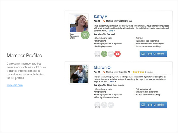
For one of our clients, an educational and accreditation organization for professional petsitters, we provided an example of how to populate member profile listings with enough content to be informative but not so much that it would make the page difficult to scan quickly.
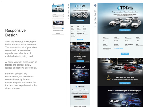
It’s never too early to discuss how a website will look and function on mobile devices. We used the visual inventory for a client that manufacturers accessible vehicles to begin a conversation about content hierarchy and which information would remain front and center for small screens and which information would be nested and accessible through menus.
Results
Since we’ve introduced the Visual Inventory into our design process (thanks, Dan Mall), we’ve realized several benefits. It allows the the design team to get “inside the client’s head” and understand them better, mostly through conversations and questions that the visual inventory generates. This can go a long way towards eliminating design and production surprises later.
The visual inventory also helps defines design goals and set a design direction, beginning at the 30,000-foot level instead of getting bogged down in small details too soon. And it runs parallel to our prototyping phase, which covers user experience and information architecture in a nonvisual way. This two-track approach helps us keep all phases of the project moving along and satisfies the client’s need to see “cool stuff” while they’re engaged in the important but less sexy task of focusing on their site’s architecture and content.
As a design deliverable, the Visual Inventory reflects the client’s stated goals back to them in a concrete way that they can respond to. It also helps us guide them toward best practices not just for design but content strategy, making it possible to create a final product that satisfies everyone.